47 Video Logos To Enrich Your Brand’s Storytelling
Reading Time: 7 minutes
Hey there, fellow video entrepreneurs! Let’s discuss something super important for your business: your video logo. Yep, that little symbol or animation that represents your…
Menu
BrandCrowd’s logo maker has over 209,000+ premium logo designs created by designers from around the world. Here's how it works:
To get started with BrandCrowd's logo maker just enter your business name and let our Logo Maker create amazing logo designs, instantly. You can browse thousands of logos tailored with your business name and find a design that's perfect for you. Looking for a more specific logo? No problem! You can enter keywords to refine the logos and find a design that really suits your business.
Once you've found a logo you love it's a breeze to change the logo colors, fonts and layout. Moving the logo icon or adjusting the spacing of the design is simple - there's virtually no limit to what you can do with our logo maker tool. You can create something bespoke by adding gradient colors, additional shapes or some curved text - it's easy to create your perfect logo.
Now that you've crafted the perfect logo design it's time to download. Downloading your logo on BrandCrowd is instant and with all your logo design files available in your account you'll have everything you need to get your new brand setup. We'll also send you an email with a link to your logo files so you can find them easily. Your logo comes with the following:
High-resolution logo files (PNG and JPG files) - perfect for your website
Vector logo files (SVG, EPS and PDF) - perfect for print
Logo files with transparent backgrounds
Multiple variations of your logo
Enter your business name and we'll start creating logos in seconds...
Every logo in our library is uniquely handcrafted by professional designers from across the globe.
Get high-res logo files (PNG and JPG) for your website & vector files (SVG, EPS and PDF) ready for print.
Choose from several layout options and use any color for your logo.
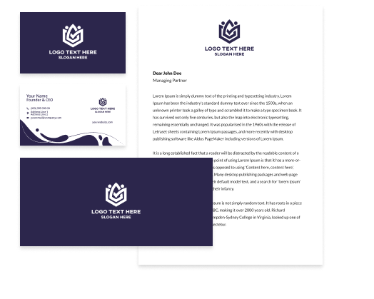
Choose from thousands of business card templates, customised with your logo colors to match your brand.
Create social media designs including Instagram posts & stories automatically customized with your logo colors.
Create letterheads, email signatures matched to your logo colors to complete your brand identity.
Change the layout, colors and font on your logo. Get unlimited edits and create as many variations as you want.
With 24/7 support from our team of logo experts, you're always looked after from logo creation to download and beyond.
Get a worldwide, irrevocable license to use your logo for any commercial and non-commercial purpose.
Everyone wants the perfect logo for their business. The good news is you can create a beautiful logo with BrandCrowd's logo maker. Our online logo maker lets you generate designs perfectly suited to your business from a professionally designed library of logos. There's no stock icons here - every logo has been handcrafted and is exclusive to BrandCrowd. So, if you want the best logo for your business then start customising a logo today. You can edit all our logos for free and make a logo you love in minutes - who doesn't like the sound of that?
At BrandCrowd we know startups, entrepreneurs and new businesses are short on time - in fact who isn't? We also know that you want a logo tool that's not just free to try, but super simple to use. That's why we've spent many hours perfecting our logo maker, so you can get that amazing logo with zero fuss - Simply find a logo, customize it and download the logo files. You can have a beautiful logo for your business in just a few clicks.
There's a lot more to starting a successful business than getting a fab logo - but making sure you put that logo to work is still crucial. At BrandCrowd, we make sure that once you've created your new logo you don't miss the opportunity to get branded business cards, social media pics, banners and covers - all easily customisable with our suite of design editors. You can also put your new logo on stationery, including envelopes and letterheads. Want more? We can also get your branded merch, office supplies and stationery printed - making BrandCrowd the one-stop-shop for launching your business.
Not sure where to start? Need some help creating a great logo? Here's a few bitesized tips from the pros:
Did you know there's an array of different logo types to choose from? What choice you make depends on the message you want your logo to convey - You can have a logo with just text or just an an icon or maybe it should have both? This is a critical decision in the logo design process.
Find out more
There's a whole world of color theory and psychology that most consumers aren't aware of. As a business owner it pays to choose the right colors for your logo. Want to convey seriousness or maybe you want your brand to appear adventurious or sporty. Choosing the right colors for your is key to getting the message right.
Find out more
It's not only the colors and logo type that convey meaning, so too can your fonts selection. Clean, bold typography can help to re-inforce a trustworthy message, whereas a softer font can can mean something more playful? Choosing the right font is vital to getting a great logo.
Find out more
Enter your business name and we'll start creating logos in seconds...
Why should you use BrandCrowd Logo Maker to create your logo?
Our 209,000+ designs have all been handcrafted by a community of top designers. Get a stunning logo - always!
BrandCrowd Logo Maker is free to use. Browse thousands of different logo designs, edit and save as many as you like.
Pick a design you like and start editing it. In minutes you can make a logo you will love.
Creating your dream logo easy with BrandCrowd. Just follow these simple steps and you'll have a logo ready to share with the world in minutes.
To find logos relevant to your business enter your business name - We'll automatically show you logos related to your business. You can browse the logos and choose one you love.
If you can't find the perfect logo, you can refine your search by entering related keywords.
To make life easier you can "shortlist" logos that you like. Simply click the heart symbol and we\'ll add the logos to your shortlist.
Once you've found a logo that you love, you can customize the logo colors, fonts and layout. You can even add more embellishments with shapes.
When you're done editing you can easily preview your logo on apparal, signage and more to see how it looks in real life.
Once you're done customizing, you can download your logo - you'll get access to all the logo files you need, instantly
Enter your business name and we'll start creating logos in seconds...
We've got heaps of useful logo design tips, tricks and insights to help you get the best logo.
The first step with any logo design is figuring out the type of logo you want. We'll show you the different logo types.
Learn more about text logos and how you can make a great logo using just typography.
Trademarking your logo can be complex. This guide will show you how to trademark a logo successfully.
Designing your logo is easy when you have the right tools. This comprehensive step-by-step video tutorial will show you how.
Feedback is a crucial part in the logo design process. This is a guide to help you design a logo like a pro.
Knowledge of color theory is a must for that perfect logo. Expand your design skills with this guide.
The number of typefaces and fonts for your logo is overwhelming. This guide aims to demystify the process of typography.
Starting a new business is hard and nailing your brand identity is a must. Learn how here.
Creating that perfect logo with BrandCrowd is easy - but just in case, here's some FAQs to help you get started.
BrandCrowd's logo maker allows you to generate and customize stand-out logos in minutes. BrandCrowd gives you access to a professional library of thousands of customizable logo designs - making creating your logo inexpensive and straightforward. Our logos, created by designers around the globe, give you unlimited possibilities.
Absolutely! A transparent version of your logo is provided when you download in a PNG format. Even if you've chosen a solid background for your logo, we'll provided a version of your logo with a transparent background for your convenience - perfect for use on your website.
You want your logo to standout above competitors. Your logo should tell your audience, customers, fans and competitors that you mean business. There's no single answer for what layout your logo should have - but keep in mind what message your want to convey with your logo. A simple layout can convey elegance and sophistication, while a more dynamic layout can mean fun or adventure. Search our logo collection for a design then customize it according to your needs. Remember you can also research logos - pay attention to their layout, color choices, design themes and fonts.
What's in a name? If you haven't already got a name for your logo then here's some tips. You want to use text and a name that describes your business, the caliber of service you provide and one that resonates with customers. If you're stumped, research other companies with logos for inspiration. Remember your logo should have a catchy and non-offensive name that's sits well with the whole team. Try to keep the logo text short and simple using a bold clean font, so it's easily recognisable on your logo.
Simply put, logos are visual representations of what your business is all about. The logo you choose will become synonymous with your brand, so it pays to choose wisely. BrandCrowd offers access to a library packed with logos created by professional designers from around the world. Find the perfect logos is as simple as searching the library, customizing the logo to your liking and downloading. Remember, keeping your logo simple with three or fewer colors and clean fonts produces an effective, eye-catching logo.
It's easy to enhance your logo with a tagline. A tagline is usually added at the bottom of your logo and consists of a short piece of text like a motto or catchphrase. Taglines that work include three to seven memorable words. Like an advertising jingle or popular song, this additional text on your logo helps further associate your design with your brand. You can add a tagline in a few clicks with BrandCrowd's Logo Maker.
Yes. Now that you've created the perfect logo, it's time to put your design to work. BrandCrowd allows you to download your logo instantly and gives you access to all the files you need. BrandCrowd provides files perfect for producing marketing and print materials, for using on your website or blog and for branding those social media posts. All the logo files you need are available in your account.
Of course. Your logo from BrandCrowd is provided in several formats including vector files (PDF and SVG). No matter how large you want your logo, it'll look great. Vector files are used to create print layouts and illustrations as they ensure the same quality appearance across all formats and sizes.
Reading Time: 7 minutes
Hey there, fellow video entrepreneurs! Let’s discuss something super important for your business: your video logo. Yep, that little symbol or animation that represents your…
Reading Time: 7 minutes
In business branding, speed is often the name of the game. It’s about getting ahead, moving fast, and making things happen. That’s where fast logos…
Reading Time: 7 minutes
Who doesn’t love snacks? Whether it’s movie snacks like popcorn, baseball game snacks like hotdogs, or even beach treats like ice cream to cool off…