10 Logo Design Trends You Shouldn’t Miss in 2021
Out with the old logo design trends of 2020, in with the new.
Every year, designers and brands all come up with influential brand movements that set trends. Others follow suit or use this to fuel their inspiration. It changes continuously, which is why some people have a hard time staying on top of them.
This article will help you learn more about the 2021 logo design trends and get a better idea of how you can apply them to your own brand identity.
A couple of advantages that come with having a brand identity that is up to the minute with contemporary design include:
- It makes you look up to date and relevant to the audience.
- Looking at trends will also help you gauge what people like and don’t like at the moment.
- Paying attention to trends isn’t applicable to design alone. It is also essential for you to be on track with the market and consumer trends to become a better company.
Whether you are a graphic designer yourself or an entrepreneur developing a branding strategy, you should not miss these design trends this year.
Here’s a quick overview of the logo design trends you’ll be seeing a lot of this year:
- Minimalism
- Overlap
- Line art
- Initials
- Whitespace
- Missing lines in typography
- Movement
- Out of the box fonts
- Asymmetry
- Nature
Minimalism
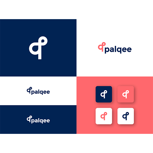
Palquee logo by isurendrarathod
Year after year, we see minimalism in trend roundups. And for a good reason. It is a practice of owning only the essentials or, in the context of design, using the bare minimum elements to come up with a brand mark.
This design trend ties nicely together with one of the best practices for logo design, which is to keep it simple. It challenges you to create something that is direct to the point and free of visual clutter.
Overlap
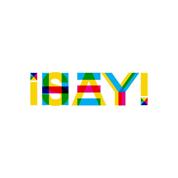
I Say Hey ! Logo by ESolz Technologies
One of the most recognizable overlapping logos today has got to be MasterCard. These Venn diagram-inspired logos create an eye-catching effect using color combinations or illustrations. This type of design can help you depict motion and achieve visual depth.
But this isn’t just for shapes and illustrations. You can also create overlapping designs with text like the logo of GoDaddy. Overlapping text logos are monogram logos, which let you create unique figures using your company name’s initials.
Line art
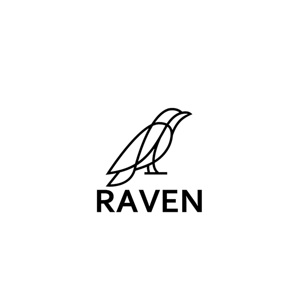
Raven logo by mera design crowd
Brands that want to include drawing in their logo, but are afraid of adding too much detail will enjoy line art. The art style is characterized by monochrome or black and white drawings that focus on line weight to compose images.
Line art adds a decorative or communicative symbol in their design without losing adaptability. This means that their brand mark remains easy to apply on marketing collaterals and other graphic design materials.
Initials
It’s no surprise that brands will follow the growing popularity of lettermarks. After all, it is currently seen on logos of highly renowned fashion brands like Fendi and tech giants such as IBM.
Making use of your initials as the focal point of your logo makes your name easier to remember. This is a stylish approach to shortening your brand name to fit the logo. Brands with long names can apply this trick to their logo for a more compact design.
Whitespace
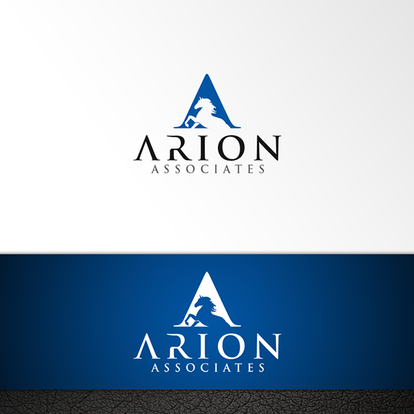
Arion Associates Logo by logo_s
Sometimes the best thing that you can add to your logo is nothing at all. Most logos today can do more with a wise approach to negative space.
Space can be used to improve design. You can even create images and messages using whitespace. Additionally, this highly underrated design element will help you create a better visual hierarchy and become more comfortable to read.
Missing lines in typography
Omitting a line or stroke in your text or drawing will give it an eccentric appearance. Doing this also gives your brand mark a futuristic look.
The missing lines intrigue audiences as they let their minds connect the elements together. However, you want to make sure that you remove the right amount of parts in your logo and not take too much. Otherwise, your logo may become challenging to read.
Movement
Animated logos have been growing in popularity, especially for brands online. However, it doesn’t always translate well when put on print materials. Having a logo that depicts motion can help you achieve a similar effect without relying on online file formats such as GIF, CSS, and SVG, among others.
You can achieve the look of motion with brush strokes, leading lines, or even static-inspired elements. These elements associated with movement will help you create a dynamic logo both for offline and online use.
Out of the box fonts
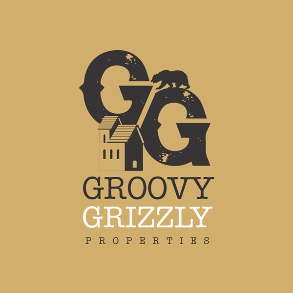
Groovy Grizzly Properties logo by Wendy Elsie
2021 is putting a lot of emphasis on type. That’s why unusual fonts will be one of the key players when it comes to trendy designs. You want to source typefaces that have extraordinary or even quirky personalities to them. This lets you experiment with more creative styles using uncommon fonts.
Pro tip: Design your font
Making your font empowers you to create something that is unrepeatable or, at the very least, hard to replicate. You can also be bold and try designing a downright quirky font. Using your penmanship to whip up a text design gives it a personal touch, too. You can learn how to turn your handwriting into a font and start impressing your audience today.
Asymmetry
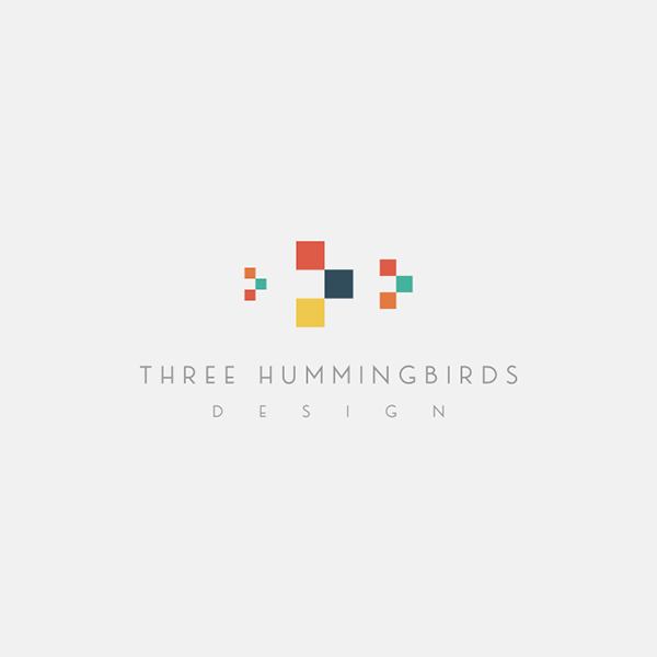
Three Hummingbirds by GLDesigns
Having a perfectly symmetric design isn’t the only way to go. Famous logos like Spotify and Google have long been asymmetric. But you can take it up a notch and use this design trick to create a dramatic logo.
Strike an asymmetric design with the use of placement, color, and even font size. There are a lot of elements that you can change to create an intriguing brand mark that will make you look distinct.
Nature
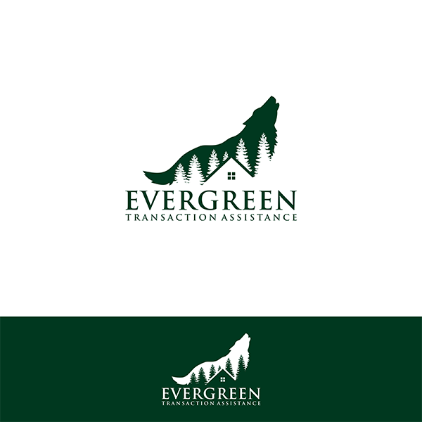
Evergreen Transaction Assistance by vanion282
2020 is the year of plant parenthood, all thanks to the quarantine. People have become more fond of designs inspired by nature, and we see this reflecting on logos.
For the year 2021, expect to see lively colors as well as illustrations of foliage. Leaf logos and other flora inspired art symbolizes growth and life. This trend is perfect for businesses in industries like gardening, landscaping, eco-friendly products, etc.
Conclusion
Trends aren’t forever. As sad as it is to hear, this means they come and go. There is no definite way for you to predict when a trend will logos its charm. This is why being overly trendy with how you present your business, or anything can leave you in an uncertain position.
You can prevent this by not diving headfirst into trends. Ideally, you can take one or two design trends you like and create a design based on them. Try to whip up a logo that possesses fresh creativity as well as timelessness.
Right now, there are a couple of ways for you to acquire a game-changing logo.
Expect quality designs from international designers on DesignCrowd. The crowdsourcing platform allows you to work with professionals through a logo contest to bring your concept to reality. You can receive up to 50 original design proposals for your brand today. Learn more about it here.
But if you’re more of a do-it-yourself whiz, you can use the BrandCrowd logo maker. Find a massive library of customizable designs that you can use for your brand. Tweak elements like colors, typography, and more to design a one-of-a-kind logo that will capture your brand’s identity exactly the way you want it.
You can also use it to create other brand assets like business cards and flyers. Try it right here.
