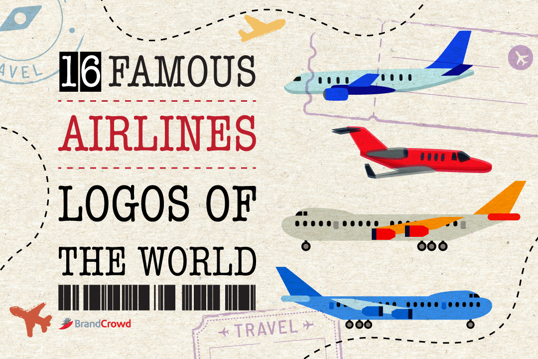
16 Famous Airline Logos of the World
Whenever you board a plane, do you check the logo on the tail and ask yourself: who designed it and what’s the story behind it?
You probably haven’t noticed this, but the logos of different airlines have a lot of similarities when it comes to design. Some often use colors from their country or incorporate their country’s symbol.
To give you a better idea of the best aircraft logo design, let’s look at the meaning of their logo designs and the tale behind them.
Famous Airline Logos of the World
Did you know that thousands of people use airlines to travel across the globe every day? Between the local and international airlines, thousands of airlines compete with each other to provide the best travel experience for customers like you!
Airlines don’t hesitate to pay massive amounts to get their airline logos designed to stand out from their competition. Have you ever browsed through an ad or passed by a billboard of a particular airline company?
If yes, logo designs are just one of the possible options they used to market their business and influence people’s views on their brand.
Now, my fellow design and history lovers, prepare for take-off and explore the logo history of 16 of the most famous airline logos in the world.
- Air Asia
- Air India
- American Airlines
- British Airways
- Delta Airlines
- Gulf Air
- Hawaiian Airlines
- Japan Airlines
- KLM Airlines
- Emirates Airlines
- Qantas Airlines
- Qatar Airways
- Sri Lankan Airlines
- Swiss Airline
- Thai Airways
- Turkish Airlines
Air Asia
The Air Asia logo is quite simple: the airline name on a red background. Some find this logo eye-catching because of its simple yet beautifully-crafted fonts. According to color psychology, red represents power, passion, energy, and courage.
Air Asia is also affiliated with the Virgin Group, which explains why the logo closely resembles the logo of Virgin Airways. However, when Virgin Airways airline faced some controversy of a runway accident.
After the accident, the runway operators tried to cover the airline logo so that it wasn’t associated with Air Asia. Well, it didn’t work out well.
Air India
Have you seen the wheel of Konark Sun Temple, a UNESCO heritage site located in India? If not, then let me tell you something about it. The lAir India logo represents a red flying swan consisting of the Wheel of Konark Sun Temple in orange color on the swan’s wings.
Designed by DMA branding in 2007, we can’t deny that the logo is stunning.
American Airlines
If you are a fan of negative space logos, the American Airlines logo might be your favorite on this list. Designed by FutureBrand in 2013, this minimalistic design has been the logo of this airline since the very beginning.
Don’t be fooled by its simplicity; the logo is packed with various symbolism. When looking at the design, you might first notice the eagle’s head that cuts into the background, creating a negative space.
The eagle logo design represents the national symbol of the United States. Aside from the eagle’s head, the line could also symbolize the tail fin of an airplane or a runway, or the contrail made by the aircraft before flying.
British Airways
The British Airways Logo is the most famous in the world, and it was designed by Newell & Sorrel in 1997! There’s an interesting background behind it, though – the logo was inspired by the old “speed bird” symbol, which the British Air Force used during World War II.
Delta Airlines
The current logo of Delta Airlines was designed in 2007, but did you know that the company went through several redesigns of the logotype during the years? The triangular shape symbolizes the fourth letter in the Greek alphabet – delta.
Looking at the colors, the blue color of the word represents the sky, while the red symbol is linked to the aircraft engines’ flame.
Emirates Airlines
When talking about luxury, Emirates Airlines comes to mind. With their hotel-like facilities, nothing feels better than flying for hours with extreme comfort.
The logo of this airline was created by Negus & Negus Associated in 1985. Despite its simple red and white, it actually has a lot of positive aura. The word “Emirates” is written in English along with intricate Arabic lettering at the top.
The color red symbolizes leadership, self-confidence, passion, and prosperity. Meanwhile, the color white symbolizes purity, elegance, and nobility—a fitting color palette for a luxurious brand.
Gulf Air
This airline first put the falcon as its logo in 1993 and has continued to use it up until now. Now, what comes to mind when you see a falcon? It shows a sense of mightiness, right? Falcon also symbolizes courage, freedom, and perseverance.
Combine all of them, and you’ll get the values of Gulf Air airlines. The designer Martin Rijven put the bird’s shape in three-dimensional space and enhanced it by putting thin lines on the bird’s feather, which softened its appearance.
Hawaiian Airlines
If you put together all the logos in this list, the Hawaiian Airlines logo might catch your attention. This is because instead of putting up an object, animal, or bird, the logo consists of a person’s head.
Sounds interesting, but what’s the story behind it?
The Hawaiian Airlines logo was designed by Lindon Leader in 2001, and if you’re wondering who that girl is, it’s Pualani. She is an island girl known to be the Flower of the sky.
Japan Airlines
Konnichiwa.
Now let’s take a peek at another popular airline: Japan Airlines. Designed in 1958 by Jerry Huff, the logo contains a Japanese Crane with extended wings called “tsurumaru,” or a crane circle.
Aside from the color red, which symbolizes happiness, the logo of this airline is delightful for the eyes! The crane logo design symbolizes long life, prosperity, and good health in Japan. – and that’s the main inspiration for the logo.
Just a little fun fact for all the history lovers out there, did you know that in 2002, Japan Airlines revealed a new logo? But their customers weren’t accepting of it; so, they decided to return to the former logo design.
KLM Airlines
Have you ever landed at any European airport? If so, you have probably seen one of KLM airline’s logos. It might not be the most aesthetically appealing logo compared to others on the list.
Still, if you put together the different symbols from this industry, this will stand out. The four-circled crown represents the plane windows or engine, while the horizontal line portrays the runway or contrail.
The logo’s typography screams power and trust, that similar feeling you get when the plane takes off. You might also want to check out the five types of fonts and their meaning.
Thai Airways
Interbrand designed the Thai Airways logo in April 2005. The logo features the word “Thai” and a symbol on the lift side of it outlined in colors yellow, pink and blue.
The logo features a colorful ornament in which the pink object represents a magnolia blossom, a popular flower in Thailand.
Sri Lankan Airlines
Srilankan Airlines logo has an attractive flying peacock logo design with an elegant typeface. The airline’s customers immediately accepted the emblem during the major rebranding project of the company in 1999.
According to Sri Lankan legend, a flying machine similar to the peacock once existed and was called the Dandu Monara Yantra. As one of the native species of Sri Lanka and its wonderful country, there’s no doubt why the airline incorporated a peacock on its logo.
Qantas Airlines
When you first look at the logo of Qantas Airline Logo, you’ll first notice the image of a flying silver kangaroo. The logo has evolved from a lighter red and white shade to a more streamlined look which symbolizes the next era that the airline is entering.
The bold uppercase lettering of the airline name is set in a smooth and sleek italicized sans-serif typeface, giving the logo that professional and energetic look.
Qatar Airways
Whether new to traveling, you probably have encountered this airline multiple times. Qatar Airways is a popular pick amongst airlines worldwide because of its excellent services.
The logo of this airline has something to do with their country. The stamp color matches the Qatar flag’s color, and the Oryx is the country’s national animal, which is why it’s also in the logo.
Yes, we know what you’re thinking: Qatar Airways can be a nominee for the most patriotic airline, right?
Sri Lankan Airlines
Srilankan Airlines logo has an attractive flying peacock logo design with an elegant typeface. The airline’s customers immediately accepted the emblem during the major rebranding project of the company in 1999.
According to Sri Lankan legend, a flying machine similar to the peacock once existed and was called the Dandu Monara Yantra. As one of the native species of Sri Lanka and its wonderful country, there’s no doubt why the airline incorporated a peacock on its logo.
Swiss Airlines
Swiss Airlines logo is definitely part of the list that focuses on flag logo designs. Designed in 2011, the SWISS logo contained a plus symbol in white color and in the shape of an airplane tail with a red background – which is inspired by the Switzerland national flag.
Turkish Airlines
The Turkish Airlines logo features a white wild goose on a red background. White on a red background seems familiar, right? Well, that’s because it’s the color of the Turkish flag!
Have you ever wondered why the airlines picked the goose among all the other animals? The wild goose is the world’s highest-flying bird that can go as high as 29 thousand feet! You might also want to check out the easiest ways to create a name logo.
Create Your Airline Logo Today
Each airline logo has designs that uniquely represent them. Some airline logos are simple, while others are more complex. But no matter which one you fly with, there’s a unique story behind each airline.
We hope you got inspired by the logo above. If you’re interested in making one, check out our logo maker and turn your creative ideas into reality!
Let us help you! By filling out your business name in our logo maker, you can start browsing through our logo templates, business card templates, Instagram post templates, and more.