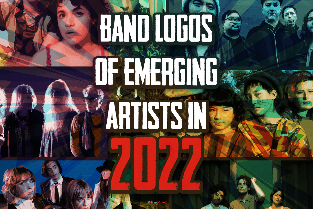
36 Band Logos of Emerging Artists in 2022
(Updated October 10, 2022) A new set of emerging bands make waves in the industry yearly. We have an endless stream of fresh inspiration for music and branding.
Being a musician in this competitive environment means you must shape your brand to become a cut above your competitors. Although artists’ careers rely primarily on their music, they also have to develop their brand through another means—the band logo.
It is one of the crucial steps for artists to start their band or company. This fact is significant for aspiring musicians that plan on creating projects. Can you imagine if The Rolling Stones or Metallica didn’t have a symbol?
We rounded up new bands gaining more attention and popularity in 2022. Get inspired by their artistry, lyricism, and visual identity.
This article will tackle the logos these bands have set for themselves. You will acquire new ideas and motivation to give your music group an effective brand mark.
Expect to see new names and styles from this solid lineup of newcomers.
Famous New Band Logos
Brands do not reach their full potential due to many pitfalls. One of which is the lack of proper marketing and branding. Strategizing your branding promotion approach can land young bands gigs, tours, radio appearances, and more.
Setting up a distinct visual identity changes the path of any artist and collective. You can draw in new listeners and connect with fans through meaningful design.
Take a peek at these 35 up-and-coming bands that captivate audiences with their music and design elements, like a distinct color palette, space, and font style, to build a unique identity.
- Audiophile
- Blacktop Mojo
- Crown Lands
- Craig’s Brother
- Deep Sea Diver
- Empty Atlas
- Fantasy League
- Frayle
- Gametime
- Ghost Hounds
- Hello Kelly
- Homeplate
- Inhaler
- Light The Way
- Low Coast
- Måneskin
- Moodring
- Moon Kissed
- Names Without Numbers
- Nation of Language
- Protect Your Heart
- RXPTRS
- Soul Glo
- Spiritbox
- Stairwell
- The Damn Truth
- The Fold
- The Immediate Family
- The Interrupters
- The Linda Lindas
- The Lost Causes
- The Satire / The Blamed
- Thundermother
- Watashi Wa
- Words
- XREDLINEX
Audiophile
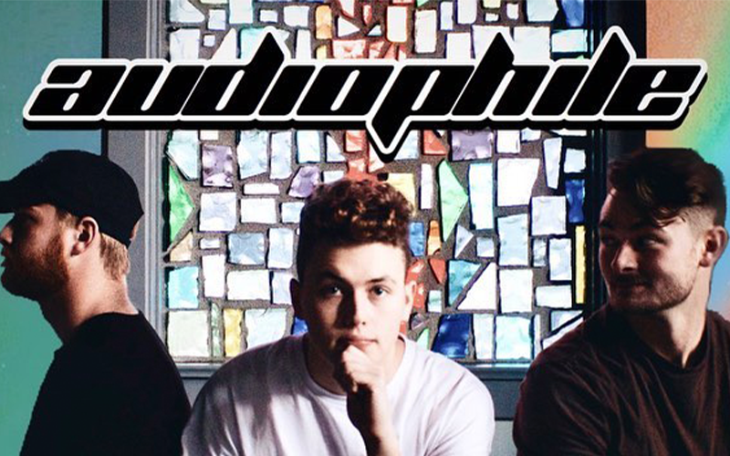
If you’re thinking of starting or managing a band, a mix of genres is a great start. Take, for example, Audiophile. Their music is a mashup of pop-rock and pop-punk.
Now add their unique music genre to their design. Audiophile’s new album Years Beyond My Wisdom is the band in suits giving off this retro feel.
But their logo itself is a black logo that’s sans serif that exudes power through their music.
Blacktop Mojo
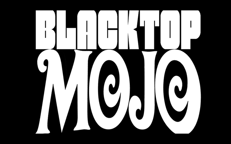
If you like listening to country-rock music, Blacktop Mojo is your band. Established in 2012, this band has its origins in Palestine, Texas.
And if you look at their logo, it exudes what you expect a fusion of rock and country to look like: a combination of a serif font and sanserif.
Crown Lands
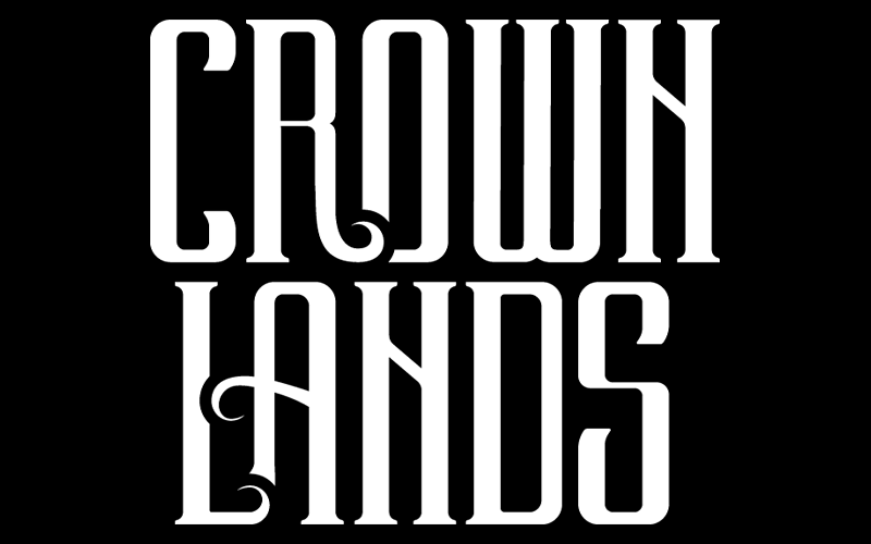
Another rock band on the list is Crown Lands. They won the Juno Award for Breakthrough Group of the Year in 2021’s Juno Awards. Juno Awards is an event to recognize notable Canadian music artists.
The duo also placed number 19 on the New Rock Bands of 2022 by Ranker. As for their logo, it’s a serif of their name that gives off a royal yet nostalgic feel.
The wordmark logo design reflects what their name means. Their name is the desire to reclaim the Canadian crown land concept.
Craig’s Brother
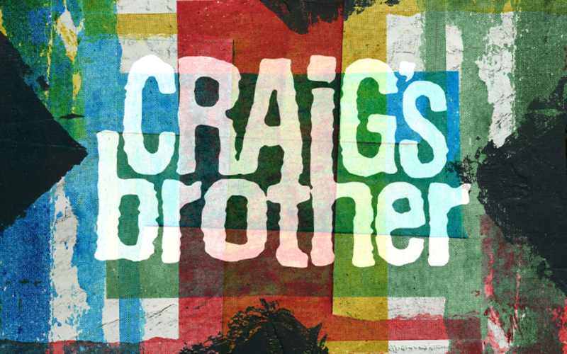
Despite being an older band than the rest, they’re on this list because they’re making a comeback this year with their album, Easily Won.
This band’s logo is exciting and has a fun serif font style. Craig’s is on top of Brother for their logo. The A and I in Craig connect to the T and H of Brother—in a way, their logo shows the fun, punk side of their music, which we could say is a success.
Deep Sea Diver
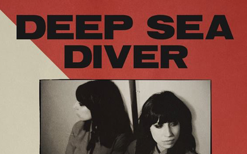
Another band with pop-rock tunes is Deep Sea Diver. If you like listening to a mix of pop, rock, and chill tunes, there’s one for you.
Their logo is a thick, bold serif font. It exudes power and simplicity, which their songs offer: strong vocals from their lead, Jessica Dobson.
Empty Atlas
Another oldie making the scene in 2022 is Empty Atlas. They were established in 2014, releasing their first double EP, Anniversary.
Their design is a minimalist logo with the band’s name inside two separate white rectangles. Empty Atlas uses a negative space design.
This style gives its logo a refreshing yet intriguing look.
Fantasy League
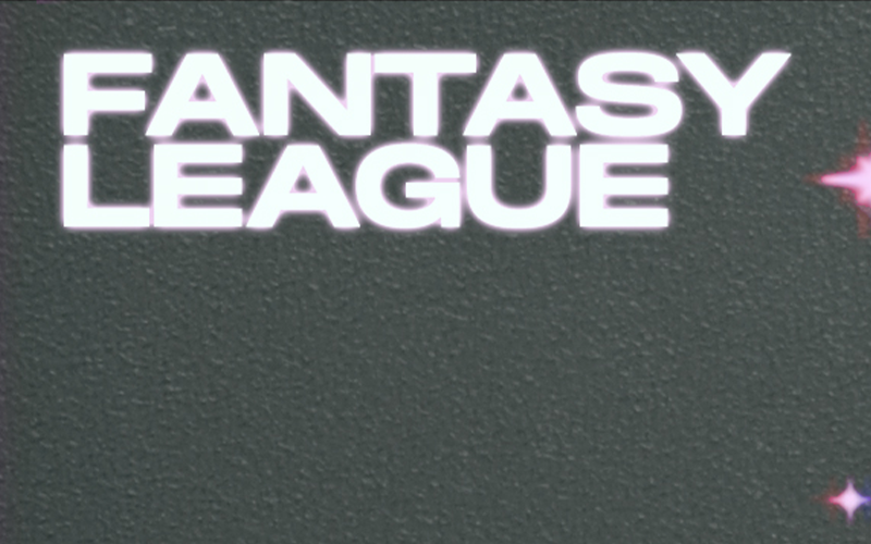
Another duo on the list is Fantasy League. Their genre of music is indie pop with a hint of electro.
Their logo reflects their electro-pop vibe through a simple sans-serif style. It changes in color and effects depending on the song’s theme.
Frayle
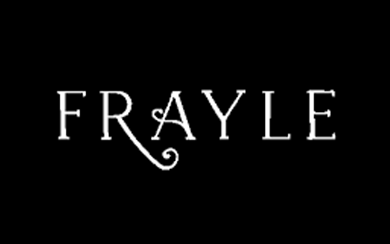
If you want to listen to ethereal tunes that sound haunting as well, Frayle is for you. They released their latest album, Skin & Sorrow, which has tunes that make you sway with the tune and feel the despair.
Their logo is a serif that looks magical and straight out of a fantasy movie which is how their music sounds.
Gametime
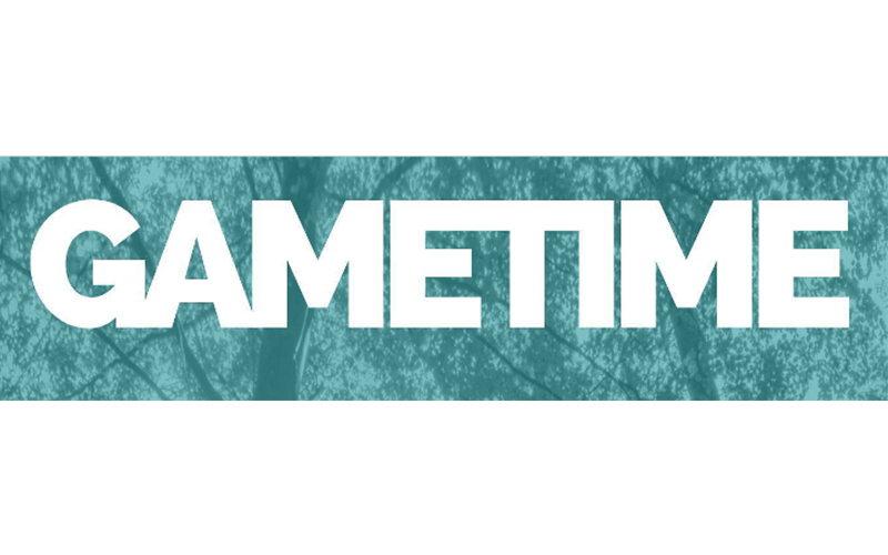
If you like tunes with melodic punk, Gametime is the band for you. You may have heard of them during the early 2000s, but they disappeared and are making their reappearance this year.
Their logo is also a simple sans serif paired with quirky doodle designs that make their album covers genuinely pop. The design also gives off an air of nostalgia which is a grand marketing scheme if you ask us.
Ghost Hounds
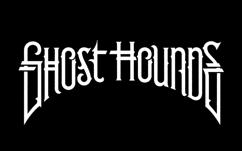
If you like the sound of rock and blues, Ghosthounds is the band for you. They hail from Pittsburgh, PA, and are composed of six members that create their unique sound.
Ghost Hound’s logo is a serif that looks curving inward. If you notice the crevice between S and T in Ghost, it seems like the nose and lips of a person or a dog which is what the group’s name means.
Hello Kelly
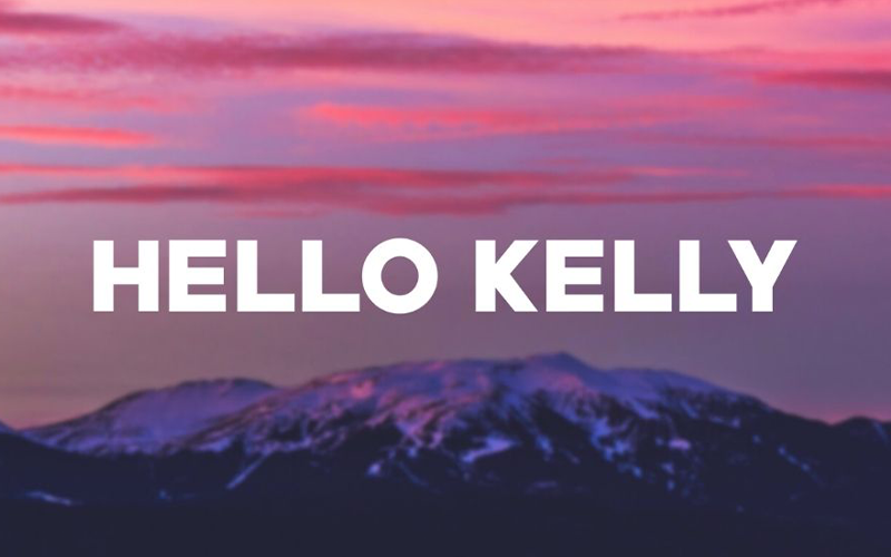
If you like the tunes of yesteryear when it comes to pop-rock, this Hello Kelly is the band for you. They recently released their album, Sweet Nostalgia, the epitome of the tunes they offer to today’s generation.
Their band’s logo is another sans serif but with rounded edges, giving off a friendly and young vibe—another reflection of their sweet and fun vibe for music.
Homeplate
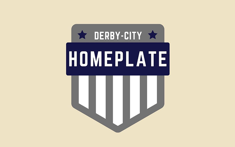
Homeplate is making a comeback as well. We see this pop-punk and easycore band creating music in 2022. Their latest album, Welcome to Breitenstein, features their iconic mix of genres.
Their logo is one of a kind with an emblem logo design. It’s an actual home plate with remnants of the US flag through the stripes and two stars that could represent the duo.
On top of the home, plate is their name in sans serif font inside a blue rectangle. And the title of a single on the space between the blue stars. The logo pays homage to their origins.
Inhaler
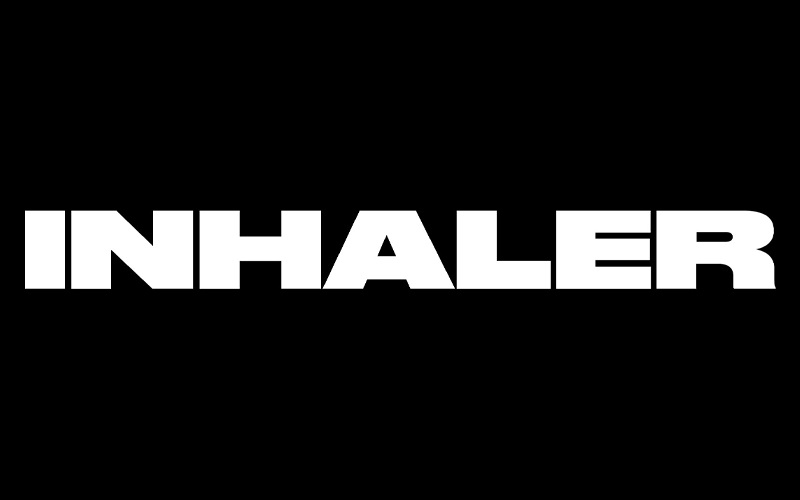
This Irish rock band debuted in 2020 with their song Falling In. And this year, their latest single, These Are The Days that has an energetic and nostalgic tune.
Their logo is also another thing sans serif style that’s reminiscent of early 2000 bands like Red Hot Chilli Pepper and more.
Light The Way
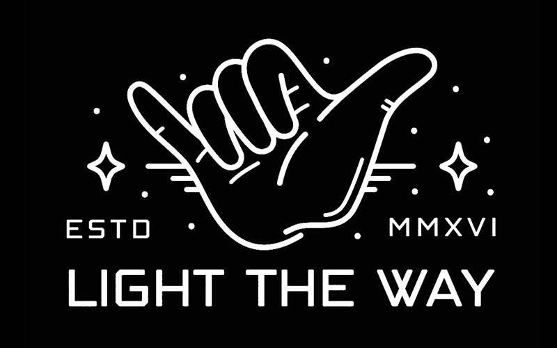
This up-and-coming indie band made its debut in 2016 and released its EP, Dude, Lame, in 2017. And this year, they released their album Long Story Short.
Their logo is one of the unique ones on the list that’s a mixture of wordmark and pictorial logo design. A YOLO hand is in the middle of EST. and the year 2016 in roman numerals.
Under that image is their band’s name in a futuristic font, which expresses what their band’s music is: fun and lively. Lastly, the stars, dots, and lines around the YOLO hand gestures make it seem like it’s moving and gives off a retro feel.
Low Coast
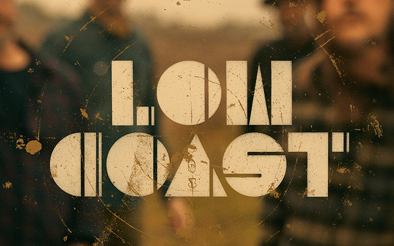
Low Coast is one of the bands that haven’t officially released their music yet but have been going on shows for a while now. Watch out for their first release soon.
But for now, let’s take a look at their logo. From the feel of their sans serif wordmark, it seems that their music could be a mix of indie rock tunes. The shape of the letters is circular as well, which could mean that their vibe is like Hollow Coves.
Though this is just a logo dissection, so just wait for their first release to determine their type of music.
Måneskin
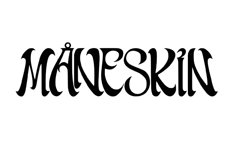
This Italian glam pop rock band gained popularity in their performance in X Factor Italy in 2017. They also won the Eurovision Song Contest last year with their song, Zitti e buoni.
Recently, they also have a piece in the Elvis film, If I Can Dream. Now, for their logo, it’s a serif font akin to the early 90s and 2000s that has an evocative feel to them.
Moodring
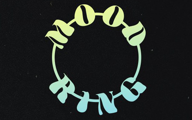
This rock band pays homage to bands like Bring Me Horizon, Nine Inch Nails, Deftones, and more. Their music is nu metal with a touch of 90s grunge metal.
Their logo is a serif font that’s their name around a ring which is a lateral representation of their band’s name. Also, the font is something you’d see in the 80s or 90s retro vibe, which is what their music’s inspiration for sound.
Moon Kissed
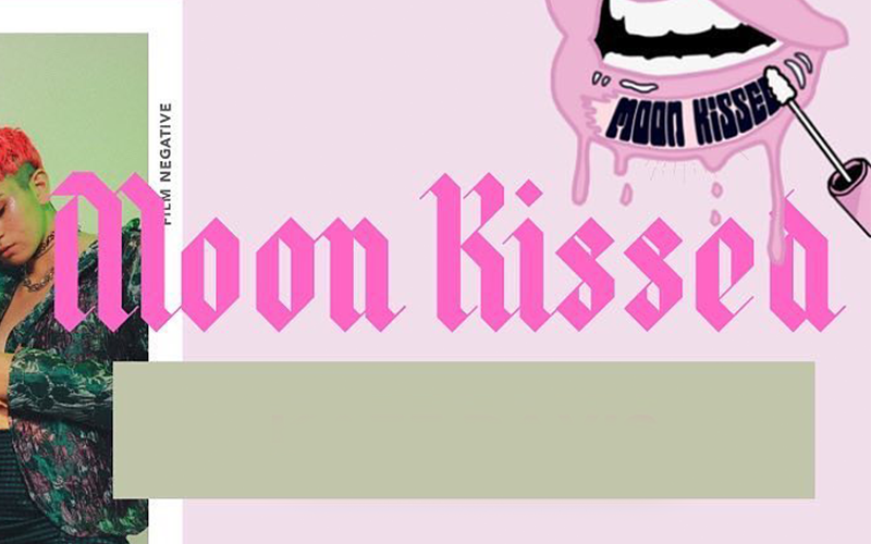
If you want to listen to songs about topics like consent, existential anxiety, and gender identity, Moon Kissed is the trio for you. Their music is synthesized pop that’s akin to early 2000s pop music.
Their logo looks like an old script that grabs attention and is in pink. According to color psychology, pink means femininity and innocence, which the band’s songs express.
Names Without Numbers
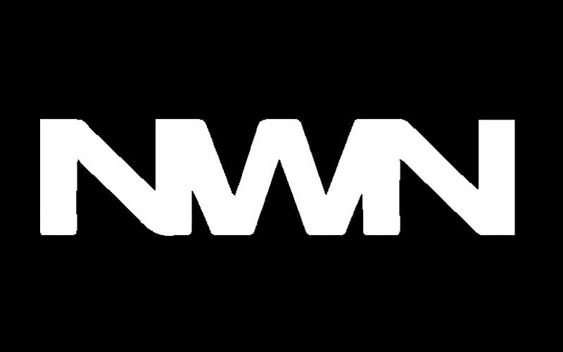
If you like melodic rock with substance, Names Without Numbers (NWN) is the band for you. Their tunes have diversity since it’s also a mix of indie power pop and strong guitar that make their sound unique from the rest of the bands here.
Their logo is a lettermark logo design with both Ns merging into W’s tips to create their unique sans-serif design in white.
Nation of Language
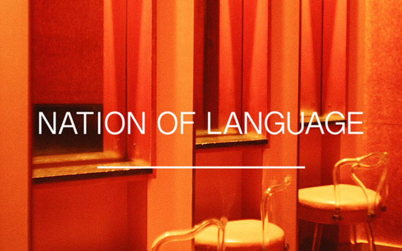
If you like indie pop, Nation of Language’s tunes is for you. They combine mellow vocals with electronic pop beats that make their songs catchy and great to listen to for a good vibe.
The band’s logo is their band name in thin sans serif font and sometimes combined with overlapping circles. Those circles sometimes have no fill, which makes them look like bubbles, but most times, they have red, blue, yellow, or white fills, which make them look like dance floor lights.
Protect Your Heart
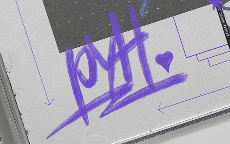
For your punk pop tunes, check out Protect Your Heart (PYH). They debuted this year with multiple songs in writing.
Their strong vocals, excellent guitars, and drums give them a unique tune amidst the various up-and-coming bands this 2022. PYH also has a distinctive logo with its initials in purple. It has a sans serif font that looks like a marker that wrote their band name with a heart beside it.
RXPTRS
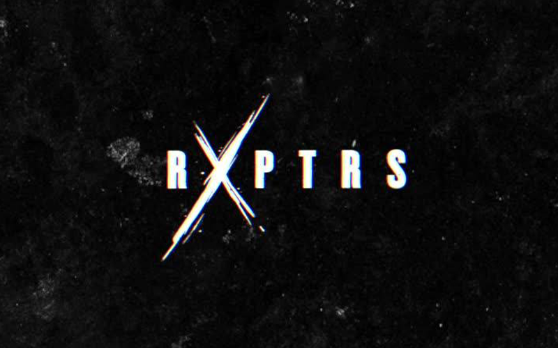
If you like guitar solos, metal riffs, and snarling punk vocals, RXPTRS is the band to choose. Their latest album, Living Without Death’s Permission, is a mix of all types of their music that’ll tingle your ears.
The band’s logo is another sans-serif wordmark with an exaggerated X that looks like it’s been carved into the background.
Soul Glo
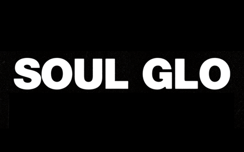
Looking for an outlet for your anger? Soul Glo may have the tunes for you. They’re a heavy rock experimental band that expresses frustration and love, and sadness in their songs.
As the vocalists of the group said, “When you’re black, and you’re American, you don’t really feel American, you just feel Black,” so their tunes bring out the feelings and emotions from that experience itself and their latest album release, Diaspora Problems expresses that.
Their logo is another sans serif font that’s oddly simple for a heavy rock band.
Spiritbox
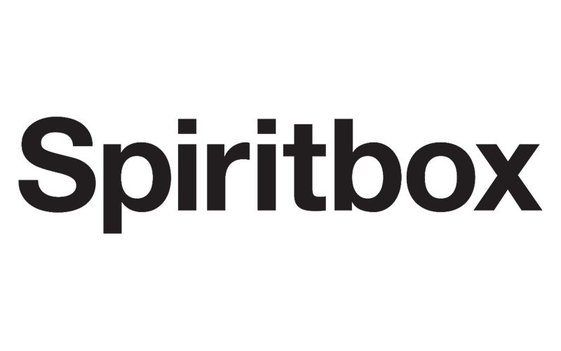
If you want to listen to different types of rock from one band, Spiritbox is your go-to band. They released their latest singles in Rotoscope, showing their range for metal rock tunes.
Their logo is also a simple sans serif font for a heavy rock band, but their merchandise design offers various types of their band’s name in a more heavy metal-worthy design akin to Bella Poarch’s logo.
Stairwell
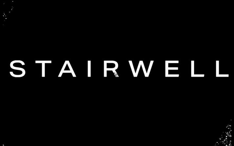
Another oldie but goodies band makes a comeback with Stairwell. Their tunes give off a sense of nostalgia and a carefree vibe to them.
Their band logo is also a thin sans serif font that makes them look professional and works well with any medium you put it on—it’s straightforward.
The Damn Truth
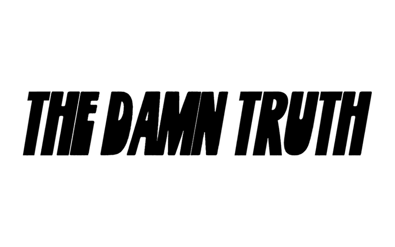
Despite not having songs released for this year yet, The Damn Truth is on tour this coming October. They’re another Canadian rock band on the list that mixes solid female vocals with drums and guitar solos.
Their logo is a wordmark tilting to the right in sans serif font that looks quite nostalgic, which is how their tunes sound as well.
The Fold
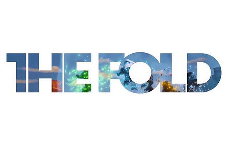
Ever heard of the Lego Ninjago songs? Yep, The Fold wrote them. But aside from that, they just released their latest album, Stereo Fire.
They’re on the older bands that are on this list as well. Their logo is a sans serif font style that has F and O melding together, giving that unique look for the rock band.
The Immediate Family
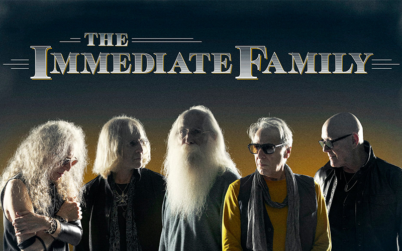
An amalgamation of rock industry veterans, The Immediate Family, provides their listeners with songs that sound nostalgic yet with a modern twist for the new generation.
They recently released an EP of songs Live from Telefunken Soundstage. As for their logo design, it’s a serif font that looks country, but powerful, which is what they are as a band, an amalgamation of industry veterans.
The Interrupters
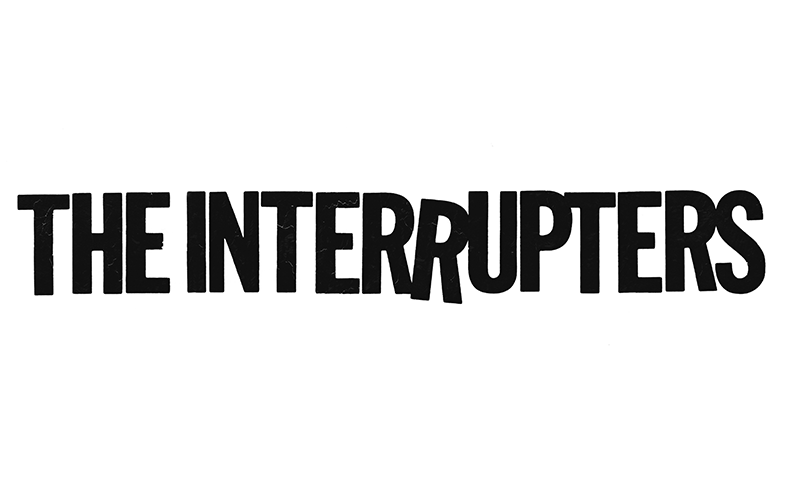
Listen to The Interrupters and experience a mix of genres and beautiful, fiery vocals from their lead female, Aimee. They recently released their album In the Wild, which gives off some reggae and punk rock vibes.
The Interrupter’s logo is a friendly sans serif wordmark with one o the Rs almost falling. And some of the letters look cracked, which gives it that dried-paint look.
It is a great band logo design since their tunes have a carefree and nostalgic vibe to them as well.
The Linda Lindas
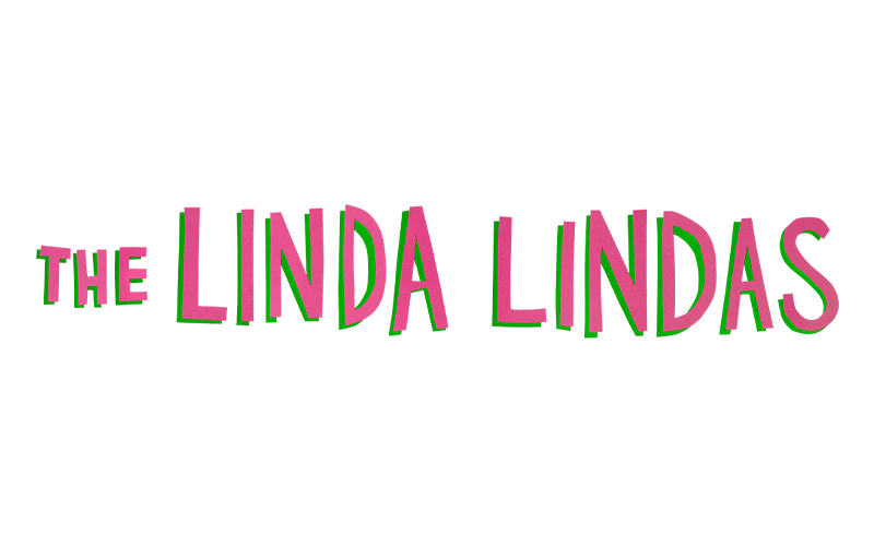
Ever watched Moxie? They’re the band that provided the music for the movie. But aside from that, they are an all-girl group of half-Asian and Latinos that channel the vibes of punk, power pop, and new wave into their songs.
Their logo as a band exudes that vibe as well with their fun wordmark logo in alternate sizes and in pink.
The Lost Causes
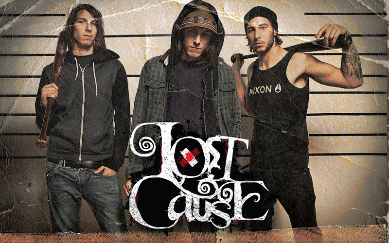
A new band emerges with The Lost Causes. They mix electro beats with a punk-pop feel and lyrics that are reminiscent of teenage angst.
Now add that to their logo, that’s a simple Times New Roman font with the O being a /, which gives them a unique look that baffles the audience.
The Satire
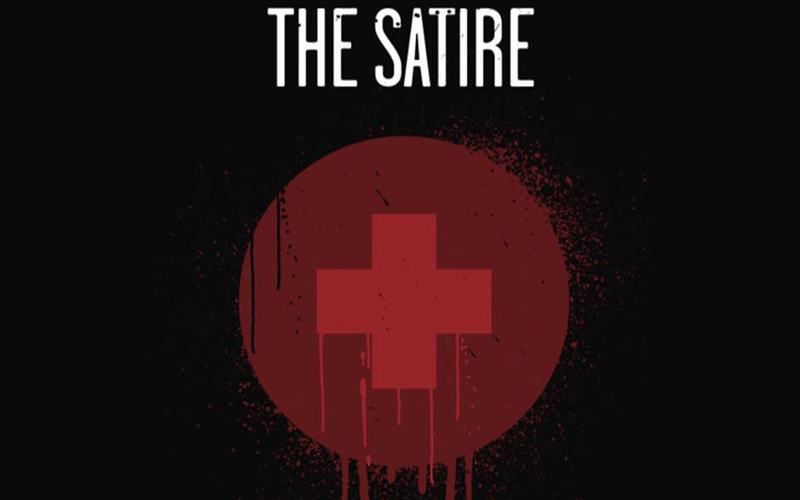
The founder of The Blamed, Bryan Gray, also founded this new band. This rock band released its first EP this year, Dialogue.
They have similar tunes to The Blamed, with more screamo vocals and louder drum beats. As for their logo, it’s a sans serif of their name with a bloody cross under it.
It kinda looks like a health pack from games or the red cross logo that’s been bloodied, but it gives off the feel of downplayed rock music which is opposite to the song’s sound.
Thundermother
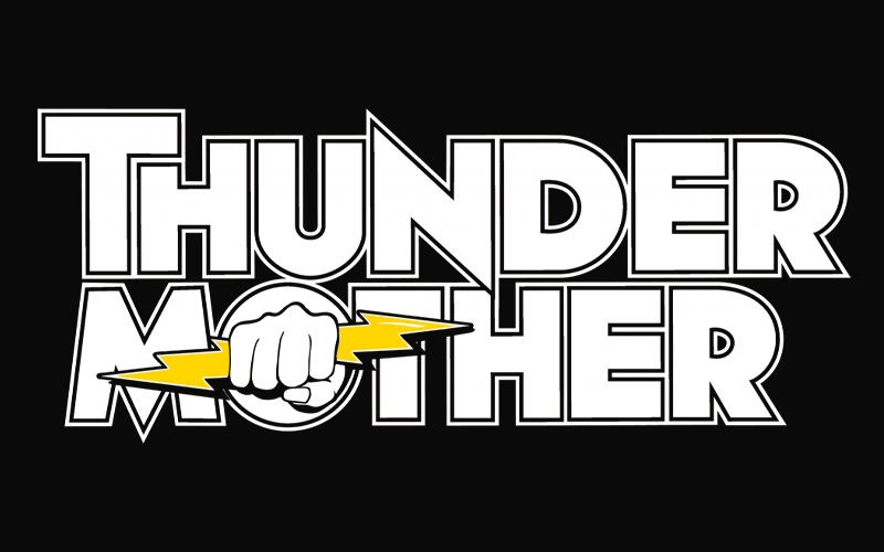
Another all-female group, Thunder Mother, gives listener’s a treat with an AC/DC vibe but with female fiery vocals. They recently released their album, Black and Gold, which touches on some familiar themes every one of us has experienced at some point.
Their logo really has a similar vibe to AC/DC with that thunder and lighting design. The N in thunder is a tip of lightning at the top, while M has a sharp bottom.
The last most iconic symbol of the group is the O having a hand popping out and holding a lightning bolt.
Watashi Wa
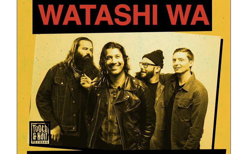
Watashi Wa is a pop band that mixes alternative rock and pop tunes to create their distinct sound. Their latest release is their album, People Like People.
And their band logo is another sans serif font-styled logo that’s in red which shows their passion for their music.
Words
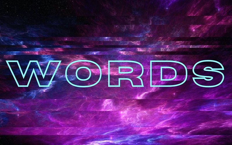
The only emo pop band on the list, Words, debuted in 2021 with their song Jumpsuit. Just this year, they released Hopscotch.
Their logo is a negative spaced wordmark of their band’s name in the hazy purple background, which exudes a mysterious vibe that their music offers.
XREDLINEX
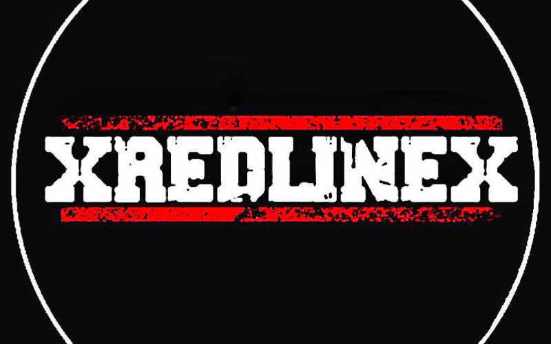
Lastly, we have the hardcore rock band XREDLINEX. They finally released their first song, 11th Hour, which mixes screamo, loud drums, and solo bass.
Finally, their logo is in white serif font inside two red lines. The overall design looks like dried paint that, gives it that grunge look that their music implies.
Create Your Band Logo Today
For new bands, it is essential to make an effort to craft professional and credible collateral. This includes your electronic press kits (EPK), merch, website, and album.
Doing this will improve and maintain consistency across different channels. The bands on this list are doing something right to support their rise to greater fame.
Some quick tips for creating your own music logo design:
- Pick the right typography.
- Add relevant icon elements.
- Choose an eye-catching color palette.
- Pay homage to your roots.
- Pick a logo that showcases your music.
Incorporating these tips into your design process helps audiences remember who you are as opposed to using just initials or illustrations alone.
If you need any more help with your design and want to learn to create your own, use BrandCrowd’s logo maker. It has professional designs that you can personalize using an easy-to-use editor.
That’s not all we have, though. We have templates for YouTube Banners, Instagram Posts, Poster design, and more! Just follow us to our website and find the perfect template for your band’s branding needs.