38 Orange Logos for King’s Day
King’s Day or Koningsdag is celebrated during the monarch’s birthday. The festivity encourages everyone to wear orange, which is the Dutch royal family’s color.
Make sure your brand dresses for the occasion with these orange logos.
This color is a combination of two primary colors, namely red and yellow. It symbolizes energy and creativity, making it a great color choice for brand identity design. Plus, the color is also versatile enough to use for different industries, whether it be business, food, or gaming.
We gathered orange logo inspiration for brands that are looking for a high-spirited brand identity. Take a look at the overview of designs in this article below.
Orange fruit logos
Apart from being used to name a color, the word orange also refers to citrus fruit. It represents prosperity and fertility in various cultures. This food is used in desserts and drinks as well.
Seeing illustrations of this on logo design for restaurant logo and bar logos is common. The fruit has an eye-catching quality and a meaning that different brands can use.
When selecting a drawing for a fruit logo, you can make it even more exciting by looking for illustrations that have unique art styles such as abstract, minimalist, or geometric to create your identity more unique.
Check out more inspiration below.
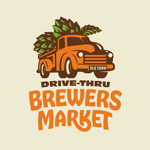
Brewers Market by Jordan Wilson

Food Health Knowledge by ESolz Technologies

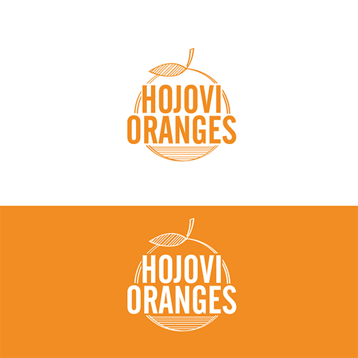
Hojovi Oranges by Sujit Banerjee

Orange Circular Logo by Opaq Media Design

Orange Logo Design by Jasmine.Designs
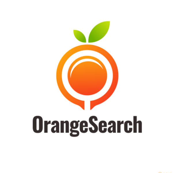
ORANGE SEARCH by Garagephic Studio
Royal Opal Logo Design by Patrick Geider


Zesty Minds by Shtef Sokolovich
Pro tip: Keep it simple
A simple logo is easy to understand and remember. It is best to create a straightforward design with minimal frills and fuss to ensure a high-impact logo. Adding unnecessary elements may stand as a visual distraction and make the design unappealing.
Orange circle logos
Circles are eye-catching shapes that help brands create a harmonious and feminine identity. The solid silhouette combined with the bright orange color makes signage inspired design that grabs the attention of any passerby. The oil company Gulf is an example of famous orange logos that take the shape of a circle.
Additionally, this figure can also be used as a frame to a logo and provide visual prominence.
You want to make sure that your logo pops because it will help you apply it to different collaterals like business cards with little worries of it being overshadowed in the design.
Orange circles are viable for brands that wish to make their brand name typography the main focal point of their design.
Take a look at more round logo ideas below.
Eagle by Yoga Perdana – Logo Designer


Labor Lab Logo by Sorin Belean
Letter G + play icon exploration by Hristijan
Modern, Simple Business Logo Design by abhishekid2

Orange Tree by Dimitrije Mikovic
Springs Pet Wash by Sujit Banerjee

Startup Launch Rocket Circle by sicasimada

United Financial by Jahid Hasan
Pro tip: Choose the right font
One way to make your logo stand out is by picking the right font that matches your brand personality. Serif or letters that have a tail detail on each stroke are best for traditional brands. While sans serif fonts or glyphs that don’t have a tail ornament look more modern, making it an excellent choice for laidback brands.
Knowing which one works best for your brand identity lets you create a design that truly represents your business.
Orange and blue logos
Designers use the color wheel to come up with strategic color combinations. Among those combinations are blue and orange. These two colors complement each other. This color duo provides an unmatched contrast.
Famous brands like Mozilla Firefox and Oklahoma City Thunder are two of the most famous examples of this logo design today.
The flexibility of these colors allows brands to incorporate a variety of designs. You can use it to bring life to your mascot logo, tech logo, and more.
Discover more design ideas here.

Business Logo Design by Joenet Jayawarna
Campsite campfire logo design by Abdullah Al Mamun

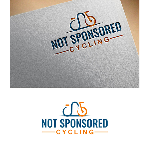
Not Sponsored Cycling by Aliqa Design
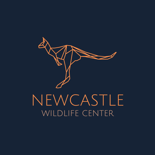
Orange Australian Kangaroo Monoline by JimjemR
Pro tip: Set a color limit
Professionals recommend using only two to three colors when designing a brand mark. This helps avoid oversaturation in the design and helps retain visual coherence. A logo with minimal color also makes it easy to use for different projects. If you wish to add more colors to your orange and blue design, make sure to do this sparingly.
Conclusion
Designing with color allows your brand to have a lively appearance. Orange is one of the most popular options today. It offers a ton of opportunities for brands to express themselves in a way that will be unforgettable to the audience.
Find the orange brand mark that will suit your brand’s needs by running a logo design contest on DesignCrowd. The crowdsourcing platform also enables users to work with a community of freelance graphic designers on different projects for business card design, flyer design, and other graphic design needs.
The BrandCrowd logo maker is a DIY solution for generating an orange logo in minutes. It has a library of designs ranging from color logos to fruit logos. The tool has everything you need to customize design elements such as font and color to make your design unique. Try it today.

