40 Recruitment Logos to Get in Your Team
Attracting top talent comes naturally to recruitment professionals. However, some may be challenged when it comes to designing the right business logo. But what do brand logos contribute anyway?
Logo design quite literally gives your branding a face that you will show onto the world. One of the great designers Paul Rand even said that design is your silent ambassador. That’s how crucial it is to your operations.
You can communicate and display your company’s greatest strengths with a single insignia. This can increase your chances of getting selected by your ideal job seeker. Overall, you can say that effective employer branding will do your recruitment company good.
Branding helps put you in an advantageous position as long as you know how to properly do it. As logo experts, we know how the best designs for business and consulting logos dabble in these themes:
First impressions are everything in the corporate world, especially if you are in the recruitment sector. Taking a good long look at your options lets you make better decisions, too. Let’s head right onto the logos.
Corporate
For years, businesses have put serious thought on their logo. They begin by considering different types of logos and competitors just to have their brand identity stand out strong.
Corporate logos may often contain typical symbols seen in the business landscape. This includes neckties and other items with professional connotations. This is a way to use universal cues to visually communicate what a company is offering.
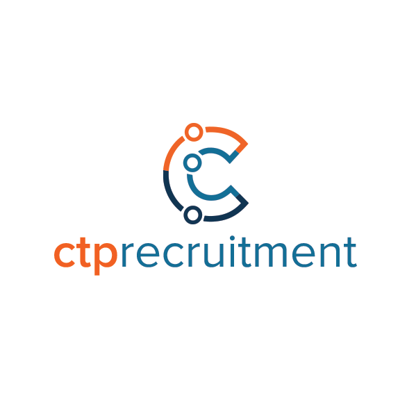
CTP Recruitment Logo by Tony Darce
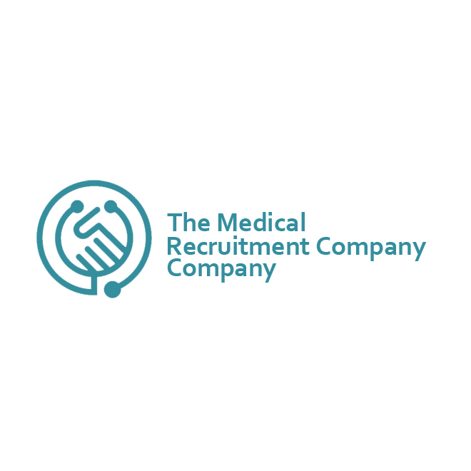
The Medical Recruitment Company Company by mera design crowd
Magnifying Glass by AlinDesign
Work Search Logo Template by Alex Broekhuizen
Elite Healthcare Recruitment by Taher Badshah
You can go for designs that are related to your niche such as this DevScout logo by Grafactory. People get an idea of what the brand offers just by staring at this strategic design.
By the looks of the programming language symbols in its logo, you can tell that it specializes in sourcing development teams. This logo was also designed with the colors commonly seen in tech, too.
Speaking of color, it is best to put a cap on your logo color limit. Designers tend to go for only two to three different colors in a single design concept to create a logo. This makes the symbol adaptive to a variety of applications making it look good and easier to use.
There’s value in looking up at established companies such as Apple, Google, and more as a source of inspiration. If you want to take a look at more logos from the most valuable brands click here.
Team
Organizational success is built up by a number of factors and one of them is the use of effective symbols. Creating an identity encourages your employees to become more engaged.
This fact is a good reason to depict teamwork in your concept. Incorporating team symbols into your logo may come in the form of patterns such as people huddling around each other and holding hands. It is also common to see round shapes as they signify unity and appear welcoming.
Colorful Reunion by LogoBrainstorm
Margot Recruitment Logo 02 by Shaun Jones
Key Property People by PAYUNG Media Creative
Counter Point Solutions by Oneb
Of course, there are other ways to instill your brand identity into the design. It can be as easy as changing the color scheme to better suit the company’s values.
People often talk about colors in the corporate setting when discussing what color you should wear during job interviews. But, it is just as important for the workplace and branding as well. Many companies take advantage of color psychology to visually communicate their core competencies.
Bold shades of colors like green, blue, and yellow are just some of the widely used colors in the business. Green is associated with productivity, while blue is with credibility, and the color yellow symbolizes positive team morale.
Unicruit Unify Corporations and Competence by wiluwoz
PGX Logo by Zlatko Najdenovski
Professional Upmarket Recruitment Logo by Mario
Pro tip: Teamwork really makes the dream work
Before you finally settle with logo design, make sure you ask your family, friends, or business partners what they think. This way you can get constructive feedback on your corporate symbol. Take note of their comments on your color scheme, composition, and font choice.
Abstract
When you think of abstract logos, you may immediately think of Nike’s swoosh. Abstract logos are often thought of as vague and emotional, causing other companies to veer away from them. Some brands look for something more straightforward that will help further their brand message. But this isn’t exactly right.
In terms of impression, abstract logos allow you to appeal to the feelings of your audience and even come off as intriguing. This is an artful and creative way for you to introduce your brand to the audience.

Hiring / Recruiting Logo by Adrian Brand. Logo Designer
HumanCapital – Logo Design Exploration by Eugene
Logo Design for MyNextHire.com by Blackslate Digital
Recruit Ai Logo by Stephen David Smith
Employ Me Logo For Recruitment Business by cityteam
logo for tech recruitment app by meddezeen
Reflect Recruitment by A_Desijn
Quru Projects Recruitment by design_ghost 2

Minimalist Human Cloverleaf by JimjemR
Hire Purpose Talent Solutions by A B I G A I L™
Logo Design for CHUZ by Collin
Abstract logos are designed with an interesting combination of shapes and colors. These elements can either make or break an abstract concept.
Plus, fonts are also valuable graphic elements that you can use to show off your brand identity. Playing around with characteristics of fonts such as corner rounding, italics, statics, and more helps you achieve the impression you are going after. Quirky brands may go for fonts that are asymmetrical and chaotic such as Lucy the Cat.
Applichat logo by Michael Barr
Graduate Leaders by mera design crowd
Professional companies gravitate towards fonts that are highly legible. For example, font types like Bodoni, Garamond, TT Commons, Brandon Grotesque, and Didot are popular choices. Human resource logos with these fonts appear clean and authoritative.
Moving the needle
Before you start hiring people, make sure that you make yourself marketable.
80% of HR leaders say that branding impacts a firm’s effectiveness. When done right, the perfect logo will set you up for long-term success. Shadowing this business best practice is a free lesson on effective business practices.
Presenting your company with a good strategy and graphic assets can drastically improve your operations and reputation. Suit up to be the best HR brand using even more of these recruitment logos.
Start exploring the path of improved designs by taking a peek at business & consulting logos that will help you make a mark in your industry.
