42 Retro Logos to Get Your Groove on
Not everyone is a fan of the ultra-sleek minimalism that modern design has to offer. The retro design gives any identity a unique and hipster feel. This style works well with brands dealing with coffee gaming, fashion, and novelty goods.
Sometimes it’s also great to return to the time of nostalgia-inducing aesthetics and exciting designs with these retro logos. Today, we rounded some of the most exciting vintage designs. Each one is something that you can use to make your brand distinct.
Check out the design overview here:
Let’s go back to the past with these charming vintage logos.
Font logos
Today, brands continue to make use of this style to appeal to audiences. Take, for example, Dollar Shave Club, which is a subscription-based company that provides consumers with shaving and grooming goods.
With font and wise use of space, you can achieve a vintage look that appeals to your target audience. Showboat, Rye, Thunderstorm, Streandstore, and Devonian, are just some of the most appropriate fonts that you can use to achieve that old-timey feel to any brand mark.
Often, vintage font logos are serif fonts or text with a tail detail found at each stroke. It makes the logo more comfortable to read on print, making it excellent when applied on invoices or catalogs.
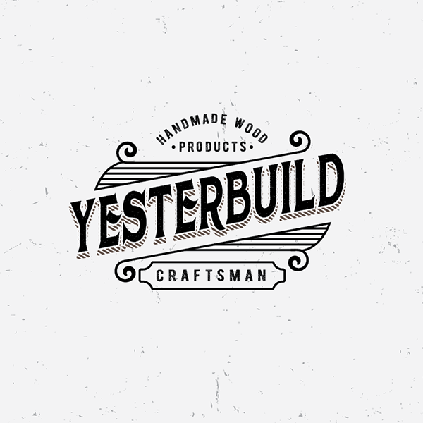
YesterBuild by Mandy Illustrator

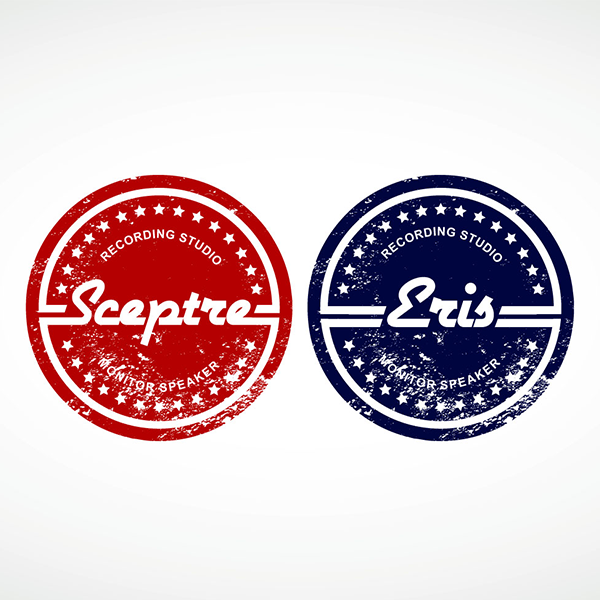
Eris (and) Sceptre, by Apolaki
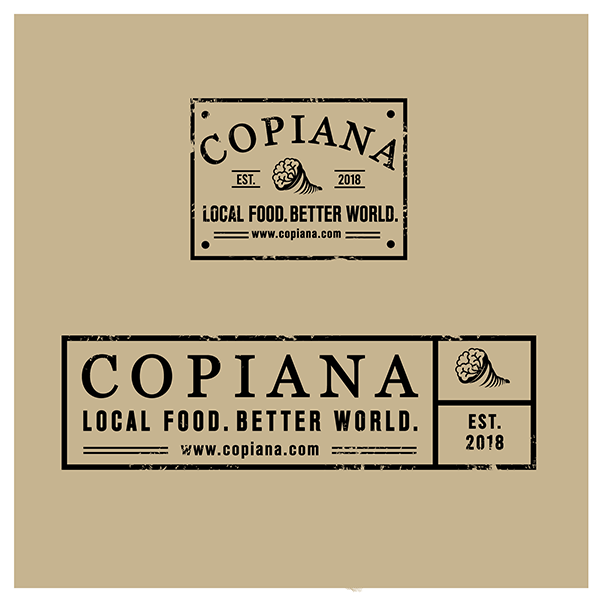
Food Graphic Design Logo Design by stevenphillips89
Intact Mechanical Services by Kreative Fingers
North Texas Vinyl by GLDesigns
Old Speed Coffee Co. by mildtravis
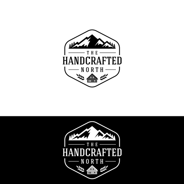
The Handcrafted North, LLC by artlancer
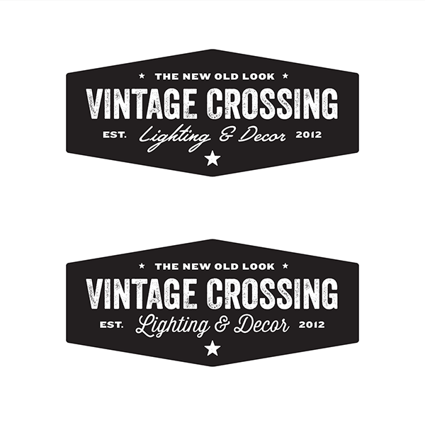
Vintage Crossing by Licorice Brand
Vintage Logo / Retro Badge by Design District
Little Tailor version 1 by Brian Males
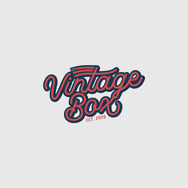
You can also expect to see script and calligraphy fonts. This is an excellent option for sophisticated brands dealing with fashion or food. Like this logo by designer Brian Males, the font looks perfectly old fashioned.
Pro tip: Study your competition
Knowing how your competition presents itself to the market prevents you from creating a design similar to them. For logo design, it is crucial to create a distinct image. You want to minimize all the possible roadblocks that may confuse your audience.
Additionally, this is also an excellent time for you to take your design up a notch and create something better than your competitors.
Illustration logos
Illustration logos are great for brands that want to send their audiences a direct message. Drawings are self-explanatory images that help achieve this. This graphic design element also helps add a decorative lament to your logo, making it more appealing and attention-grabbing,
You can use this to get creative with your design. Record players, gears, sceneries, among others, are just some of the drawings that you can seamlessly add to your design.
When adding these retro icons, you want to be wary of oversaturating it. Doing this may result in visual clutter and make your design lose its overall impact.
Agassiz Peak Performance by JoseDesign
Art Barbershop Logo by Creasystd
Berringer – A Vintage Sans Serif by Jeremy Vessey
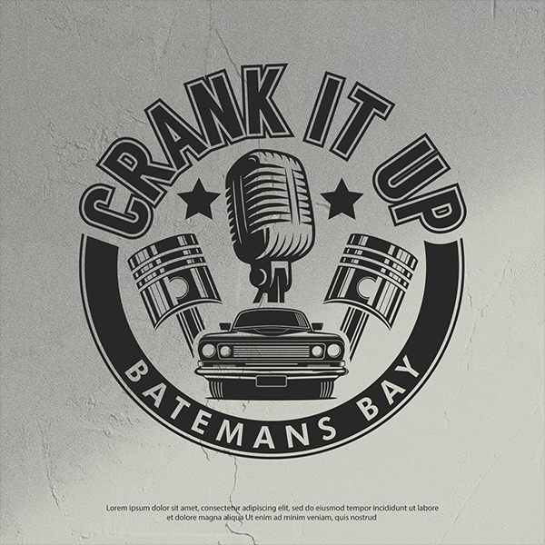
Crank It Up by Classgraphics11
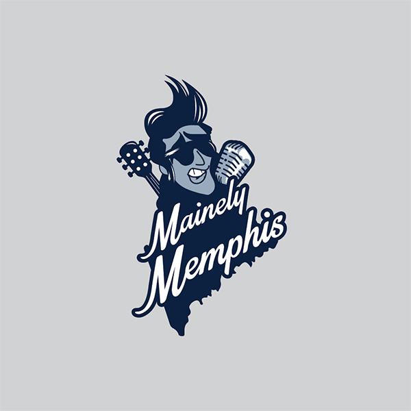
Mainely Memphis by Mandy Illustrator
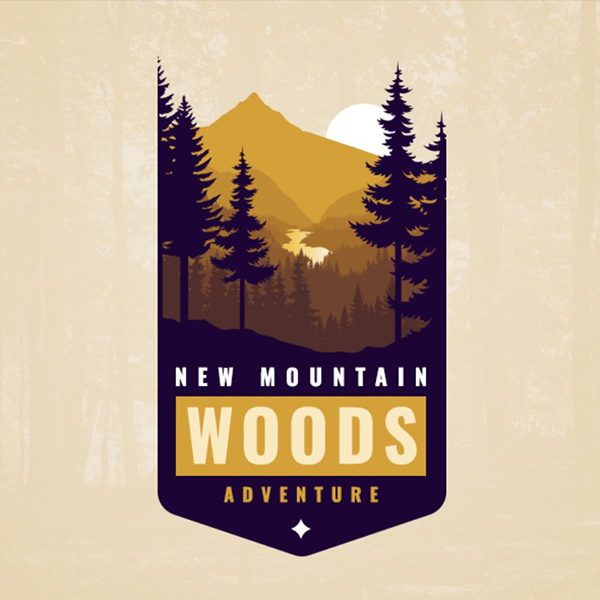
New Mountain Woods Adventure by Dimitar Dzhenkov
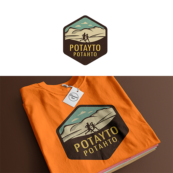
Potayto potahto by Design Sachith
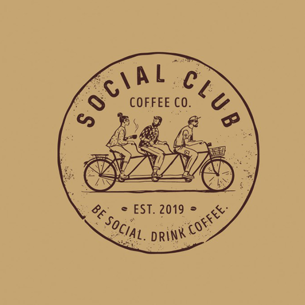
Social Club Coffee Co. by Dmitry Litvinenko

This Sunset Hats logo uses an abstract symbol. It successfully represented a setting sun and a silhouette of a person’s head. The designer also paired the icon with era-appropriate typography to tie the design together.
Pro tip: Try using handwritten fonts
To keep your design away from the commonplace, you can try using your handwriting for the typography. This gives it a more authentic look that is hard to replicate. You can check out tutorials for converting handwriting into fonts or source readymade ones.
Neon logos
In recent years, we’ve seen some incredibly impressive neon logos. One great example is Stranger Things. It uses the fluorescent style to make the overall design appear as if it is glowing. This type of style is excellent for brands planning to have shop signs.
Neon design is reminiscent of arcades and other establishments. This style will surely give your brand identity a nostalgic flair.
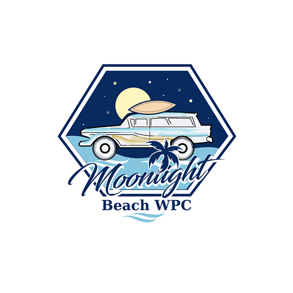
Moonlight Beach WPC by Jay Design
Word Mark Retro Logo by Nissan Banik
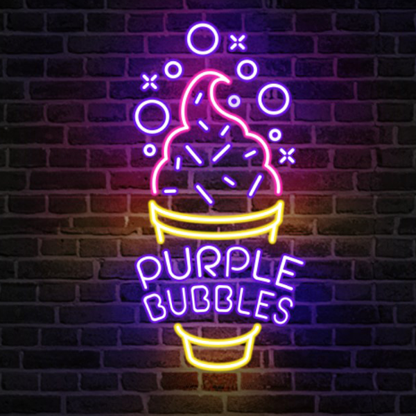
Red, blue, pink, and violet are colors commonly associated with this design. However, you can use other colors. You can even choose to apply color psychology to your brand mark and associate your brand with traits such as energy, royalty, and more.
Pro tip: Add space
One of the most important elements of logo design is space. Generally, negative space gives your design clarity and makes it easier to understand. Plus, space provides clarity and visual prominence which allows you to apply your brand mark on different materials like business cards and brochures.
Conclusion
The designs in this list demonstrate exactly why both old and younger generations have an affinity for the ’80’s style.
With the level of versatility that this style provides, brands can make use of the vintage style, whether it’s for an apparel logo or a personal logo.
Don’t miss out on getting the best retro-inspired branding. Source a cool design with the help of logo design contests. Crowdsourcing platforms like DesignCrowd allows you to connect with a community of international freelance graphic designers. Get over 50 submission bids to choose from today.
Or you can also generate a logo and add your spin to it. BrandCrowd’s retro logo maker gives you old logos, 80s logos, and 70s logos to choose from. Use the maker to tweak design elements such as color, typography, and more. Take full control of your brand identity right here.
