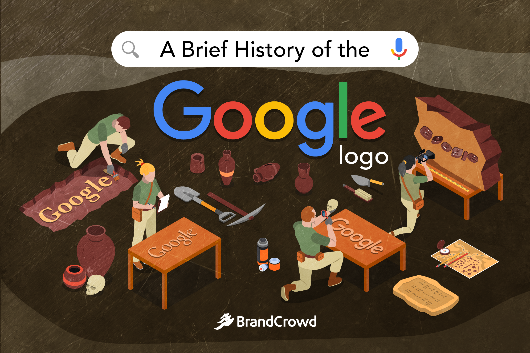
A Brief History of the Google Logo
You probably see this logo on a daily basis. The search engine has been a reliable source of information for many people around the world. People run to Google to ask questions about anything under the sun, making it an integral part of our daily life. In a study conducted by Cognified, about 70,000 queries are typed into the search bar in a single second.
But have you ever wondered how the Google logo came to be? Even as a passing thought as you look for pizza delivery hotlines on the search engine?
Today, we are going to talk about the history of the Google logo. We’re letting you in on the story behind classic and doodle versions of the search engine symbol.
Meet the Designers
We have a lot of creative minds to thank for the Google logo we see on our screens today. The first logo was created by co-founder Sergey Brin. Using a design software called GNU Image Manipulation Program (GIMP), Brin decided to take the design process towards the DIY route.
At that time, Brin was a graduate student taking up computer science at Stanford and by no means was he a professional graphic designer. He was not a pro, but he still managed to whip up a great symbol.
With the help of Ruth Kedar, an art professor at Stanford in 1999, the founders collaborated to take their logo further. They sent the professor an email and began their creative back and forth. Google kept the logo Kedar designed for 15 years. Eventually, the brand had to redesign its logo which earned Kedar the moniker FGLD or the former Google logo designer.
The recent contributors to the design include Google’s Creative Lab and Material Design team. You can definitely call this a group effort
Google Doodle
Chances are, you’ve probably opened Google in the past and found yourself floored by a doodled version of the logo.
The company has over 4,000 unique variations of its logo to commemorate different occasions. This tradition started in 1998. The brand added a stick figure to their logo to advise users that they were going to be out of the office to attend the annual Burning Man festival.

Google has a team of illustrators and engineers working to celebrate holidays, anniversaries, birthdays, and other events with a special design. The ideas come from Googlers and crowdsourced from google users.
Out of its doodle versions, some of the most popular Google Doodles include a PAC-MAN version. It was released on the arcade game’s 30th anniversary in 2010.

The Halloween 2016 version is also a fan favorite. It is another mini-game you can play as a spell-casting black cat named Momo. The goal of the game is to bring back a book stolen from the Magic Cat Academy.

The Timeline
Now that you’ve met the people behind the design and some of the well-known Google Doodles, let’s head right on to the timeline.
Get ready to be surprised by Google’s peculiar start.
1996

Google wasn’t always called Google.
Prior to Google, there was BackRub. The engine’s main purpose was to be used for backlinks and analyze the importance of a website. The logo was in a vivid shade of red and a sans serif font called Impact.
The wordmark was set with a black and white background photo of a back being rubbed. Talk about being on the nose, right? It could definitely use some improvements to create better contrast. However, this era was an important time for the creators, Larry Page and Sergey Brin, who humbly made necessary changes to bring their vision to life.
1998

The founders had improved upon their original project.
The two changed the brand name to a Latin-inspired play on words. The word “googol” refers to the number 1 tailed by 100 zeroes. However, this domain was already taken which pushed the team to brainstorm another name that isn’t far from googol.
You may also notice the exclamation mark at the end of the wordmark. This symbol is also found in the logo of Google’s competitor, Yahoo.
This was a DIY logo made by the co-founder himself. Brin used free design software to create this wordmark. He added shadows to create a 3D effect. The bright color scheme featuring 4 different colors looks so ‘90s.
Great things come to those who DIY
Designing your own company symbol is now easier with ready-made technology logos. BrandCrowd makes it easier for you to achieve your brand logo goals. Using an intuitive editing tool, you are equipped with everything you need to create a strong insignia.
1999

This is Google’s longest kept logo. A year after the conception of Google, the founders reached out to Ruth Kedar who made sure the company would land a design that is appropriate for the young company.
Kedar searched for fonts that look traditional and timeless which is everything that Catull represents. She found the font’s elegant and unique characteristics to be fitting. For the designer, the deep meaning of each element is important for typography logos.
As for the color, the designer decided to retain the fun colors of Google to make it look more approachable. The ‘90s was a door into greater digital innovation, but back then many students back then were still reliant on printed materials.
The playful look of primary colors balances this intimidation out. She added that the primary colors represent the quirky company culture and mathematics, the very thing that powers the algorithm.
2015

The company created a significant change in its brand identity. In an effort to make information more accessible, they decided to dress their logo up accordingly.
The wordmark is now in a flat design style and a sans serif font called Product Sans Font. Flat logos are known for being more legible and providing a defined visual hierarchy.
Google took on a more modern look that is very readable. This is due to the custom-made geometric font that they developed. Geometric fonts are inspired by the Bauhaus design movement. These modern-looking fonts are derived from basic shapes such as circles, triangles, and squares.
The design team of Google collaborated for a week-long process in New York to create the logo we see today. In this redesign, the designers aimed to ingrain the logo with the following:
- Scalability
- Responsiveness
- Systematic branding
- Reinforced “Googley” personality
Conclusion
It goes without saying that Google is a tech powerhouse, but the company is also a great inspiration for many designers. The company’s constant innovation in these aspects has been one of its keys to continuous growth.
Your company can find balanced and improved designs by checking out our logo library. We have a gallery of ready-made logos that you can personalize using our logo maker and create an iconic symbol for your company.
These designs are professionally designed and curated to shorten your logo search. Additionally, you can customize and personalize the design to perfect it according to your needs. Try it for free.
