BTS Logo History
BTS was one of the biggest boy bands since its debut in 2013. They recorded songs like Butter and Dynamite. A huge part of that is third branding and logo design. Join us as we take a look at their history and logo to better understand how they got their fame.
History Behind The Logo
First, before we dive into their abstract logo, let’s take a peek behind the curtain and get to know how the band started. The career path of becoming a Korean Pop sensation was created in the 1990s when Koren and American music started a fusion.
The love child of both music types was K-Pop, a mix of hip-hop, pop, and R&B. Now pair that with electric costumes and a well-choreographed music video, and you have the complete K-Pop experience.
With that in mind, our topic steers to the roots of a K-Pop star. How does one become like BTS or TWICE or EXO or Black Pink?
Recruitment of singers starts at a young age ranging from 11 to 18 years old and undergoes rigorous dancing, singing, acting, and general media classes. Then, after the completion of training, the agency will decide if you’re ready to make your debut as a star.
For BTS, the members (RM, Jin, Suga, J-Hope, Jimin, V, and Jungkook) trained with HYBE (rebranded for BigHit Entertainment) for three years before making their debut as BTS. They first started posting covers on YouTube before making their debut in 2013.
BTS stands for Bangtan Sonyeondan. It means Bulletproof Boy Scouts. Their name, as J-Hope explained, is “to block out stereotypes, criticisms, and expectations that aim at adolescents like bullets.”
A beautiful sentiment that they individually embody and portray through their music. Aside from that though, they’re also big on fighting for social issues.
Did you see them do a speech during the United Nations General Assembly last year? They raised US$3.6 million for UNICEF’s work to end violence—that’s groundbreaking work.
BTS is a boy band that supports social issues, creates terrific music, and has a loyal fan base that would do anything for them. Their marketing scheme is great, but now, let’s look at its logo and how it’s evolved.
Logo Dissection Through The Years
BTS has gone through a total of four logo changes in four years. Let’s look at them and learn from the design technique they put on different types of media like t-shirt design, social media posts, CDs, etc.
2013-2016
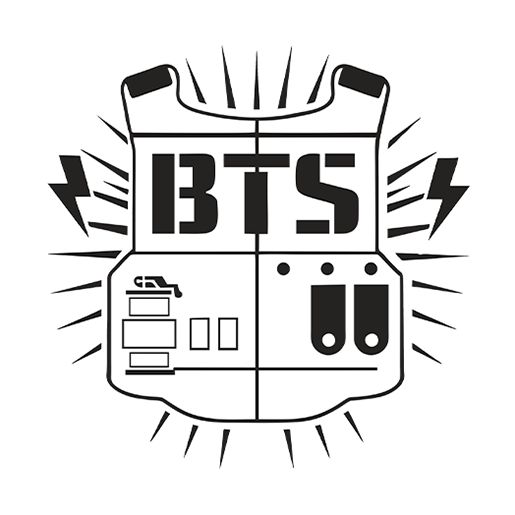
Their graphic is an emblem logo in line with the meaning of their name, Bangtan Sonyeondan (Bulletproof Boy Scouts). The lines and lighting create this loud motion like it’s coming from the stereo.
And inside the lines and lighting is a bulletproof vest with their acronym BTS, a grenade, and pockets. The logo came out with the release of their album, 2 Kool 4 Skool, but it wasn’t a masterpiece.
The logo is cluttered and could be lost in translation, especially if one didn’t know the meaning of the band’s name. But, their choice of color scheme is pretty powerful and sophisticated with the color black.
2016

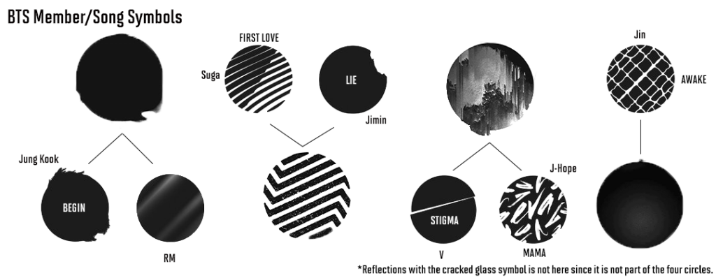
Their black logo is sustained but with a new design. Instead of the bulletproof vest, it has four separate circles with different symbols. From an emblem logo, it became an abstract logo.
Fans describe it as the famous WINGS era this time in their career. Their logo is four circles with each member’s symbols incorporated into it. They all have a symbolic meaning, from the stripes to the faded black and shattered glass.
Each member’s symbol represented a song in their second album, WINGS. Check the symbols below to understand this logo better.
2017
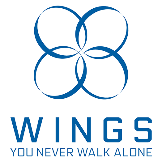
Still, under the WINGS era, we have an abstract design of four ellipses converging in the middle. Their font and logo color changed to blue and featured their tagline: You Never Walk Alone.
We couldn’t find much more on this logo as we did more research. If you want to share your thoughts or any info about it, you can share it with us below.
2017-Now
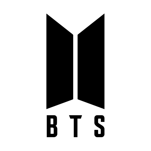
We finally get to the latest graphic that the band has. It’s a simple yet modern black logo that tells a story. The two trapezoids represent a door opening from the inside. Aside from that, BTS changed the meaning of its name.
From Bangtan Sonyeondan to Beyond the Scene, it expresses who they are as a band and what they represent. It works well with the ARMY logo, which we’ll expound in in detail in the next portion of the blog.
BTS logo exemplifies the band’s mission: to protect the youths from prejudice and encourage young people to follow their dreams despite the harsh reality that our world has to offer.
Now that you know the history of BTS and their logo, let’s get into their ARMY logo and why it’s essential to their overall design.
Symbol of Oneness
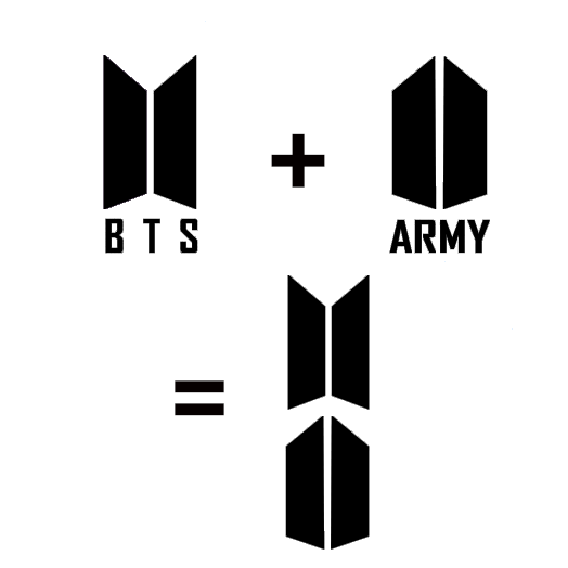
The beauty of the BTS logo is that it works well with the logo of their fans, the ARMY. It stands for Adorable Representative M.C. for Youth, and the BTS ARMY logo is also two trapezoids looking like a half-open door.
If the BTS logo is the band waiting for the fans at the door, opening the door for them, the ARMY logo is the opposite. It’s the fans waiting at the door for their favorite boy band.
See the exciting aspect of their combined logo—it makes up a shield. So when BTS and their fans combine forces, they’re an unbreakable force for the positive impact and change. As per their Twitter page, BTS confirms this by saying, “us and army becoming one together.”
This gesture shows that the boy band loves their fans and vice versa, which is excellent for branding and will surely last for generations.
If you notice, the band’s logo works because the band themselves fight for social issues that many fights for and believe. Aside from that, they are consistent and open about their beliefs as a band and as individuals.
Though, after nine years of providing music, BTS just announced yesterday that they’re taking a “hiatus” to focus on their individual careers. Aside from that, they were exhausted with the K-pop and idol system since they rush maturity rather than give you time.
We wish them luck in their future endeavors.
Create a Logo To Connect Today
That concludes our take on the BTS logo. We hope you learned much about how to create a logo that resonates not only with you as a business but with your target audience.
Key takeaways are:
- A cluttered logo design is a no-go.
- Go for a simple yet modern graphic.
- Make sure your logo connects with your audience.
- Fight for a cause as a business.
- Tell a story with your brand’s visuals.
For a brand to truly work, you need to take note of those to better your reach. We can help you there through design. You can visit us and create the perfect logo to put on email signatures or even letterheads and much more that embody who you are as a business.
Happy designing!
