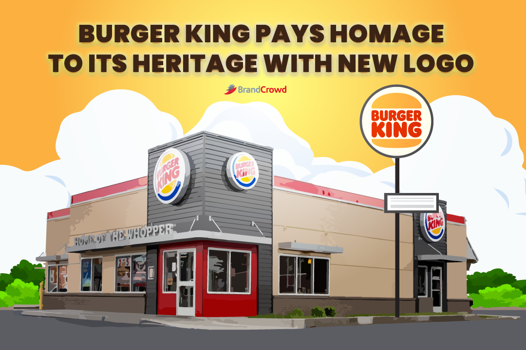
Burger King Pays Homage to Its Heritage With New Logo
Burger King flipped its brand identity after two decades.
In January 2021, the brand welcomed the new year with an extensive redesign starting from its fast-food logo down to its marketing assets like the menu.
But before we dive right into it, let’s take a quick view of the brand’s history. The second-largest hamburger chain in the US started its story in 1954 when James W. McLamore and David Edgerton established it. The brand is best known for the Whopper.
In the formative years of the brand, its brand identity was a monochrome illustration featuring a half-rising sun. It looked joyful even with the lack of bright colors. From then on, the brand’s business logo progressed to create a more colorful symbol to represent its products.
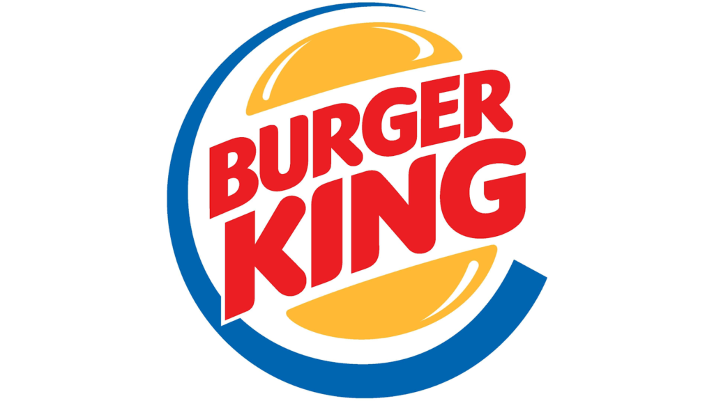
Prior to this effort, the brand had a logo from Sterling Brands. It depicted the brand name between buns and the composition bordered by a dynamic blue line that forms a letter C around the design.
The brand kept this recognizable design from 1999 to 2020. It is arguably one of the most iconic fast food logos in history.
Here is what its new logo looks like today.

The brand worked with a design firm called Jones Knowles Ritchie. Lisa Smith, who is an executive creative director, created the current logo of the brand.
Smith has worked for several food companies such as Grubhub and Dunkin. In an interview with Dezeen, she explained, “The new logo pays homage to the brand’s heritage with a refined design that’s confident, simple and fun.”
It looks a lot like its logo from 1969 to 1999. The team explored various design styles but was magnetized by its old logo. According to Smith, this time was when
Burger King looked at its best.”
In this project, the logo was given new life without forgetting to pay homage to the brand’s history. Its flat logo and sans serif design are legible on different applications both online and offline.
The brand had a goal in mind, which was to use design to improve the quality and the way the audience views them. Colors that were related to food and flame grilling were used. A custom typeface called Flame Sans was also created for the brand inspired by the menu.
Every element in the logo is recognizable. Whether they were being used alone or as a group, you’ll think of the brand immediately. Their favicon is an excellent example of this. Check it out below.
Conclusion
The redesign of Burger King proves that brand identity has the power to transform the way people see and approach your brand. It’s a way for you to stand out, and at the same time, showcase your brand story.
Are you looking for a suitable fast food logo for your business? There are a few ways for you to do this.
Try running a logo design contest. DesignCrowd is a crowdsourcing platform that lets you work with graphic designers. You can receive up to 50 design proposals from the community, and from there, you can pick the best one for your brand. Learn more about it today.
The BrandCrowd logo maker is a quick and cost-effective way for you to generate a restaurant logo. You can browse its design library of business logos, personalize it, and call it yours. You’ll get the logo you’ve been looking for in a matter of minutes. The logo maker makes it possible. Try it right here.


