Logos of the Richest Bands 2022
We’ve done the highest-paid DJs, but what about the bands? Well, here it is, our collation of logos of the wealthiest bands as of 2022.
Pretty sure you’re familiar with them since most of them are from the classics. But either way, get to know how and why they’re rich and add a brief analysis of their logo design below.
What Makes a Band?
In today’s music industry, there are musicians (solo artists) and there are bands. A band has multiple aspects, but here are the most common characteristics of a great band.
- There have to be more than four people in a band.
- The members consist of a drummer, lead guitarist, bass guitarist, and vocals.
- Strong visual identity (logo design, business cards, album covers, t-shirt design, overall band’s fashion sense, and other merchandise)
- Bands need to connect with their audience both as individuals and through their songs.
- And having a strong sense of resilience in the industry.
Those are the aspects that constitute a band. Aside from their harmonization, they have a persona to uphold for their fans and make sure that their brand as a band is great.
Now, let’s take a look at the visual identity of the wealthiest bands in 2022.
15 Logos of Richest Bands in 2022
Music has become an integral part of our lives. Whether it’s from famous DJs or famous musicians, we enjoy the tunes either way.
Today, we’re taking a look at the wealthiest bands of 2022. You’ll learn about their humble upbringings and the components that make their respective logos iconic to everyone who sees it.
After rigorous research, we found 15 bands that are both incredibly famous and wealthy. Join us as we take a peek at their fame and band logo design
- The Beatles
- U2
- The Rolling Stones
- Metallica
- Bon Jovi
- Korn
- Eagles
- Aerosmith
- The Black Eyed Peas
- Dave Matthews Band
- Muse
- Rascal Flatts
- Fifth Harmony
- Radiohead
- Coldplay
The Beatles
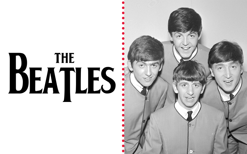
First, on the list, we have one of the oldest bands, The Beatles. Their net worth as a group is around 2.2 billion dollars making them the richest band in history.
From hits like Yellow Submarine to I Want to Hold Your Hand and Can’t Buy Me Love, The Beatles built their fame on spearheading the shift of the music scene from American rock bands to British music.
Now, let’s take a peek at their logo. It’s a wordmark logo design with their signature serif font style, Bootle. It’s plastered on merchandise and even album covers.
But what makes the logo iconic is the association the band created with it as a group of singers who consistently created trends in not only the music industry but fashion and culture itself.
U2
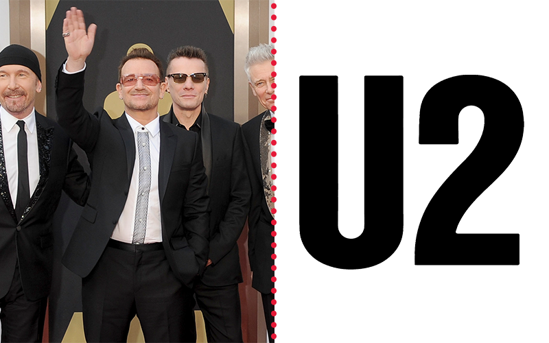
We have another one of the classics, U2 is a band that debuted their first album Boy on October 20, 1980. Their net worth is 1.8 billion dollars from hits like Sunday Bloody Sunday, Where Streets Have No Name, and Beautiful Day.
U2 has also won around 22 Grammy Awards and sold around 110 million copies of their album worldwide. But aside from that, they’re known for their philanthropic efforts as well.
The band announced recently that they would donate €2 million from the ‘iNNOCENCE + eXPERIENCE’ concert to Ireland’s national music program. Let’s get into their logo.
It’s a simple lettermark logo design of U2 in sans serif font. It’s a minimalistic logo with little to no embellishments which says something about how strong their branding has been.
The Rolling Stones
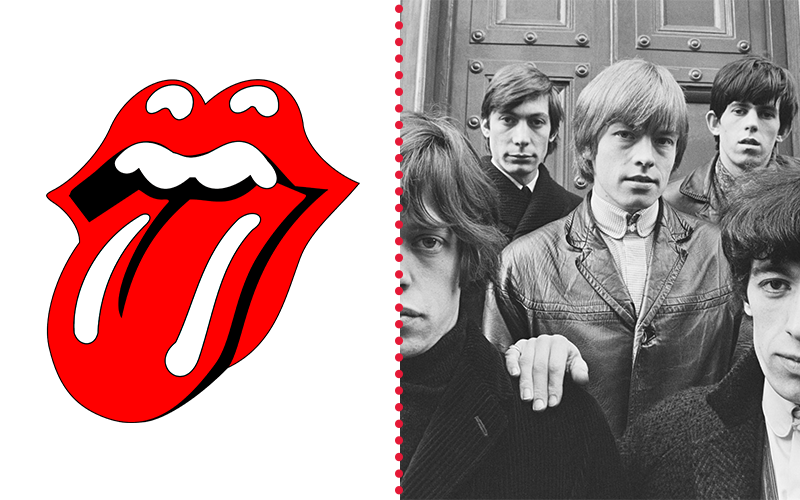
The older bands truly dominate this list since they’ve been in the business longer. Our third band on the list is The Rolling Stones. Their net worth as a brand is around 1.45 billion dollars.
Their famous icon design is the lips with a tongue sticking out. It does have some sexual connotations for an emblem logo design. But, hear us out.
It’s a homage to the Hindu goddess of death, Kali. Aside from her, Mick Jagger himself inspired the logo physically.
Logo designer, John Pasche, had an interview with The Guardian and said, “I wanted something anti-authority, but I suppose the mouth idea came from when I met Jagger for the first time at the Stones.”
Pasche instantly noticed Mick’s lips. So the tongue and lips logo came to life. In 2018, the iconic logo was dubbed the most “classic” t-shirt design in the UK through a poll.
Also, just an added fun fact, the magazine is indeed associated with the band since it was an avenue for them to express themselves and explain their songs. But today, it encompasses topics coming from the music industry.
Metallica
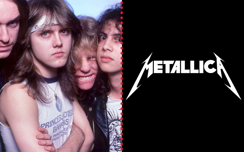
Metallica gained fame upon releasing its third album Master of Puppets in 1986. The song of the same name was actually featured in Stranger Things Season 4 finale—of course, we won’t spoil anything just in case someone reading is watching ST.
Anyway, going back, the net worth of Metallica is around 1 billion dollars and a factor of that is their place as one of the “Big Four” of thrash metal. They’re up there with Slayer, Megadeth, and Anthrax.
Now, delving into their primary visual, it’s also a wordmark logo. It’s had a total of 16 revisions since it changed each time with its album cover.
The constant characteristic of their graphic is the elongated M and A with tails in their band’s name. It gives off a frequency kind of vibe that says loud which is exactly what their music emulates.
Bon Jovi
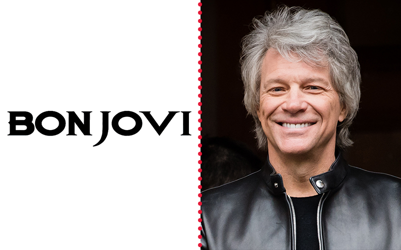
Bon Jovi may be an individual, but we’re taking a look at the band itself. They’re known for their tunes that mix good time vibes with arena-rock largesse and pyrotechnic riffing.
Some of their greatest hits that helped generate their 679 Million dollar net worth are Livin on A Prayer, You Give Love A Bad Name, and It’s My Life. Now add that with eye-catching visuals, Bon Jovi has one of the most iconic logos as well.
It’s a mix of a wordmark and a strong and famous emblem design of a dagger with wings piercing a heart. The wordmark itself had three revisions before the final Bon Jovi with a sharp J tail. Combine both and you have a symbol that says love is pain which is mostly the theme of the band’s songs.
Korn
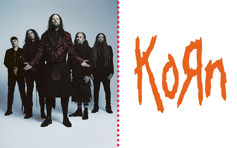
Our second rock band, Korn, is greatly known for their being the forefather of nu metal. Nu metal is when alternative rock is mixed with other genres of music.
Some of the songs that contributed to their fame and attainment of 120 million dollars are Blind, Falling Away From Me, and Here to Stay. But another question we have is how did they come up with their band name and logo design?
Korn came from a suggestion and the band member started to play with the name. From C to K and the reflected R takes inspiration from Toys R Us. The logo itself looks like a child created it but with the color orange added to it, it exudes huge energy as stated in color psychology.
Eagles
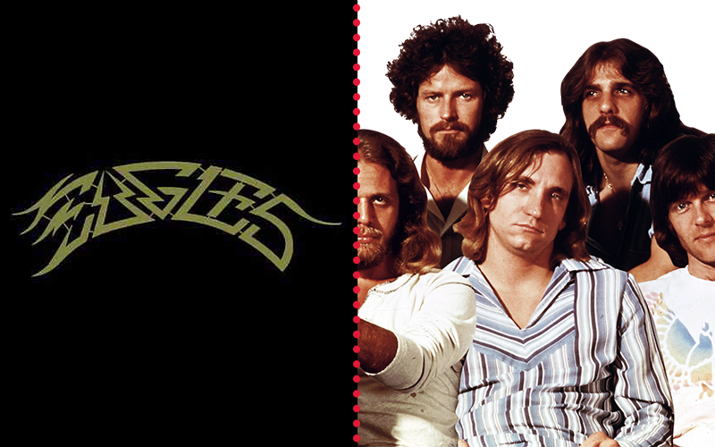
If you want to listen to songs that hit your Kokoro (heart) Eagles songs are here for you. Their tunes were branded as “Songs that are the soundtrack to our lives.”
Almost all bands do that, but what distinguishes Eagles from the rest is their consistency despite people loving to hate on them and their member change. Aside from that, they’re the symbol of an “All American” band, especially in music.
Despite the distaste of others, the Eagles still get full-packed stadiums as they perform their greatest hits like Hotel California, Desperado, and The Last Resort. A reflection of that consistency that their fans love is their overall net worth which is 100 million dollars.
Now a part of that is their marketing scheme. A crucial part of that is logo design. Taking a look at their logo, it’s their name but intricate, almost illegible typeface.
Though, you could see the outline of their name and association with the Eagle itself through the letter E which looks like feathers.
Aerosmith
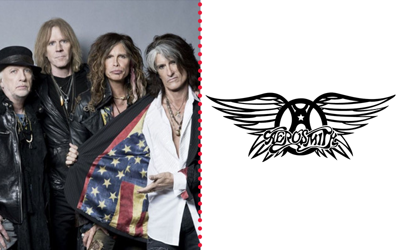
Another pioneer in the genre of rock, Aerosmith dominated the music industry for two decades in the 70s. Their style is a mix of alternative and heavy metal rock with the spice of raunchy, blue tunes.
Some of the hits that contributed to their 100 million dollar net worth are I Don’t Wanna Miss A Thing, Walk This Way, and Dream On. Now let’s take a look at their logo.
It’s a complex logo with tons of elements. From the A-based steering wheel to the wings sticking out from the wheel, it’s truly an iconic visual for a rock band.
The Black Eyed Peas
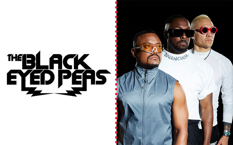
The band has a range of tunes under genres like rap, hip hop, and pop. Some of their hits that contributed to their 61 Million dollar net worth are I Gotta Feeling, Boom Boom Pow, and Imma Be—top three songs according to Billboard.
Now for their logo design, The Black Eyed Peas has had around six revisions to it. Each font style represented a different era, the logo you see is from 2011.
It’s a geometric mixture of and humanistic font style with the letters looking round like B and D. But the main feature are the lightning bolts as the tails of Y and A.
They look like static waves if looked at it from the music perspective. Their tune style at the time was electro-pop so the logo exudes exactly that feeling.
Dave Matthews Band
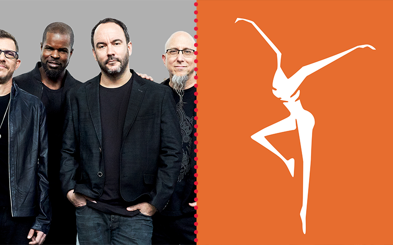
If you love seeing a live spectacle every time you attend a concert, then the Dave Matthews Band is up your alley. They won the 1996 Grammy Award for Best Rock Vocal Performance for So Much to Say.
Their net worth is around 51 million dollars. Their live performance contributes to this since they don’t perform the same style twice. And they have around 7 chart-topping songs under their belt.
Dave Matthews and his band really know how to please a crowd. And their logo says just that. It uses a white space design to create this thin figure that looks like he or she is dancing.
When people hear their music, the band wants people to let go and just dance and enjoy themselves. That’s what the logo shows, right?
Muse
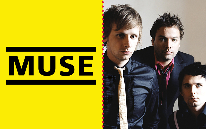
Think about the mix of guitar rifts with amazing melodies, that’s what Muse’s music sounds like—alternative rock. Some of their greatest hits are Supermassive Black Hole, Plug In Baby, and the United States of Eurasia.
Aside from those hits, their theatrical and electrifying live performances also contribute to their 35 million dollar net worth. Muse also found success being featured in movies like Twilight (that baseball scene—Supermassive Black Hole) and in World War Z (the end credit music).
With their huge success, we can’t forget to look at the symbol that identifies them, a simple wordmark. It’s their name in between two horizontal lines in Frutiger 65 Bold typeface.
Rascal Flatts
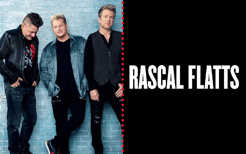
The only trio on the list, Rascal Flatts is also the only country band featured here. They’re famous for hits like Prayin’ For Daylight, What Hurts the Most, and Life Is A Highway.
Rascal Flatts also paved the way for artists to go for the digital medium since they had 2.2 billion streams worldwide and 4.4 billion on Pandora. However, just before the pandemic hit, they already announced disbanding.
Either way, as a group their net worth is 34 million dollars. And their logo is their band’s name in monospaced font style.
Fifth Harmony
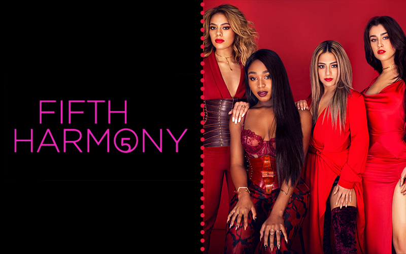
The only girl group on our list, Fifth Harmony tasted fame when they come to the X Factor show as individuals, but were tasked to come together as a group ad signed with Simon Cowell as Fifth Harmony.
They later won MTV’s Artist To Watch award at the 2014 MTV Video Music Awards. But they also disbanded in 2018. Though, their net worth as a group is around 22 million dollars.
Fifth Harmony’s logo has a pink hue that screams girl power in humanistic font and has their signature number, 5.
Radiohead
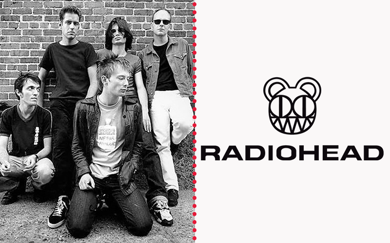
We present to you The Beatles of the 21st century, Radiohead. Their tunes are a mix of electronica, alternative, art, and experimental rock.
Their net worth is around 240 million dollars through songs like Paranoid Android, Creep, and Fake Plastic Trees. Instead of using their royalties for cocaine, which was a trend at the time, they bought new equipment that allowed them to create their unique sounds.
Now, pair their fame with an iconic symbol. For Radiohead, it’s an animal logo design of a bear with eerily huge eyes and sharp teeth in a grin. They took inspiration from Charles Burchfield’s A Tree Like A Grinning Skull and The First Spring Beauty.
It’s an equally eerie sketch of a tree in a form of a skull. In a way, Radiohead’s bear has the same feel which is an innocent creature that looks fierce. Their tunes are exactly that.
Coldplay
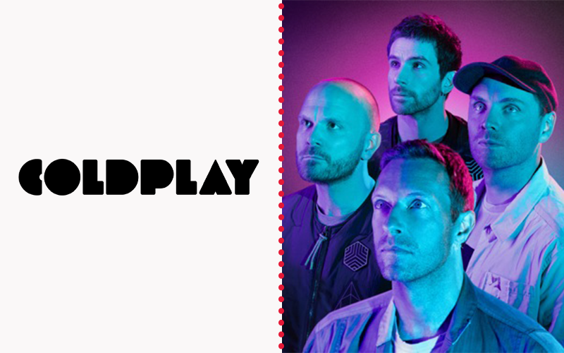
Lastly, we have the only alternative indie band on the list, Coldplay. They’re famous for their songs Viva La Vida, Yellow, A Sky Full of Stars, and The Scientist.
Fans appreciate this band because of how adaptable they are with the times. A testimony to this is when they collaborated with BTS on the song My Universe which has both band’s signature vocals and a pop beat to it.
Finally, on to their logo. It’s a bold geometric font style of their wordmark. Coldplay’s logo has a retro, fun feel to it because of the typeface used regardless of the color black used.
Create Your Band Logo Today
And there you have it! Our list of the richest bands worldwide this 2022. Some key takeaways are:
- Band logos are an expression of their music.
- There’s a good mix of icon design and wordmark styles
- Typography is important to the creation of their logo
- Symbolism is strong depending on the style of the logo
We hope you liked this blog, leave a comment below about why you love any of the bands mentioned above. Also, if you need any other help with your branding scheme, don’t be shy to tap us!
We offer various types of logo templates, Instagram post templates, Twitter post templates, and more.
See ya around, designer!


