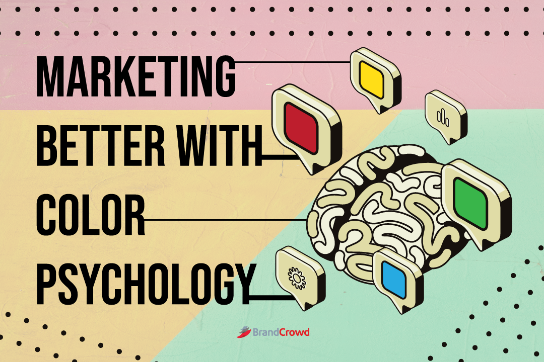
Marketing Better With Color Psychology
As businesses, our motto is, “A happy client is a happy business.” But how exactly do we market ourselves as a business that may give happiness to our clients?
The answer is color psychology. Learn how to manipulate color and persuade your market to support you through color-evoking emotions.
After all, emotions lead to preference which prompts people to make decisions. Join us as we discuss the intricacies of color psychology.
Emotional Marketing
When we talk about color psychology, we can’t NOT mention emotional marketing. What is emotional marketing?
It’s the marketing that aims to persuade your market through inciting emotion. Color psychology helps with that since it studies colors and their impact on human behavior.
Emotional marketing is a bridge to connect with your market and allows your brand to look more humane. Depending on your color combinations, you can achieve that as well.
Like when the news started to feature the war on Ukraine, some brands changed their logo to feature the colors of the Ukrainian flag to show their support. That’s one way of using emotional marketing and colors simultaneously.
You’re hitting two birds with one stone since your colors mean something, and you’re supporting a social cause that your market supports. Achievement Unlocked: Brand Awareness and Recognition just became more robust.
Let’s get into how colors persuade your market to make decisions.
Encouraging Decision Through Color
Some statistics you need to know are:
- Distinct brand color increases brand recognition by 80%
- Around 85% of consumers say that color is a primary factor when they make their purchase
- Color affects your brand impression by approximately 90%
But how exactly do you persuade your market to avail products and services from you through color?
It’s through the creation of the color wheel. The association of warm and cool colors and their combinations is what makes color psychology.
Therapist Carl Jung studied Newton’s color wheel and created a color-centered therapy that allowed his patients to express themselves through hues and images. But now, it’s more used in marketing to aid businesses in making a better impact.
We collated five methods in that color psychology plays a role in your marketing endeavor.
- Setting Expectations
- Establishing Brand Identity
- Resonate with Market
- Incite Emotion, Get Personal
- Color Wheel Unmasked
Setting Expectations
When you see a brand, as a consumer, you already have these assumptions about the quality and type of product and service they provide. Take, for example, Mcdonald’s. You expect them to serve you meals that only take minutes to wait.
Why?
Because of the color of their business, Red and Yellow, Red scientifically stimulates appetite, and Yellow connotes happiness. Combining both, Mcdonald’s successfully gives you both food and joy. Your expectation is met.
Rethink your view of your overall business color and ask yourself what bar of expectation you exude to your customers. Some standard colors per industry are according to the Digital Synopsis:
- Restaurants: Red, Green, Blue
- Banks: Blue, Red, Black
- Beverages: Red, Green, Black, Orange
- Airlines: Blue, Red, Yellow
- Computer Service: Blue, Red, Green
- Electronics: Blue, Red, Black, Orange
- Apparel: Black, Red
- Auto Manufacturers: Grey, Red, Blue, Black
- Home Improvement: Blue, Orange, Red, Green
- Publishing: Blue, Red, Orange, Grey
- Real Estate: Green, Blue, Red, Black
- Software and Programming: Blue, Red, Grey, Black, Green
- Courier Services: Blue, Red, Orange, Yellow
Establishing Brand Identity
When you create the overall visuals of your brand, you need to understand that everything has to have that uniform color scheme. From the banner of your website to the social media posts you publish, they all have that standard color.
It’s a great way to make your brand look consistent and build that association with your viewers. Once they see your handpicked colors on any elements associated with you (business cards, email signatures, letterheads, logo design), they’ll know it’s you since you successfully established your brand identity through color.
Resonate with Market
Different cultures see color differently. Yellow means happiness to the majority, but some cultures in Latin America see yellow as the color of death and mourning.
It all depends on who and where is your target market. Research is essential, so you know you aren’t offending anyone, but you know the hues you picked are just suitable for the target market.
Incite Emotion, Get Personal
Touch the hearts of your market with the hues you use, like what we said in emotive marketing above, and light the fire behind your audience’s spirits by giving them some visual candy.
A typical example here would be the use of red during valentine’s day since it promotes love and affection. Or green for saint Patrick’s day.
There’s also orange and yellow, which exude warm and happy vibes. But when you mix that with green which signifies anything eco-friendly, you tell your market that helping the environment creates these sunny and warm vibes for everyone.
Color Wheel Unmasked
Lastly, we’re looking into the more technical stuff. For example, the color theory utilizes the color wheel to create better color combinations that’ll allow you to experiment.
It’s the best way to mix and match hues to create color schemes for every emotion or vibe you want to become in front of your market. The theories themselves came from Newton to Goethe to Munsell.
Newton created the base of the color wheel through science. He experimented with light and found out that it consists of seven colors: Red, Orange, Yellow, Green, Blue, Indigo, and Violet.
As stated earlier, Goethe’s Theory of Color is the basis of color psychology and looks like the wheel we use today. He further discussed that specific colors represent human behavior (check the list below) and that there’s a difference between the perception of color under dark and light settings.
Lastly, we have Musen, who created the color tree. His model helps teachers explain color in-depth for art education, optics, and color mathematics.
Colors and What They Mean
Now you know how to better persuade your audience through color with a mix of emotional marketing, let’s get into the heart of this blog.
We listed 12 color meanings below, accompanied by their hex code to better your color game.
- Red
- Red represents power, passion, courage, and energy. However, it could also mean fear, danger, and revenge. It stimulates the brain in various ways, depending on how you use it. Like restaurants, they use Red to enable hunger, but for warning signs on the road and the stop light, it’s an implication for caution. There’s also the case for CALL TO ACTION buttons which are usually red to emphasize and encourage the viewer to click on them.
- Orange
- Orange represents enthusiasm and vibrant energy. It’s also associated with feelings of warmth since it has the color of the sun and everything. Using this color allows you to encourage and uplift whoever is looking at your design. Aside from that, orange attracts viewers in a more subtle way than red. Take a look at Nickolodeon and Gatorade with their logos becoming orange, promoting being lively and energetic.
- Yellow
- Yellow, on the other hand, exudes happiness, hope, optimism, and spontaneity. It allows your brand to look happy and full of life. Yellow inspires the mind to think curiously and gives people a sense of confidence. Though sometimes it could mean cowardice, egotism, or deception, use it wisely and with the appropriate icons and images.
- Green
- Green represents nature, growth, harmony, wealth, and health. If you want to show your market that you care for their physical well-being and the environment they stay in, this is the perfect color for you. Whenever you stare at the green, it relaxes and refreshes you. The color gives
- Blue
- Blue represents trust, security, calmness, intelligence, loyalty, and responsibility. Use this color, and your market’s perception will see you as trustworthy. That’s why security businesses and even tech companies use this color for their respective logo designs. Using blue makes you feel like your brand is honest, confident, and reliable. It’s great for building brand awareness.
- Purple
- Purple represents royalty, imagination, luxury, spirituality, and mystery. Add that air of wisdom to your design with the color purple. It’s a great way to show your creativity and embody luxury as a brand.
- Pink
- Anything in pink is often associated with femininity. It’s also a great color to show your support for survivors of Breast Cancer. Though it also represents being playful, romantic, and sweet. It’s a color least used for being romantic and playful, but big brands like Dunkin Doughnut and Cosmopolitan use it to express what their product offers or their target market.
- Black
- White
- Now for white, it exudes purity, simplicity, minimalism, and perfection. This color and black are great for a white-spaced design that plays with your market’s eyes. White is a great way to showcase your brand’s symbol at the center like in Apple’s design.
- Gray
- If you want another neutral color to use, try gray. It exudes practicality, formality, and professionalism. Gray is also the color of stones or rocks that express stability and calm. It looks great with blue or other neutral colors like black and white to create a sense of serious, authoritative, and dependable atmosphere that’ll surely win over your market.
- Brown
- For brown, it expresses honesty, reliability, wholesomeness, and comfort. Like green, brown has a connection to nature so when you use this color, it also gives off calming vibes. It can also be seen as friendly and dependable as well. Though it still depends on the color scheme and logo type you want to employ. Like Dunking Doughnuts is sweet pink and brown, while UPS is yellow and brown for authority and courier assurance.
- Metallics
- Bronze, silver, and gold when used as brand colors express prosperity and wealth. Any color based on metals gives off an atmosphere of glamor and prestige as well. It’s the association of how we use metals today that gives off the association, Bandwagon on that thought, and color your business cool, simple, yet energetic that your market will surely love.
Use Color Psychology To Your Advantage Today
Take a hint from color saturation to color theory and combine colors to create the perfect combination for you. Incite emotion and persuade your market to support your brand through design and hues.
If you need any other help with any type of graphic design like logo design, email signatures, business cards, and more check us out at brandcrowd.com and find the best-fit template for your business.
Happy color mix and matching!