
Pantone Highlight 2022: Very Peri
Are you ready to find out what the Pantone highlight for 2022? It’s Very Peri! Or periwinkle if you want to say the whole word.
It’s like a mix between blue and purple, but we’ll get into the technicalities later in the blog. Also, before anything else, we know our feature is long overdue, but we’re excited to give you our take on 2022’s Pantone Color of the Year.
But before diving into how beautiful periwinkle is, let’s get to know why Pantone is significant to us designers today.
Getting to Know Pantone
It all started in 1962 when Laurence Herbert bought, which was then, a small business of color cards for cosmetics, Pantone. Herbert began to as an employee, and upon purchasing the company, he shifted the tides.
Pantone did a 180 degree turn from a cosmetic color card business into a color matching system—created in 1963. The company’s goal was to develop guides for designers to mix and match colors during their production of goods and services.
The color matching system came into existence through mixing and matching colors from the CMYK (Cyan, Magenta, Yellow, Black) process. And the colors from this process are called Spot Colors.
With that in mind, let’s delve into the background of Pantone’s color of the year. The birth year of the first Pantone color of the year was 2000. It was both a marketing scheme and a method of expressing what the year had in store for everyone.
The first color released under this scheme was Cerulean Blue. It embodied inner peace and spiritual fulfillment for the millennia to come. Aside from that, statistics showed that the blue hue lowered blood pressure.
That makes you wonder how Pantone truly picks the color of the year. No worries, we have an answer for that too.
Pantone has numerous researchers dedicated to researching the trends in color (as seen in 2000s Color of the Year) and analyzing which color seems like the top dog when it comes to consumerism.
In a study in 2015 conducted by the Color Marketing Group—around 85% of respondents base their purchase habits on the color of products. And now you see the importance of Pantone Color of the Year.
Pantone Colors Through the Years:
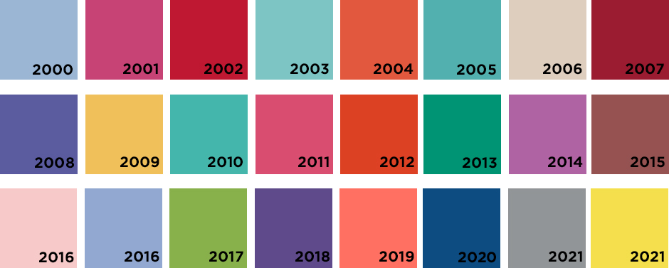
Despite some questionable choices over the years, especially 2003, 2005, and 2010 choices, this year is a spectacle to see.
Very Peri is Here
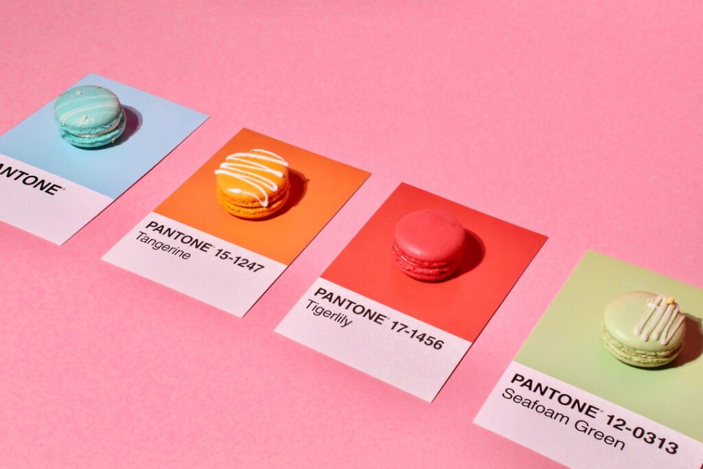
Let’s get into 2022’s color: Veri Peri. Periwinkle, when elongated, is the first color that Pantone created itself.
The combination of blue with violet-red undertones gives the room a feel of wonder. Periwinkle can look bluish or purplish depending on where the light strikes it. We’ve seen the shades commonly used in commercial spaces and lighting to exude calm and positive vibes in venues.
When seen through the lens of color psychology, very peri embodies our sense of creativity, confidence, and curiosity to try something new. It’s a great way to greet a new year after abandoning most of the restrictions and coming into an age of exploration into the New Normal.
Periwinkle represents the integration of digital colors into our modern everyday lives. From the furniture to the lighting at home, periwinkle has become a staple color for designers around the globe.
Get With the Color Trend!
And there you have it. You now know this year’s color. A vibrant yet cool color to add to your arsenal of graphic design choices.
No worries, we’re always here to back you up in your branding choices. We can aid you with our logo template library that has 75,000+ visuals you can choose from to represent your business.
Get trendy with this year’s color and watch your market grow.
