The Evolution of Famous Food Company Logos
Are you familiar with the history that sits in your pantry?
They are right there on the labels of your food.
Food is a basic necessity that one can’t live without. Needless to say, the food industry is one of those sectors that continues to expand and develop with each progressive year. With different brands and products out in the market, most brands blend in and remain unnoticed.
Some companies undergo various rebranding processes to adapt to the ever-changing needs of the market. Especially for new brands trying to get a seat at the table.
While it is true that each business has a unique path towards success we can still see that there is one common factor that these big companies have. And that is effective branding.
In this article, we are going to examine how these top food brands have improved their branding kit to rise above their competitors.
Popular Logos of Food Companies And Their Evolution
Branding is the result of a long-term strategy that allows your customers to recognize you and your products among other players in your industry.
It helps people choose you over countless other brands seen in the supermarket, food stalls, and many other commercial places. One of the branding tools that they use effectively is their logo.
The food brands that we love have rebranded over the years. This is evident in the way they implement their marketing strategy, produce products, and even in their logo design.
We can learn a lot by taking a look at what they are doing. Below are some popular food brands that have and continue to improve their identity:
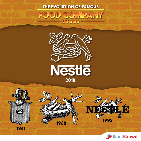
Nestle’s logo has had interesting changes since its first original logo conception in 1961. The original logo was based on the founding family’s coat of arms, which is a bird sitting on a nest. From the crest-inspired original design, Nestle currently has a more down-to-earth logo of a family of birds on a nest.
Despite the obvious differences from the very first logo to the current, the company has still embraced the black and white colors of the original design. They also added emphasis to the brand name with a larger font.
The illustration of the birds are now cleaner and defined. Overall, the insignia we see today is simpler and more adaptive than ever before.
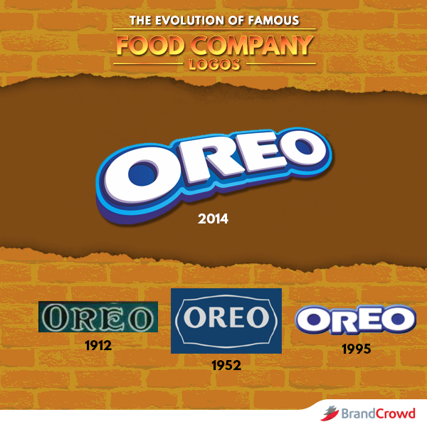
Oreo’s logo design has undergone several design changes throughout the years. It is noticeable, however, that the company has used fonts in their design. From the calligraphic and darker color combination of the original design, Oreo now has a more modern and lighter color tone.
The biscuit logo features different shades of blue that adds depth to the design.
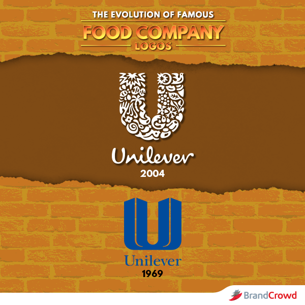
Unilever’s logo is one of the most iconic and easily recognizable logos in the food industry.
The bold and blue color of the logo is both pleasing to the eyes and radiates calmness. Its original ‘U’ shape and plain-looking logo have been replaced with a composite logo. The letter consists of several icons that each represent an aspect of the company’s effort to sustainable living.
Overall, there are 25 different icons that make up the silhouette of the brand name’s initial. These icons represent the different goods that the company offers. You can spot symbols that represent ice cream, shampoo, tea, and more.
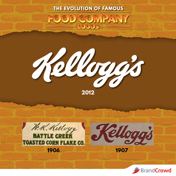
Kellogg’s original and current logo is based on one specific thing: the founder’s, William Keith Kellogg, signature. This is a reference to how Kellogg, the man himself, used to sign every cereal package back then. Needless to say that the founder took branding seriously.
At a glance, the design does not have that many noticeable changes, apart from the color. If you look at it closely though, the difference lies in the color and the strokes used in the logo design. It retains the classic typography that was very popular in the early 1900s.
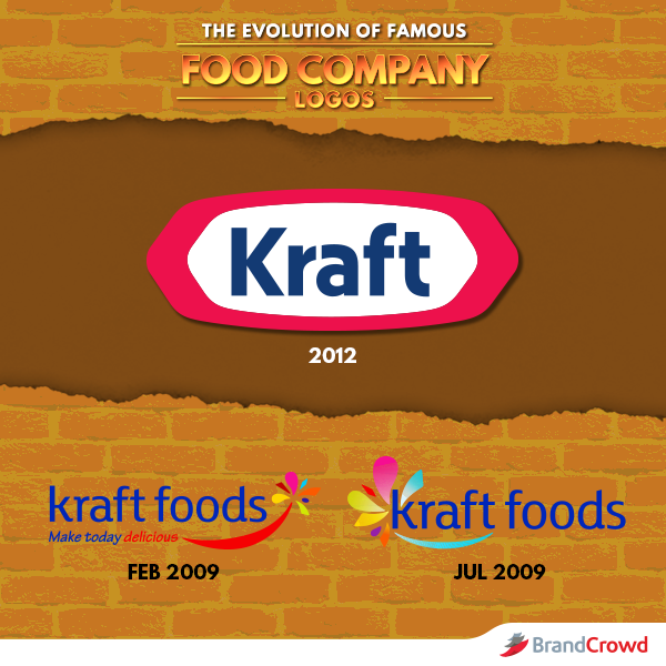
The Kraft logo made some interesting changes in the design compared to the original concept. From the colorful logo concept, the company has embraced a bolder logo with a re-do of their old racetrack logo.
Using only three colors gave the symbol a cleaner and more recognizable look. The brand also removed the flower-like design elements from the 2009 version. To replace it, the brand chose to frame the wordmark with a hexagon.
CEO Tony Vernon spoke of the effort as “the beginning of a great new company, a totally new Kraft, one with the spirit of a startup and the soul of a powerhouse.” The design complements the history and plans of the brand well.
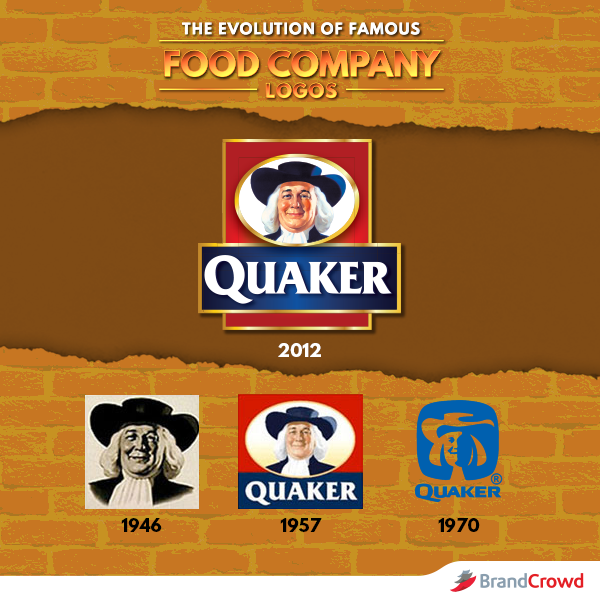
Quaker’s logo has always had the same Quaker man image on its logo since its first conception in 1946. This man is named William Penn and he is considered the standard-bearer of the company.
Over the years, changes to the design-focused mainly on the outer shapes of the Penn Quaker man. There weren’t really any major changes done with the symbol. Although the company redesigned the logo to a silhouette of Penn in the 1970s. Currently, Quaker’s design is that of the man on a red, blue, and gold emblem.
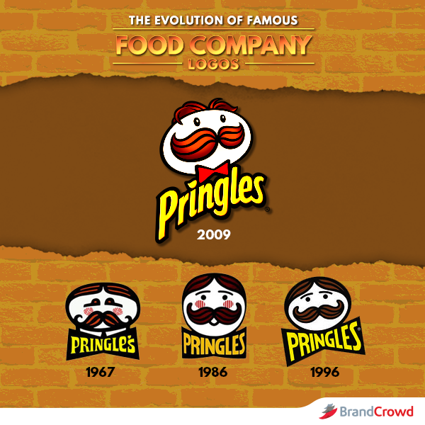
Pringle’s mascot name is Julius Pringle. Mr. Pringle has always been part of the company’s official logo design. The mascot is conceptualized from a piece of potato crisp with eyes, eyebrows, parted black hair, and a bushy black mustache. The 2009 design has more details like shadows and highlights that give this logo complexity.
Any changes in the design are mostly on Mr. Pringles himself and the font used in the brand name.
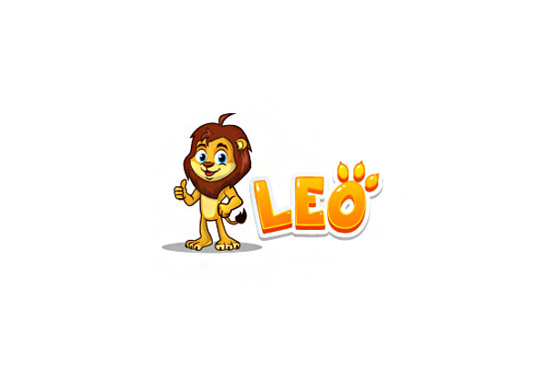
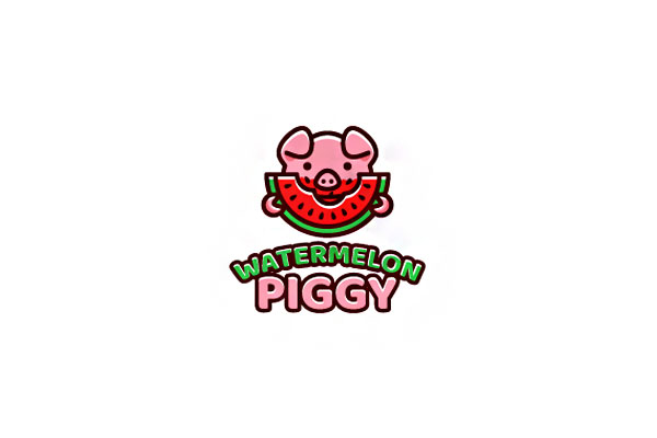
Food Logo Design For Inspiration
Most food logo ideas that are conceptualized nowadays have animated drawings and use vibrant colors. Designers use catchy images to draw attention and make people want to buy certain goods. Most of these logo designs are conceptualized based on the food product being offered.
Designs feature relevant products such as loaves of bread, cakes, fruits, and even fun-looking vegetables. You can even use other characters like animals as a mascot and symbol. For example, rabbit logos have long been used by companies like Blue Bunny and Nesquik for their branding.
Creating a good logo is a good way to kick off your business. Even if you are an existing brand or simply planning to start your own, working on your branding kit will make you remarkable.
To help you get that much-needed design inspiration, look at these cool food symbols that you use for your business. They are great for any brand ranging from restaurants, breweries, take out stations, and more.
Bread Logo by Dalia
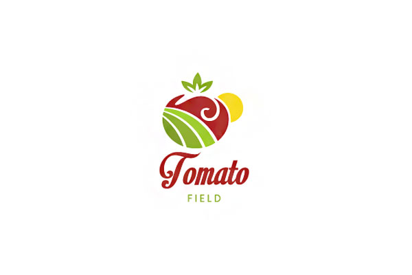
Tomato Logo by Dalia
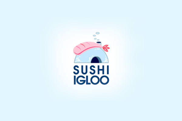
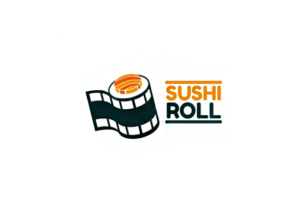
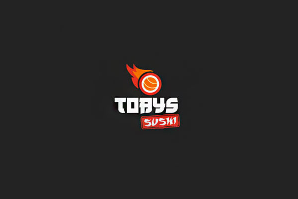
Sushi Logo by Amir66
Our aim is to give you plenty of design inspiration for your brand logo. We hope the collection above helped!
Try using a minimalist, illustrated, or text logo. Whichever logo design theme you pick, it all boils down to one thing. A good food company symbol is one that will represent your brand identity in a remarkable and simple way.
Do You Need Help With Acquiring A Food Logo For Your Business?
Conceptualizing and designing are two difficult tasks. That is why we at BrandCrowd are happy to help you get this job done!
BrandCrowd’s food logo maker is an amazing tool for all fun-loving and creative entrepreneurs out there who love a challenge.
The site has tons of amazing logo design ideas that you can use for your logo. It is also very easy to use that you will be rocking your logo design in no time at all.
All you need to follow are 3 simple steps: generate, customize, and download. Our tool has several customizing features that you can use to personalize the design and make it your own. This includes the font, shape, color, background, and even the layout of the design.
Super easy, right?
And if the food logos are not just your type, explore our restaurant logo maker and dinner logo maker to get tons more of logo designs that can fit your food business.
There is no better time to start working on your food logo than today. Get started now and reap the benefits of having an amazing brand identity!