Target Logo History
When it comes to finding cool stuff at reasonable prices, Target is where many people turn. And when you think of Target, you probably picture that famous red bullseye logo, right? It’s everywhere, and it’s easy to spot.
But there’s more to this logo than just a red circle with a dot. It has a story that goes way back and tells us much about the store and its place in our culture.
Want to create a brand name that perfectly fits your logo, just like Target? Check out our business name generator for incredible ideas.
In this article, we’ll take a closer look at the history of the Target logo. We’ll see how it’s changed and what it means to the brand and everyone who loves shopping there.
Let’s get started!
Brief History of Target
Target is super popular because it sells affordable and stylish clothes, home goods, electronics, and groceries. People love it because they can get good quality stuff for reasonable prices. It’s a top choice for folks who want to save money but still have many options.
But how did everything start?
Target Corporation, commonly known as Target, has evolved from its humble beginnings in 1902 when George Dayton opened the first Target store, originally named Goodfellow Dry Goods, in Minneapolis, Minnesota. Target as we know it today, however, emerged in 1962 when the Dayton Company opened its first Target discount store.
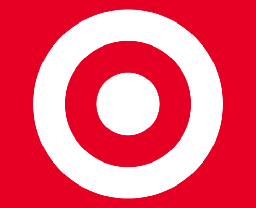
One of the main reasons why Target is so popular with its customers is its cool logo. It’s just a simple red bullseye on a white background, but it’s super memorable.
When you see it, you know it’s Target. The logo shows that Target is all about helping you find what you need at reasonable prices and in style. It’s like they’re hitting the bullseye every time you shop there!
Target Logo History
Over the years, Target has had a few updates but has always kept the traditional bullseye icon and red brand color. Here’s how its logo has evolved throughout the years:
1962-1968
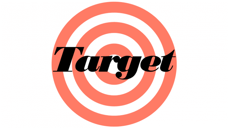
Initially, the Target logo had three concentric rings instead of the familiar circle and dot we recognize today—the typical target used by marksmen inspired this design.
The company name was written in black italics above the emblem in the logo. While this design was memorable, the logo was sometimes hard to read, especially in monochrome. The overlapping elements in black and white further affected its clarity and legibility.
1968-1974
In the updated version of the Target logo, readability significantly improved. The name and emblem were separated, and the bullseye underwent a redesign closer to the famous version we recognize today.
Frequently, only the bullseye emblem is used without the name. Another notable change was the switch from an italic typeface to a sans-serif, all-capital typeface, resulting in a more concise and clean appearance.
During this period, it became typical for the wordmark not to accompany the Target logo, with the brand opting to use just the circle and dot emblem on products.
1974-2004
After two logo updates, each occurring six years apart, a noticeable pattern began to form.
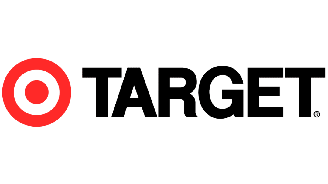
However, this pattern was disrupted by introduction of the Target black and white logo, which remained unchanged for three decades.
This update marked yet another change in the typeface. The letters became bolder, straighter, and filled in. The larger lettering made the brand name more prominent and enhanced readability, making it even easier to read.
2004-2018
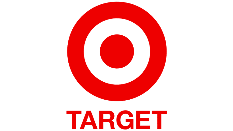
The font remained unchanged in this update, but the color shifted from black to red, and the entire logo transitioned to a singular color scheme. Additionally, the name’s positioning was adjusted from beside the emblem to a smaller size and placed below it.
This version of the Target logo has remained nearly identical ever since, enduring through to the present day.
2018-Present
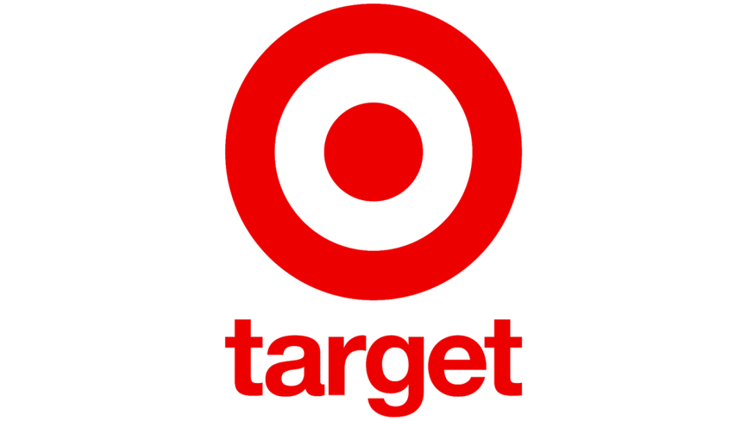
Here’s the latest version of the logo. The most obvious alteration in the Target logo is the shift from all uppercase letters to all lowercase. This change in font style aligns with trends seen in other prominent brands like Facebook and Amazon.
This adjustment gives off a friendlier and more casual feel. Concurrently, the name has been completely removed in many digital iterations of the logo.
Target Logo Design Elements
Check out the three main design elements that make up the Target logo:
- Font
- Color
- Icon
Font
The present logo iteration consists solely of the emblem, requiring no accompanying company name or additional text for recognition. However, the prior version incorporated a wordmark in the Helvetica Neue Bold font.
Color
The Target logo has predominantly featured red and black as its primary colors, with white as the background.
The black letters in the wordmark ensure clear readability, while the red depiction of the target serves as a captivating focal point. In its earliest iteration, the target was rendered in a lighter shade of red, encompassing rosy and orange tones.
Icon
Target’s icon is instantly recognizable: a simple yet bold red bullseye set against a white background.
This iconic emblem embodies the brand’s essence, symbolizing precision, focus, and hitting the mark. The bullseye represents Target’s commitment to providing customers with a targeted and satisfying shopping experience.
Design Your Logo Today!
With the convenience of online tools and resources, you can bring your vision to life and create a logo that perfectly represents your brand identity.
BrandCrowd’s logo maker offers a vast array of customizable templates, allowing you to craft a logo that stands out and resonates with your target audience. Moreover, BrandCrowd can assist with all your advertising needs – from Posters and LinkedIn Posts to Facebook Posts and Instagram Stories, ensuring a cohesive and professional brand image across various platforms.
Get started today!

