
50 Pharmacy Logos to Reflect Your Commitment to Health.
The pharmacy industry is one of the most stringent industries to be in. To date, there are over 200 compliance agencies and regulatory bodies around the world, which makes selling food and drugs extra tough.
If you plan on entering the pharmaceutical industry, ready your wallet because surely it will take a hit. But besides your products, your marketing must also be on their a-game. To maximize your marketing efforts, make sure your logo serves looks. Either make it happen with a logo maker or by designing it your own.
Don’t worry; we’ll help you navigate the pharmacy branding world in this guide. We will give details of pharmacy logos and their good combination of letters, font style, color combinations, and mood. We will also offer significant categories of designs that you might find suitable for your special branding needs.
Tips to create pharmacy logos
Pharmacy logos are not like other logos. Unlike traditional logos, where you can get away with subliminal messaging, the pharmaceutical market needs you to be direct, upfront, and clear. The reason is that safety is its highest requirement. There’s no room for misinterpretation.
Here are some more tips to get started with designing pharmaceutical logos:
- Use tried and tested fonts.
Not all fonts can be used in this industry. Some fonts could be more decorative and stylistic, which may signal unseriousness and out-of-the-box strategies that might not work in stringent and compliant-laden organizations.
Instead, use the tried and tested serif fonts or sans serif fonts that lean on thin and tall configurations. Such features are visible in Astra Zeneca, Moderna, and Pfizer wordmarks.
- Minimal color combinations
Feel free to use vivid and striking multicolor colors, but keep the combinations to a minimum. This is not a child daycare center, a creative agency, or a museum where diversity is prized.
Pharmacy is like other bureaucratic and formal organizations such as banks and firms where single to two-toned color combinations are usually used.
To successfully pull off your brand colors, make sure that you choose a color from the same font family. That way, there’s variety while still staying true to its core principles.
- Incorporate globally recognized icons.
Logos are communication tools. That’s why, to communicate to your audience that you’re within the pharmaceutical industry, the easiest route is to use well-known icons.
For example, if you’re a biotech company, DNA, RNA, microbes, and cells are perfect symbols. The same way that a drug company might find a pill, syringe, ampoule, and capsule beacon of their brand.
Pharmacy logos examples
And speaking of symbols, the pharmacy industry can be divided into three main categories depending on their symbols. We choose the pills, crosses, and plants as some of this industry’s most commonly used symbols.
Pills Logos
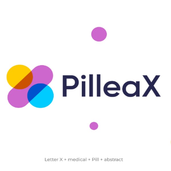
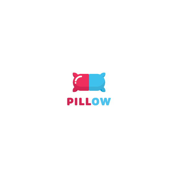
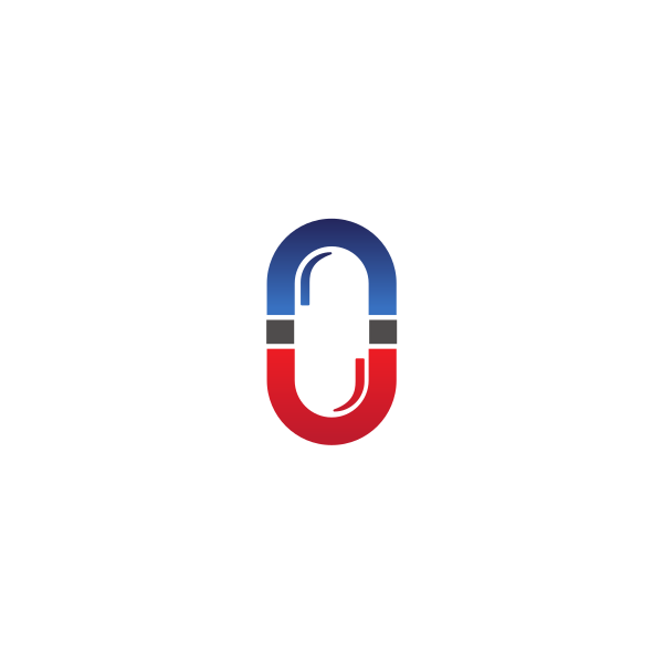
Pills are universally recognized symbols of medicine and healing. Logos featuring pills can communicate a direct connection to pharmaceuticals, emphasizing the practical and therapeutic aspects of the brand.
This symbolism is ideal for pharmacies, drug manufacturers, and medical research companies aiming to highlight their focus on medication and health solutions. When designing a pill logo, consider incorporating clean lines and a simple color palette to maintain clarity and professionalism.
Using negative space or abstract pill shapes can add a modern twist to the design, making it memorable and distinctive.

ill pill logo by Ildar Fatikhov
Capsules Logo Design | C + Capsule | Modern Medicine Logo by Abir | Logo Designer
Drug Pill Logo Design by Dalius Stuoka | logo designer
Letter A Medical Pill Logo by Sabuj Ali
Pill and Pillow V2 by Nikola Matošević
Pill | Medicine | Pin | Logo design by Viktor Vostrikov

Pill Heart by Djordje Miljkovic

Watermelon Medical Pill by town


Hexagon Medication Pill by town

Organic Medical Pill by royallogo

Health Medical Pill by Joebert


Pharmaceutical Medicine Pills by FishDesigns61025
Medical Pill Letter U by SimplePixelSL
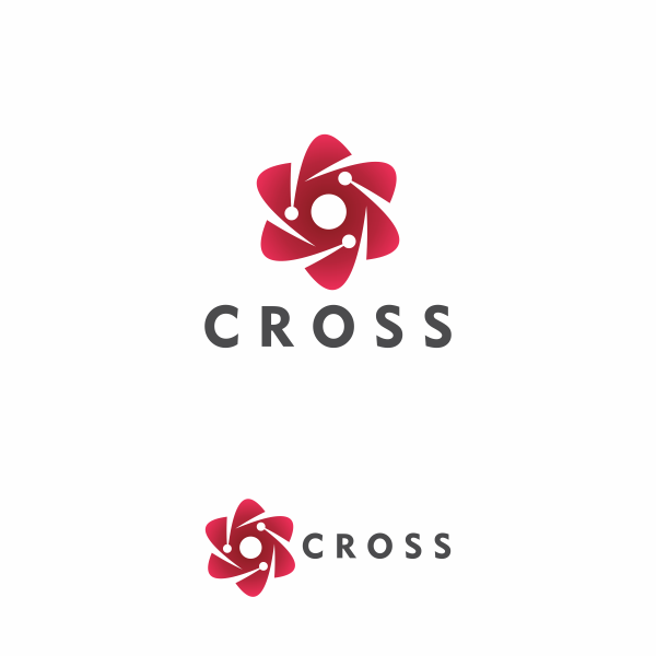
Cross Logos
The cross, especially the Red Cross, is synonymous with healthcare, medical aid, and pharmacy services worldwide. Incorporating a cross into your pharmacy logo can instantly convey a sense of care, trust, and medical assistance.
It’s essential, however, to design your cross logo to differentiate it from the internationally recognized symbols of specific organizations like the Red Cross or Red Crescent to avoid confusion or trademark issues.
Using unique color schemes, incorporating additional elements like leaves or hands, or stylizing the cross shape can help your logo stand out while still evoking the essential theme of healthcare.
Medical Logo with Cross & Bag by Turbologo Turbologo

Orange County EMS by Jennifer Rice-Daniels
Health cross logo concept by Josh Brill
Medical / Healthcare Logo Design by Jana Novak
Logo with Stethoscope & Medical Cross | Turbologo byTurbologo
Medical cross + blood drop negative space modernist logo design byEdgardo Rondón

Cross + Leaf byKakha Kakhadzen

Medical community symbol by Sam DeMastrie

Medical Technology Cross by MDS

Red Medical Cross by royallogo
Medical Leaf Cross by CreativePixels

Medical Digital Cross by royallogo
Medical Ribbon Cross by SimplePixelSL

Cross Medical Center by JimjemR

Natural Medical Doctor Cross by SimplePixelSL


Emergency Medical Cross by MDS
Plant Logos
Plant logos are perfect for pharmacies and companies focusing on natural, herbal, or homeopathic remedies.
They convey a commitment to natural health solutions and can appeal to customers interested in organic and eco-friendly products.
When designing a plant logo, consider using green tones to emphasize the natural aspect, and choose plants that are commonly associated with healing and wellness, such as aloe vera, ginkgo biloba, or echinacea.
A minimalist approach with clean lines and a modern font can make the logo more contemporary and appealing to a broad audience.

Herbal Medication Capsule by marcololstudio

Green Flower Medical Pharmacy by town
Medical Marijuana Smoke by CreativePixels

Medical Marijuana Outline by SimplePixelSL

Medical Marijuana Man by GianC
Green Natural Medication by SimplePixelSL

Herbal Medicinal Plant by town

Medical Weed Plant by marcololstudio
Medical Weed Plant by SimplePixelSL
Design your own pharmacy logos
Your pharmacy logo is more than just a visual identity; it reflects your commitment to health and wellness.
You can create a powerful logo that communicates trust, care, and professionalism by carefully selecting symbols that resonate with your brand values and target audience, such as pills, crosses, or plants.
Remember to keep your other designs such as flyers, menus, and business cards simple, use appropriate color schemes, and select fonts that reinforce the message of reliability and expertise in the pharmaceutical industry.
With these tips in mind, you’re well on your way to creating a pharmacy logo that looks great and effectively conveys your brand’s commitment to health.
