40 Famous Four-Letter Logos You Will Recognize Instantly
Bored? Or just looking for great design inspiration from successful brands?
Try browsing through this list of famous four-letter logos we created for you.
It’s not necessary for you to stress out about every graphic design element out there. You can create a powerful brand symbol with just text. Here are famous letter logos that prove how effective letter logos can be:
- Famous four-letter logos
- Letter logo ideas
We have more than big brand logos for you. We also have more font logo ideas for you down below.
Get ready four these letter logos.
Famous four-letter logos
Some may pass on logos as something unimportant, but it contributes a significant amount of value to company growth. Great branding is built up by a lot of things and a good logo design plays a role in it.
These brands have all made letter logos that made their identity remarkable.
Short letter and initial logos are a popular choice for companies that want to incorporate their brand name into the design. The concept and execution of these logos have opened a lot of opportunities for the brand you will see down below.
IKEA
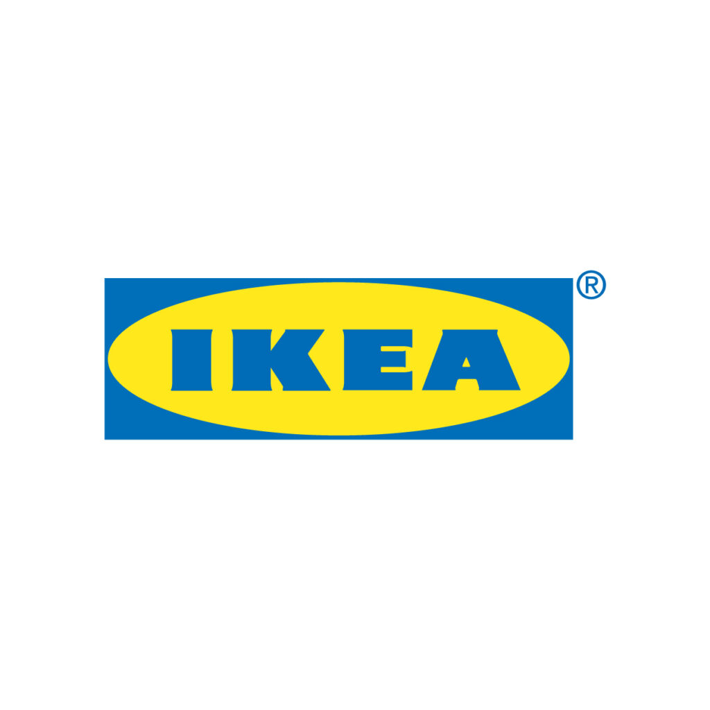
This Swedish brand has a great logo that stands the test of time. In 2019, IKEA also has every so subtly redesigned it to make it “future-proof”. The design now features heavier text and a larger yellow oval the yellow oval.
The change made this lettermark logo more functional and easier to apply.
NASA
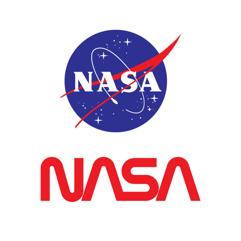
National Aeronautics and Space Administration’s bright blue logo carries a lot of meaning. Not only does this acronym logo signifies a lengthy name, but the administration’s meatball insignia also symbolizes the extraterrestrial travel and aeronautics.
It also has a version of the logo called “The Worm”. This logotype features a curvy font called Nasalization that looks like worms in formation.
Oreo
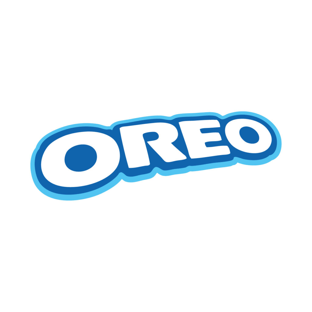
The outlined text makes this design pop out by adding visual depth. The snack brand debuted this logo version in 2004. Its logo has evolved a lot from what it was in 1912.
Looking at the design evolution, you will learn that the company has remained faithful to typography logos. Its design is always adaptive to applications like advertisements and packaging as well.
VISA
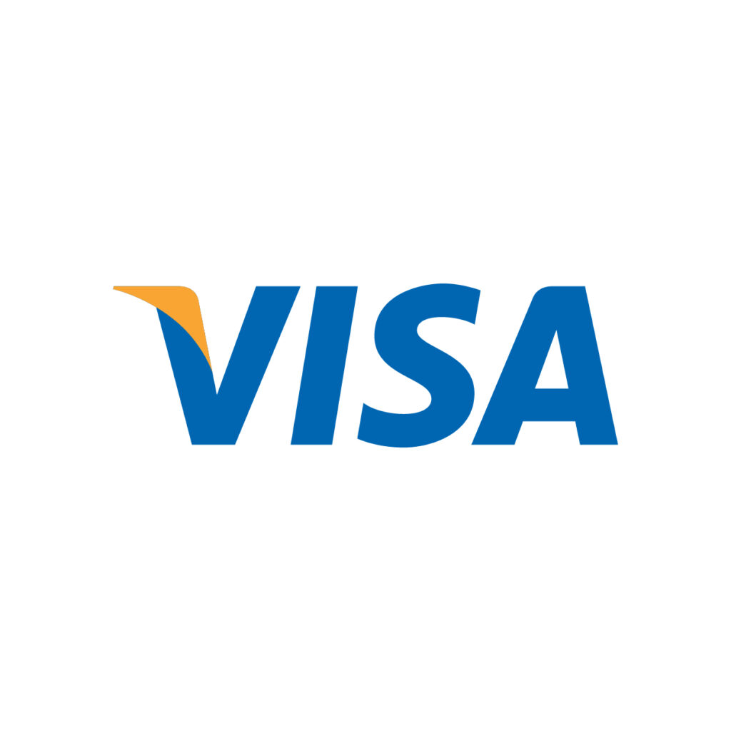
This finance brand uses simple brand colors to take its logo to greater heights. Its use of dark blue and bright yellow adds good contrast.
The tail element found on the letter V gives it a dynamic look and leads the eyes of the audience. Although the detail may be small, it still contributes a lot to the insignia.
DELL
The slanted E has been around since the ‘80s. However, the blue circle frame made its first appearance in 2010. The asymmetry in this logo gives a modern look that is fitting for the computer technology company.
Additionally, the design also uses the color blue which communicates intelligence and security.
Nike
Everyone knows about Nike’s celebrated swoosh logo. The active brand also has a wordmark design that is worthy of praise. This font is called Futura Condensed Extra Black designed by a German typeface designer named Paul Renner.
The typography is italicized ever so slightly and this gives it personality.
Lego
Custom fonts give a unique air to a design. This is great for brand logos because it makes it unlikely for your competitors to share the same style.
The toy company also uses a clever color scheme. Primary colors like red and yellow attract the eyes of kids. This is because bright colors help children distinguish one thing from another.
Fila
This sportswear company was created in Italy way back in 1911. Interestingly, the text logo has been this way since with only minimal revisions. It has an eye-catching wordmark made with a sans serif font that creates a playful silhouette.
It has very sporty colors, too. The red and blue of this logo fit the brand’s products made for an active lifestyle.
Puma
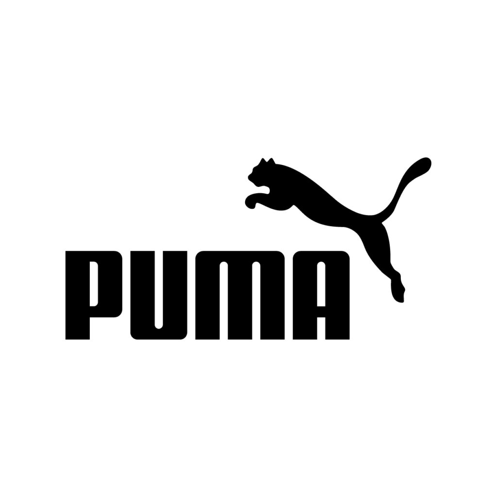
As one of the celebrated designer companies in the world, Puma has a sophisticated animal logo.
It features a silhouette of a leaping cat to complement the weighty sans serif font in its logo. Over the years, this puma had gotten a little more detail than its first rendition. This minimalist illustration was created by a cartoonist named Lutz Backes.
Juul
This American brand of electronic cigarettes has a logo that has balanced glyphs. It creates a pattern of its own creating no need for additional illustrations and other graphic elements.
The modern color and style of the design work well for the innovations introduced by this e-cigarette company.
eBay
From chaotic disarray, the eBay logo found stability in their recent redesign. The multinational e-commerce company said of the change “It reflects who we are today — a global online marketplace that offers a cleaner, more contemporary and consistent experience.”
The design still retains the playful spirit of its past version, all thanks to the improved color scheme and contemporary sans serif font.
Vans
This logo was meant to be sprawled across skateboards, this logo was designed by co-founder Paul Van Doren. Doren created this wordmark as a stencil. This eventually evolved into a logo that is sported by streetwear and skateboard lovers all over the world.
It was first introduced on the heel tab of early models of the brand’s Style 95.
BASF
Sony
VAIO
Avis
Uber
Lyft
Ford
Jeep
Xbox
Sega
Asus
Acer
Oppo
BENQ
Citi
HSBC
ACLU
Mets
Dior
Elle
Lay’s
Ritz
Mars
Line
Twix
Olay
Dole
Milo
Considering a four-letter design of your own?
The recognizable logos you’ve seen in the list all started somewhere. Some took multiple revisions and underwent consultation before creating an effective word logo. However, not every brand has the resource to do this.
But we’re here to tell you that you can get a lot of options and insight even without an upmarket budget.
Logo design contests allow growing brands to get a variety of design proposals to choose from. This is a method trusted by established companies for sourcing the graphic design their campaigns need.
Get support from a team of expert designers that will provide your campaign with the winning design.
Abstract Coffee Pastry by SimplePixelSL
Construction Letter H by SimplePixelSL
There are also competitive options for those who want to design their logos on their own.
Tools like BrandCrowd’s logo maker provides professionally made logos that you can customize. Its interface allows you to do so much more with your logo. This helps you connect to your audience through high-impact visual communication.
Progress Business Growth by DanikBrt
Red Business Building by LogoBrainstorm

