How to Create an Eco-Friendly Logo
An eco-friendly logo is a logo designed to visually communicate a brand’s commitment to sustainability or nature-conscious values. Just look at the logos of famous brands like WWF, Whole Foods, or Patagonia. At a glance, you know they champion sustainability.
However, creating an eco-friendly logo doesn’t mean making everything green or adding leaves everywhere. The most effective logos use thoughtful design choices (whether through color, typography, icon, or composition) to communicate sustainability in a way that isn’t overly literal and feels authentic to the brand.
In this guide, we’ll walk you through the key design principles behind successful eco-friendly logos, share practical tips for creating your own, and show awesome eco logo design ideas you can use as inspiration.
Let’s get on to it!
What Is an Eco-Friendly Logo?
An eco-friendly logo is a logo designed to represent sustainability, environmental awareness, or responsible business practices.
It typically features elements associated with nature or the environment: colors like green, blue, and brown, icons like trees, leaves, and flowers, hand-drawn fonts, rustic or organic textures, and minimalist compositions.
While these are common elements found in eco-friendly logos, it doesn’t mean limiting yourself to these alone. Just like with regular brand logos, your goal is to create a design that communicates sustainability and expresses your own unique brand identity.
Take a look at Who Gives A Crap, an Australian brand that sells sustainable toilet paper:
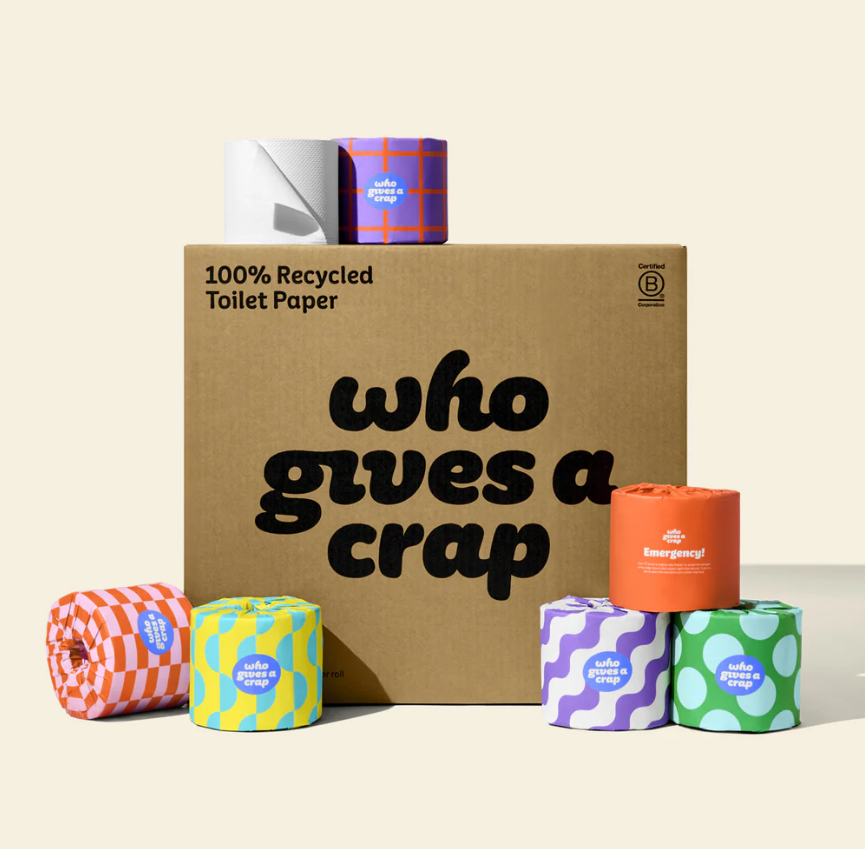
They use a bubblier typography style combined with funky patterns to convey their cheeky, fun, and vibrant brand identity, which helps set them apart from their more understated competitors. Still, they keep some sustainable branding elements like their blue and white logo palette and organic textures to keep them recognizable as a green brand.
How Do You Design an Eco-Friendly Logo?
To design an eco-friendly logo, use colors, typography, and symbols associated with sustainable branding while also keeping your brand identity in mind.
Let’s break down these elements in-depth:
What Colors Work Best for Sustainable Logos
Some of the best colors to use are:
- Green – Green is the color of most natural elements (like grass, leaves, and trees), which is why we subconsciously associate green with nature. It’s the most straightforward and effective way to signal yourself as a sustainable brand.
- Blue – Blue is the color of the sea and sky, which again is an easy way to link your brand to sustainability. Blue in color psychology also represents trust, stability, and serenity, which can help boost your brand’s credibility.
- Earth tones – Colors like brown, beige, clay, sand, and terracotta create a handcrafted, rustic, or natural feel. It’s a good way to make your brand feel more natural and organic while also adding a sense of coziness and warmth.
- Neutral colors – White, cream, charcoal, and soft gray can be used as accents to help other colors stand out while also making brands appear modern or minimal.
Using different shades can also change the feel of your logo. For example, emerald comes off as more mature and elegant, while lime green feels more vibrant and playful.
What Typography To Use for Sustainable Logos
Typography, just like color, vastly influences how customers perceive your brand.
The best typography styles to use are:
- Handwritten fonts – These fonts look organic, natural, and give off a handcrafted feel. They’re a great choice for small businesses that sell handmade products or organic goods.
- Rounded sans-serif fonts – The soft edges create a more approachable, friendly, and welcoming feel. It’s a solid choice for just about any eco-conscious business.
- Clean geometric sans-serif fonts – Geometric fonts have a modern, “techy” look that works particularly well for renewable energy companies or green technology startups.
- Serif fonts – Serif fonts work especially well for sustainable brands that want to emphasize craftsmanship, heritage, or premium quality, such as organic wineries, eco-friendly fashion labels, or natural skincare companies.
Regardless of which font you choose, prioritize readability over decoration. Your typography should remain clear whether it’s displayed on a product label, business card, website, or billboard, helping your logo stay recognizable across every touchpoint.
What Symbols Represent Sustainability in Logo Design
Symbols you can use for a nature-inspired logo are:
- Leaves
- Trees
- Mountains
- Rivers
- Water droplets
- Seeds
- Flowers
- Animals
- Recycling symbols
- Earth
- Sun
- Wind turbines
- Solar panels
Of course, you don’t need to use these elements literally all the time.
You can go abstract instead. Abstract imagery uses stylized shapes, lines, or forms to suggest sustainability rather than depict it directly. For example, instead of using a river icon to indicate water conservation, you can opt for a simplified flowing curved line. A circle can be used to convey connection and unity instead of two interlocked hands. And so on!
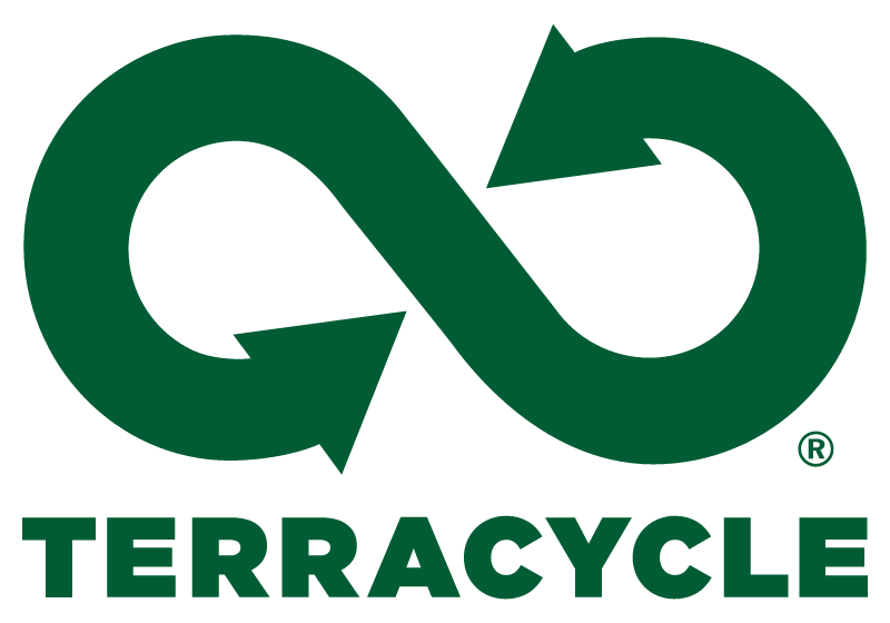
An example is recycling company TerraCycle’s logo. They used a stylized line with arrows pointing to each other to represent the circular economy and recycling, instead of the usual recycling symbol.
So, when should you use literal vs abstract symbols?
Literal symbols are great for new brands since direct symbols are easier to understand and remember. Meanwhile, abstract symbols are good for those who want to stand out and create a more distinct identity.
Both approaches work well. The right choice will depend on your audience, brand personality, or goals.
What Industries Benefit Most From Eco-Friendly Branding?
The most common industries that benefit from eco-friendly branding are organic food and beverage, organic skincare, sustainable fashion, renewable energy and environmental nonprofits. Still, any business with sustainability as part of its mission can use sustainability marketing.
Let’s take a closer look at these industries:
Organic food and beverage
Organic food brands can go for earthy color palettes, handcrafted typography, nature-inspired symbols, or badge-like layouts. These elements help suggest that the products are fresh, all-natural, and eco-friendly.
Organic beauty and skincare
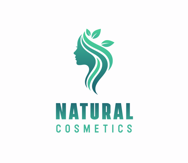
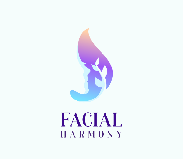
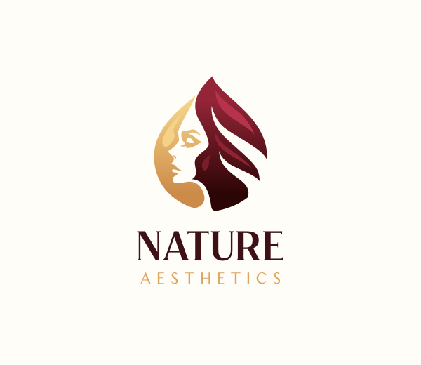
Natural skincare brands typically balance nature symbols with beauty elements that show femininity, self-care, and wellness.
Effective organic beauty logos often feature soft greens and sage tones, floral illustrations, line artworks, and delicate serif typography. These results in logos that feel elegant, premium, yet still approachable.
Sustainable fashion
Eco-conscious clothing brands often favor minimalist design. This means using neutral colors like beige, slate, soft gray, or ivory. Some also use darker shades like charcoal blue, garnet, or forest green. You’ll also see more elegant script typography or traditional serif fonts, simple icons, and spacious layouts to really give that modern minimalist feel.
Renewable energy
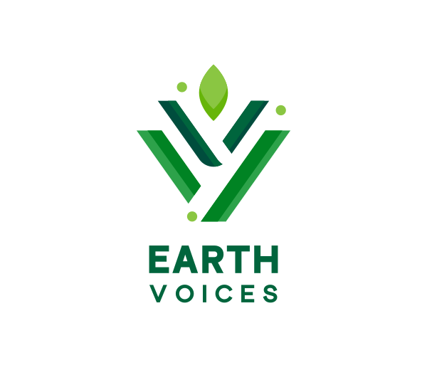
Solar, wind, and clean energy companies usually lean toward tech aesthetics.
Good design choices include: muted blue and green combinations, minimal geometric icons, geometric fonts or clean sans-serif fonts, circular or flowing shapes, and innovative use of negative space.
Environmental nonprofits
Conservation organizations, waste management companies, or environmental law offices should prioritize building trust and credibility in their brand. This means using logos that feature more direct symbolism, clean and corporate-style typography, and colors that don’t lean too bright or too dark.
Eco-friendly home products
Businesses selling reusable household products or sustainable cleaning supplies should go for designs that best exemplify their brand personality. These might include brighter greens and blue palettes (or even more experimental ones like pink or canary yellow), rounded and loose typography style, and more detailed icons.
Landscaping and gardening
While not necessarily focused on sustainability, these businesses also deal with nature and the environment so they could benefit from green branding as well. Below are some logo ideas that can help you convey care and connection with nature:
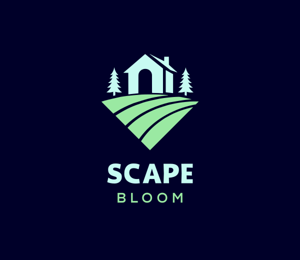
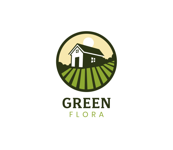
Famous Eco-Friendly Logos
Let’s now take a look at famous eco-conscious businesses and their logos to see how they nailed their sustainability marketing.
WWF
The World Wildlife Fun used a panda, a well-known endangered animal, to represent their mission. Even their color-palette choice is rooted in sustainability as well, as the founder specifically chose black and white to keep the printing costs low.
Whole Foods
Whole Foods combines simple yet elegant typography with a subtle leaf icon. The logo communicates freshness and natural ingredients without becoming overly literal.
Patagonia
Patagonia uses a mountain silhouette inspired by the Monte Fitz Roy range to reflect the brand’s deep connection to outdoor adventure and environmental conservation.
The Body Shop
The stylized circles are meant to evoke both a wreath and a crown. It’s the best balance to represent both natural ingredients and premium body care. Meanwhile, the color palette leans towards dark green: again to reinforce the company’s ethical positioning while also giving the brand a more sophisticated vibe.
Beyond Meat

Beyond Meat’s logo features a cow wearing a superhero cape, to better express their new brand positioning as a meat alternative that can help athletes win.
Ecosia
Ecosia’s logo shows a globe that seems to be spouting leaves, making its environmental mission of planting trees per internet search instantly recognizable.
Seventh Generation
Leaf logos are one of the most straightforward ways to showcase eco-friendliness, which is why it’s no surprise Seventh Generation uses one for theirs. However this logo also has a deeper meaning: it shows seven leaves stacked upon each other, with each leaf representing their company’s values. It’s also a witty nod to their name.
Native Shoes

Native Shoes uses a bubbly lowercase wordmark, with the word “shoes” tucked under the letter “e”. Rather than focusing on environmental symbols, they prioritized matching the casual and playful character of their branding with their logo.
Dr. Bronner’s
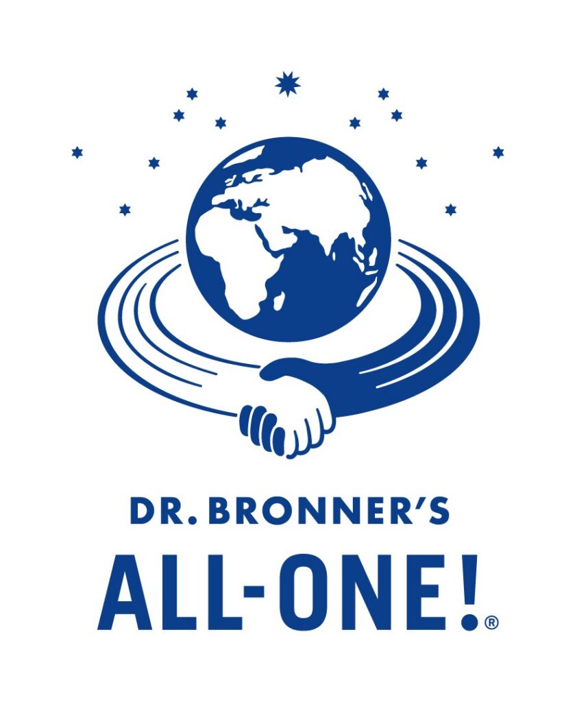
Dr. Bronner’s logo features a globe embraced by a protective hand, visually reinforcing the company’s philosophy of caring for both people and the planet.
EarthHero
EarthHero is an online marketplace dedicated to selling sustainable products. Their logo is a stylized tree with an arrow pointing to itself, as an abstract way of depicting recycling. The slightly rounded, thick font also lends a more friendly look to the brand.
Can an Eco-Friendly Logo Still Look Modern and Unique?
Absolutely! Eco-friendly logos can look more modern by pivoting away from the typical color palettes and symbols used in traditional green branding. This means embracing either a more minimalist font or going for bolder and more playful typography, using any color palette aside from green, blue, and brown, or opting for symbols that can best represent your brand identity rather than solely be about nature.
An example is Method. The company embraces a vibrant gradient color palette featuring purple, electric blue, pinks, and lime green. Aside from making their products instantly recognizable on store shelves, it also best represents their brand values of “shaking up the status quo”.

Nudie Jeans also avoids conventional eco branding. Their loose, ultra-casual handwritten logo shows that their brand focuses on boldness and individuality.

Aesop takes the opposite approach. The brand went for a simple black serif wordmark to give their brand a classic, chic, and premium appearance.
All of these brands promote sustainable and eco-friendly practices. It’s just that they reflect those on their products, ingredients, packaging, or initiatives rather than on their logos.
How To Avoid Greenwashing in Your Eco-Friendly Brand
Being a real, effective eco-friendly brand means real actions and not just a logo that is colored green or has a flower on it. Customers expect genuine efforts, and not just fancy claims or deceiving marketing campaigns.
To build trust:
- Let your products and business practices support your branding – Using organic and fair trade ingredients, sustainable packaging,ethical sourcing, environmentally responsible operations, and creating or supporting environmental causes will always speak louder than design alone.
- Make only sustainability claims you can support – Avoid making promises or claims that can’t be verified. If you mention using recycled materials, reducing emissions, or equitable supply chains, be prepared to provide evidence when customers ask.
- Use clear terms – Related to above is to avoid vague buzzwords like “100% green”, “all-natural”, or “the most eco-friendly shirt ever” in your marketing campaigns. Not only can these claims make your brand appear less trustworthy, but they may also create unrealistic expectations and even raise legal or regulatory issues. It’s best to use clear terms that show customers what exactly they are getting such as: “made with 100% certified organic cotton,” “packaged in 80% recycled materials,” or “manufactured using renewable energy.”
- Use recognized certifications where applicable – Certifications from reputable organizations can give customers greater confidence in your claims. Depending on your industry, labels related to organic ingredients, fair trade, recycled materials, or sustainable forestry can strengthen your brand’s credibility.
- Be transparent about areas where you’re still improving – It’s impossible to make every aspect of your business 100% sustainable right from the start. Acknowledging your goals, where you are at right now, your progress, and your plans builds more trust with your customers than pretending you’ve already achieved perfection.
- Keep your messaging consistent across your website, packaging, and marketing materials – Every customer touchpoint should reinforce the same sustainability story. Consistent branding helps customers understand your mission and makes your environmental commitments feel more authentic.
Conclusion
Whether you’re launching an organic skincare brand, a zero-waste refill store, or simply want your business to reflect your sustainable values, a well-designed eco-friendly logo can become one of the strongest foundations of your brand identity.
We hope our tips above plus our collection of nature-inspired logos have helped jumpstart your creative juices. If you’re feeling extra inspired, why not check out our related logo maker tools like flower logos or earth logos? You can also hop on to our website builder or LinkedIn banner maker to ensure your green branding comes across everywhere and not just in your logos.
Create your brand identity with BrandCrowd today!
Faviola Publico is an SEO Content Writer specializing in branding and digital marketing strategies. Outside of work, she enjoys reading slice-of-life novels and watching any mystery thriller-themed series.