Understanding Color Theory for Beginners
Color theory isn’t just for designers. It’s a great topic to delve into for branding experts and entrepreneurs who wish to take their graphics up a notch.
Understanding color theory is another way for you to express your feelings and brand traits effectively. Think of this as a tool to create a mood and evoke an emotion. Being able to do this makes you a better visual communicator.
It’s convenient to know about this topic as you could apply it to a variety of projects. Artists widely use the theory for paintings. At the same time, brands use it to create compelling graphic designs for social media posts, billboards, and more. You could even incorporate it in film, web design, photography, makeup, the list goes on and on.
We’re tackling this theory to help you become more informed and more aware of how you can apply this in your work.
Take a look at the overview of topics we’re discussing below.
What is Color Theory?
Color theory is a systemic approach to curating colors for a palette and mixing. In simpler terms, it is a guide to picking colors that look good together. This helps designers use science to help them create combinations that look well-matched every time.
To apply this, designers use the color wheel with the help of geometry to identify which colors go well together in harmony or contrast. It requires a combination of art and science for it to work.
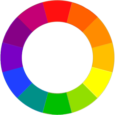
But what is the color wheel?
The color wheel, also referred to as the color circle, was created by Isaac Newton when he discovered the light spectrum.
However, the color wheel commonly used today was created by Johann Wolfgang von Goethe as a result of his own investigation. This circle represents the color spectrum that illustrates the relationship of the primary, secondary, and tertiary colors together.
The Meaning Behind Colors
The wheel can be separated into two different categories, which are warm and cool. The changes in color temperature shape the mood of a design. For example, warm colors such as red and orange appear more approachable, while cool tones like green and blue may seem more distant or serene.
Plus, we see this at play in daily lives through the form of expressions. Ever notice how we use colors to capture emotion, such as “green with envy” when someone is jealous or “feeling blue” when someone is sad.
Some colors even have a physical effect on consumers. For example, yellow and red are known to encourage appetite among the audience. So now you know why brands like Coca-Cola or McDonald’s use this to present themselves to the market.
The psychology behind colors presents an opportunity for you to improve your brand image using science.
It is a popular fact that consumers assign unique human traits to color. In addition, research has found that it may vary according to a person’s culture. But here is the quick rundown of what colors generally mean to consumers.
- Red – Passion and celebration
- Orange – Creativity and youth
- Yellow – Joy and energy
- Green – Nature and health
- Blue- Professionalism and innovation
- Violet – Royalty and faith
- White- Purity and harmony
- Pink – Innocence and playfulness
While you could certainly choose colors according to your mood, there is a structured approach to creating a color palette. The following section will tackle how you can go about applying these colors through a bulletproof technique.
The Six Color Harmonies
The color wheel offers a unique technique that you can use to create color chords. You can use this to determine which colors go well with each other.
Learning about the possible combinations that you can make with the wheel gives you the chance to improve your process of mixing and matching color. This is helpful for times when you’re not sure of what colors will be compatible with the colors you already have in your design.
There are six types of color schemes that you can create out of the color wheel. The best part is it works regardless of the shade or hue you want to use.
Check them out below.
Monochromatic colors
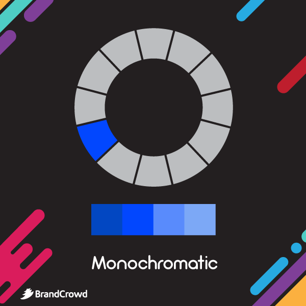
This color chord uses a single color. The monochrome palette is composed of various shades, tints, and tones from one family. This creates visual depth with only one color, resulting in a unified look with minimal visual clutter. The challenge for this scheme is it limits designers to one color, which puts them at risk of creating an unappealing design.
Where can you use this?
You can use this combination for graphic design materials that require a lot of coherence, such as web design or a PowerPoint template.
Complementary colors
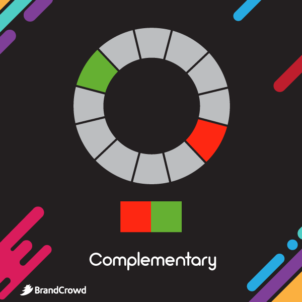
Also known as the supplementary or contrasting combination. The color on the opposite side of the wheel creates a contrasting scheme. It’s a method that produces vibrant palettes that can catch the attention of your audience. For example, the warmth of the color orange goes well with the cool shade of blue.
Where can you use this?
The nature of this color scheme makes it applicable for call-to-action buttons and other vital parts of your design.
Triadic colors
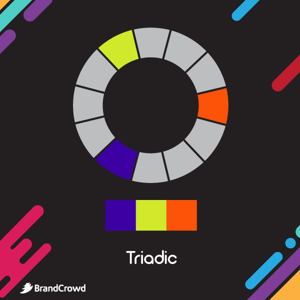
From its root word “tri,” this color scheme features a group of three colors in the wheel selected by an evenly spaced triangle. This results in a balanced design that features both warm and cool colors. An example of this is orange, green, and violet.
Where can you use this?
A triadic color scheme is versatile, but it becomes especially beneficial for charts, infographics, and other projects that tackle two or more subjects. This is because it creates a striking visual divide.
Analogous colors
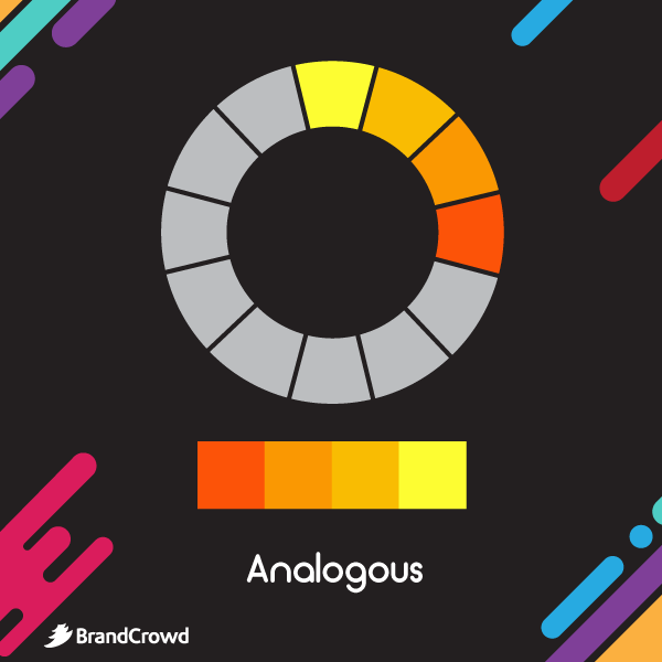
Similar to the triadic combination, an analogous color scheme consists of three different colors that are next to each other. It helps you whip up a design that has a similar look and a natural gradient, all while introducing some variety in colors. An example of this is red-orange, orange, and yellow.
Where can you use this?
Similar to monochromatic colors, you can use this for graphs or even carousel social media posts.
Split complementary colors
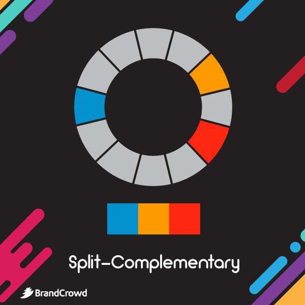
This harmony is a combination of complementary and analogous colors. It is created by selecting a color, its complement, and adjacent colors. For example, split complementary colors in the wheel include blue, yellow, and orange-red. This type of combination creates a vibrant yet subtle look to a design.
Where can you use this?
Since this scheme has a strong contrast with minimal tension, it is a smashing choice for illustrations, logos, and the like.
Tetradic colors
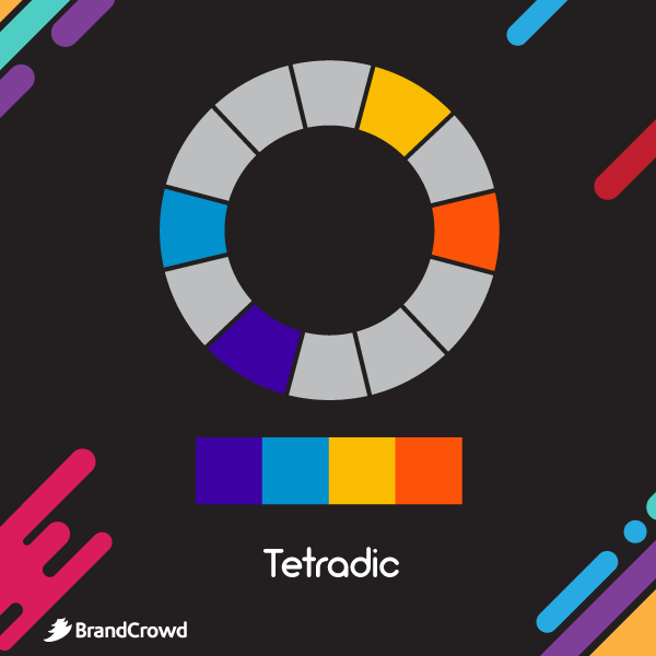
The tetradic color harmony is composed of four different colors. It is also referred to as double complementary because it uses two sets of complementary colors. An example of a tetradic color scheme is yellow-green, orange, light blue, and purple. The variance of colors will give your design an eye-catching look, but it may also oversaturate it when done improperly.
Where can you use this?
The harmony is suitable for any big graphic design project like illustration or magazine layouts. But designers recommend not to use every single color equally and instead use some of the colors as accent colors to keep the design subtle.
Bonus Tip

If it’s taking a while for you to get the hang of the color wheel, you can make the process easier by using a color palette generator online. These tools come with options for you to generate combinations by selecting what color harmony rule you want.
In addition, some online tools also provide color codes. This feature makes the color combinations easy to reference and use on different projects.
Conclusion
With a better understanding of color comes improved design concepts. This is helpful, especially if you are an artist who is just starting out or a branding expert who isn’t super familiar with graphic design concepts.
So get ready to apply what you’ve learned today. A color circle paired with your knowledge of color theory is a game-changing tool for brand logos, banner ads, and flyers, among other design projects.
Bring your concept to life by running a design contest on DesignCrowd. It is a crowdsourcing platform that lets you work with freelance graphic designers to design your logo, T-shirt design, and other graphic design projects. You can post your design brief and concept to get them started. Get up to 50 submissions today.
BrandCrowd is an excellent option for those who want to DIY. It has an easy-to-use tool that functions as a logo maker, business card maker, social media post maker, and more. You can personalize a design you need and express yourself through color, illustration, and other design elements. Try it today.
