Who Changed Their Look? A Mid-2025 Roundup of Brand Logo Updates
Logos don’t stay the same forever. Brands change, and their logos change with them. Some updates are tiny. Others are a complete reset. Either way, they tell you something about where a brand is heading.
The first half of 2025 already saw plenty of changes. Tech brands went sharper and simpler, and fashion labels kept chasing that stripped-down look. After years of sticking to the same thing, a few old household names cleaned up their image.
For small businesses without a design team, using a logo maker has been the go-to way to keep up.
Why does it matter? A new logo can mean a new direction. It can also be a way to look fresh on today’s screens. Some updates got a thumbs up. Others left people asking what was wrong with the old one. c
Here’s a look at the most significant changes so far in 2025.
Key Takeaways
- Trends in 2025 favor simplicity and clarity: Logos are becoming flatter, typography-led, and softer in color to adapt better to digital platforms.
- Logo updates must be purposeful: Successful redesigns reflect real strategic shifts, while poorly received changes show the risks of alienating loyal customers.
- Small businesses can compete with smart tools: Even without large design teams, affordable logo makers allow testing and refining identities in line with modern trends.
Why Brands Update Their Logos
Logos change for a reason. Sometimes it’s about staying current. Other times, it’s about signaling something bigger inside the company. Here are some of the most common reasons brands decide it’s time for a refresh:
- Staying modern: Design trends move fast. A logo that looked sharp 10 years ago might feel dated today. Brands update to keep their image fresh.
- Digital fit: Logos must work on small screens, apps, and social media icons. Older logos are often simplified to scale better online.
- New strategy: A logo can show that a brand is shifting direction. It could mean new services, new markets, or a new vision.
- Reaching new audiences: Companies want to connect with younger or broader groups. A modernized look can help them feel relevant.
- Ownership or mergers: A new logo often signals the latest chapter when businesses combine or change hands.
- Consistency across markets: Global brands sometimes simplify or unify their logos to look the same everywhere.
Mid-Year Logo Trends in 2025
Trends don’t mean every logo looks the same. But they do show what many companies are aiming for this year.
1. Simpler, flatter designs
More brands are stripping down details and moving toward clean, flat marks. This approach is easier to use across digital platforms and avoids the heavy, textured look that doesn’t scale well on screens.
Flat logos also age more slowly. They tend to hold up longer in different contexts without gradients or shadows, which makes them safer in the long term, especially for big companies that can’t rebrand often.
2. Typography in focus
Many logos now rely more on the wordmark than on a symbol. Big, bold typefaces with minor tweaks give brands a distinct look without extra graphics.
This shift also reflects how people interact with brands online. The name becomes the logo’s most recognizable part, so making the text clear and strong matters more than adding a decorative icon.
3. Softer colors and palettes
Bright primary colors are being swapped out for softer, muted tones. Brands want to appear approachable and timeless rather than loud.
These palettes also feel easier on the eyes when viewed constantly on screens. Subtle gradients and calming tones align with how people consume digital content now.
4. Heritage with a modern twist
Some companies are reaching back to older versions of their logos for inspiration. They bring back classic elements but simplify them for today.
This approach gives a sense of continuity. It respects the brand’s history while keeping the design usable across modern platforms. It’s especially common in long-standing consumer brands that want to remind people of their roots.
Major Brand Logo Updates
Logos changed across industries in 2025. Some were minor adjustments, others were bold shifts.
Here’s a look at the most significant updates so far this year.
Adobe
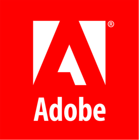
Old logo
Adobe made one of the most notable identity updates of 2025. At first glance, the logo looks familiar, but a closer look shows a careful rethink of how the brand presents itself.
The biggest shift is in the wordmark. For decades, Adobe’s “A” was defined by negative space. That space has been filled in the new design, turning the letter into a solid form. It’s a small change, but it changes the feel of the logo. The brand now reads as firmer, more grounded, and more contemporary.
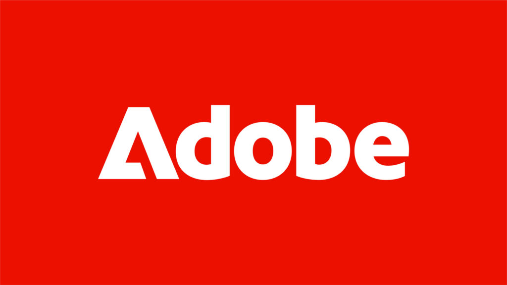
New logo
Typography also got an update. Adobe introduced Adobe Clean Display, a crisp and adaptable type style meant to look good across screens and in print and age well without chasing trends. These updates give Adobe a stronger, more coherent system while keeping the parts people already know.
Amazon
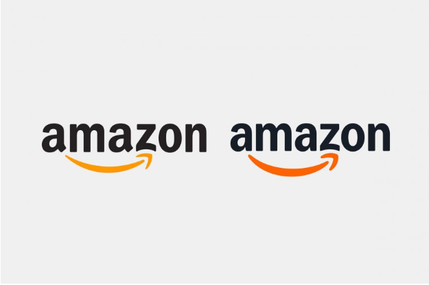
Amazon updated its logo with the help of Koto, a design agency. The changes were subtle but meaningful. The arrow smile was refined, the typography was modernized, and the overall mark feels more balanced.
The refresh aims to give Amazon a sleeker, more digital-first image without losing its recognizable look. It’s not a radical change but a polish that makes sense for a global platform used daily on screens.
Colgate-Palmolive
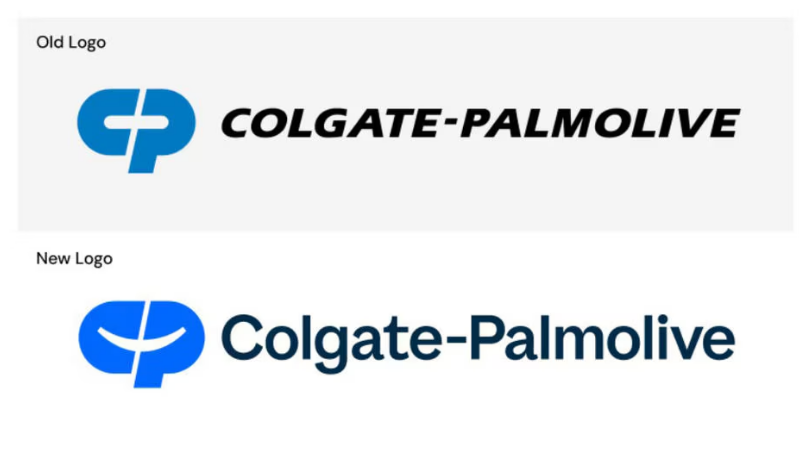
Colgate-Palmolive rolled out a refreshed corporate identity in August 2025, pairing a new logo with a meaningful “Make More Smiles” tagline. The update is less about flashy visuals and more about expressing purpose and clarity.
The new logo uses a brighter, more vibrant blue. Cleverly, the white space between the letter “C” and the letter “P” creates a subtle smile—simple but effective. The tagline reinforces that optimistic tone and speaks to the company’s mission of promoting healthier futures for people, pets, and the planet.
To support the refresh, Colgate-Palmolive introduced a more cohesive visual system: modernized photography, streamlined iconography, and a design language that works consistently in digital and print formats worldwide.
Cracker Barrel
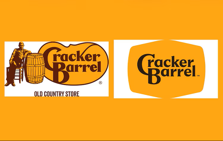
Cracker Barrel rolled out a brand-new logo on August 19, 2025, as part of a broader push to modernize the chain: brighter interiors and pared-back décor.
The old logo featured a man leaning on a barrel, often called “Uncle Herschel,” but the new one stripped away that character altogether, leaving only a streamlined barrel shape and a simple wordmark.
The company’s leadership, led by CEO Julie Felss Masino, saw it as a step toward relevance. With sales and traffic slipping, especially among younger guests, they believed a cleaner look and a minimal logo could appeal more broadly while still nodding to the brand’s heritage.
Longtime customers felt the redesign erased the brand’s soul. Social media lit up with complaints calling the new logo “soulless” and “generic,” criticism that echoed across conservative circles, where many labeled the change “woke.” The stock dropped nearly 10–12%, costing the company ~$100 million in market value. Even President Trump weighed in, urging Cracker Barrel to return the old logo.
Within a week, Cracker Barrel announced it would restore the old logo, including Uncle Herschel, saying they had listened to customer feedback and realized their mistake.
Eventbrite
Eventbrite refreshed its logo and visual identity in early 2025 to shift from a basic ticketing site to a cultural hub for real-life connections. They introduced a new symbol called “The Path,” a dynamic, brush-stroke–style mark intended to represent the journey from discovering an event to experiencing it in person.
This change responds to shifting user behavior. Eventbrite found that 95 % of young adults want to bring their online interests into real-life experiences, and the brand needed visuals that express that emotional journey, one that starts with curiosity and ends with shared memories.
Beyond the new mark, Eventbrite overhauled its look across the board. The app update, done with Instrument, now features neon-accented palettes, expressive gradients, custom illustrations, and bold type to infuse energy and flexibility into every touchpoint.
Korean Air
Korean Air updated its “taeguk” emblem, making it more straightforward and more balanced. The wordmark was also modernized with a cleaner type. The changes extend to the airline’s livery, giving planes a fresher look while keeping ties to Korean heritage.
The goal was to keep the identity recognizable but make it work better in global contexts. The simplified design ensures consistency across physical and digital environments, from aircraft tails to mobile apps.
La-Z-Boy

La-Z-Boy launched its first full brand refresh in over 20 years as part of its lead-up to the 100th anniversary, reporting one of its most significant updates ever. The goal was to shift from being known as a recliner maker to becoming a modern lifestyle brand rooted in comfort and calm.
The new logo draws on the classic lean of its 1927 mark, but with a modern, handcrafted wordmark that looks soft and inviting. Every curve of the letters echoes the feel of sinking into a recliner. The italic tilt of the lettering even suggests relaxation and ease. The refreshed palette uses warm, grounded tones: earthy hues and midnight shades that feel comforting and timeless.
This branding is more than just a logo. La-Z-Boy wanted it to feel like an exhale… something people actually feel, not just see. And so the new design shows up across packaging, stores, digital spaces, and internal materials as part of a full sensory and visual system that invites rest and comfort everywhere.
OpenAI

OpenAI updated its logo and brand identity in 2025, the first significant change since the company started. The new blossom mark looks cleaner, with more space in the middle and smoother lines. It’s easier to use at different sizes on apps, websites, or products like ChatGPT.
They also introduced a custom typeface called OpenAI Sans. The letters are geometric but not too stiff. For example, the letter “O” is a perfect circle on the outside but slightly uneven inside, which makes the design feel more human and less machine-like.
The color palette was refreshed with calm grays and blues, and a new circular “point” graphic was added to show movement and focus. This reflects how OpenAI has grown from a small research lab into a global company with an identity that feels both simple and approachable.
UGG
UGG (Since 74), a family-run boot maker on Australia’s Gold Coast, has been selling sheepskin boots since the 1970s. In Australia and New Zealand, “ugg” is a generic name, and the company could keep using “UGG Since 1974.”
However, internationally, UGG is a registered trademark owned by Deckers Outdoor Corporation, giving Deckers exclusive rights in over 130 countries. Because of this, since 1974, Ugg has had to drop that name for exports and rebrand as Since 74.
The legal fight started in 2016, when Deckers sued Australian Leather, the parent company of UGG (since 74), for using “ugg” outside Australia and New Zealand. Ugg Since 1974 challenged the trademark in Australia and won locally. However, it faced ongoing court pressure and social media restrictions internationally. The rebrand to Since 74 outside its home market became unavoidable.
Despite the name change, the company remains true to its roots. Todd Watts, grandson of the founders, said the product, craftsmanship, and their story didn’t change.
Walmart
Walmart refreshed its Spark logo and wordmark at the start of the year. The changes are subtle, with cleaner lines, refined typography, and a new motion system that brings the spark to life in digital contexts.
This rebrand reinforces Walmart’s push to present itself as modern and tech-driven while keeping its identity familiar to millions of shoppers. The spark remains central, but the design works better across all media.
Lessons for Businesses
Big brands have the money and teams to manage logo changes carefully. Smaller businesses don’t, but there are still lessons to take:
- Update with a reason. A logo change should match a fundamental shift in your business, not just fill time or make noise.
- Keep it simple. A logo that works on a phone screen will stay clear and recognizable anywhere.
- Respect your history. Keep elements people already know and trust, even if you simplify them.
- Test reactions first. Share ideas with customers before a full rollout. A logo maker can help you create options to test without spending much.
- Think long term. Trends fade quickly, but a solid logo should stay relevant for years.
Conclusion
Logos are never really finished. They shift along with the brand, the market, and the tools people use to interact with them. The first half of 2025 showed many changes, from careful refinements to bold redesigns.
Some updates landed well, and others reminded us how attached people are to the logos they know. The takeaway for businesses of any size is simple: a logo is more than a graphic. It’s a signal of who you are and where you’re going.
If you’re running a small business and don’t have a big design team, tools like BrandCrowd can help. Our tool lets you create and test logo ideas quickly, so you can explore options without spending a lot before making a final choice.