FIFA World Cup Logo History
Every four years, something incredible happens.
The world seems to hit pause as billions of people gather in stadiums, sports bars, living rooms, and city squares to watch one tournament: the FIFA World Cup.
Even if you’ve never watched a football match before, chances are you’ve heard of it. It’s the biggest sporting event on the planet, bringing together the best national teams from around the world to compete for football’s most prestigious trophy. Legends are made, unforgettable moments are created, and entire nations celebrate together.
But before a single ball is kicked, another symbol quietly begins its journey around the world: the official FIFA World Cup logo design.
In this article, we’ll take a journey through the complete history of FIFA World Cup logos!
What Is the FIFA World Cup?
The FIFA World Cup is an international football tournament where the world’s best men’s national teams compete to become world champions. Organized by the Fédération Internationale de Football Association (FIFA), the tournament takes place every four years and is considered the biggest event in football.
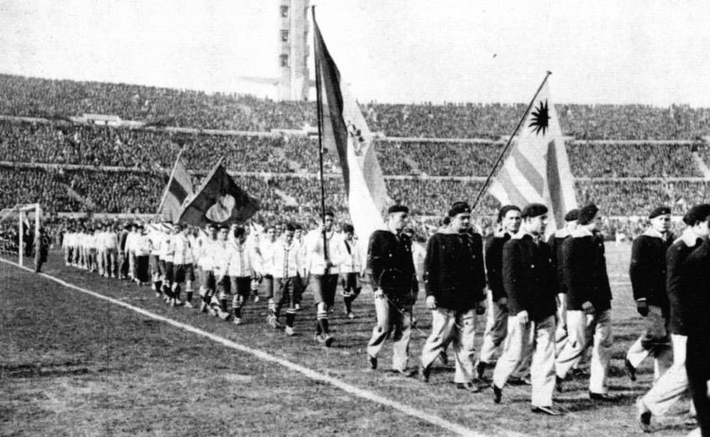
The competition began in 1930, with Uruguay hosting the first tournament and winning it! Since then, it has grown into one of the most-watched sporting events in the world, attracting billions of viewers across television and digital platforms.
Beyond the matches themselves, every FIFA World Cup has its own identity. From the official mascot and theme song to the tournament poster and logo, each host nation introduces unique designs that celebrate its culture while showcasing football’s global appeal.
Among these, the official World Cup logo stands out as the symbol that represents the tournament for generations to come.
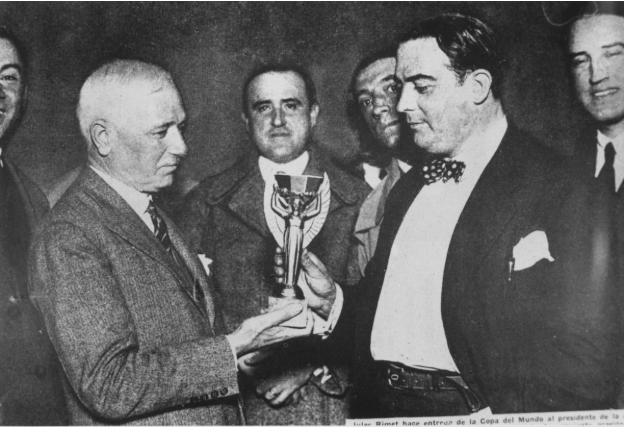
Winning the FIFA World Cup is the highest achievement a national football team can earn, making every match a battle for sporting history.
The FIFA World Cup Logo History
Since the first FIFA World Cup in 1930, every tournament has featured its own official logo, each reflecting the culture, identity, and spirit of the host nation.
Let’s take a look at how the FIFA World Cup logo has evolved through the decades, one tournament at a time:
Era 1: The Poster Years (1950 – 1966)
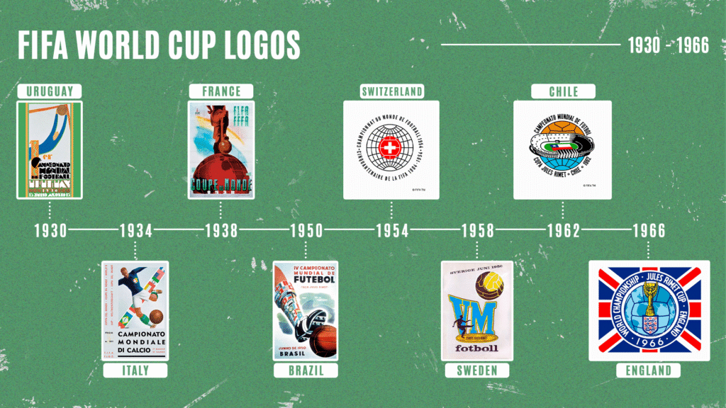
1930 – Uruguay
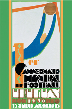
The inaugural FIFA World Cup in Uruguay featured an Art Deco-style poster showing a goalkeeper diving to make a save. Bold geometric shapes, vibrant colors, and dramatic movement reflected one of the era’s most popular art styles.
Since the tournament was completely new, there was no official logo yet. The poster itself became the face of football’s first World Cup.
1934 – Italy
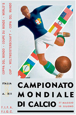
Italy’s 1934 tournament continued the poster tradition with a powerful illustration of a footballer striking the ball. Inspired by the bold artistic style popular in Europe at the time, the design emphasized strength, athleticism, and national pride.
Like its predecessor, it served as promotional artwork rather than a standalone tournament logo.
1938 – France
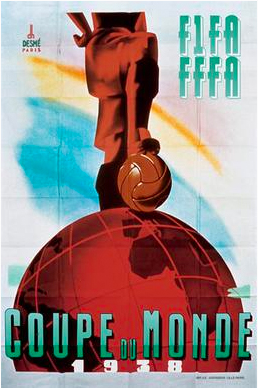
France’s official poster took a more symbolic approach. It featured a footballer holding a globe football above his head, symbolizing the international spirit of the competition. The artwork hinted at the World Cup’s growing global importance while maintaining the detailed illustration style that defined the tournament’s early years.
1950 – Brazil
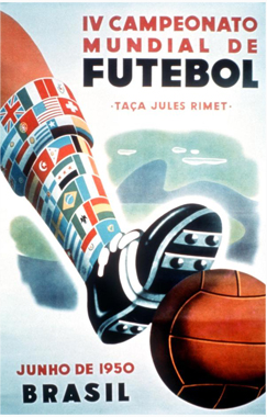
After a 12-year break due to World War II, the World Cup returned to Brazil with what is considered the tournament’s first official emblem. Although still designed very much like a poster, it introduced a more recognizable visual identity. Hand-drawn typography, the green and yellow colors of the Brazilian flag, and Portuguese text proudly celebrated the host nation.
At this stage, FIFA wasn’t focused on creating a consistent global brand. The World Cup was simply an international football tournament, and each host country was free to express its own identity through the design.
1954 – Switzerland
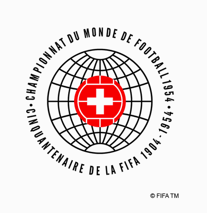
The 1954 tournament marked an important turning point in World Cup logo history. Switzerland introduced a cleaner, more recognizable emblem featuring a football with the white Swiss cross placed over a subtle globe. Around it appeared the tournament title in French, German, and Italian, reflecting Switzerland’s multilingual culture.
Unlike previous poster-style artwork, this design worked well as a standalone logo. It established many of the visual elements that future World Cup emblems would continue to use, including the combination of football, national identity, and global symbolism.
1958 – Sweden
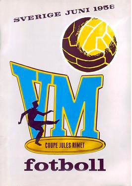
Sweden moved slightly back toward the poster approach with a busier design centered around the initials “VM,” the Swedish abbreviation for World Championship. The logo also featured a footballer, a ball, and Sweden’s iconic blue-and-yellow colors.
While colorful and energetic, the design felt more like promotional artwork than a lasting tournament identity, showing that the World Cup was still searching for a consistent visual style.
1962 – Chile
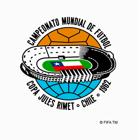
Chile introduced one of the most creative concepts of the early World Cups. At first glance, the emblem resembles a stadium viewed from above. Look closer, however, and it also forms a globe, with the Chilean flag standing proudly at its center.
The clever design symbolized both the host nation and football’s worldwide reach. It carried even greater meaning because Chile successfully hosted the tournament just two years after the devastating 1960 Valdivia earthquake, the strongest earthquake ever recorded.
1966 – England
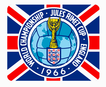
England’s 1966 emblem brought together more visual elements than any previous tournament. It combined a football, a globe, the famous Jules Rimet Trophy, England’s Three Lions crest, and the Union Jack into a single design.
Most notably, it became the first World Cup emblem to prominently feature the tournament trophy itself. Although the logo was more detailed than modern designs, it hinted at a future in which the World Cup would develop a stronger, more recognizable visual identity.
Era 2: The Geometric Shift (1970 – 1986)
1970 – Mexico
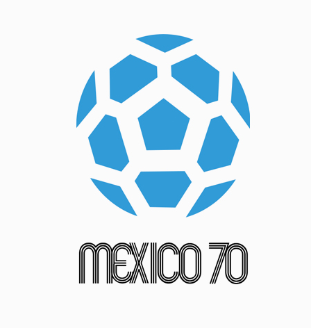
Everything changed in Mexico.
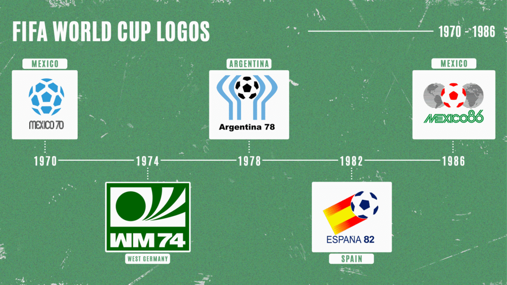
The 1970 World Cup introduced the first truly modern tournament logo. Instead of using an illustrated scene, it featured an abstract football above the bold “MEXICO 70” lettering inspired by the country’s famous 1968 Olympic branding.
Using only blue and white, the logo was simple, striking, and instantly recognizable. More importantly, it worked on everything from tickets and posters to television broadcasts and merchandise. More than 50 years later, it still feels surprisingly modern.
1974 – West Germany
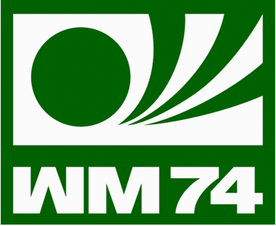
West Germany embraced the “less is more” philosophy.
Its logo used a single green color and a series of bold geometric shapes that formed both a football and the motion of a player kicking it. The simple “WM 74” text completed the design, creating one of the cleanest World Cup logos ever made.
It proved that a memorable logo didn’t need lots of detail to make an impact.
1978 – Argentina
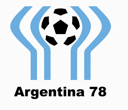
Argentina brought national pride into modern logo design.
The emblem wrapped the iconic sky blue and white colors of the Argentine flag around a classic football. The flowing shapes could also be seen as raised arms, welcoming hands, or even the curves of a football stadium.
It was elegant and meaningful, showing how a logo could tell several stories with just a few simple lines.
1982 – Spain
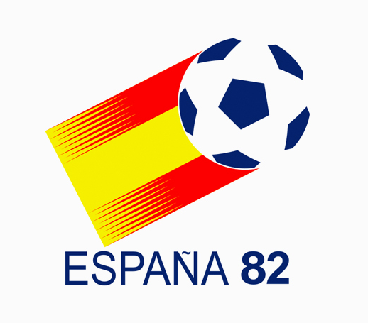
Spain kept things simple and colorful.
Its logo featured a football flying through the air with red and yellow streaks inspired by the Spanish flag. While it wasn’t as symbolic as Argentina’s design, it was clean, energetic, and easy to recognize.
The logo also reinforced a growing trend of incorporating each host nation’s colors into the tournament’s visual identity.
1986 – Mexico
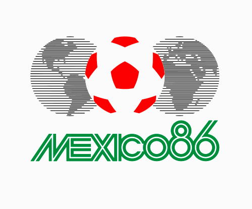
When Mexico became the first country to host the World Cup twice, it introduced another memorable logo.
The design placed a football between the halves of a globe, alongside the slogan “The World United by the Ball.” It also updated the bold typography that made the 1970 logo so iconic.
The combination of the globe and football became a defining theme in many future World Cup logos, underscoring football’s ability to connect fans across every continent.
Era 3: The Globe-and-Trophy Period (1990 – 2010)
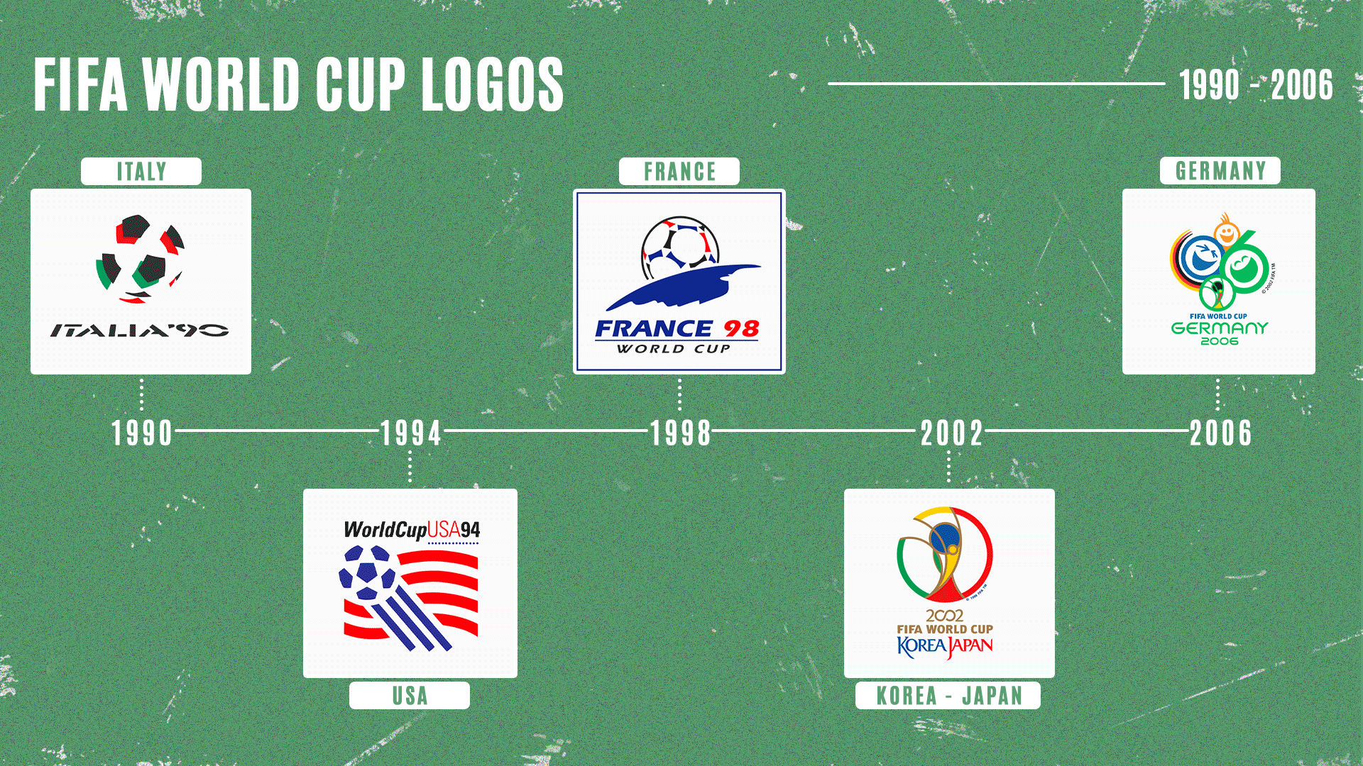
1990 – Italy
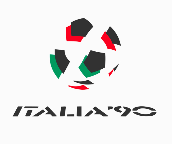
Italy kicked off the decade with a bold geometric logo made from green, white, and red shapes inspired by the Italian flag. The abstract football design continued the minimalist approach introduced in the 1970s while giving it a fresh national identity.
Simple and modern, it proved that geometric design still had plenty of life left.
1994 – United States
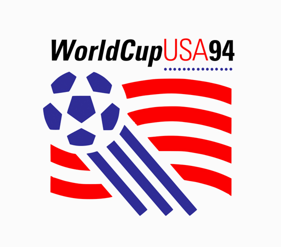
The United States took a more patriotic approach by combining a football with the American flag. Blue stars appeared across the top, while flowing red and white stripes added a sense of speed and movement.
Although the design captured the excitement of hosting the tournament, it packed too many visual elements into a single logo. Even so, it showed how host countries were becoming more confident in showcasing their own identity.
1998 – France
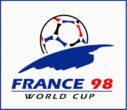
Many fans and designers consider the 1998 FIFA World Cup logo one of the greatest ever created.
The emblem featured a football rising over the horizon like the sun, using the blue, white, and red colors of the French flag. Clean lines and clever use of negative space gave the logo a timeless look that still feels modern today.
Its simplicity proved that sometimes, less really is more.
2002 – South Korea/Japan
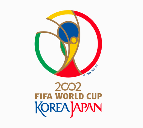
The 2002 FIFA World Cup was historic as the first tournament hosted by two countries.
To represent both nations, the logo featured an abstract figure set against a circular shape inspired by the FIFA World Cup Trophy. The design symbolized unity, movement, and the tournament’s shared spirit.
More importantly, it marked the beginning of a new design direction. From this point on, many World Cup logos would incorporate the iconic trophy shape into their identity.
2006 – Germany
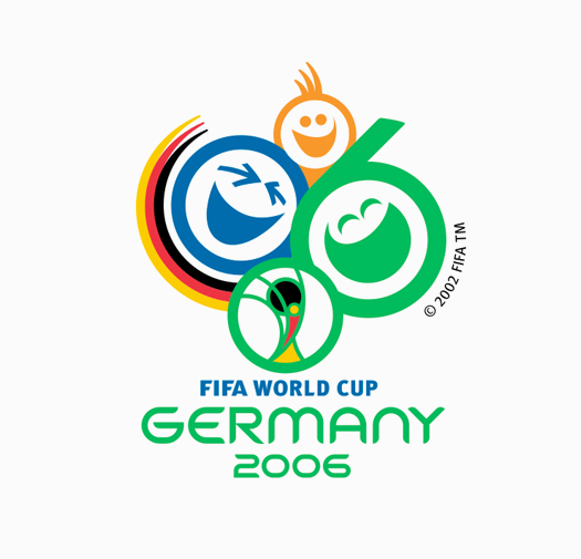
Germany took a very different approach by focusing on emotion rather than geometry.
Nicknamed “Celebrating Faces of Football,” the logo featured three smiling faces, with two cleverly forming the numbers “0” and “6” in 2006. Bright colors and friendly expressions reflected the joy of fans coming together to celebrate the beautiful game.
While it wasn’t as iconic as some of its predecessors, it stood out for putting happiness and togetherness at the heart of the tournament.
Era 4: Cultural Specificity (2010 – 2022)
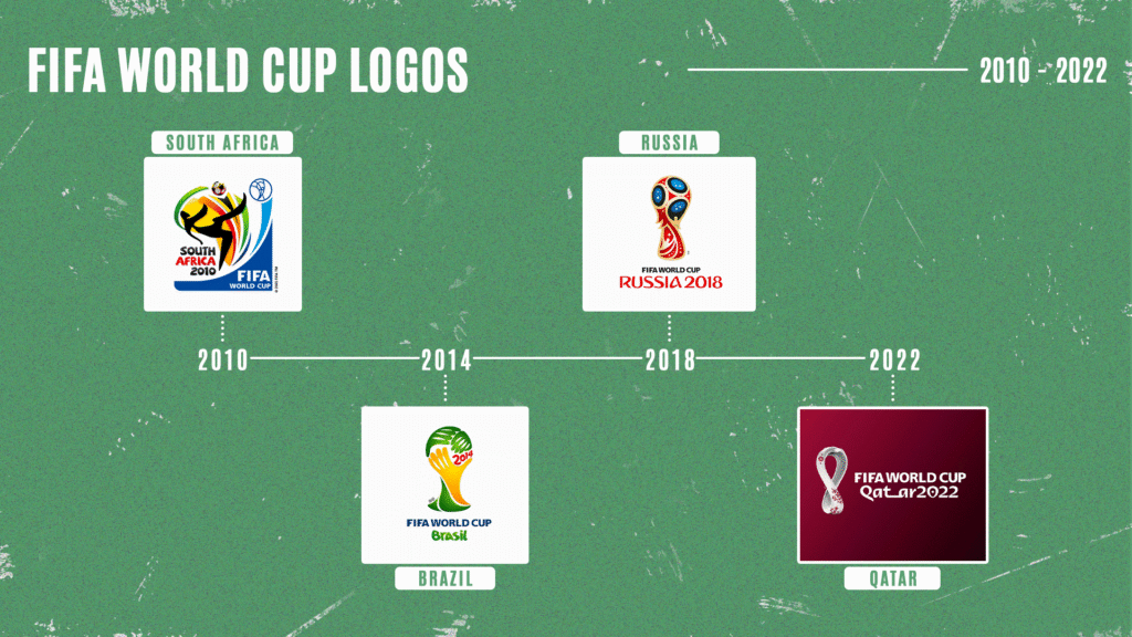
2010 – South Africa
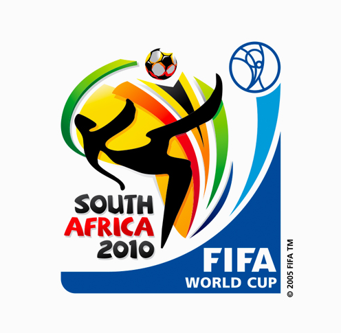
South Africa set the tone for a new era.
Its logo featured a footballer performing a bicycle kick using flowing ribbon-like shapes, with the ball cleverly created through negative space. Bright colors inspired by the South African flag and African art gave the design incredible energy and movement.
As the first FIFA World Cup held in Africa, the logo proudly celebrated both the host nation and the continent’s rich culture.

This is also the era where the World Cup’s official song is Shakira’s “Waka Waka,” which became famous worldwide! Listen to the song here:
2014 – Brazil
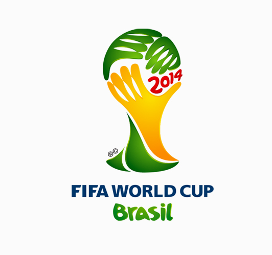
Brazil took a bold and creative approach by forming the FIFA World Cup Trophy with three hands reaching upward.
The concept represented unity, celebration, and Brazilians’ passion for football. However, the design also became one of the tournament’s most talked-about logos for an unexpected reason. Many people felt the hands resembled someone covering their face, and the internet quickly turned the logo into a popular meme.
Despite the mixed reactions, it remains one of the most recognizable World Cup logos ever created.
2018 – Russia
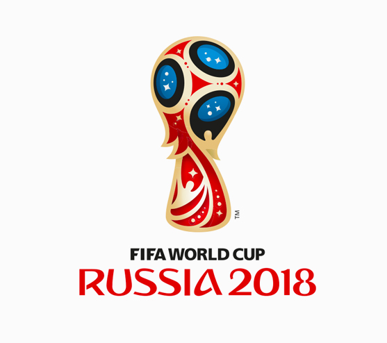
Russia delivered one of the strongest designs of the modern era.
The logo used the silhouette of the FIFA World Cup Trophy, decorating it with elegant red, blue, and gold patterns inspired by Russian folk art and the country’s achievements in space exploration. The result was both modern and unmistakably Russian.
It proved that a logo could celebrate local culture while still feeling clean, iconic, and instantly recognizable worldwide.
2022 – Qatar
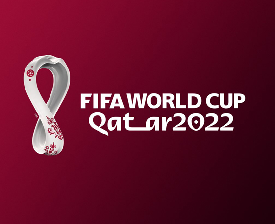
Qatar pushed cultural storytelling even further.
Its logo featured a flowing white loop that resembled both the number 8, representing the tournament’s eight stadiums, and the infinity symbol, reflecting football’s lasting impact. The shape was also inspired by traditional Gulf woolen shawls and echoed the curves of the World Cup Trophy.
Paired with elegant typography influenced by Arabic calligraphy and Qatar’s signature maroon color, the logo celebrated the country’s heritage while introducing something completely different from previous tournaments.
FIFA World Cup 2026 Logo
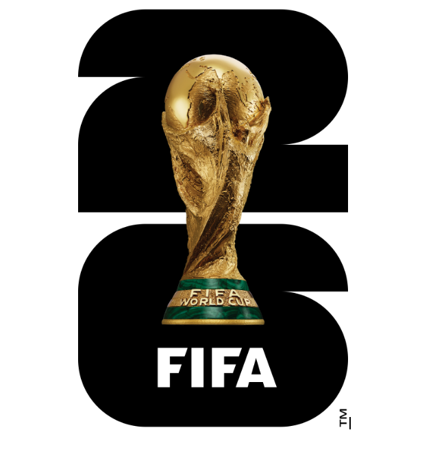
If there’s one FIFA World Cup logo that completely breaks tradition, it’s the 2026 edition.
For decades, World Cup logos hinted at the famous trophy without ever showing it directly. Designers used footballs, globes, abstract trophy shapes, and creative symbols to represent the tournament. Even logos like Brazil 2014, Russia 2018, and Qatar 2022 borrowed only the trophy’s silhouette, rather than displaying the real thing.
The 2026 logo changes that completely.
Instead of an abstract design, the official emblem features a realistic gold FIFA World Cup Trophy front and center, boldly sitting over the number 26. It’s the first time in World Cup history that the actual trophy itself has become the main feature of the tournament logo.
The message couldn’t be clearer: when fans see the logo, they instantly know what it represents.
But there’s more happening beneath the surface. The number 26 wasn’t simply chosen because of the year. Its custom typograph is built from geometric shapes that represent the tournament’s expanded format of 48 participating nations, while also referencing the square football pitch and the round ball. It’s a subtle design detail that gives the logo more meaning than it first appears.
The branding system also goes far beyond a single logo. Since the 2026 FIFA World Cup will be hosted across Canada, Mexico, and the United States, each of the 16 host cities has its own customized version of the emblem. Every variation keeps the iconic trophy and “26” while incorporating local colors, landmarks, and cultural elements, creating one of the most flexible World Cup branding systems ever developed.
Compared to visually rich logos like Russia 2018 or Qatar 2022, the 2026 emblem is much simpler. Some fans love its clean, modern look, while others feel it lacks the artistic personality of previous tournaments.
Regardless of opinion, one thing is certain: the 2026 FIFA World Cup logo marks one of the biggest design shifts in tournament history. After decades of symbolizing the trophy, FIFA finally put the real prize on the badge, creating an emblem instantly recognizable to football fans worldwide.
Final Thoughts
The FIFA World Cup is much more than a football tournament. It’s a global celebration that brings together billions of fans, unforgettable moments, and cultures from every corner of the world. Its official logo has evolved over the decades to reflect that journey, transforming from simple promotional posters into powerful symbols that capture the spirit of each tournament and its host nation.
As football continues to grow, so will the stories behind every new World Cup logo. Whether through bold modern design, cultural inspiration, or innovative branding, each emblem becomes part of the tournament’s legacy long before the opening whistle.
With the 2026 FIFA World Cup on the horizon, excitement is already building for another chapter in football history. New stars will emerge, unforgettable moments will be created, and one nation will lift the famous trophy.
The only question left is: Who are you rooting for?
Read More on Logo History Here:
Shayne Jain is a content writer with 7 years of experience specializing in creating engaging and impactful content. Her passion for writing began at age 8, when she started crafting short stories and songs. You can find her kicking balls on the football field or immersed in a good video game when she’s not writing.