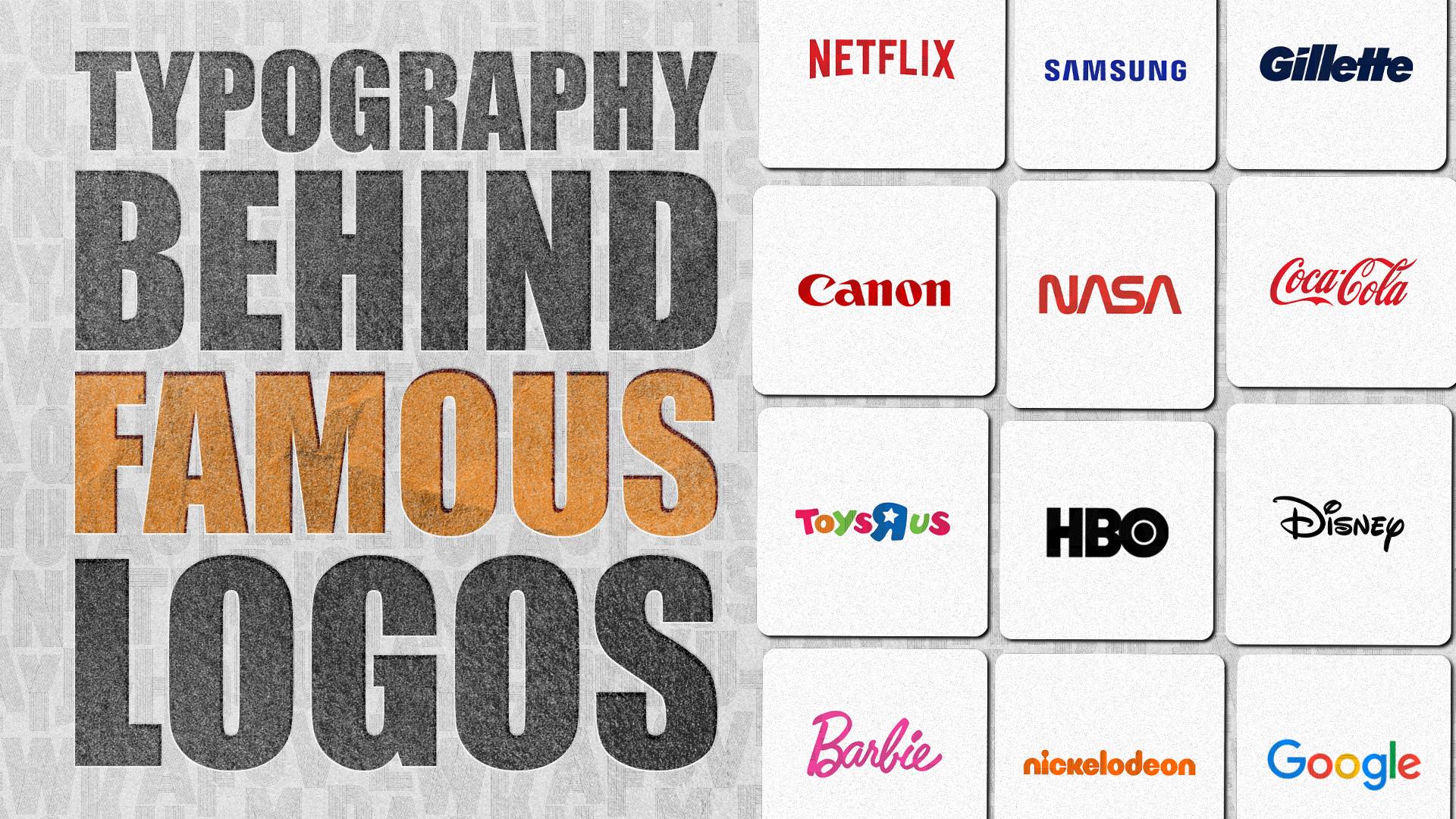
30 Famous Logos and the Typography Behind Them
Think of the logos of Coca-Cola, Google, and Disney. Notice a similarity among them?
All of them are wordmark logos. Their logo consists only of text, with no icons, symbols, or illustrations.
Despite the lack of visual elements, these logos are among the most famous of all time. And the reason is their clever use of typography — using the space, weight, color, or arrangement of the text to make it stand out and accurately represent their brand identity.
Studying famous logo typography is one of the fastest ways to understand why some logos remain memorable for decades. Below you’ll find 30 famous logos and the typography styles behind them. We’ll explain what makes each one effective, plus give you the design principles you can apply when you create a logo for your business.
What Is Typography in Logo Design?
Typography is the art of arranging and designing text to make it clear and visually appealing. This includes the spacing, weight, proportion, angles, curves, color, size, and more.
You can create a specific “vibe” or personality from the typography. This is why customers can feel what the brand personality is like, even if you just use lettering alone with no symbols or illustrations.
For example:
- Bold letters feel confident and powerful, which is why they are favored by automobile brands or creative agencies.
- Thin lettering appears elegant and premium, which is why you see it often on skincare or makeup brands.
- Letters arranged chaotically across the page can communicate that your brand is a rule-breaker and unconventional.
- Multicolored text logos give off a whimsical feel that is best suited for brands aimed at kids.
Why Is Typography Important in Logo Design?
The typography you use shapes how people perceive your business, influences first impressions, and helps customers remember your brand long after they’ve seen it.
Let’s break it down below:
- Shapes your brand personality – Typography gives your brand a distinct voice. Rounded letters often feel friendly and approachable, while geometric styles can appear techy or scientific. Choosing typography that matches your brand personality helps customers instantly understand what your business is about.
- Supports your industry positioning – Different industries and positioning often have different typographic expectations. Luxury brands tend to use elegant serif lettering, while a friendly next-door brand is more likely to use a clean sans-serif. Choosing typography that aligns with your positioning helps customers quickly understand that your brand fits them.
- Creates a memorable identity – Details like unique letter shapes, creative arrangement, or overly wide spacing can make a logo look recognizable and help it stand out from competitors.
- Communicates without extra graphics – Typography alone can communicate many elements of your brand and identity. It helps keep your logo clean and uncluttered since you don’t need to add extra symbols or illustrations just to get your point across.
- Builds trust and professionalism – Customers naturally associate well-designed typography with established, credible businesses. On the other hand, poorly chosen lettering can make even a great company appear less professional.
Types of Typography in Famous Logos
Let’s first distinguish different typography styles that can be commonly found in famous logos before we look at the samples.
Serif
Serif refers to the lines you see at the end of a letter stroke. Times New Roman, Georgia, and Garamond are samples of serif typefaces.
Serif gives off a traditional, corporate, and authoritative feel. They are best for law firms, academic institutions, literary publishers, consulting firms, and the likes.
Sans-serif
What is the difference between serif vs sans-serif logos? Sans-serif lacks the line at the end of the stroke, hence the “sans” in the name. An example is Arial, Helvetica, and Verdana.
Sans-serif looks very modern, clean, and approachable. They look neutral, which is why they tend to be a universal favorite among brands.
Script
Script mimics a cursive handwriting style. These can be done in a casual, playful way or in an elegant cursive.
Slab
Think of Slab as a thicker and bolder version of the serif typeface. They are typically used in headlines since they are very bold and eye-catching. The lettering can also convey an industrial and powerful feel, which is why you see them on automobile and tech brands.
Custom
These are fonts or typefaces that were created specifically for the brand, instead of using an existing one. An example are Coca-Cola, Disney, and LEGO.
There is also what is called proprietary typeface, which are custom typeface that brands exclusively own and use for all their branding needs. An example is Product Sans from Google.
Meanwhile, some brands do use an existing font and just adjusted the space, weight, or style to make them look customized. This is called a modified typeface. An example of this Nike, which uses Futura Bold Condensed Oblique. They altered it to have minimal spaces between the letters, have it slanted to the left, and make it a little blockier to give that athletic and dynamic look.
30 Famous Logos and Their Typography
Let’s now take a look at famous logos across various industries and see the typography behind them, plus what design lesson you should take away from them.
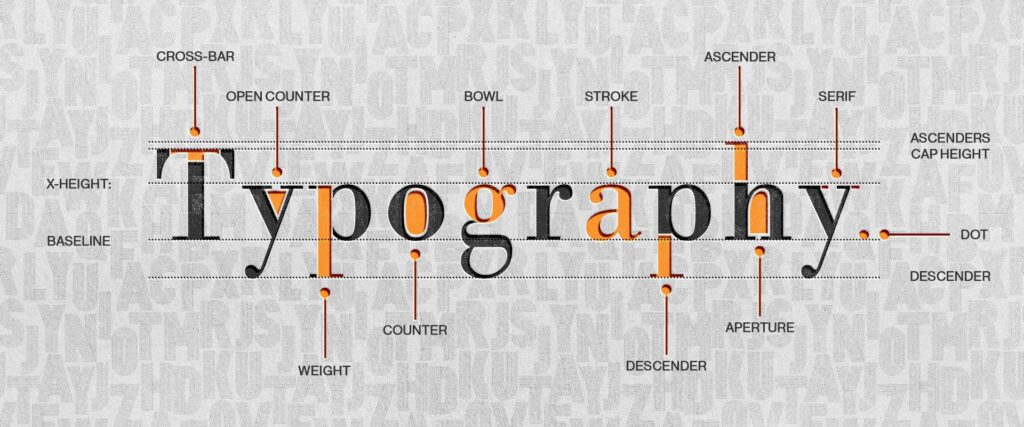
It’s also important to keep these letterform components in mind so you can fully appreciate the art behind the typography. You can further read our article on What Is Type Anatomy for more details.
Coca-Cola
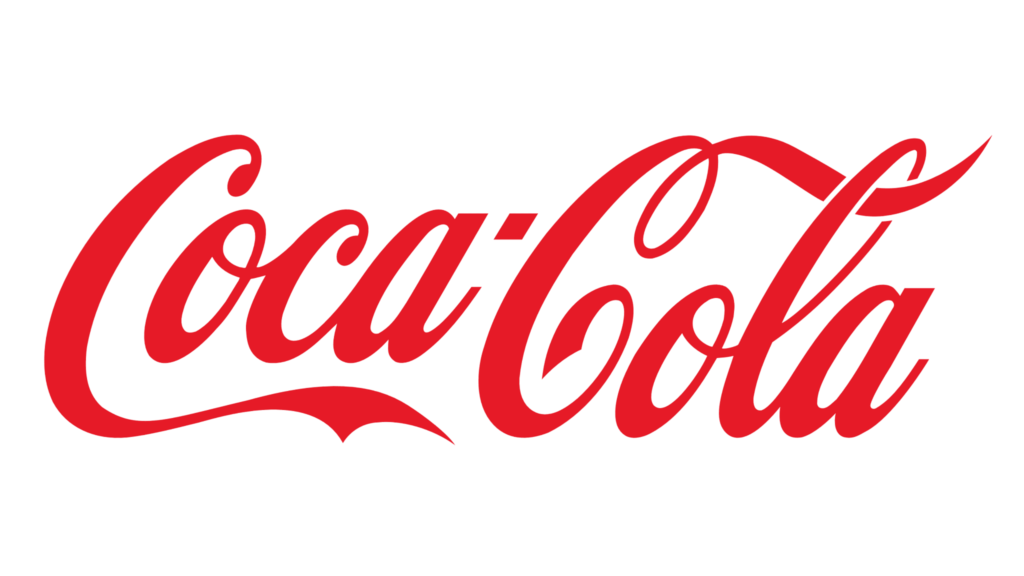
Typography Style: Custom script lettering
Key Typography Characteristics:
- Warm, flowing, approachable handwriting
- Strong contrast between thick and thin strokes
- Swashes are used for decoration and to make it look even more flowy
- Connected letters
- Bold red color
Why It Works:
The handwritten logo with the warm red color works since it looks approachable, happy, and friendly, which is exactly Coca-Cola’s branding. The cursive font also gives it an “older” feel, which reflects their long heritage. The custom lettering also makes it look more recognizable and unique.
Design Lesson: If your brand has a specific personality and identity, using a custom font is better since it can accurately reflect that than using an off-the-shelf font.
Disney

Typography Style: Custom decorative lettering
Key Typography Characteristics:
- Playful and whimsical handwriting style
- Lots of curves
- Unusual letter shapes
- Varying stroke widths
- Storybook aesthetic
Why It Works:
The whimsical lettering immediately communicates imagination, creativity, and entertainment. The casual, free, and informal style also makes it more suitable for kids, which is their main target audience.
Design Lesson:
Typography should reinforce the brand identity you want your customers to perceive.
Barbie
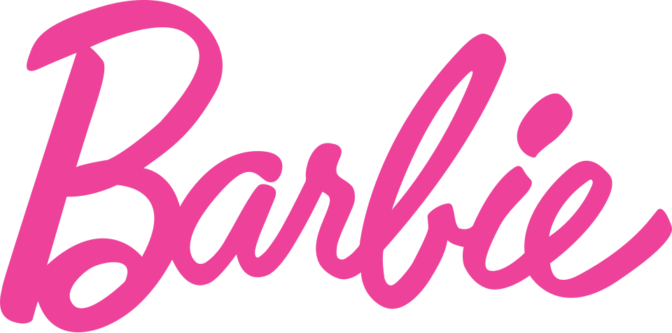
Typography Style: Custom script lettering
Key Typography Characteristics:
- Flowing connected script
- Clean but still casual handwriting style
- Slightly forward slant
- Thick, confident strokes
- Elegant flourishes
Why It Works:
Barbie’s script wordmark feels fashionable, confident, and expressive, perfectly reflecting the brand’s emphasis on self-expression. The flourishes and fancy handwriting style make the logo look more distinctive, but the open spaces and clean angles make it still easy to read.
Design Lesson:
Script typography works best when it balances personality with legibility, ensuring decorative details never make the logo difficult to read.
Formula 1
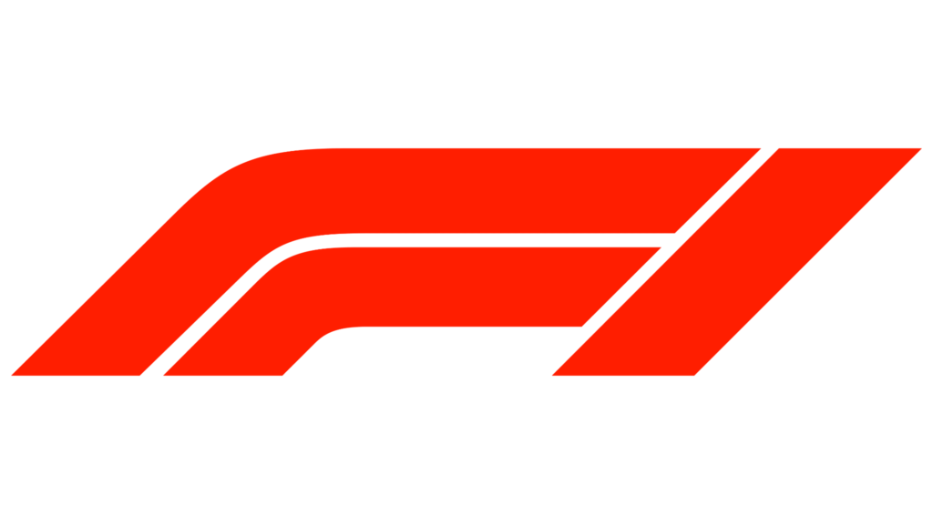
Typography Style: Custom lettering
Key Typography Characteristics:
- Strong forward slant
- Angular letterforms
- Condensed proportions
- Dynamic spacing
- High sense of movement
Why It Works:
Every element of the F1 wordmark is designed to communicate speed. The slant, the sharp angles, down to the thin white lines, make the logo feel like it’s moving even while it’s completely static. It’s an excellent example of typography expressing a brand’s core identity.
Design Lesson:
Typography can create a feeling of motion through angle, proportion, and spacing without needing additional graphics or effects.
NASA
Typography Style: Geometric sans-serif
Key Typography Characteristics:
- Geometric yet still flowy
- Clean curves
- Sharp edges on some letters
- Uniform stroke widths
- Very open counters
Why It Works:
NASA’s iconic red text logo is called the worm mainly because of its thin, flowy look that resembles a worm in motion. Design-wise, the typography makes it look very futuristic, which, of course, fits the organization. The A is also supposed to look like a rocket nosecone, which again fits them perfectly.
Design Lesson:
A combination of sharp strokes with open space gives a futuristic and technical appearance.
VAIO

Typography Style: Custom lettering
Key Typography Characteristics:
- Minimal geometric construction
- Very open and free spacing
- Smooth flowing curves
- Clever integration of letterforms
Why It Works:
VAIO is a great example of a famous logo with a hidden meaning. It’s supposed to look very techy and scientific, yes. But did you know that the “VA” is drawn to resemble an analog waveform, while the “IO” references the binary digits 1 and 0—both of which represent VAIO’s products and core essence?
Design Lesson:
Typography can be used to convey hidden meanings, giving your logo a fun twist for those who get it.
Lyft
Typography Style: Rounded sans-serif
Key Typography Characteristics:
- Soft, rounded letterforms
- Thick, consistent stroke weight
- Tight but balanced kerning
- Lowercase lettering throughout
- Friendly, approachable proportions
Why It Works:
Lyft positions itself as a safe, people-first transportation service. The lowercase letters and the bubblier typography help make it feel more approachable and welcoming, differentiating the brand from more formal or corporate competitors.
Design Lesson:
Softer, rounded typography is suitable for those going for a casual, friendly, and approachable vibe.
Toys “R” Us
Typography Style: Playful custom lettering
Key Typography Characteristics:
- Childlike handwritten appearance
- Mixed letter heights
- Irregular spacing
- Reversed “R”
- “R” also uses a star as a counter rather than a circle
Why It Works:
The playful lettering mirrors the way young children write, making the logo instantly relatable to its audience. The backward letter “R” and the star on it also add personality in a subtle yet creative way.
Design Lesson:
Intentional imperfection can become the most memorable part of a logo, provided it’s relevant to the brand’s identity.
Nickelodeon

Typography Style: Rounded custom lettering
Key Typography Characteristics
- Thick rounded letterforms
- Soft curves throughout
- Playful proportions
- Heavy stroke weight
- Casual, informal appearance
Why It Works:
Nickelodeon’s typography communicates fun and creativity with its slightly irregular letter heights, very rounded shapes, and its iconic orange color. It accurately reflects the playful personality of the children’s entertainment brand.
Design Lesson:
Color can be a powerful weapon in making typography stand out from competitors and feel more unique to you.
LEGO
Typography Style: Bold custom lettering
Key Typography Characteristics:
- Thick rounded letters
- Soft corners
- Tight spacing
- Playful proportions
- Sharp contrast between each color used
- Creative outlines
Why It Works:
The chunky yet soft, rounded lettering feels fun, child-friendly, and playful while remaining bold and eye-catching even at small sizes. The colored outlines around the text also make the logo look more visible, while also adding more visual interest.
Design Lesson:
Match your lettering to your audience.
Canon
Typography Style: Proprietary custom lettering
Key Typography Characteristics:
- Rounded counters
- Thick strokes
- Distinct, sharp endpoints
- Circular shapes are very round and curved
- Balanced spacing
Why It Works:
Canon’s lettering balances technical precision (the sharp endpoints and geometric spacing between the letters) with friendliness (the rounded circles in “a” and “o”), which makes the logo look professional and reliable without being overly corporate.
Design Lesson:
Adding softer details, no matter how small, can make bold typography feel more approachable.

Typography Style: Geometric sans-serif (also a proprietary typeface)
Key Typography Characteristics:
- Rounded letters
- Open counters
- Even stroke widths
- Generous spacing
- Distinctive color palette
Why It Works:
Google used sans-serif to look approachable while adding a geometric twist (even stroke widths and balanced spacing) to align with their advanced-technology branding. They also used color to enhance accessibility and make it visually impactful. Since the color palette is so distinctive, it was also associated with their brand, which makes them even more recognizable.
Design Lesson:
Every detail–from the spacing, stroke widths, proportion–counts when making a good logo.
Netflix
Typography Style: Custom sans-serif
Key Typography Characteristics:
- All-caps letter
- Heavy, bolded weight
- Tight kerning
- Distinct red shade
- Layout and subtle arch on the letters gives off a Cinemascope effect
Why It Works:
The heavy weight of each letter, combined with the all-caps styling, grabs attention and gives off a confident and powerful vibe, which fits with Netflix’s branding. If you look closely, the arch at the bottom of the wordmark mimics the curve of a traditional movie screen, a clever detail.
Design Lesson:
Increasing weight can dramatically improve logo visibility, especially in digital environments.
Sony
Typography Style: Serif-inspired proprietary typeface
Key Typography Characteristics:
- Balanced proportions
- Moderate stroke contrast
- Wide spacing
- Clean construction
Why It Works:
Sony uses a custom serif typeface to show their brand’s reliability and timelessness. The simple yet elegant design was so successful in capturing their brand’s essence, which is why it has remained unchanged since 1973.
Design Lesson:
Sometimes, restrained and simple typography creates longer-lasting brand recognition than trend-driven styles.
Samsung
Typography Style: Custom sans-serif
Key Typography Characteristics:
- Unique detail on the letter A
- Wide letters
- Balanced spacing
- Geometric construction
- Strong horizontal emphasis
Why It Works:
The horizontal bar on the letter A was removed to showcase the company’s goal to be an innovator in the industry. Design-wise, the missing bar makes the logo even more geometric and symmetrical, which in turn makes it easy to read and remember.
Design Lesson:
Typography can be used as a visual shorthand for your brand’s message, making your logo more meaningful without needing to add icons or symbols.
IBM

Typography Style: Slab-inspired custom lettering
Key Typography Characteristics:
- Bold uppercase letters
- Horizontal stripe treatment
- Squared, geometric look
- Heavy, bolded weight
Why It Works:
The stripes make the logo look fast, almost like it’s moving. It also adds a visual interest to an otherwise plain logo.
Design Lesson:
Custom modifications can make otherwise simple typography unforgettable.
Visa
Typography Style: Modified sans-serif
Key Typography Characteristics:
- Open counters
- Balanced proportions
- Slight slanted movement
- Slightly sharp edge on V and the inside of A
- Medium weight
Why It Works:
The lettering makes Visa look dependable, professional, yet still accessible, which is what the financial service company is all about.
Design Lesson:
Financial brands benefit from typography that prioritizes clarity and simplicity over decoration.
Typography Style: Humanist sans-serif
Key Typography Characteristics:
- Sans-serif font
- Rounded forms
- Balanced proportions
- Even and geometric spacing
- Calm blue color
Why It Works:
The typography, plus the color blue, communicates professionalism without appearing intimidating, making it ideal for a networking platform.
Design Lesson:
Professional doesn’t always mean defaulting to serif fonts. Sans-serif could work by adjusting the spacing, proportions, and weight to make them look more balanced and restrained.
Gillette
Typography Style: Custom sans-serif
Key Typography Characteristics:
- Bold and thick lettering
- Sharp diagonal cuts
- Forward-leaning visual rhythm
- Tight kerning
- Clean geometric forms
Why It Works:
The lettering reflects the brand’s focus on precision shaving. You can see this in the sharp cut on the letters “G” and “i”. It’s a creative and witty way to reinforce the product’s purpose without relying on an additional icon.
Design Lesson:
Typography can be modified to convey your product’s purpose, instead of just simply showing your business name.
HBO
Typography Style: Custom Geometric Sans-serif
Key Typography Characteristics:
- Bold uppercase letters
- Uniform stroke widths
- Circular counter within the “O”
- Tight spacing
- Clean geometric construction
Why It Works:
HBO’s bold and heavy text makes it look premium and authoritative, which matches its reputation for high-quality TV. The detail on the letter “O” is not only an aesthetic element but also a hidden meaning, as it was meant to represent a camera (which ties in perfectly with their brand).
Design Lesson:
A single detail is enough to make a wordmark logo more distinct and meaningful.
Adobe
Typography Style: Bold sans-serif
Key Typography Characteristics:
- Strong weight
- Design on the letter “A”
- Simple geometry
- Slightly tight spacing
- High visibility
Why It Works:
The open-ended A and its sharp inside angles contrast nicely with the more rounded letters of “dobe”. It creates a modern, bold, and energetic vibe, signaling Adobe’s positioning as a creative and innovative design software.
Design Lesson:
Simple typography can look bolder just by experimenting with the contrast of the letters.
FedEx
Typography Style: Modified sans-serif
Key Typography Characteristics:
- Bold weight
- Tight kerning
- Clean geometry
- Strong negative space
Why It Works:
The typography is memorable not only because of its unique color combination but also because of the spacing between the letter “E” and “x” which creates the famous hidden arrow.
Design Lesson:
Playing with negative space can give your wordmark a more interesting and creative look.
Zara

Typography Style: Condensed serif-inspired custom lettering
Key Typography Characteristics:
- Tight kerning
- Tall proportions
- High contrast between the thin and thick strokes
- Elegant construction
Why It Works:
The font and the close spacing between each letter create a chic and fashion-forward identity, which fits the brand.
Design Lesson:
Intentionally compressing the letters can become a defining visual feature, so long as you don’t sacrifice readability.
Vogue
Typography Style: High-contrast serif
Key Typography Characteristics:
- Thin hairlines
- Thick vertical strokes
- Elongated proportions
- Large counters
Why It Works:
The serif font combined with the contrast between the thin and thick lines communicates authority, elegance, and sophistication. It’s the perfect fit for the top fashion magazine of our times.
Design Lesson:
Serif typography remains a great choice for fashion brands due to the natural inclination of customers to view it as elegant and chic.
Gucci

Typography Style: Serif
Key Typography Characteristics:
- Moderate spacing between letters
- Edges on the letter C are cut sharply and inward
- Balanced letter height and stroke thickness
- Classical proportions
Why It Works:
The typography reflects craftsmanship and heritage while remaining timeless. The detail on the letter Cs makes the logo look a bit more rounded while still keeping the formal and elegant strokes.
Design Lesson:
Little details can make classic typography look more interesting and modern without sacrificing the premium feel.
H&M
Typography Style: Custom lettering
Key Typography Characteristics:
- Brush-like handwritten strokes
- Slightly irregular letterforms
- Dynamic angles
- Thick, expressive lines
- Organic spacing
Why It Works:
H&M went for a loose, hand-drawn style logo that feels energetic, playful, and friendly. This reinforces their fast-fashion identity and sets them apart from the typical black-and-white script lettering used by fashion brands.
Design Lesson:
Handwritten typography doesn’t always mean defaulting to an elegant cursive. It can also be used to make a brand feel more approachable and welcoming.
Cosmopolitan

Typography Style: Sans-serif
Key Typography Characteristics:
- All-caps lettering
- Moderately thick and heavyweight
- Tall proportions
- Tight but carefully balanced spacing
Why It Works:
Cosmopolitan needs typography that feels fashionable but not too formal, while still grabbing attention on crowded magazine shelves and digital covers. The bold blocky letters combined with the bright pink color do just that.
Design Lesson:
Bold fonts can be offset by brighter colors to look more friendly while still being attention-grabbing.
Uniqlo
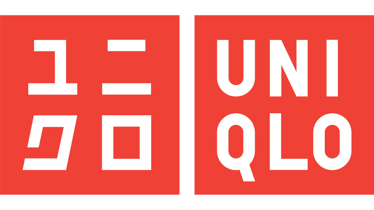
Typography Style: Geometric sans-serif
Key Typography Characteristics:
- Bold uppercase lettering
- Uniform stroke widths
- Simple geometric letterforms
- Tight but balanced spacing
- High legibility at small and large sizes
Why It Works:
Uniqlo’s wordmark reflects the brand’s philosophy of providing simple and functional everyday wear. The clean, bold sans-serif typography that is broken down to two keeps it minimalist and clean while still adding visual interest.
Design Lesson:
Typography doesn’t need to be restricted to one line. Breaking it down can give it a more unique look.
Dell
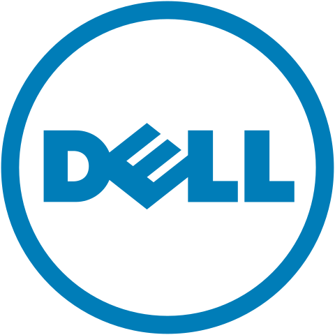
Typography Style: Geometric sans-serif
Key Typography Characteristics:
- Medium weight
- Rounded construction
- Distinctive angled “E”
- Balanced spacing
Why It Works:
The rotated “E” is meant to represent Dell’s mission of shaking up the tech industry. Meanwhile, the corporate blue color and balanced weight of the serif letters keep it still aligned with tech branding norms.
Design Lesson:
If you want to make your logo look more unconventional but not overtly so, you can modify one element while keeping the rest in line.
Intel
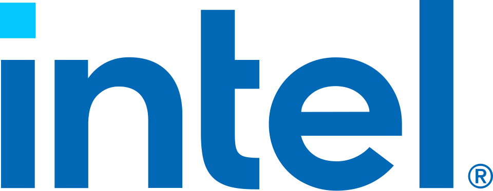
Typography Style: Sans-serif
Key Typography Characteristics:
- Rounded forms
- Open counters
- Consistent weight
- Balanced proportions
Why It Works:
Intel’s typography is very simple, clean, and balanced. It screams credibility, reliability, and endurance, which reflects their image as a trusted brand for years.
Design Lesson:
Simpler typography gives off a very reliable and no-nonsense feel, which is useful for building trust in technical industries.
Should I Use a Custom Font or an Existing Typeface?
The right choice depends on your brand, budget, and long-term goals.
Existing typefaces are a great option for most businesses because they’re affordable, professionally designed (so you are sure it works), and can often be personalized and made more distinct through adjustments to spacing, weight, or individual letterforms. If you’re a small business, this approach usually provides the best balance of quality and cost.
Custom typography, on the other hand, is worth considering when you want a truly unique identity that no other brand can replicate. Many well-known companies, such as Coca-Cola, Disney, and Barbie use custom lettering to make their wordmarks instantly recognizable. While it requires a larger investment, a custom wordmark can become a valuable brand asset as your business grows, especially if your logo will be used across products, packaging, advertising, and other customer touchpoints.
Create Great Logo Typography Today
The best typography isn’t just one that looks cool or attractive. It’s one that effectively communicates who the brand is, what it stands for, and why customers should remember it.
Make sure to spend as much time choosing and refining the typography as you do selecting colors or icons. Even small adjustments to weight, spacing, or proportions can dramatically improve how professional and memorable your logo feels.
If you need more tips on creating great typography, check out our articles on How Typography Impacts Your Brand plus The Art of Font Pairing. You can also use our letter logo maker to get access to over 750+ fonts, which you can further customize to fit your brand identity.
Faviola Publico is an SEO Content Writer specializing in branding and digital marketing strategies. Outside of work, she enjoys reading slice-of-life novels and watching any mystery thriller-themed series.