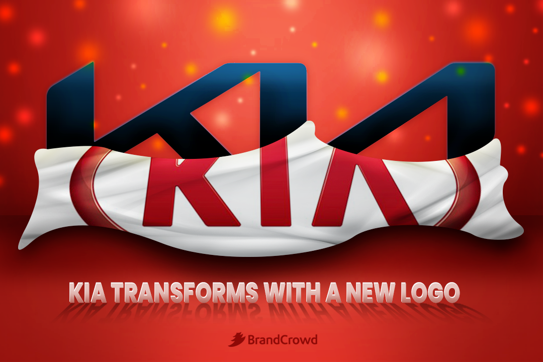
Kia Transforms With a New Logo
The South Korean car manufacturer Kia introduced a new brand logo and slogan in the first quarter of 2021.
From its old signature saying, “The power to surprise,” the brand’s new signature new slogan is now “Movement that inspires.” This bold statement can be found under the company’s new logo in a light sans serif font.
The redesign goes hand in hand with the brand’s plan to expand and climb higher to a leadership position in the industry, as said by the company in a statement. Kia calls this its Plan S.
It entails its goal to expand to its mobility services and vehicle electrification, autonomy, and connectivity.
Find out how one of the top car brands incorporated modernity with a signature-inspired logo.
The Old and New Kia logo
Let’s start this off by looking back at how the manufacturer’s logo appeared before the overhaul. The Kia logo history has seen over five redesigns since its inception in 1944. It is essential to take its evolution and become more aware of the changes made in the logo.
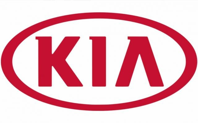
It has a minimalistic look. The absence of the horizontal bar keeps it looking contemporary despite the serif font. Serif fonts are known to produce old-fashioned output when incorporated into the design. But the logo continues to look updated.
This logo is also a great example of a flat design. The design style gives the brand the chance to have a logo that looks readable when displayed on digital and print applications.
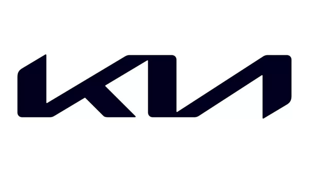
In the most recent redesign of the South Korean brand, the new logo of Kia symbolizes its shift to a more confident and innovative company. CEO and President Ho-Sung Song said in a statement, “Kia’s new logo represents the company’s commitment to becoming an icon for change and innovation.”
The CEO and President added, “Our new logo represents our desire to inspire customers as their mobility needs evolve, and for our employees to rise to the challenges we face in a fast-changing industry.”
You can see this reflected in the brand’s new wordmark with its asymmetric and handwritten signature look.
It utilizes different line weights for the text, providing depth to the design. The brand also bid its farewell to the circular frame that surrounds the wordmark. However, the logo still looks distinct with its use of space and simplicity.
But it’s not all new. The brand managed to retain some familiar elements as well. The glyphs have been connected, and the letter A is still without a horizontal bar. The lack of space also denotes a rhythm and leads the eyes of the audience.
Conclusion
The car industry is going through a phase of rapid growth—those who want to find themselves at the top need to double down on their efforts to succeed.
Kia showed its commitment to its objectives by creating a new logo to help distinguish itself in the market.
Here are quick ways for you to find a brand identity to make your company memorable.
In DesignCrowd, you can find the perfect logo by launching a logo design contest. This connects you with a community of freelance graphic designers who will submit up to 50 design proposals for your brand. Find the winning design today.
The BrandCrowd logo maker is an alternative for those planning to DIY their logo. You can generate the ideal design in minutes. Each design in the BrandCrowd library is customizable, allowing you to take full control of graphic elements such as font, shape, and color. Try it right here.
