5 Famous Car Logos Through The Years
Car fans, allow us to take you for a ride to check out interesting logo history. We will examine them to know what makes a dynamic car logo. These are top car brand logos that embody their brands perfectly and continue to stand the test of time.
Expect fun trivia and a deeper dive into what you know about these car companies.
You’ll also find amazing logo ideas for your brand down below.
Cadillac
People hold this brand to high regard. Did you know that the brand has revamped its logo more than 30 times?
It sounds a lot. Here are some of the most notable eras in its history. One thing is for sure, the brand puts a lot of emphasis on having a symbol that represents each of their eras.
Luxurious, geometric, and mysterious, those are just common words you can use to describe this crest logo. Its journey began in 1902. The design was inspired by the heraldic symbol of founder Henry Leland’s ancestor. The company only got around to trademark it in 1906. At the time the company was lauded for being one of the first producers of enclosed cars in America.
In 1908, the brand decided to furnish their logo with weighty serif text. It went without the crest and used a round shape to frame the coat of arms instead.
By 1920, the laurel wreath got a comeback.
Typically, wreaths symbolized victories in sports in the Greek context. While its Roman counterpart alludes to triumph in war. Regardless, it is a symbol for dominance whichever way.
Today, the logo lost the wreath. The heraldic ducks have been translated to minimalist stripes. You will also notice a cinched look that elongates the crest logo. The car company began to use it on their models in 2014.
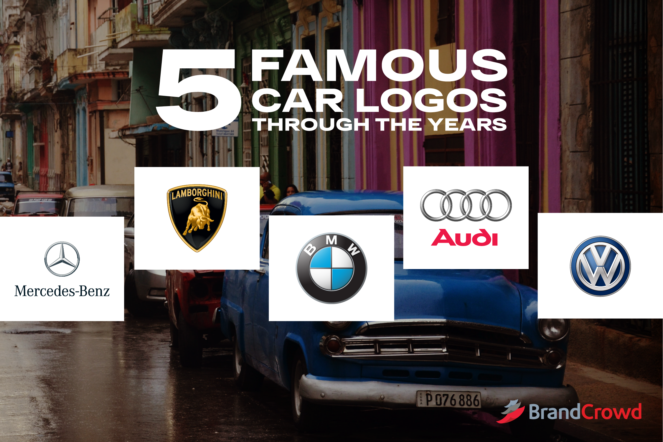
Mercedes-Benz
Its name took a few turns before the founders eventually settled with Mercedes-Benz. Daimler was the first name of the brand, Daimler-Motoren-Gesellschaft to be exact. The name stuck until 1902.
When the founder died, his business partner took the wheel and steered it towards a new direction. Wilhelm Maybach got a new partner who had a daughter named Mercedes. They took this as inspiration for the new name.
The iconic three-point star logo was derived from a postcard Daimler sent to his wife which was discovered by his sons in 1909. The founder said on the postcard that the shape marked his home in Germany.
He added that the star brings prosperity and hopes that it will do the same to his automobile company as well.
More about symbols
It’s common for car logos to contain an element that the company founder treasures deeply. For Mercedes-Benz, it was a shape that was used to pin a home. Have you thought about what you’re going to use for your car company? Drive over to our automobile logo collection to get inspired.
Thus, an iconic logo was born.
Mercedes-Benz trademarked the star logo with three and four points. Only the three-point logo is used today, though. It is said to embody the brand’s domination of the three elements: land, sea, and air.
This wreath and star logo signified the successful merger of DMG and Benz & Cie. in 1926.
Throughout history, the logo was only changed in terms of its color, font, and border. The star mark remains to be the focal point regardless of every rebrand.
BMW
People often say that the sky-like colors of the Bavarian Motor Works logo were chosen to honor the beginnings of the company as an aircraft propeller manufacturer.
It’s actually a tribute to the flag of Bavaria, only inverse.
They did this because it was put into law that corporations are not allowed to use national flags in their branding. This reverse application of Bavarian colors worked and the brand faced no repercussions. That’s a fun story for you.
From its first year of being trademarked, the logo had a metallic color to it. In 1917, its border and text were both gold.
It was only until 1953 that they went with a totally flat design. The logo now featured the color white instead of gold.
Less than 50 years later, they brought the metallic finish back. The 1997 logo had the light shining on the letter B on the BMW logo.
In 2020, however, BMW chose to significantly change the logo with a flatter design. The bright center of their insignia was now paired with white instead of the black border. The text is now less readable especially when put in lighter backgrounds.
Needless to say, a lot of people did not take joy from this rebrand. BMW defended its decision by reasoning that the design was a way for the brand to further its mission of being more open and clear.
Lamborghini
Alright, astrology fans. Rise up.
You probably already know that the bull represents the astrological sign of Taurus. People with an Earth sign like the Taurus are known for being ambitious and luxurious. Ferruccio Lamborghini, the founder of this brand was a Taurus. Living up to these qualities worked well for the brand.
Plus, he also happened to have an affinity for bullfighting. And that sums up the history of this iconic luxury car logo.
But it wasn’t the first Lamborghini logo. The tractor company began with a triangle logo cut in three sections to carry the founder’s initials and the company’s geographic location which was Cento.
Lamborghini began to embark on a new direction in 1963. The company began producing sports cars. It seemed fit to give this rebrand a new logo to match.
The Movement in Sports Cars
Sports car logos often contain an illustration that portrays movement. Big brands such as Lamborghini and Ferrari even have logos that use animals appearing to charge towards a target at a high speed as its focal point.
The bull was a perfect fit for the brand as it also symbolizes aggression. Lamborghini’s crest logo was filled in with the color red, too.
In 1972, they changed the logo up with a more sophisticated color scheme. Metallic gold and stark black changed the whole vibe of the logo. The brand name was also put inside the crest which was a big change from the previous cursive typography.
Today, the car brand retains a detailed version of its 1972 logo. Talk about not fixing what isn’t broken, right?
Volkswagen
Famously known for its iconic beetle car, the brand started out with a logo associated with the Nazi movement. This was in 1937. The logo back then was described as something that resembled a fan.
When the second world war ended, Volkswagen was put into the hands of new management. The 1939 logo removed the fan-looking lines and chose to frame the brand initials with a sprocket. It was given a new life by omitting those elements.
As time passed, the letter V and W stayed, but the only difference made was their borders. However, in 1967, they decided to give it some color. The logo featured a vivid shade of blue, not far from the hue we see today.
It went through about 4 shade changes before settling with the current shade of the current logo.
Car Logo Ideas
If you’re looking for a good car logo, we have some designs for you to get your wheels going.
It’s helpful to consider your audience when picking a logo. Women automobile consumers go for brands that are known for being safe and environmentally friendly. On the other hand, males go for cars that are stylish.
AV AUTOMOBILE by Armend Berisha
Flame Horse Gaming by AMCstudio
Four Wheel Drive Circle by Kayla06
You’ll notice that there’s a lot of movement in these vehicle logos. This motion looks exciting which communicates a lively vibe that looks great for car brands.
Lightning Cheetah Shield by JimjemR
Red Sport car Logo by Sentavio
Self Driving Car Logo by Mateusz Delegacz
Rev up your car company or vehicle-related business with more of over logos. We have more for you here.


