The Only Guide You Need To DIY Logos
You may not have a fancy art degree, but do you know what you have? The will to take time researching logo design templates and how to use them right. And sometimes, that’s really all you need.
We know it, you know it: the fastest and cheapest way to complete design projects is to do them your own. Templates are such a valuable resource for DIY entrepreneurs.
Sadly, some turn away from creating their own logos because of terrible advice.
People talk a lot of smack about templated logos, but that’s only because they don’t know how to use them. Others end up seeking graphic assistance from professional designers. This is beneficial as long as you have time and you give the designers a killer design brief that captures the very essence of your brand. From there, you can expect kick back and wait for the perfect, professionally-made logo in your inbox…in a perfect world.
Alas, to err is human. Graphic design projects go through an average of three revision rounds before completion and not everyone has the time and resources to wait that long.
Misinterpretation = Longer turnaround time
Some are left with no choice but to take matters into their own hands. This is where the mastery of your own brand comes in handy. Today we’re going to teach you four essential steps to make stunning logos from templates that snobs label as “generic.”:
Watch like a hawk

Differentiating yourself as a brand from your competitors is the very core of any marketing strategy.
It’s always a good idea to check if you have indistinguishable styles and reconsider every move. Having similar looks can lead people to mistake you for your rivals or worse, they might start thinking of you as a copycat.
Organizing the information you collect can be condensed into a simple spreadsheet. It’s helpful to start collecting these facts about your competition:
- Unique Selling Point
- Brand Identity
- Audience
There are online tools and resources out there that will give you an easier time collecting this information. From here, you can create a clearer vision of what you should and shouldn’t do. Study your competition’s lapses so you won’t have to make the same mistakes yourself. You can even collect their good ideas and make them better.
Learn how to solidify your brand identity by studying others.
Pro Tip: Test your logo to see how well it can hold itself in the market.
This is done by big companies and big logo design platforms like DesignCrowd to check audience preference. You can do this at home by simply asking your friends and family what they think of your design concept!
Pick your brand colors wisely
It’s all about brand recognition. Your target audience sees a minimum of 4,000 advertisements daily, each one brandished by different logos.
That’s a steep number.
Luckily, there are actionable tips for you to encourage brand recognition. You can use color as a quick way to be remembered.
It may seem like a gimmick, but consumers rely on color to differentiate brands from one another. A great color choice can increase your odds by 80% in being acknowledged by your audience.
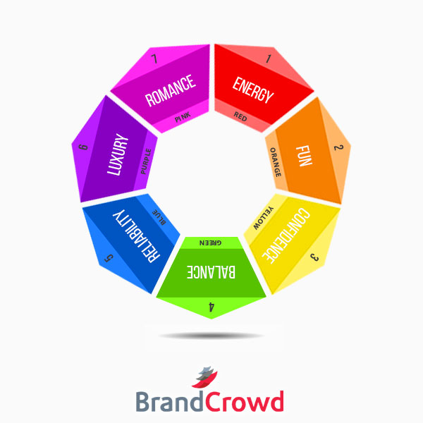
A simple change in hue opens opportunities for brand perception. Years of color research have proven that people associate brand colors with the following attributes:
- Red – Energy
- Orange – Fun
- Yellow – Confidence
- Green – Balance
- Blue – Reliability
- Purple – Luxury
- Pink – Romance
Color prominence changes a lot according to each market sector. For tech, the most used color is blue. For restaurants, the color red dominates most logos. It can differ per industry and be backed by different psychological reasons.
Pro Tip: Pick only two to three colors
Businesses tend to go overboard with colors and end up with a mess of a logo. While it’s exciting to use all the brand-changing color facts we’ve just mentioned, less is always more. Besides, oversaturating your design with different colors make it less adaptive to print and digital channels.
Get Readable Fonts

Would you like your audience to react more to your text?
Fonts allow you to set up better impressions of your brand. You can be silly, playful, authoritative, and whatever it is you want to be. There are countless typefaces that allow you to do this through a change in style, weight, and other elements.
But demonstrating these characteristics through your text means nothing if no one can read what you’re trying to say.
Readability is the measure of how advantageous your use of typographic properties is. It depends largely on how you use a typeface.
Always prioritize your brand name before anything else. Remember that the main goal of logos is to make your brand recognizable and not just pretty. Be mindful of the contrast your logo design elements are making, whether it be in color on in illustrations.
One way you can do this is to play around with the vertical spaces, otherwise known as leading, in your text.
Pro Tip: Air it out
When dealing with text, make sure that you provide proper space. Contrary to popular belief, adding white space doesn’t make your design look loose. Proper spacing makes your logo all the more functional. Why choose to add visual stress when you can relax?
Work Smart

Efficiency is a common trait of successful design. We have thousands of online tools such as logo makers within our virtual reach. These tools get us the results we want better and faster.
Rome can be built in a day. Technology has made it possible for you to have the logo of your dreams in as fast as 5 minutes. It’s all a matter of what tool you end up using.
Here are the three must-have qualities of your logo maker:
- Expertise in brand identity – Work with a website that knows the importance of exclusive brand kits. To really speed up the pace of your branding projects, you can look for websites that offer powerful, ready-made identities. These packages typically come with a logo and even a domain name.
- Quality logo template collection – Logo service providers often have criminally generic templates. This is usually caused by the use of AI technology that lacks nuance. Handcrafted logos are still the way to go.
- Easy to use graphics editor – Customizing your logo gets you an extra mile ahead of the competition. When picking a logo maker, keep in mind that editing features should always be user-friendly. Navigating their interface affects your process.
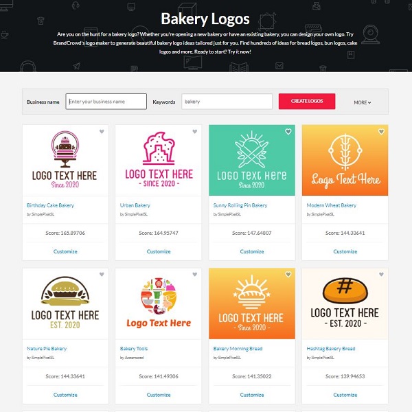
BrandCrowd Bakery Logo Gallery
Pro Tip: Look around
Study as many logos as you can for inspiration. A good method for this is searching for logo round-ups that are related to the type of industry you’re in or related to. There are hundreds of curated lists dedicated to every niche.
Shock the world
Audiences receive your brand identity better when it is represented well in a single emblem such as your brand logo. It’s all about getting personal when it comes to logo design. And who knows your brand better than you do? No one.
Now that you’ve learned so much about design, you’re ready to create a logo that will make people think you got it professionally done.
Give logo makers a try, commitment-free. Meet the logo of your dreams by clicking here.
