
15 Famous Bird Logos and Their History
For most businesses, a logo becomes a symbol. It becomes the face of a brand wherever it may go. And like the brand it signifies, a logo often holds a story that has never been told nor shared. It reflects a company’s humble beginnings and the vision that its owner had. Most of the time, you just don’t choose a concept just because it is there. You base it on something powerful and unique to your brand. And this is particularly true for companies with a bird logo.
Birds and other animals are easy to identify with and often are easier to recognize. A bird symbolizes peace, freedom, beauty, and spiritual growth. They can also mean happiness, strength, power, and purposefulness.
Brands in sectors such as transportation, entertainment, education, and more are fond of using these animals to represent their identity. Although we still see some bird logo concepts from other industries from time to time.
Bird Logos Designs of Big Companies
Most bird logo designs are minimalistic where designers use abstract or even pictorial marks or logo symbols. The common designs you’ll see are of different looks for a variety of birds. Depending on which type of industry, the aesthetics are different and vary from one another.
For example, bird designs are more formal and geometric for airlines like American Airlines or Turkish Airlines. On the contrary, bird logo designs in entertainment and media are freer, with animated drawings or colorful aesthetics, such as the NBC logo or the Duolingo bird logo.
Before we delve further into each design concept, let us take a look at some bird logos of popular brands and their corresponding history.
Nestle
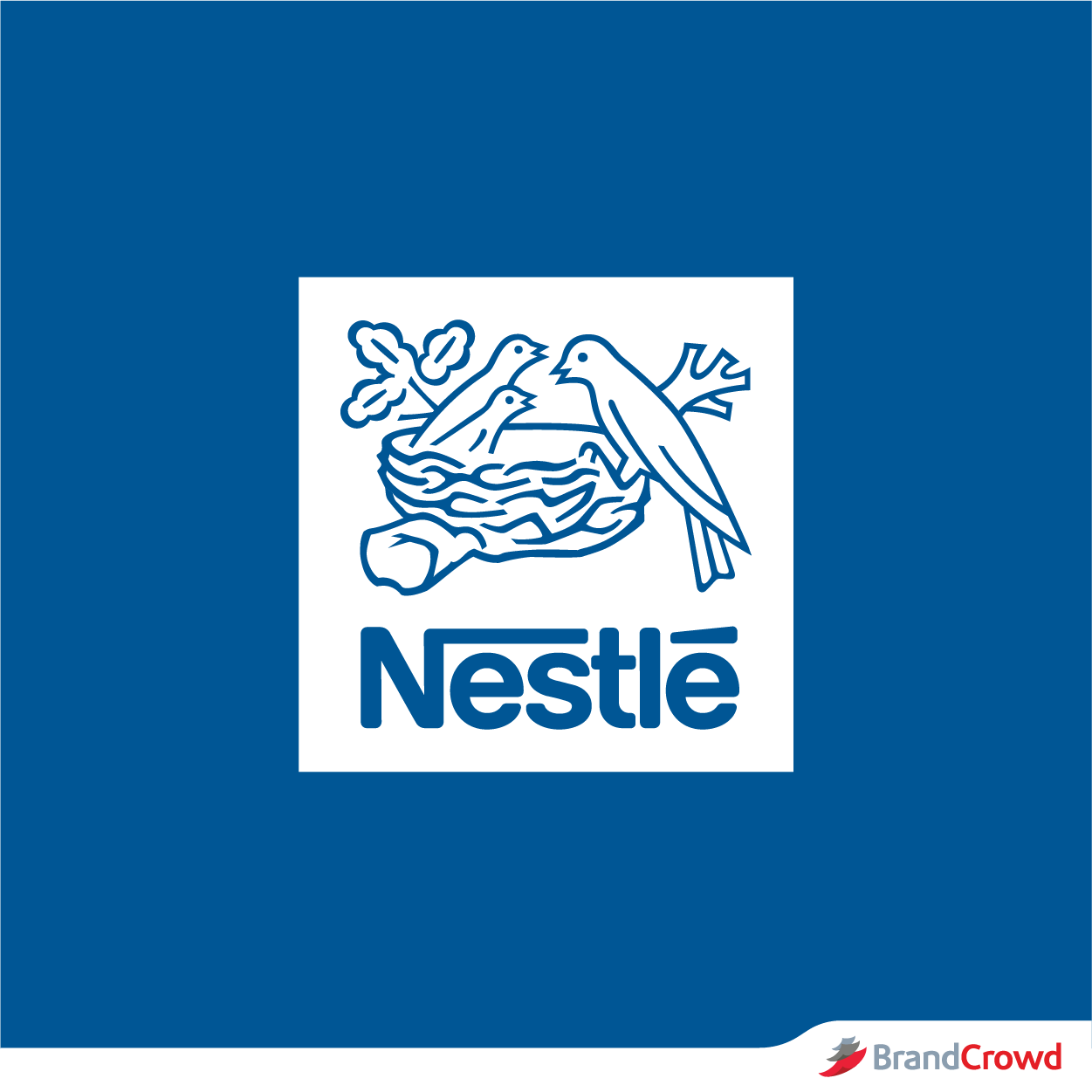
The Nestlé logo is that of a bird family resting on a nest. Its logo concept design is made in reference to Henri Nestlé’s family name which means ‘nest’ in German.
The design concept started out as a single bird on a nest embedded on the Nestlé’s family coat of arms. It was then revised to adopt 4 birds on a nest sometime in the mid-1860s before the Nestlé lettering was added in 1938.
Minor changes have been made over time to the logo with it later displaying 3 birds, instead of 4 and placing the Nestlé lettering at the bottom. Aside from the more clean design, the current softer Nestlé logo is easier to read on modern digital devices.
American Airlines
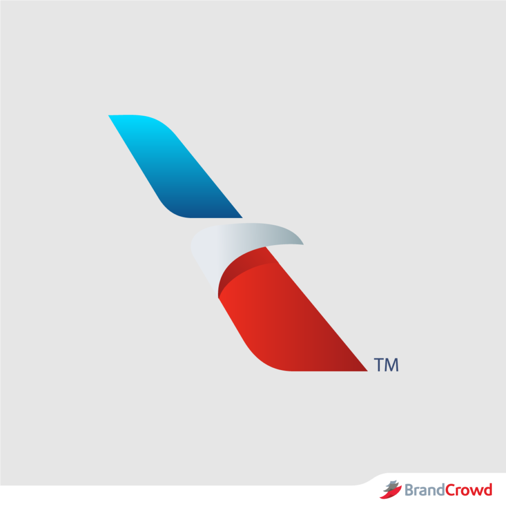
The American Airlines logo also embraces a bird logo with an eagle head on negative space. Prior to this modern design, the airline’s logo showcased a fierce image of an eagle that is seemingly swooping down. This previously designed logo helped build a glamorous image of air travel, which was quite expensive years ago.
Numerous variations of the logo design over the years has retained the eagle icon before it was completely changed during the merger of American Airlines and the US Airways Group in 2013. The logo in itself was a chance to rebrand the company with a fresher look.
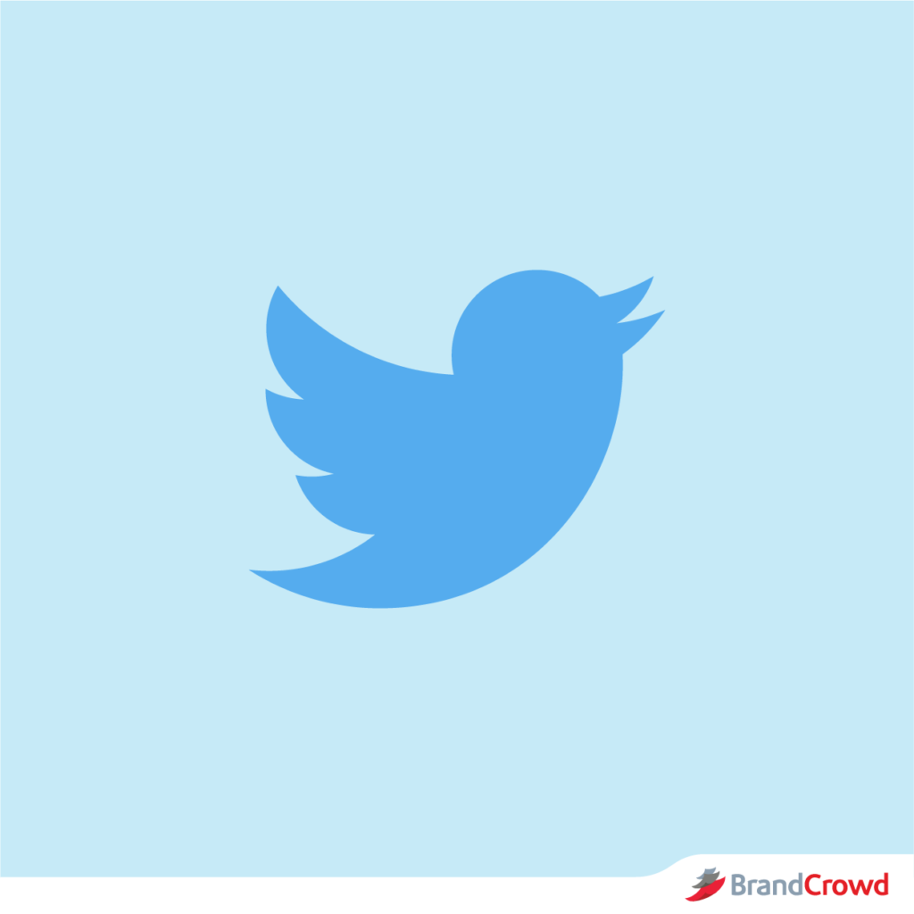
Twitter has been one of the most recognized bird logos there is. The company uses a sleek picture logo that symbolizes communication and spreading the news. When you send out a tweet, you become a part of a social conversation across the world.
The company’s logo started out as a simple blue text that spells out the company name on a white background. In 2010, the company decided to embrace a new look that would symbolize the tweets that were being sent out, which resulted in the invention of the twitter bird. The twitter bird became a new addition to the logo text which was then designed in black text.
The bird logo perfectly fitted the company name as it sounded like a bird and is quick and speedy like the messages the user send out. By 2012, the company decided to embrace the bird logo alone in a larger image and more sleek design.
Swift
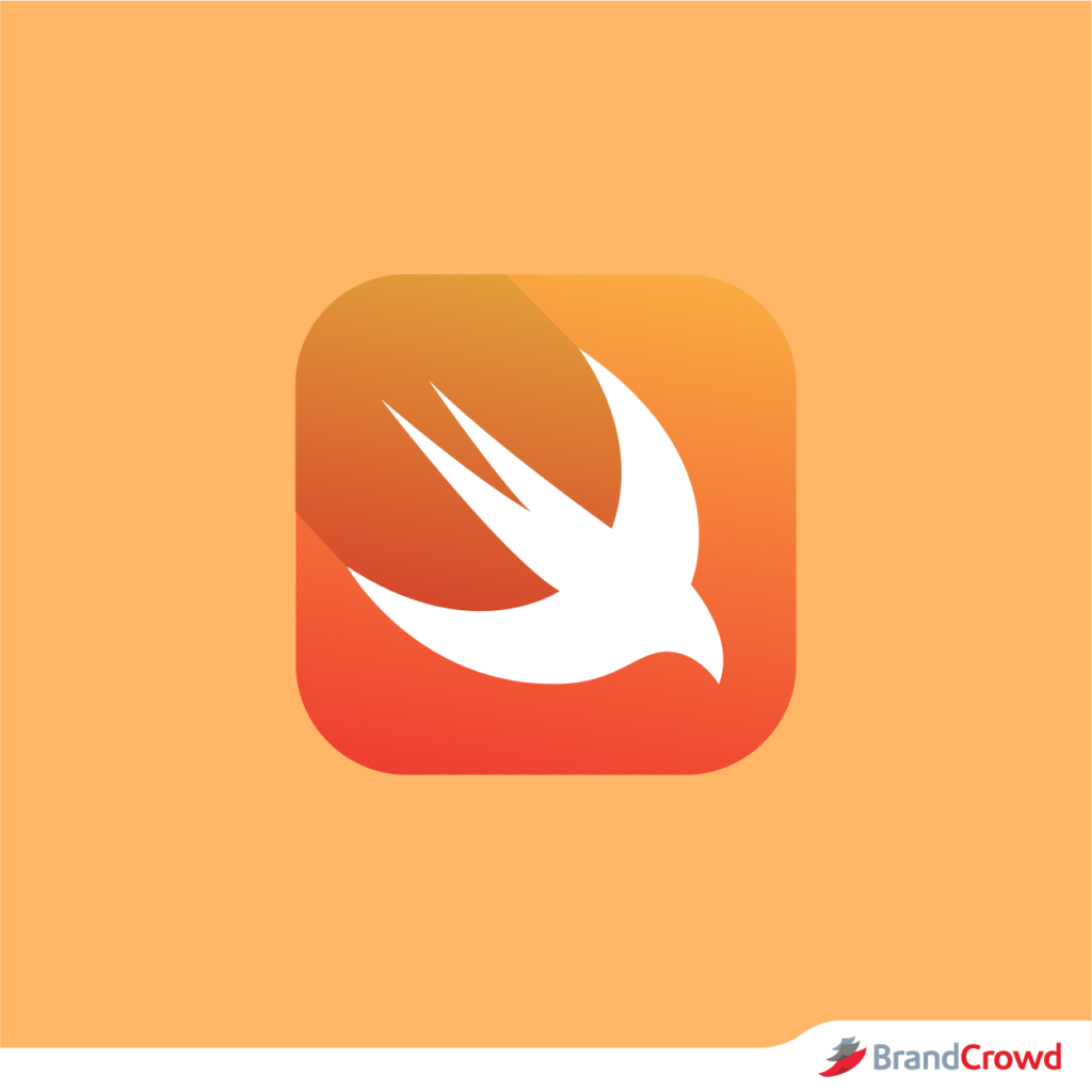
Swift’s powerful and intuitive programming language is heavily illustrated in its white bird logo on an orange background. Some feature the logo with a swift text while others only feature the bird alone. The logo illustrates a picture image of a swift bird that signifies how the program was built to be fast.
Duolingo
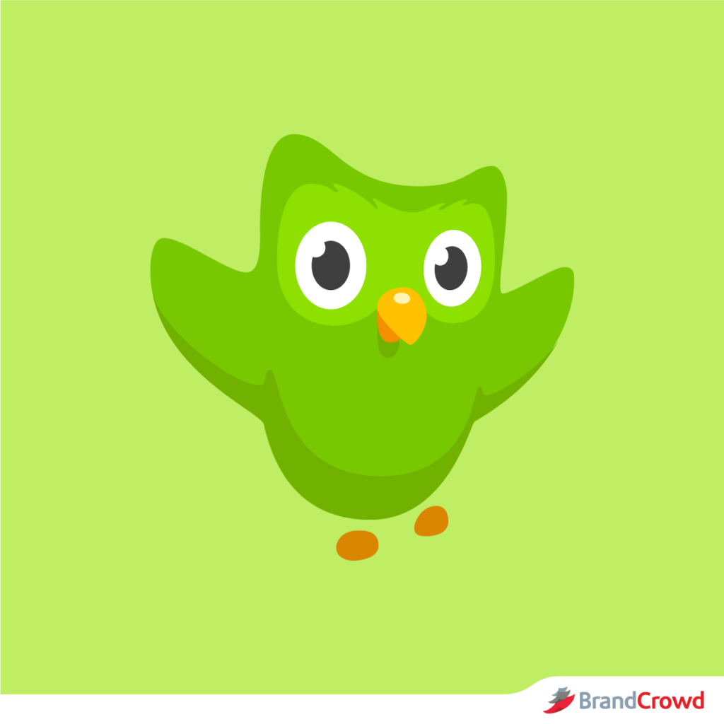 Duolingo
Unlike the Twitter logo, Duolingo’s logo uses a playful mascot. The creature is named Duo and it has multiple animated expressions. The company has transformed its logo from a simple and expressionless cartoon logo with a face that spells out ‘duo’ to something with a blockier and cartoony concept.
This current logo design is considered to be the biggest redesign that the company has made in 5 years with Duo still at the center of it all.
Dove
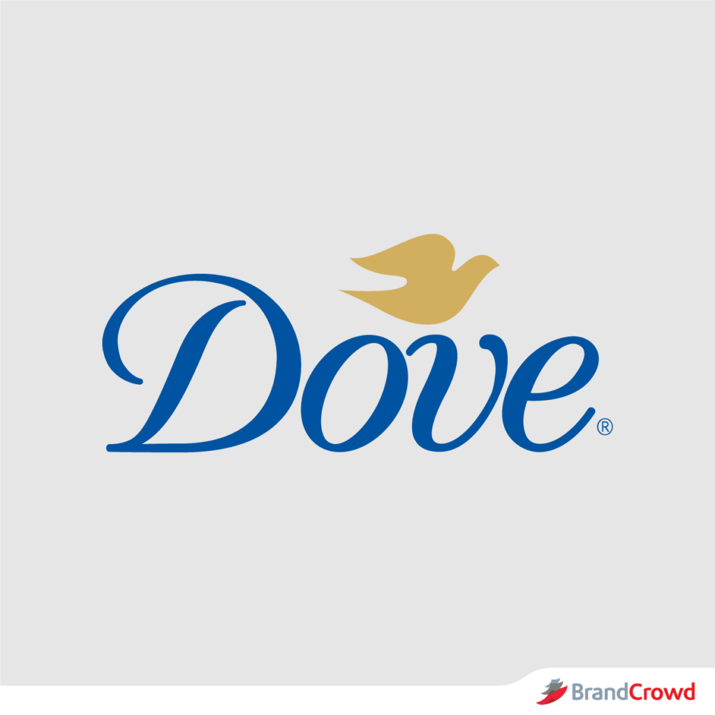 `Dove
`DoveDove’s bird logo is among the most recognizable logos in the beauty and cosmetics industry. It was designed by Toronto-based lettering designer, Ian Brignell who used a custom-made typeface.
Simple variations of the logo design were made over the years that mainly involved the image of the dove and where it is placed beside the Dove lettering. It is noticeable, however, that the type-face is retained and was just modified a little to embrace a more modern and sleek look.
Turkish Airlines
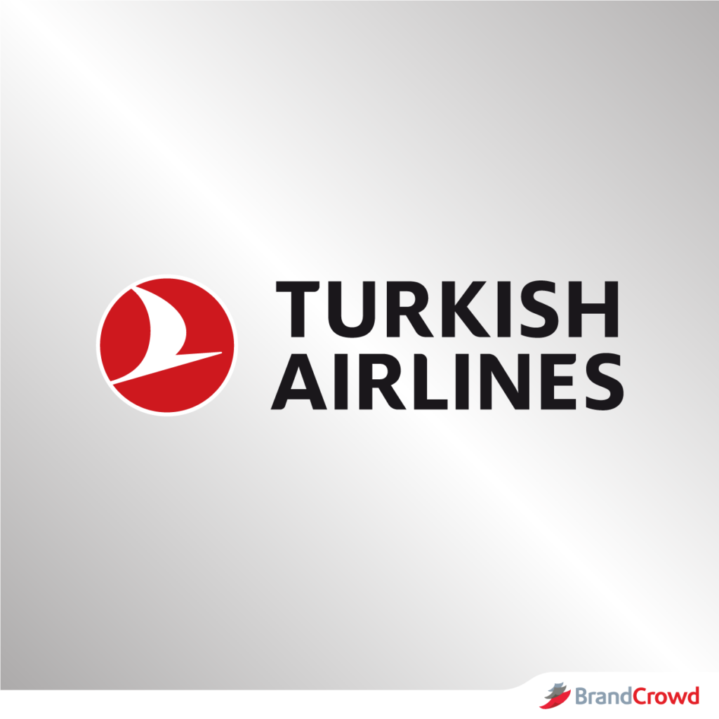
Turkish Airlines’ logo features a redefined and modern looking bird logo with a new wave graphic. This is considered a rebranding moved by a company that was founded in 1933.
The logo still uses a wild goose—which is considered to be the highest-flying bird – as their airline’s mascot. Changes were also made on the typeface of the logo. You will notice the text now has round corners.
Freelancer
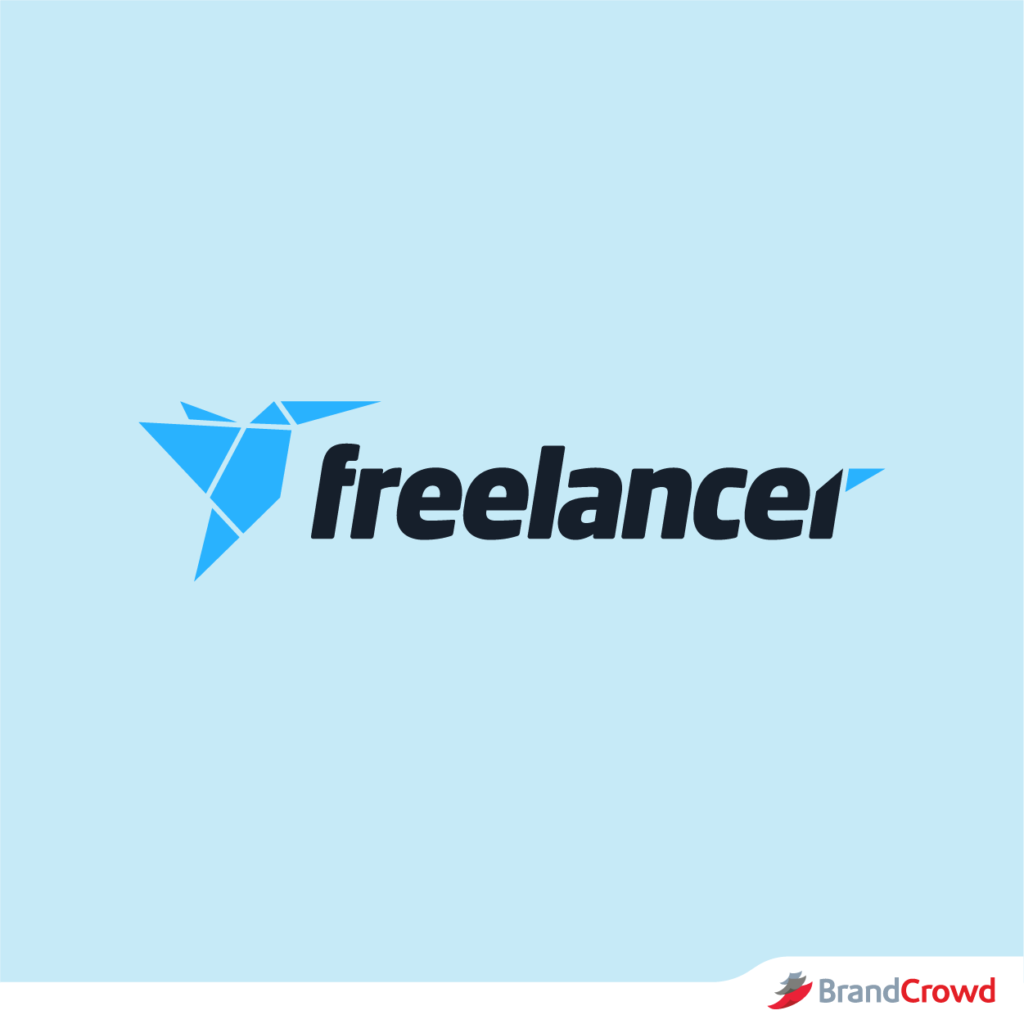
Nothing makes a logo freer than using a bird as the main object, and that is exactly what Freelancer has used on theirs.
Freelancer is an online marketplace that connects employers and employees. It is a very popular platform nowadays with over 39 million users around the world. The company uses an origami image of a hummingbird next to a bold Freelancer text. This logo was designed by Edward Sutrisno in 2009 after winning a contest organized by the company.
The design was lauded because it symbolizes the freedom of being a freelancer and how one can turn something simple and ordinary into something beautiful and intricate.
Want to celebrate design wins for yourself, too?
Do what Sturisno did and run a logo design contest of your own. This will grant you the chance to pick your brand logo out of the design bids submitted by professional graphic artists. You can receive up to 25 proposals from platforms like DesignCrowd.
Hollister
Hollister’s overall logo design has not changed over the years: a silhouette of a seagull that is on a mid-flight with the Hollister text at the bottom. Changes were only made on the bird shape and the color of the logo while keeping the same font to make it more recognizable.
The logo is also accompanied by the text California, which refers to the company’s fictional background. This hypothetical inspiration story supports and represents the preppy surfer style of the company and its product.
NBC
NBC’s logo only came to be after visual branding became an important part of their business, which happened in the year 1943. Throughout the years that followed, NBC had several logo design variations before settling with their colorful peacock logo.
This logo was first conceptualized as a bid to further promote colored television sets that were sold by the same company that owned the network. Despite straying away from the colored peacock logo for a time, the company finally decided to embrace an abstract bird logo where the peacock’s body blended into the background and left the brightly colored feathers to become more prominent.
Penguin Books USA
The aquatic bird has finally graced this logo roundup. Penguin Books USA symbolizes their brand with a bright orange logo featuring its namesake. This creature was select by the publishing company for its noble yet carefree nature.
Over the years, the bird has lost weight. Angus Hyland, the mind behind the redesign stated that the bird got 15% slimmer. The logo is well-designed and recognizable enough for you to pick out from a paced bookshelf.
Swarovski
It was only until 1988 that the luxury brand changed its edelweiss logo into a swan. This bird symbolizes grace, beauty, love, and spirituality, among many others.
You will notice that the swan drawing gradually blends from a solid color to a series of dots. The use of pointillism gives the design a unique look. Plus, the slender illustration of the swan complements the elegant wordmark nicely.
Kiwi
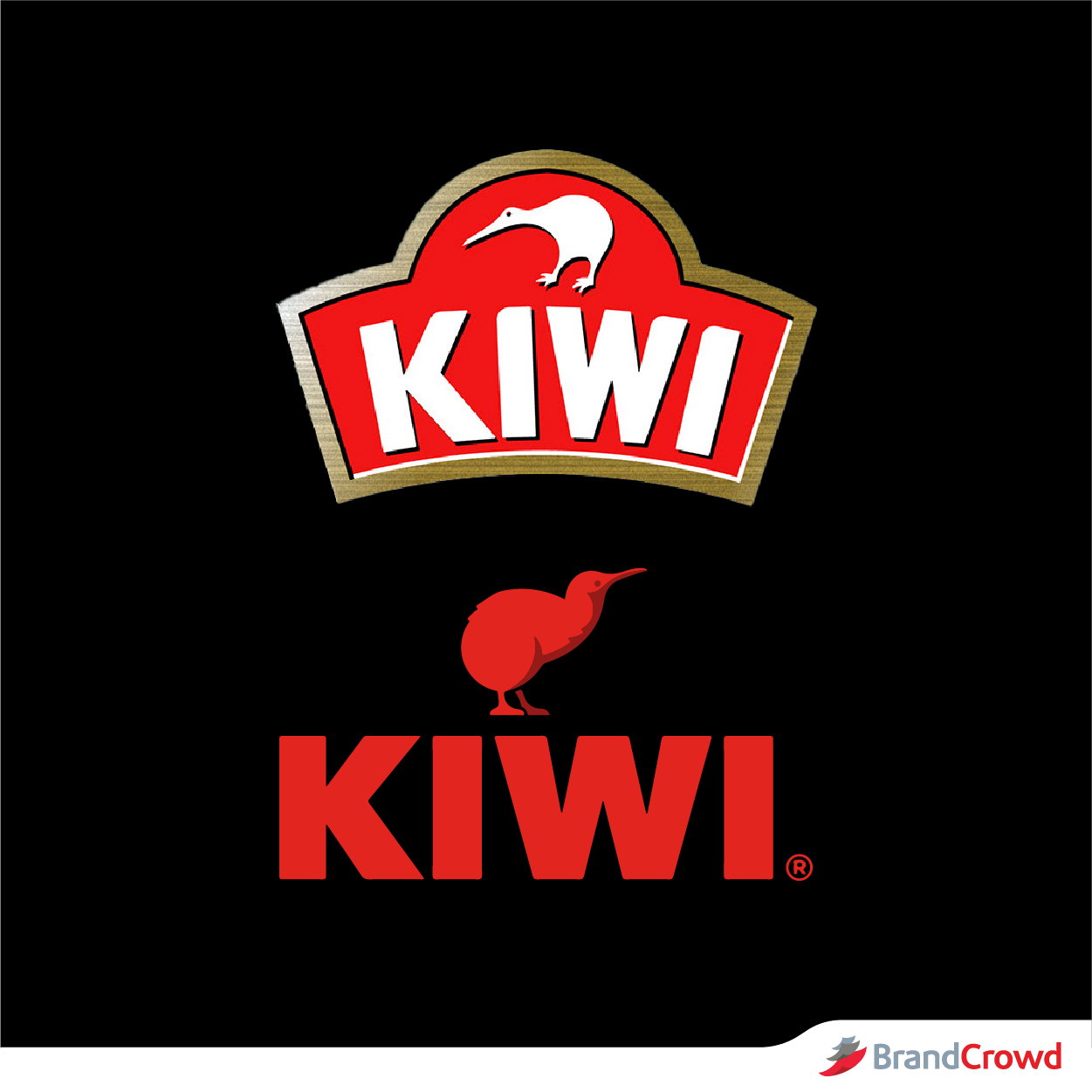
Considered as a New Zealand icon, the kiwi is the focal point of this design. This is because creator William Ramsay’s wife is from New Zealand and he wanted to honor that through his product. The shoe polish has kept the flightless bird in its logo since 1906.
The silhouette of this bird always sits atop the typography of the logo.
Giorgio Armani
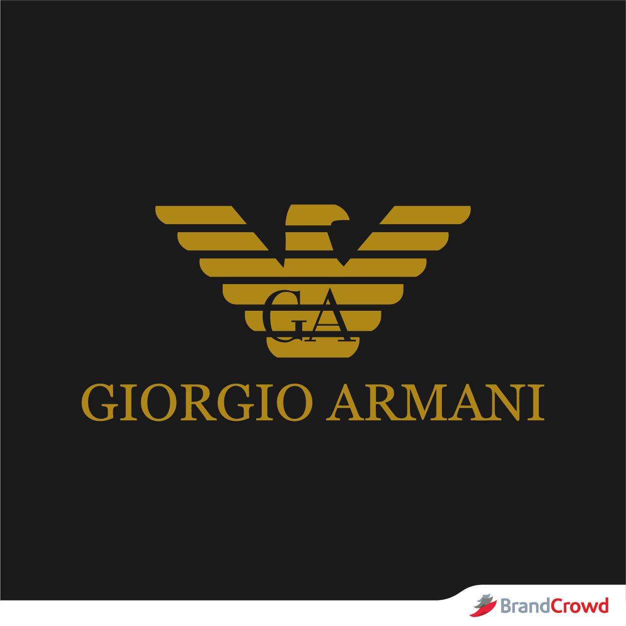
Eagles are one of the animals at the top of the food chain. Their spot at the apex makes them a symbol of dominance. This fashion brand uses the bird to represent its top-notch products.
Being a creative brand, Giorgio Armani approaches this design in a unique way. The animal logo is drawn using horizontal stripes which give it an attention-grabbing effect. It is always drawn facing the right side.
American Eagle Outfitters
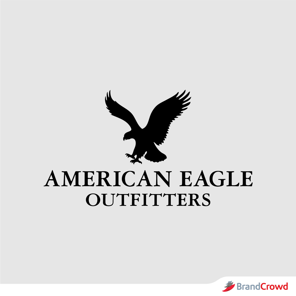
The USA loves this bird for its strength and grace. It has been the national emblem of the said country since 1782.
This retail giant began its journey in 1977 with a symbol that represents their roots. You will see an American eagle taking flight at the design’s center of activity. It tells their brand story well as a company founded in Pennsylvania, United States.
Soar High With a Bird Logo
We all want that amazing logo to make our business look more professional and memorable.
If you need that extra help to get one, BrandCrowd’s bird logo maker is a great tool to start using. The tool has a lot of customizing features that you can use to get that perfect logo in no time.
You can edit several features of your design including the font, logo color, background color, shape, and even the layout. It is also very easy to use and can be completed in 3 easy steps: generate, customize, download.
You can also use our animal, airline, and eagle logo maker to get a variety of logo designs.
Get other design inspiration from various related logos from below:
47 Beautiful Owl Logo Designs
60 Wing Logos To Get Your Dream Off The Ground
18 Mountain Logos For A Breath Of Fresh Air
49 Beautiful Bird Logo Designs
41 Funky Monkey Logos
It isn’t every day that you’d get a chance to work on your brand. Get started today!
