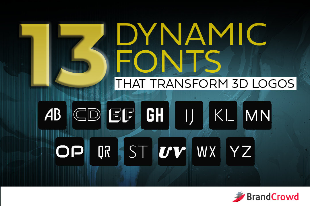
13 Dynamic Fonts That Transform 3D Logos
Run-of-the-mill is the last word you want someone to describe your business logo. 3D design gives your logo concept an unmatched depth 2D can’t beat. Most logos in the market tend to go down the path of plain old 2D. You can take the unbeaten path by using a 3D logo.
Creating a timeless 3D symbol is easy when you have a good grasp of the fundamentals. Make your 3D symbol unforgettable by choosing a high-impact font from this collection to complete it. These fonts give your business a visual edge that will draw the audience to your brand.
Covering the ground of 3D design concepts and amazing fonts that work well with them gets pretty complex. Here are the topics we’re going to discuss in detail:
- Why 3D Matters
- 3D Logo Hall of Fame
- Thick fonts
- Thin fonts
Why 3D Matters
Let’s define 3D otherwise known as 3-dimensional before we really get into this. This term refers to objects with width, height, and depth. The application of 3D design gives artists more room to play with the depth of field and create complex spatial relationships.
But, hey. Don’t get us wrong. 2D logos can still pack a punch. It’s just that not everyone takes joy in the fact that it’s flat. Besides, other opportunities just open up to brands that go with a 3D logo. Logos that have 3D elements integrate seamlessly with animation because they have a more realistic feel and reusability.
Take a look at these famous brands that have benefitted from staying true with their 3D concept despite the massive shift of companies to its flatter design counterpart.
3D Logo Hall of Fame
Chevrolet
This bowtie logo is an iconic one from the automobile industry. Although there are hundreds of theories surrounding this mystifying logo, one thing is for sure, it has remained 3D since its launch in 1913.
Logo designers used a thick custom font made by artist Tom Speedwell. It’s on the thicker side of the font choice spectrum which helps define the brand name despite the bowtie’s broadness. The use of the color black in the text provides balance to the metallic finish of the metallic symbol.
Xbox
Microsoft’s Xbox has an eye-catching stylized X figure that works because of its color choice and it was laid out with a highly polarizing font. The round shape has slits running down its surface that get slimmer as it grows closer to the brand name.
“Xbox” is typed in a font called X360 created by Redge. It’s a fairly simple san serif font, but its characters have bowls that extend to an overreaching bar. This is seen in the letter B. This gives the text more attributes that go beyond just being sleek. It makes it adaptive, yet fun which is everything a gaming console should be.
We’ve given some prime examples of logos that used either thin and thick fonts. Weighing out your options is crucial for having a thorough branding plan because as simple as font choice may seem, consumers perceive brands differently by fonts alone.
Use these effective fonts to kick start your logo design concept ideas.
Thick Fonts
Association of human personality types is used by consumers to differentiate how they perceive all the brands they encounter every day. By using heavier fonts, you give your design a dominant nature to match 3D figures. Here are some fonts you can use to do that.
Douar
Douar is an outline font that has broad characters. This results in an interesting silhouette that looks like something straight out of a science fiction pulp cover from the 30s. 3D symbols won’t look overbearing seven if the characters are broad because the characters aren’t filled with color.
Bungee Shade
The font is an interesting take on retro typography. Bungee Shade looks as if the text is transcending from the planes of your screen because the text has a 3D effect. This is all thanks to the shadow detail that adds depth to each character.
Norwester
Get a condensed text with the subtle geometric nature of Norwester. The fun is loud and fun, but its characters have a distinctly structured aperture.
Audiowide
Brands with a flair for drama will like this. Audiowide is a sans serif font with interesting bowl strokes that make up its characters. It has a variation of round and sharp edges formed pipe-like lines.
Shrikhand
Using Shrikhand in your design can help your brand look elegant and your logo look readable. Serif fonts or typefaces with small strokes at the end of defining strokes are known to have this effect on the text. This looks fitting for companies that are in the data or health sector to get an authoritative brand persona.
Grotesk
The futuristic energy of the font is adaptive and far from being overbearing. It stays in the borders of modern design but breaks the rules a little to create playful accent strokes in some of its characters.
Thin Fonts
Simpler fonts can do more with less when used right. They give soft touches of style to 3D elements that usually have complicated forms and spectrum of colors. Your text will look harmonious and bring the attention of your audience to your 3D figure.
Beon
You can ditch tacky text highlights and shadows to highlight your brand company name and slogan with Beon. This is a san serif font inspired by neon lighting. It retains the effect of fluorescence even if you use a monochromatic scheme.
Unica One
If your logo has a healthy variety of colors and figures, you can go with a highly-readable sans serif font like Unica One for stability. The font can even work for a lot of women fashion brand logos.
Julius Sans One
The font’s neat stems end with strokes that give your text subdued elegance. Julius Sans One creates a harmony that consumers may find comforting. Plus, it helps draw the eyes to your elaborate 3D symbol.
Reckoner
Although the font is slender, it makes room for subtle accent details that take the form isosceles triangles. Reckoner catches attention and challenges the audience to complete the missing portions of the characters.
Rounded Elegance
This minimalist san serif font goes all out by surrendering strokes that are commonly seen in most fonts. Rounded Elegance creates a smooth look for text like brand names and slogans.
Omnibus
Omnibus presents a simpler take on curvy fonts that pairs seamlessly with loud and layered elements. This is a sans serif font with a lot of personality, one of which is light-heartedness.
Gandhi Sans
Gandhi Sans uses tidy strokes that add variety to design element proportions. Illustrations with a lot of depth will go hand in hand with this san serif font. It makes brand names and slogans look prominent despite the lack of gimmicky elements.
The Windup
Outstanding logo designers create stunning output by selecting timeless font, color, and figures. Selecting the best font is just a part of the process, which this article covered. You’re well on your way to having a great logo.
To make your life even easier, BrandCrowd offers a selection of powerful logos you can use these fonts on and flaunt your eye for design. Demonstrate your graphic design know-how by bringing your design concept to life.
Let our 3D logo gallery bring you into a new dimension of better branding.
