Top Typography Trends in 2026
Typography has always been an integral part of branding.
You know how Google plays around with its wordmark logo to symbolize its creative and innovative culture? Or how The New York Times’ classic serif font instantly shows their tradition and integrity?
The right typography can instantly make a brand feel playful, elegant, traditional, or dynamic. It shapes your brand’s personality and messaging at just a glance.
Great and distinct typography is also woven into a brand’s identity. This is why you can recognize Coca-Cola or Disney’s font anywhere!
Typography is truly important. Brands and designers know this, which is why in 2026, it goes even further. It’s more expressive, experimental, and personality-driven. It’s now another avenue for brands to stand out amongst their competitors.
Luckily, you don’t need a massive design team to keep up in this typography war. We’ve listed down the top typography trends in 2026 to keep you in the loop and prepare your brand moving forward. Check it out below!
Our logo maker tool and other customizable templates can also help you apply these trends across logos, social posts, flyers, and more, so make sure to check those out as well.
Typography Trend 1: Kinetic and Animated Typography
Static text is so over. This year, it’s all about kinetic typography. These are text that moves, morphs, stretches, reacts, or animate accordingly based on sound, mouse scroll, click, or other action.

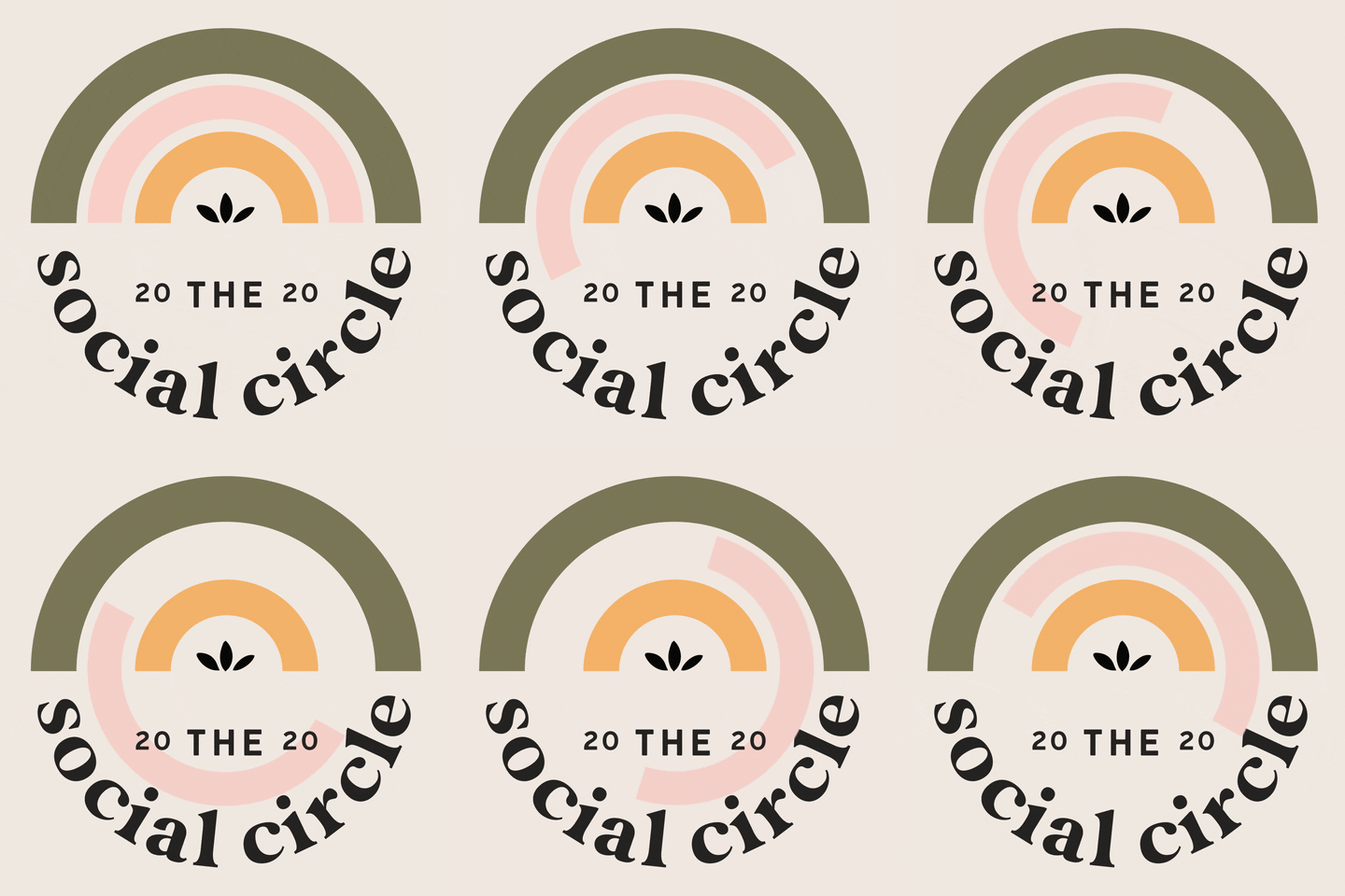
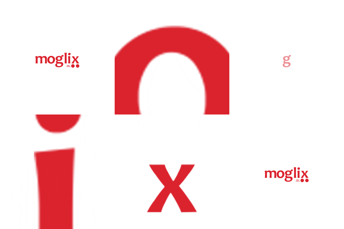
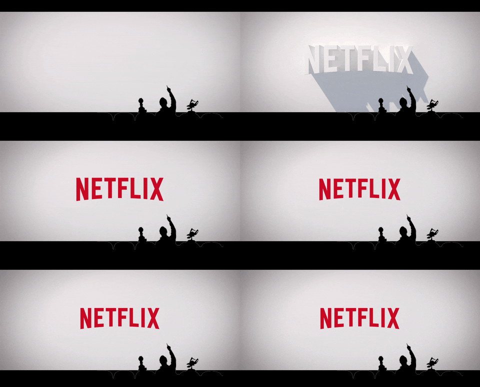
Why it’s a 2026 trend: Animation adds life and personality to your typography. Motion can also be used to help in storytelling (text quickly zipping through could indicate speed, while text melting slowly can symbolize heat, etc.).
Where you’ll see it: Landing pages, website hero section, video intros, video transitions, product teasers, or UI interactions.
When to use it: Use this when you want to highlight key messages, have richer storytelling, or if you want to grab attention once they land on your page.
How to use it:
- Reserve the animation for headlines, important phrases, or for animated logos. Avoid animating long bodies of text, as that can be too overwhelming to the eyes.
- Optimize your animations by using CSS/JavaScript animations, hardware acceleration, or Lottie files to ensure they run fast and smoothly, without causing lag on your website.
- Always keep accessibility in mind. Include reduced-motion preferences and ensure the animation won’t hinder readability.
Typography Trend 2: Bold and Maximalist Typefaces
Goodbye to minimalism, hello maximalism!
Bold and expressive typefaces are all the rage now. These are your heavy and blocky letterforms, oversized letters, exaggerated serifs, and more. It’s best for brands that want to make a statement.
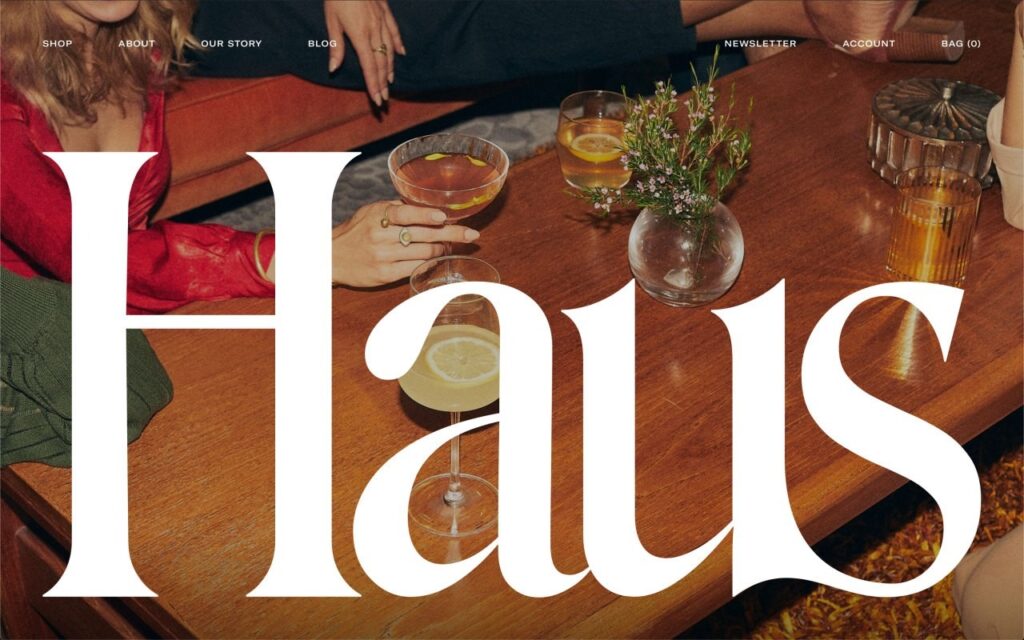
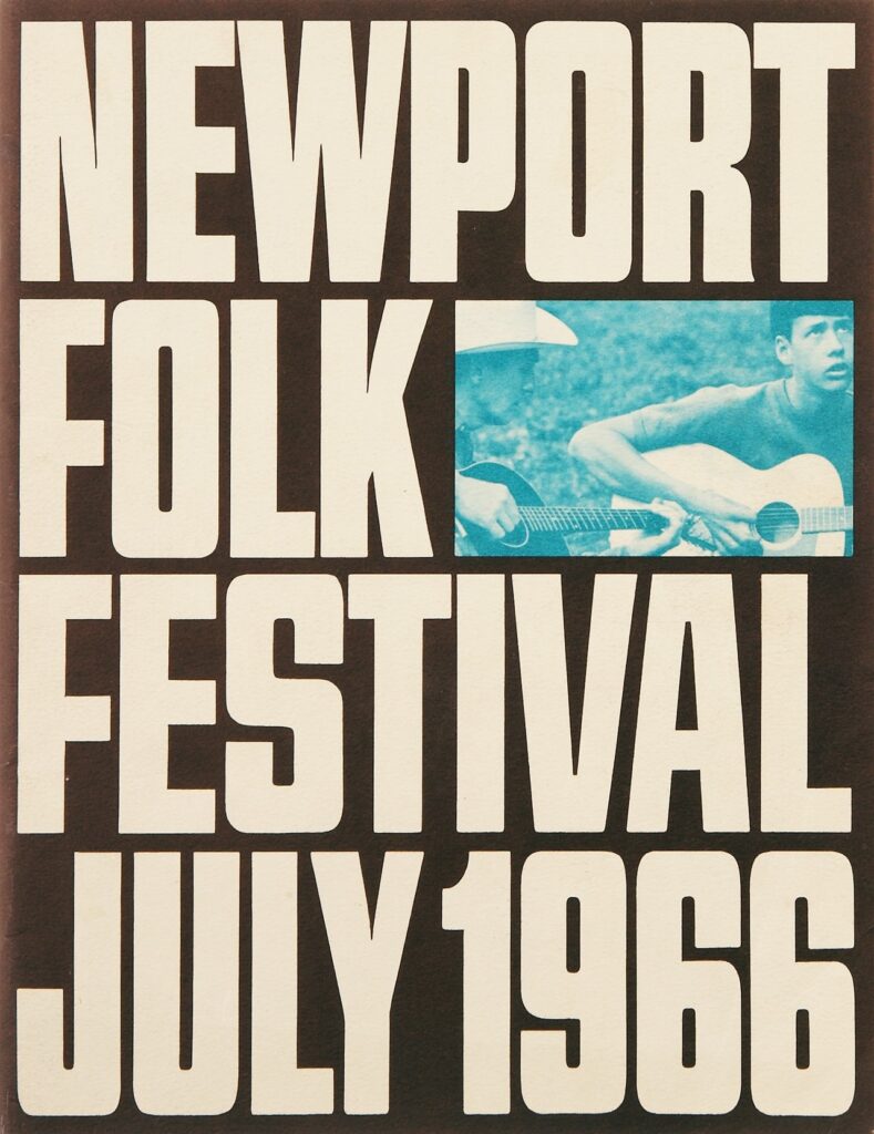
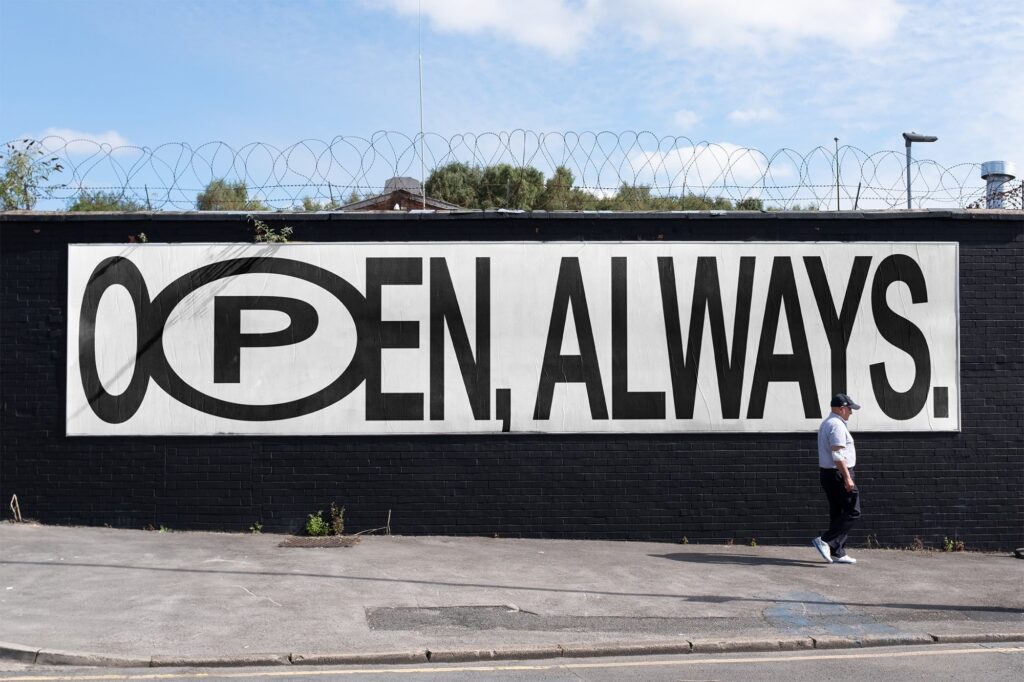
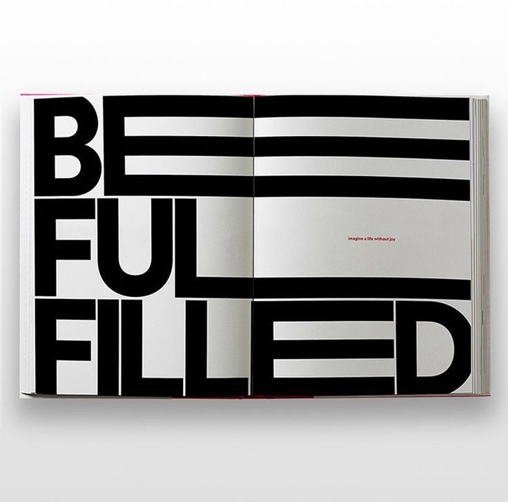
Why it’s a 2026 trend: Brands now prefer a more unapologetic and eye-catching design to cut through the noise on the oversaturated social media and digital platforms. Bold and maximalist fonts do exactly that, as they are more attention-grabbing compared to regular fonts.
Where you’ll see it: Billboards, event posters, website hero headlines, or main campaign visuals.
When to use it: Use this typography trend when you want to make a strong first impression or you want to convey your bold and dynamic brand identity.
How to use it:
- Pair oversized fonts with clean layouts and plenty of space so the typography can breathe.
- Only use this for headlines, important text, or for creating a maximalist logo.
- Keep the rest of the text simple and neutral to balance the boldness and maintain readability.
Typography Trend 3: Experimental and Playful Letterforms
Just like the maximalist trend, this one is all about taking a more playful and adventurous direction for your typography.
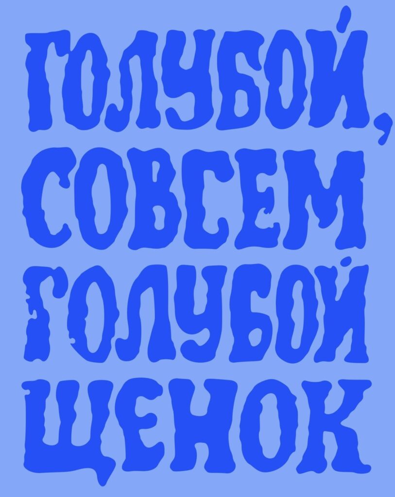
The difference is that this trend plays more on the arrangement of the letterforms by playing around with asymmetry, spacing, distortion, texturing, or layering. It’s all about breaking the rules of graphic design and doing it in a more creative and unconventional way.
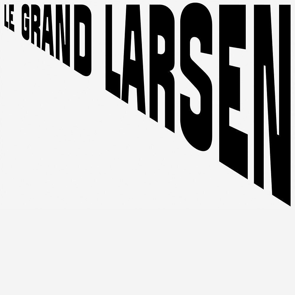
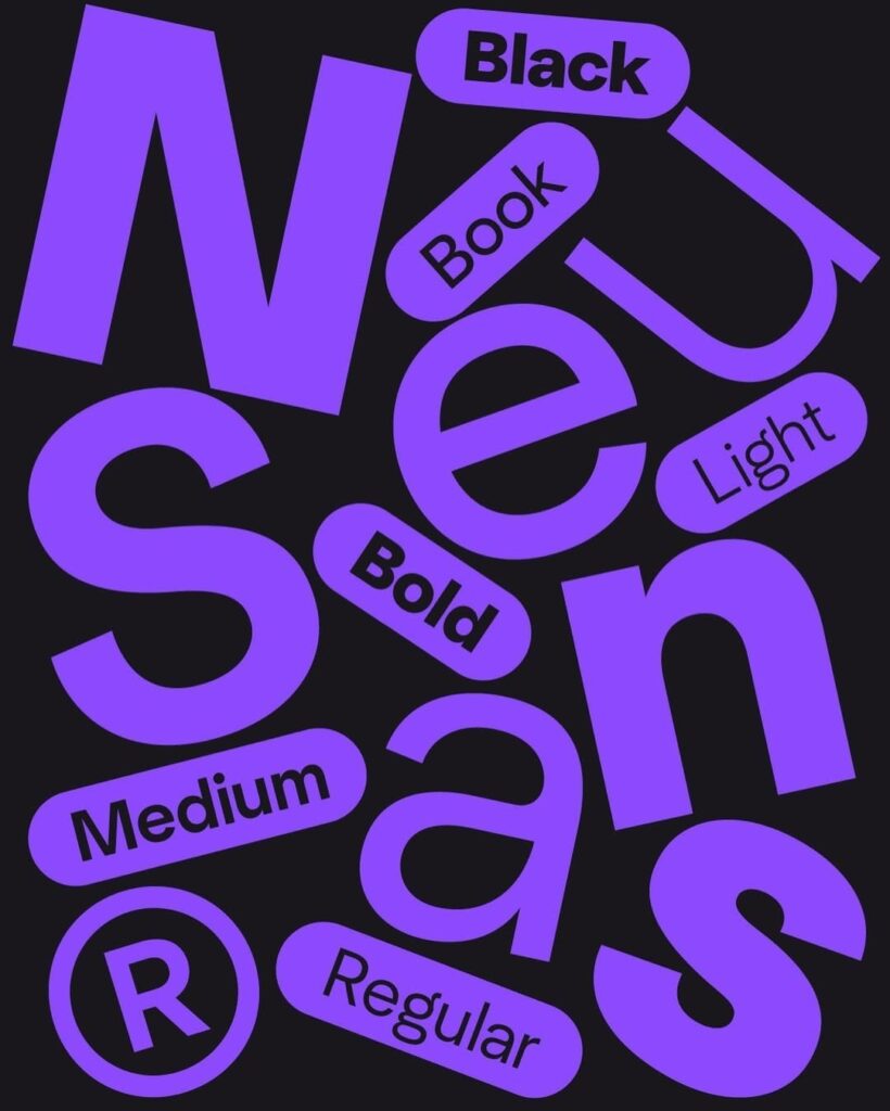
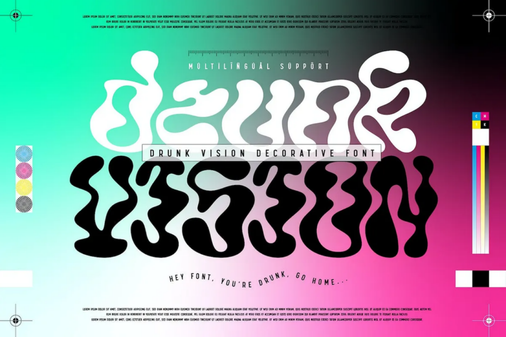
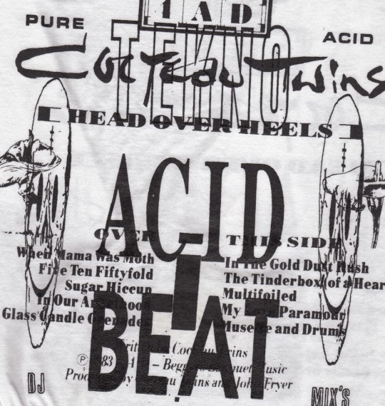
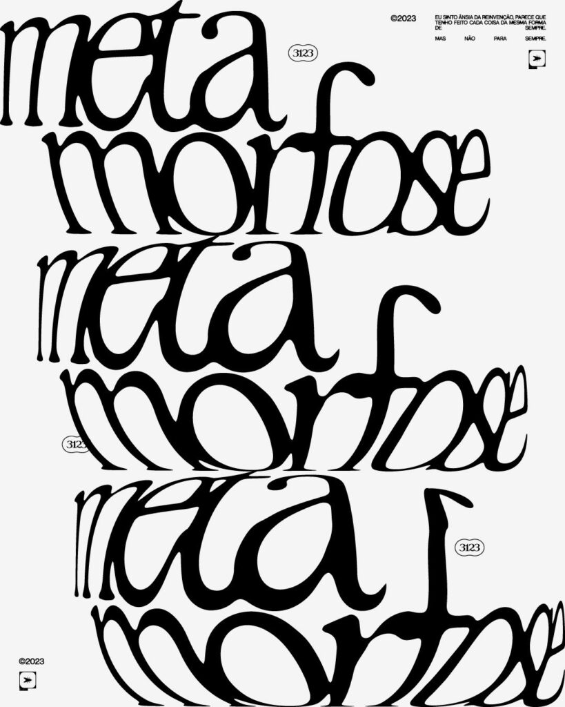
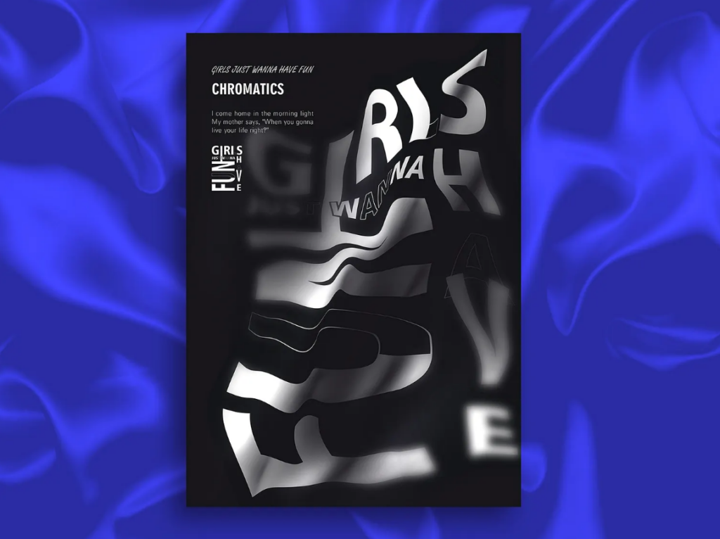
Why it’s a 2026 trend: Brands are looking for more creative and expressive ways to stand out. Experimental typography signals creativity, confidence, and originality, which resonates strongly with younger and design-savvy audiences.
Where you’ll see it: Magazines, editorials, posters, carousel posts, ads, or main campaign visuals.
When to use it: Use experimental typography when the goal is to intrigue, shock, or express creativity. It’s best suited for campaigns, events, or special projects, rather than everyday branding.
How to use it:
- Use an effect that is relevant to your brand or messaging, such as using a glitch effect for tech companies or layered color-blocked text for fashion houses.
- Apply experimental typography only in headlines or featured text to avoid overwhelming your audience.
- Test designs across different sizes and platforms to ensure that the effect comes across correctly.
Typography Trend 4: 3D and Dimensional Type
3D logos remain a popular choice this year.
Here, you’ll see designs that focus on depth, perspective, shadows, and lighting. You may see them in multiple variations, such as subtle shadowed effects on a font to full-on 3D animation. They are great for adding realism and making each letter feel more tangible and immersive.
This typography trend may seem like it is only great for tech-related industries, but current 3D effects can go beyond that. They can create a more textured, flowy, or soft vibe, which then works well for various industries and niches.
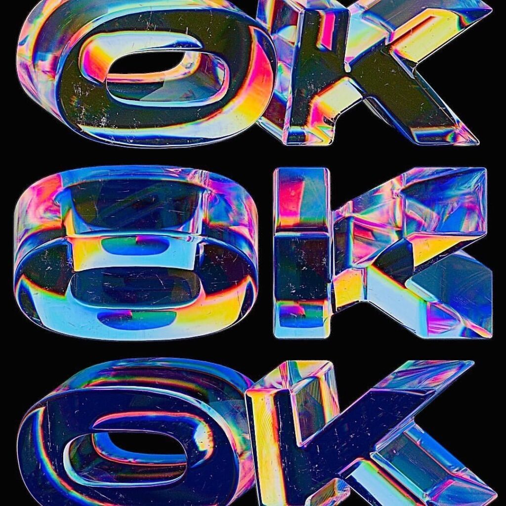
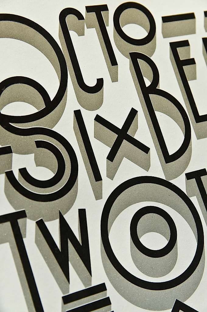
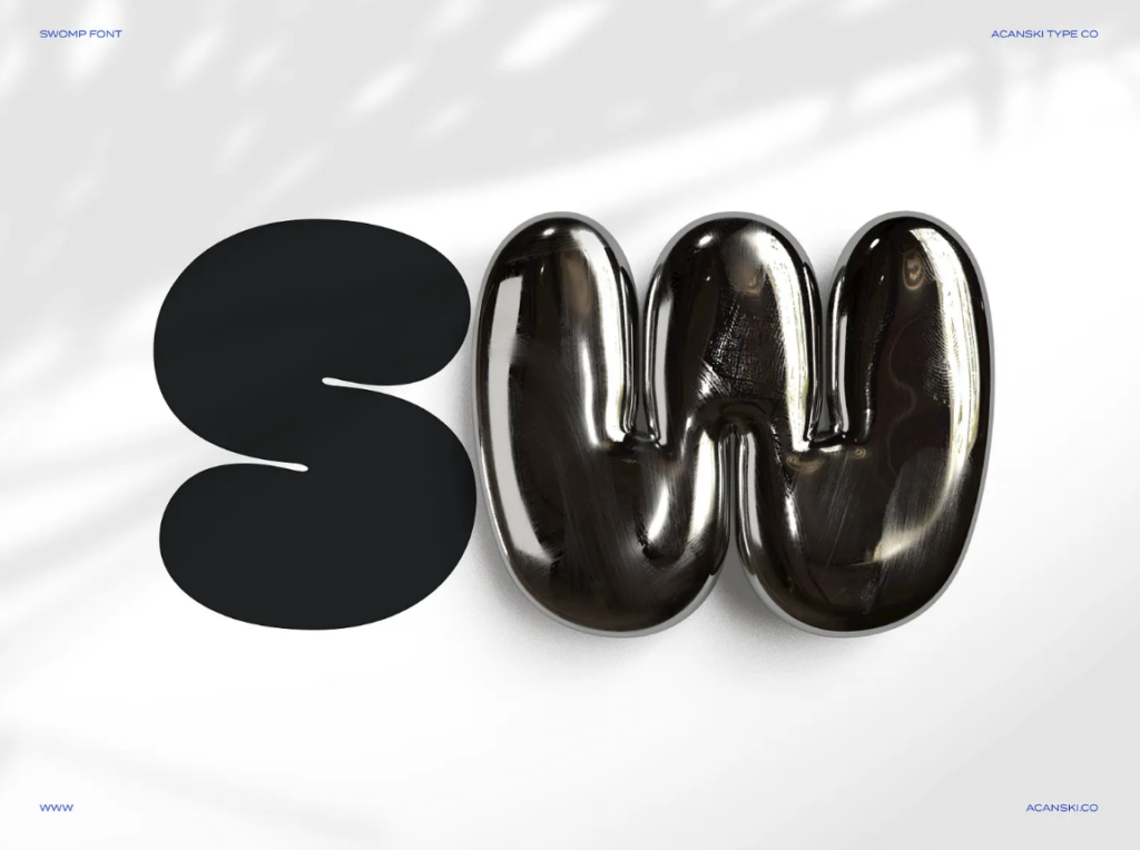
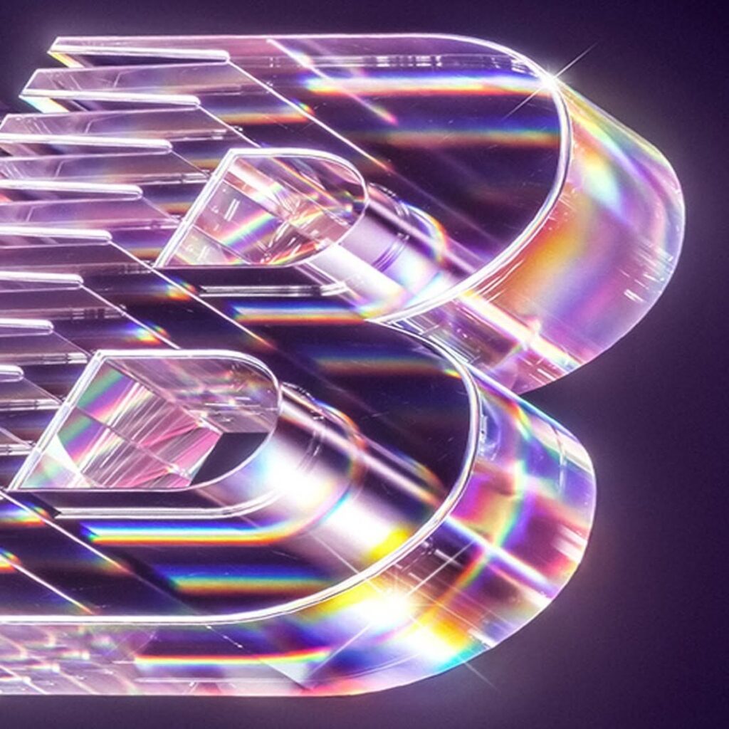
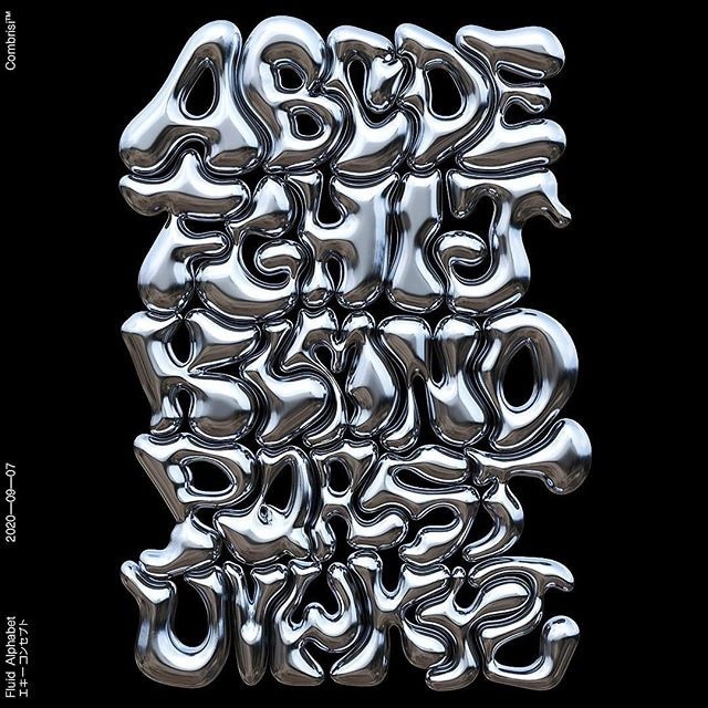
Why it’s a 2026 trend: Brands are using 3D typography to add visual richness and create more immersive and high-impact experiences. These are even more popular now with the rise of technology and AR/VR, which makes all these “techy” effects more accessible and easier to do.
Where you’ll see it: Digital ads, outdoor ads, AR/VR displays, website hero sections, or social media motion graphics.
When to use it: Use it when you want your message to feel bold, immersive, and creative.
How to use it:
- Use it with headlines or important text rather than whole paragraphs.
- Pick an effect that is relevant to your brand identity.
- Balance 3D typography with simpler supporting elements so the design doesn’t feel too much or too cluttered.
Typography Trend 5: Variable and Responsive Fonts
Accessibility becomes even more important as we shift into a digital-first mindset, which is why variable fonts, AKA those font files that can automatically adapt weight, width, and contrast depending on the screen size or layout, have become a popular trend.
It also helps maintain a consistent brand identity throughout platforms, as you can use your main fonts without having to switch to a simpler one just to ensure that your text will be visible on different screens.
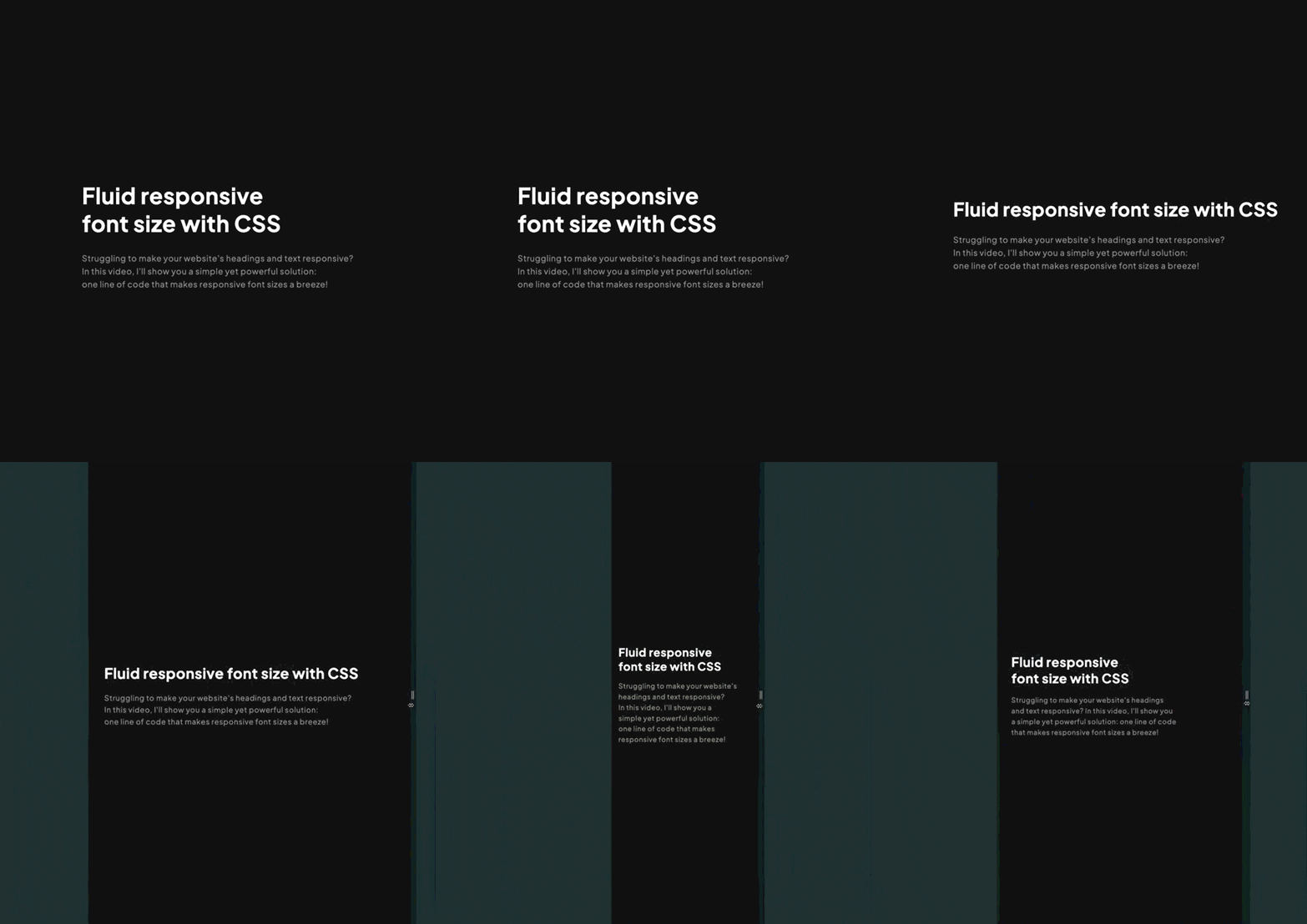
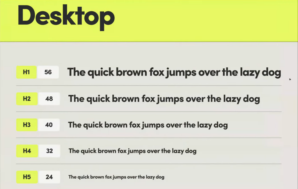
Why it’s a 2026 trend: Variable and responsive fonts offer flexibility, smoother scaling, and faster load times. They become even more important as brands prioritize more digital content and platforms.
Where you’ll see it: Websites, mobile apps, mobile site layouts, and other accessibility-focused systems.
When to use it: Use variable fonts when you need typography to adapt seamlessly across different layouts and devices while maintaining your branded look.
How to use it:
- Choose variable fonts for body text and sub-headings.
- Use a variable font that is still in line with your visual look and brand identity.
- Test how it looks on different screens and platforms.
Typography Trend 6: Nostalgic and Retro-Inspired Type
Nostalgia continues to influence typography in 2026.
Designers are revisiting letterforms inspired by the ’70s, ’80s, or ‘90s, then reworking them with modern spacing, colors, and layouts. The result is typography that feels familiar yet fresh.
These are great for brands that want to tap into emotion and nostalgia while still fitting contemporary design.
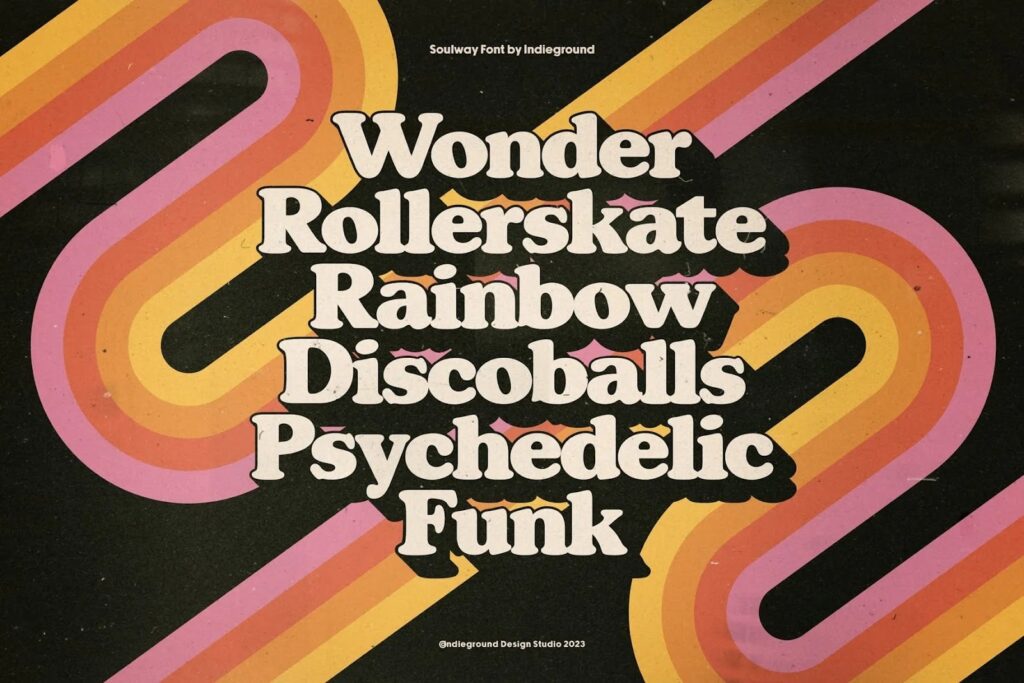
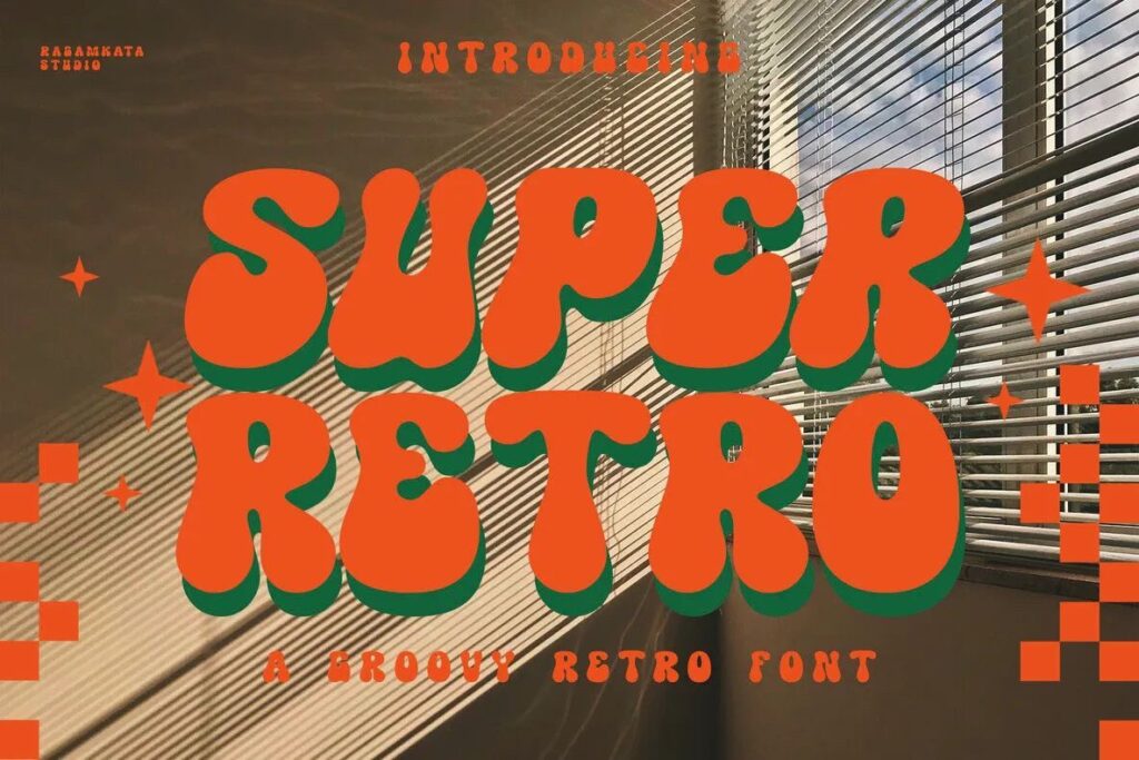
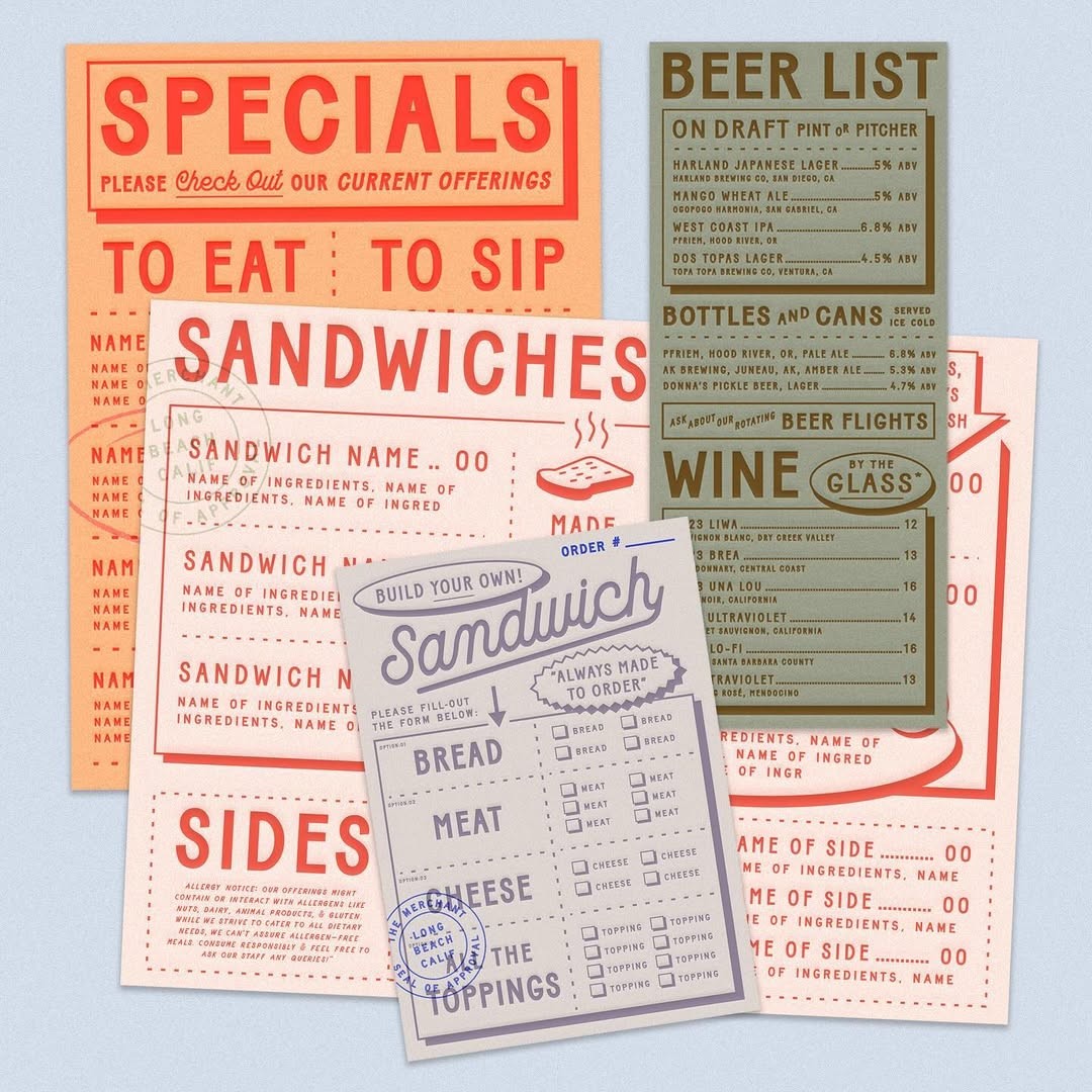
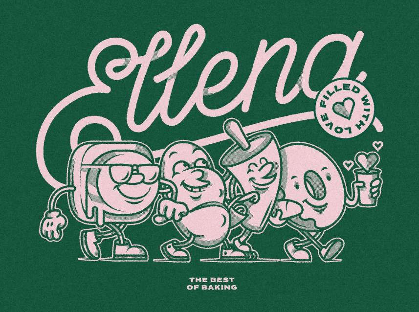
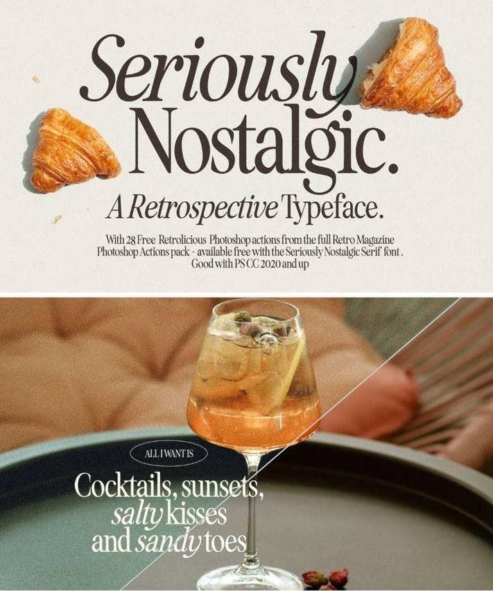
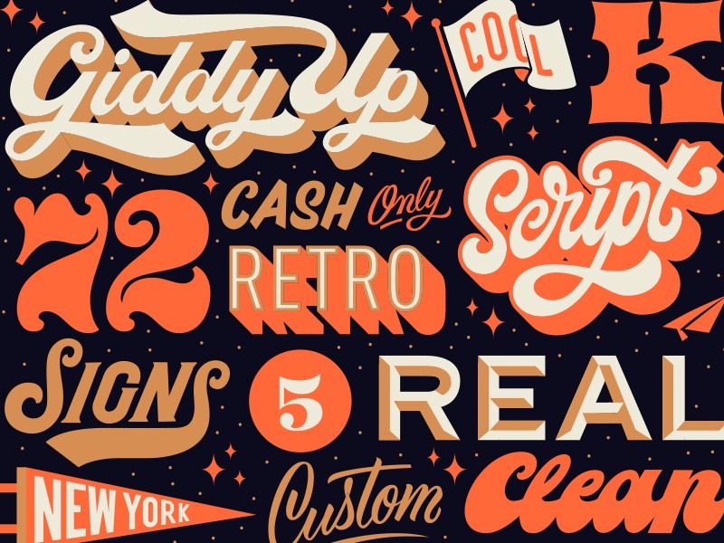
Why it’s a 2026 trend: Retro-inspired type and retro logos create emotional connections and help brands feel more human and approachable. In uncertain times, familiarity and comfort play a powerful role in branding.
Where you’ll see it: Logos, packaging, labels, editorials, lifestyle shoots, or seasonal campaigns.
When to use it: Use retro typography when telling a brand story, highlighting heritage, or creating a warm, approachable feel.
How to use it:
- Combine retro fonts with modern layouts, clean spacing, and updated color palettes.
- Or you can go full retro and use design style choices of the past.
How to Use 2026 Typography Trends for Your Brand
Trends are only effective when you use them with intention. You don’t need to follow trends just to be “in” or use every typography trend you see on our list. The key is choosing a style that is aligned with your brand identity and messaging, then applying them thoughtfully on suitable places or platforms.
Some other tips you must keep in mind are:
Pick a primary trend to emphasize
Use only one typography trend that aligns with your brand’s voice.
For example, experimental fonts work well for brands in the fashion and creative industry, while 3D typography suits brands that want to feel dynamic and modern.
Focusing on one primary trend keeps your visuals cohesive, clean, and easy to recognize.
Apply it across your logo and other brand visuals
Once you’ve chosen your direction, make sure you apply it consistently in all of your assets. This helps build a strong, unified brand presence across all platforms.
You can bring trend-forward typography into your logo with BrandCrowd’s logo maker, then carry the same look across Instagram posts, Facebook ads, flyers, posters, and other marketing materials with our customizable templates. Make sure to check them out!
Balance expression with readability
Eye-catching typography is used to make a statement, but you shouldn’t sacrifice readability and accessibility for it.
Use expressive fonts for headlines, taglines, and key messages, while keeping body text clean and simple. This balance ensures your designs look bold and modern without sacrificing clarity.
Test across multiple platforms
Typography can look very different depending on where it’s seen.
Always double-check your designs on mobile, desktop, and print to make sure your text scales well and remains legible. Small adjustments in size or spacing can make a big difference in how your text would look. You wouldn’t want to waste all your efforts by having your text get awkwardly cut off or weirdly stretched, right?
Mix trends thoughtfully
You don’t have to limit yourself to just one style.
Just make sure you are intentional. For example, pair bold and oversized headers with subtle kinetic subheadings, or combine retro headers with modern, sans-serif body text. Thoughtful combinations like these can add depth and personality without overwhelming your design.
Conclusion
Fonts aren’t just fonts anymore in 2026.
They’re not just a background element. No, they are the main character. From animated type to maximalist designs, these typography trends help brands express themselves, stand out over their competitors, and leave a mark on their audience’s minds.
For small businesses and creators, now is the perfect time to experiment.
With BrandCrowd’s logo maker and tools like poster maker, website builder, or animation maker, you can easily get into these typography trends without the hassle.
Simply enter a keyword relevant to your trend of choice (something like “retro logo” or “maximalist logo”), choose the template you like best, customize, and then download to use. It’s that simple!
Make your brand stand out with BrandCrowd today!
Read more on typography and fonts:
- How Typography Impacts Your Brand and How to Pick the Right One
- 50 Typography Logos That Are Remarkable
- Emotional Typography and the Psychology of Fonts
FAQs About Typography Trends
What are the typography trends for 2026?
The top typography trends for 2026 are kinetic & animated, bold & expressive, experimental, 3D, responsive, and retro-inspired typography. These trends show that typography is evolving to be more than just a font, and instead be another way to give more personality and identity to brands.
How to use typography trends in branding?
Typography trends can be applied to your logos, social media posts, website, flyers, or posters to reinforce your brand personality. Alternatively, you can also just dip into the trend by using it in one relevant marketing campaign, just to see if it is suitable for your brand.
Are variable fonts important for 2026 design?
Yes. This is because variable fonts adjust weight, width, and style dynamically across devices, which improves readability and accessibility, all while improving site performance. It’s a huge boost, especially for brands that live on digital platforms.
Do these typography trends work for small businesses?
Absolutely! Even small businesses can benefit from expressive typography to stand out in crowded markets. Trends like bold type, retro styles, or subtle animations can make a big impact without requiring a large design budget, and they can be applied easily using tools like BrandCrowd.
Do I need to redesign my brand just for typography trends?
No. Your typography should be aligned with your brand identity and audience. If the trends are not suitable or relevant for your brand, you don’t need to follow them.
Faviola Publico is an SEO Content Writer specializing in branding and digital marketing strategies. Outside of work, she enjoys reading slice-of-life novels and watching any mystery thriller-themed series.
Header Image by Khim John Blazo