8 Steps to Rebrand a Startup Without Losing Recognition
Rebranding a startup is riskier than launching a brand from scratch. When you are new, you have nothing to lose. When you rebrand, you are spending equity you already earned, the trust, familiarity, and search visibility that took months or years to build.
Done well, a rebrand can unlock new markets, reflect who you have become, and give investors and customers a clearer story. Done poorly, it can confuse the very customers who found you in the first place.
Learning how to rebrand a startup without losing recognition is less about design and more about sequencing. This guide walks through how to diagnose what actually needs to change, which brand elements are worth protecting, how to test a new identity before it goes public, and how to roll it out as a managed transition rather than a single dramatic reveal.
Why Startups Rebrand
Most startups rebrand for one of a few reasons:
- The company pivoted into a new product or market
- The original name or look no longer fits the business
- A funding round or acquisition raised the stakes on how “investable” the brand looks
- The visual identity became inconsistent as the team grew
Whatever the trigger, the real challenge is the same. You need to change enough for the rebrand to actually solve the problem. You also need to keep enough that loyal customers still recognize you on the other side.
This balance is what separates a startup brand refresh that builds momentum from a startup rebranding effort that quietly weakens customer confidence.
The Startup Rebranding Process, Step by Step
A rebrand works best as a sequence rather than a single design sprint. Each step below builds on the one before it, starting with diagnosis and ending with measurement:
Step 1. Diagnose the problem
Before opening a design tool, figure out what is actually broken. Is it the name, the visuals, the positioning, or all three? Many founders jump straight to a new logo when the real issue is that customers do not understand what the company does.
Talk to the people who already know your brand. Interview a handful of existing customers and ask what comes to mind when they think of your company. Ask which words, colors, or feelings they associate with your name.
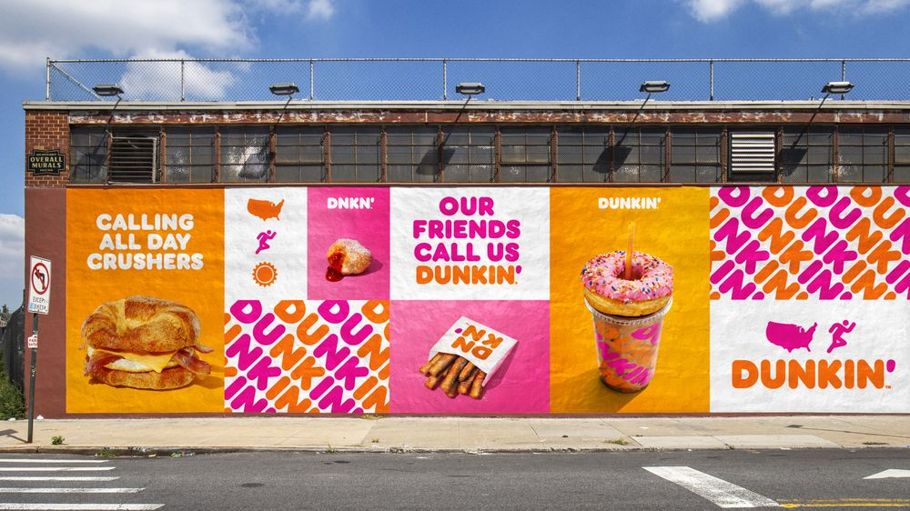
Dunkin’ Donuts is a useful example here. Customers had already been shortening the name to “Dunkin'” for years before the company made it official in 2018. The research confirmed a shift that had already happened in the market, which is why the rebrand felt natural rather than forced.
Diagnosing first also protects you from a common mistake. Founders sometimes rebrand because they are personally tired of the old look, not because customers are confused by it. Those are very different problems, and only one of them justifies a rebrand.
Step 2. Decide between a brand refresh or a complete rebrand
A brand refresh updates the execution. You tighten and make subtle logo changes, modernize the colors or type, and clean up inconsistencies, while the name, strategy, and positioning stay the same.
A complete rebrand changes the strategic foundation itself, which can include the name, the positioning, and sometimes the business model.
Use this table as a starting filter:
| Symptom | Likely Fix |
| Logo feels dated but the company is well understood | Refresh |
| Name no longer reflects the product or audience | Full rebrand |
| Business pivoted, merged, or entered a new market | Full rebrand |
| Visual identity is inconsistent across channels | Refresh |
| Customers are confused about what you actually do | Full rebrand |
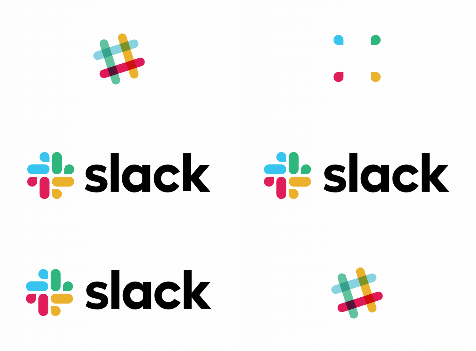
Slack‘s 2019 update is a clean example of a refresh. The name and positioning did not change. Pentagram, the agency behind the redesign, deliberately kept elements of the original hashtag shape as the starting point for the new logo, since the symbol was tied to how the product actually worked. At the same time, the team simplified an eleven-color palette down to four core colors, which solved a real usability problem without touching the brand’s foundation.
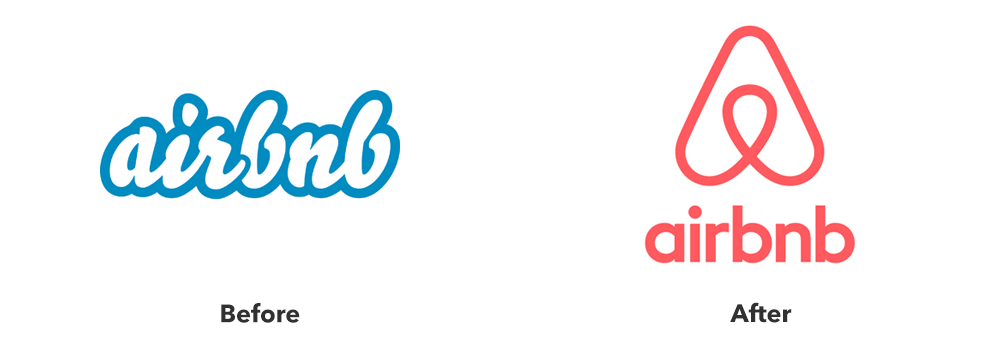
Airbnb‘s 2014 identity update sits on the other end of the spectrum. The company introduced a new symbol, the “Bélo,” alongside a full repositioning around the idea of belonging rather than just booking a place to stay. That is a full rebrand, not a refresh, because the strategy changed along with the visuals.
If you are unsure which path fits your startup, a refresh is almost always the safer place to start. You can always go further later. It is much harder to walk back a full rebrand that proved more disruptive than necessary.
Step 3. Decide what to keep, evolve, or replace
Once you know the scope of the change, run every major brand asset through one simple filter. For each one, decide whether to keep it, evolve it, or replace it.
| Asset | Keep, Evolve, or Replace | Why |
| Logo mark | Evolve | Preserve the shape or silhouette that customers already recognize |
| Color palette | Keep the primary color, evolve the rest | Color is often the fastest recognition trigger |
| Typography | Evolve | Small refinements rarely disrupt recognition |
| Name | Replace only if the strategy truly demands it | Names carry the most SEO and word-of-mouth equity |
| Tagline | Evolve or replace | Lower risk than changing the name or logo |
| Tone of voice | Evolve | Should shift gradually with the brand’s maturity |
| Domain and URL | Keep whenever possible | Protects backlinks, direct traffic, and search rankings |
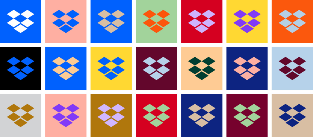
Dropbox shows how this works in practice. The company has kept its core box logo anchored across every redesign since 2008, even while experimenting with a much wider palette in marketing materials. That single point of consistency has helped the brand stay recognizable through several rounds of change.
The company picked the elements that mattered most for recognition, kept those steady, and used the rest of the identity to signal growth.
This is also where a tool like BrandCrowd’s logo maker becomes useful. You can explore evolved versions of your mark quickly and compare them side by side before committing to a direction.
Step 4. Set strategy before the logo
The safest approach is to keep one visual bridge between the old mark and the new one. That might be a shape, a proportion, or a color that carries through the redesign, so customers have something familiar to anchor to.
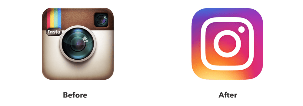
Instagram’s 2016 redesign is a strong example, though the story is more nuanced than it first appears. The initial public reaction was sharply negative. Many users criticized the new gradient icon as generic and a step down from the detailed retro camera it replaced.
What made the redesign work over time was not the reaction. It was the fact that the new logo was built around the three shapes people actually remembered from the old logo: a rounded square, a circle, and a dot. The lesson is not that backlash does not matter. The lesson is that preserving the core shape memory of a logo matters more than preserving every visual detail.
This is exactly why messaging and strategy need to come before the redesign itself. If you know which elements customers actually associate with your brand, you can intentionally protect those elements rather than guessing what to keep.
Step 5. Test the new identity before launch
Before anything goes public, benchmark where you stand today. Record your unaided brand recall, your Net Promoter Score, your direct traffic share, and your social engagement numbers. You will need these later to measure whether the rebrand actually worked.
Then test the new identity in small batches. Show it to existing customers first, since they are the group most likely to notice a break in recognition.
Ask two simple questions. Do you know who this is? Do you understand why we changed?
If a meaningful share of your existing customers cannot answer the first question, the identity needs more work before launch. If they can recognize you but do not understand the reasoning, that is a messaging problem you can solve before the public rollout, not after.
Step 6. Prepare internal teams before the public reveal
Your employees will field the first questions about the rebrand, often before your customers even see an official announcement. Sales, support, and customer success teams need to understand the reasoning before they are asked to explain it.
Hold an internal reveal before the public one. Give teams a simple FAQ document that covers what changed, what stayed the same, and how to answer common customer questions.
This step is skipped more often than it should be, especially at fast-moving startups. Internal teams who feel blindsided by a rebrand tend to communicate that uncertainty to customers, whether they mean to or not.
Step 7. Launch as a migration
A rebrand is not a single reveal moment. It is a coordinated migration across every touchpoint where your old identity currently lives.
For name changes in particular, consider a temporary “formerly known as” period. Every communication about the rebrand should clearly explain two things: what is changing and what remains the same. Customers tolerate change much better when they understand exactly what they are keeping.
Build a checklist that assigns a clear owner and a deadline to every touchpoint that needs updating, like the one below:
| Touchpoint | Owner | Deadline |
| Website and app | Product or design lead | Before the public announcement |
| Social media profiles | Marketing | Same day as announcement |
| Email signatures | Ops or IT | Within one week |
| Signage and packaging | Operations | Per production timeline |
| Third-party listings and directories | Marketing | Within two weeks |
| Domain and URL redirects | Engineering or SEO lead | Before the old domain goes dark |
If your rebrand involves a domain name or URL change, remember to carefully protect your search traffic. Set up proper 301 redirects from every old URL to its new equivalent, update your listing in Google Search Console, and update citations across directories and partner sites. Search rankings can take months to recover if this step is rushed.
Step 8. Measure what actually matters after launch
Compare the same metrics you benchmarked before launch. Track recognition, comprehension, customer retention, and overall sentiment, not just whether people like the new logo.
A rebrand that gets positive comments on social media but confuses long-term customers about what you do has not actually succeeded. Watch churn and support ticket volume closely in the weeks after launch, since spikes there often signal a recognition or comprehension gap that a quick survey might miss.
Give the rebrand real time to settle before drawing conclusions. Some resistance in the first few weeks is normal, even for changes that turn out to work well.
Common Rebranding Risks to Avoid
Most rebrands that lose recognition fail for the same handful of reasons. Almost all of them come down to moving faster than customers or teams can keep up with.
Watch for these common mistakes:
- Changing too much at once without warning customers or teams
- Launching a new visual identity with no prior announcement or transition period
- Skipping customer testing before the public launch
- Ignoring SEO during a domain or URL change
- Rebranding without buy-in from internal teams
- Removing every trace of the old identity so fast that customers lose their anchor
- Treating the reveal as a single event instead of a phased rollout
None of these mistakes is really about design quality. They are about skipping the steps that protect recognition, diagnosis, customer testing, internal preparation, and a gradual transition.
Keep an archive of old logos, colors, and assets for internal reference, but remove them from active templates to avoid confusion about which identity is current.
When Is the Right Time for a Startup to Rebrand
The right time is usually tied to a real business shift, not a personal preference for a new look. Legitimate triggers include the following:
- A pivot into a new product line or category
- A significant funding round or acquisition
- Expansion into a new market or audience
- A merger that combines two existing brands
If your current brand still accurately reflects what your company does and who it serves, a full rebrand is rarely worth the risk. A smaller refresh can often solve the same problem with far less disruption.
How BrandCrowd Helps You Rebrand
A successful startup rebrand comes down to a few core moves. Diagnose the real problem before you touch a design tool, decide honestly between a refresh and a full rebrand, keep the assets that carry the most recognition, and roll out the change as a managed migration instead of a single reveal. None of that requires starting from a blank page.
BrandCrowd can help with each of those moves. The logo maker lets you create evolved versions of your existing logo in minutes, so you can compare options side by side before committing to a direction.
Once you land on a new identity, the brand kit tools help you build consistent assets across every touchpoint, from social profiles to business cards to websites and more! That consistency is exactly what protects recognition during the migration period described above.
A rebrand is not about how dramatic the reveal looks on launch day. It is about how many of your existing customers still recognize you a month later.
FAQs on Startup Rebrands
1. How do you rebrand a startup without losing recognition?
To rebrand a startup without losing recognition, you have to diagnose the actual problem first, then keep the brand elements that customers already associate with you, rather than changing everything at once. Test the new identity with existing customers before launch, and roll it out as a gradual migration rather than a single announcement.
2. What is the difference between a brand refresh and a complete rebrand?
A brand refresh updates execution, tightening the logo, colors, or type, while the name and strategy stay the same. A complete rebrand changes the strategic foundation itself, including the name, positioning, and sometimes the business model.
3. Which brand elements should a startup keep during a rebrand?
Run every asset through a keep, evolve, or replace filter rather than deciding all at once. Color, name, and domain usually carry the most recognition and search equity, so they deserve the most caution before changing.
4. How can a startup change its logo without confusing customers?
Keep one visual bridge between the old logo and the new one, whether that is a shape, a proportion, or a color. Preserving the core shape memory of a logo matters more than preserving every visual detail.
5. How should a startup announce a rebrand to customers?
Prepare internal teams first so they are not blindsided by customer questions. Then explain clearly what is changing and what is staying the same, using a phased rollout instead of a single reveal, especially for name changes.
6. How do you measure whether a startup rebrand is successful?
Compare recognition, comprehension, retention, and sentiment against the benchmarks you recorded before launch. Watch churn and support ticket volume closely in the weeks after, since spikes there often signal a gap a quick survey would miss.
7. When is the right time for a startup to rebrand?
When the business itself has genuinely changed, through a pivot, a funding round, a new market, or a merger, not simply when the founders are tired of the current look. If the brand still accurately reflects the company, a smaller refresh is usually the safer choice.
Read more on branding here:
- Brand Purpose: The Ultimate Guide to Building a Meaningful Brand
- How to Design a Blog with AI Tools
- What Is Brand Reputation?
Hannah Suroy suroy brings clarity to complex topics across entertainment, business, and creative industries. She specializes in translating industry trends and innovations into engaging content that helps readers understand the creative process behind the work they love.