Famous Anime Logos of 2022
(Updated Oct 6, 2022) For generations, anime has become a staple medium of entertainment. The popularity of Japanese animation continues to climb at a steady rate.
Its history reflects the fathers of anime, Ōten Shimokawa, Jun’ichi Kōuchi, and Seitaro Kitayama. All three of these creators created pieces like Imokawa Mukuzo Genkanban no Maki, Nakamura Katana, and Urashima Taro aired in 1917.
Now, thanks to innovation, the process has evolved into using 3D animation, rotoscoping, and more. Fans worldwide don’t just love the unique art style but the stories that anime shares.
Anime has become a genre that not only suits children but adults themselves. And it’s never too late for you to hop onto the hype train. That’s why today, we are featuring some of the best anime logos and titles per season of 2022.
These logos are a fantastic source of inspiration for your gaming logo design or wordmark logo design! See them down below per season.
Winter Season 2022
The titles below were released from January to March of 2022, with 12-13 or 14 episodes per release. Check out the unique logos below.
Attack on Titan: The Final Season Part 2
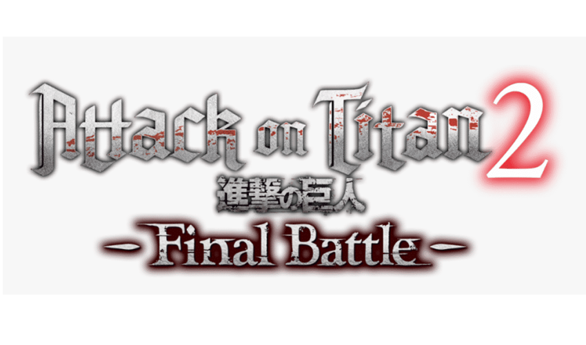
Here we have a familiar title from our 2020 list. This season, we see the main character grow into an antagonist, and his motives are unclear, but we know the ending will be impending doom nonetheless.
Blood spatter is prominent on the text logo design of this post-apocalyptic show by Hajime Isayama. It references the gory events that transpire between humans and titans. The logo itself is Linotext which is a serif font style.
Demon Slayer: Entertainment District Arc
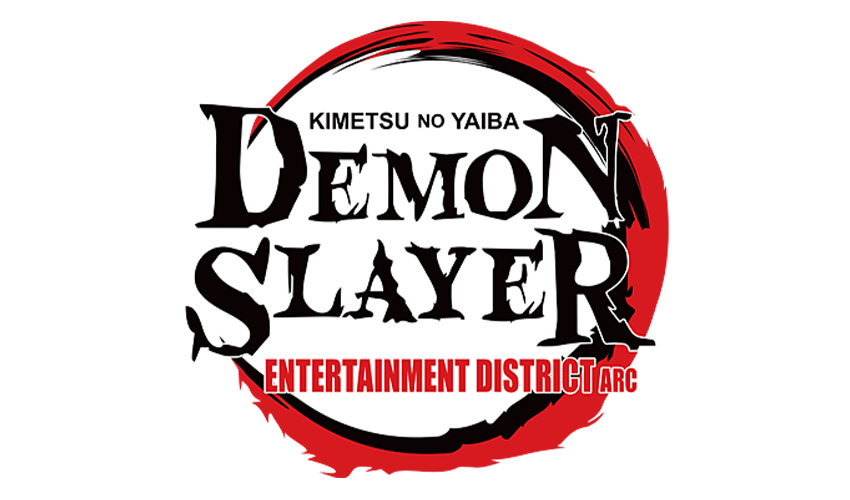
This season is the third season of anime. We follow the three protagonists after healing and grieving the death of Rengoku, the Flame Hashira in the anime. And later accompany Tengen Uzui, the Sound Hashira, as they embark on the quest to find what is causing terror and havoc in the district.
A red and black circle surrounds the words Demon Slayer or Kimetsu no Yaiba in a clean streak atop and a fiery end at the bottom. One could say the emblem logo design is akin to Tanjirou’s move seen in the first season.
But the color palette is associated with the evil lurking and bloodshed in the anime. And the font style is a serif that looks like letters burnt onto parchment.
My Dress-up Darling
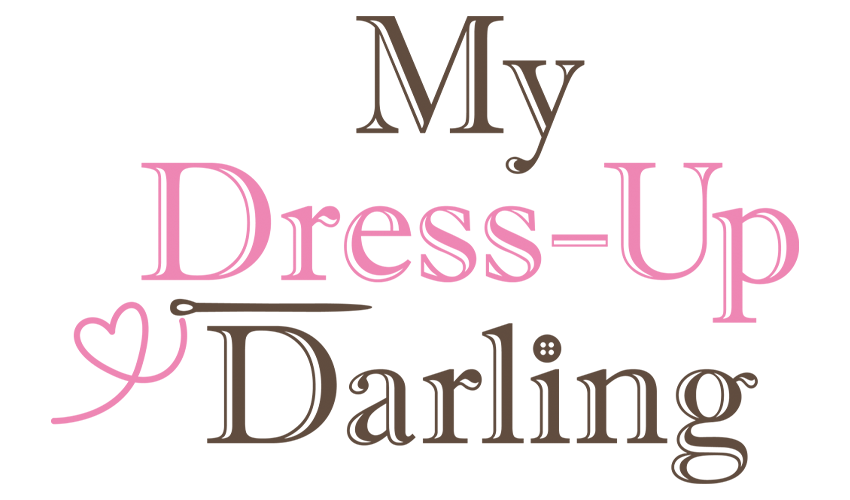
Next, we have an anime targeting cosplayers. The protagonist, Wakana Gojou, has difficulty finding friends because of no common interest—sewing. When Marin Kitagawa, the most popular girl, shares her secret of being a cosplayer, Wakana finds a new purpose for his sewing skills as they make her cosplay dreams come true.
In this adorable anime directed by Keisuke Shinohara and features works from CloverWorks, we see the logo in a serif font. We see a heart thread attached to the needle between the words Dress-Up and Darling.
It also has a cute color scheme of pink and brown, common color combinations associated with sweetness and chocolates.
Akebi’s Sailor Uniform

Our next winter anime is slice-of-life anime. We follow Akebi in her pursuit of new experiences as she starts her first year in junior high. All the while wearing her favorite outfit, Robai Private Academy’s sailor uniform, and taking a step forward to her next chapter in life.
This anime’s logo, it’s a cute simple logo with giant kanji surrounding the English name. And there’s a pink bow titled to the left after the main character’s name, Akebi’s. A cute logo for a cute anime.
Teasing Master Takagi-san 3
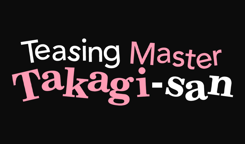
The third season of the anime starts during the summer break of Nishikata. The days fill with teasing between him and his classmate Takagi as they slowly get closer, trying to best each other on who would be better at teasing the other.
We have another classic pink and black color scheme for this anime with a wavy font for the logo. It gives off a fun, and nostalgic feeling since the letters seem floating in the air.
Spring Season 2022
The titles below were released from April to June. Check out the cool logo designs below.
Kaguya-sama: Love is War – Ultra Romantic
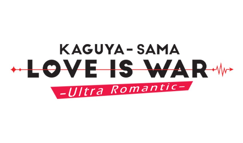
We have another anime focused on two individuals (Council president Miyuki Shirogane and vice-president Kaguya Shinomiya) competing, but this time, it’s to see who confesses their romantic love first.
Their logo is a rather interesting one since it’s in sans serif. The O in love has a heart, and there’s a lifeline crossing out love in war with Ultra Romantic inside a red rectangle below. One could say that it looks great for a business name and tagline design.
SPY×FAMILY
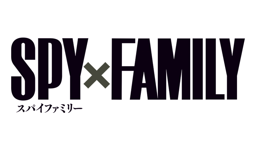
One of the most anticipated mangas finally has an anime adaptation. It’s about Loid, a spy creating a makeshift family as his cover, with Yor being his make-believe wife and Anya being his make-believe daughter. Unknown to Loid and each other except Anya, Anya is an esper (someone with psychic powers), and Yor is an assassin.
The anime revolves around the three of them working out the intricacies of being a family while hiding their jobs/abilities from each other and the rest of the world. Now, if you look at their logo, it’s a thin sans serif in black.
It screams being professional and, oddly enough, feels covert and spy-like.
Aoashi
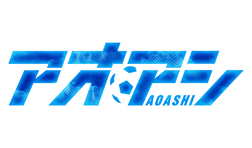
In our 2020 list, we had Haikyuu! An anime featuring volleyball centered on Hinata and his journey with his archnemesis from elementary, Kagayama. Now we have Aoashi, featuring the journey of Ashito Aoi, a soccer player who may have botched his chance to get a soccer scholarship, but a critical person sees his talent, which kicks his plans back on track, maybe.
The anime’s logo, it’s a sans serif in light blue. It has a bit of a soccer ball pattern and patches of light blue on the Kanji name.
Summer Time Render
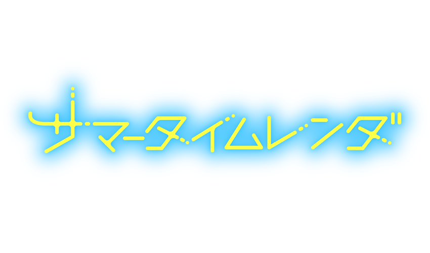
The first sci-fi anime on the list is Summer Time Render. The story starts with Shinpei Aijiro visiting the island he grew up on because his childhood friend, Ushio Kofune, died.
The story offers suspenseful storylines and twists, which people would love. It’s similar to Erased on our 2020 list without the time jumping. Moving to the anime’s logo, the Kanji is yellow with a cyan background.
But the most striking feature of the logo is the dotted edges of some of the letters, which give off a sense of techno stuff, like a type of signal disconnection.
Ya Boy Kongming!
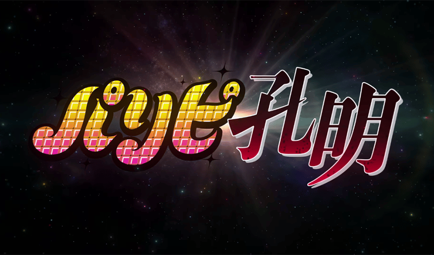
Last for spring anime; we have an Isekai-like theme when Kongming. He’s a general who wishes to be reborn in a world of peace and prosperity before his dying breath after enduring multiple battles in Ancient China.
Two millennia later and he’s reborn and tries to find his way around Japan’s modern party hot spot: Shibuya City, Tokyo. There he meets Eiko, an amateur musician. Their meeting starts an unlikely friendship, with Eiko teaching Kongming street smarts and Kongming strategizing Eiko’s steps to stardom.
The anime’s logo is attractive since it’s in serif font but two styles and colors. Ya Boy is in serif retro font while Kongming is in sans serif font, which looks oddly like Mortal Kombat font.
The color scheme is contrasting, which is unique and pays homage to the story itself—Ya Boy in a gradient color scheme of pink and yellow with a disco ball-like pattern. And Kongming is in a gradient of light (the tips) and dark red, which we could trace back to his past in wartime and bloodshed.
Summer Season 2022
These are the animes released from July to September. Get inspired by the logos below.
Made in Abyss: The Golden City of the Scorching Sun
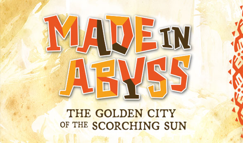
First on the list we have a dystopian anime. Made in Abyss is about the journey of Riko, Regu (a cyborg), and Nanachi (a Narehate—curse survivor) as they descend into the depths. And this season, they reach the sixth level: The Golden City of the Scorching Sun.
The logo looks fun and quirky with an orange and brown color scheme. It masks what themes the anime talks about, but that’s for you to find out if you want to watch this anime.
Lycoris Recoil
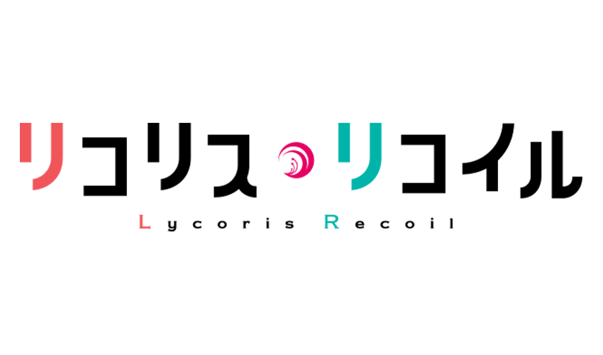
If you want action-packed anime with cute girls saving the day, this is the anime for you. Lycoris Recoil focuses on the relationship between Chisato Nishikig and Takina Inoue. They’re both orphan girls trained to become an assassin by the DA (Direct Attack) to stop terrorist attacks in Japan.
Join Takina—who gets kicked out of the DA and wants back in—and Chisato as Chisato shows Takina that there’s more to life than just working for the DA. Now for the logo design analysis.
The logo is in black sans serif font with a slight height variation for each letter, making it look like a mini wave. The first letters of the word have different colors, with L in red and R in a blue-green hue.
The letter R in red and L in blue-green hue could pertain to the uniforms of the DA members. Red for top skilled, and blue for seconds who are less experienced. The last striking bit of the logo is the ricochet-like bullet or the trajectory of a shot, or it could also be remnants of an actual lycoris flower on the uniform of the DA. That’s for you to decide.
Call of the Night
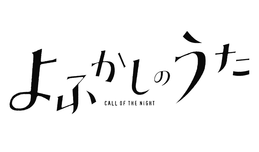
Call of the Night is the anime one for you if you like the concept of vampires. The main guy, Kou Yamori, caught insomnia due to his idleness. One night, he went for a walk late at night and met Nazuna Nanakusa.
Nazuna Nanakusa invites Kou back to her place and asks him to lie down with her on her futon to ease his sleep troubles, but Nazuna reveals herself to be a vampire as she bites his neck. While waiting to turn, it’s explained that people only turn into vampires if they’re bit by their true love. That sparks Kou’s new goal in life: to fall in love with Nazuna and turn into a vampire.
For the logo analysis, it’s quite a simple logo with a sans serif font for the English name. It’s straight to the point with thin letters and black color—the kanji in an erratic pattern over the English name sp up the logo.
Classroom of the Elite II
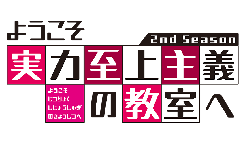
Here we have another high school anime with a dark twist. Since it’s the second season, we see the journey of D-Class as they navigate through the quizzes and events pushed their way as they try to reach the status of A-Class.
The whole school has a caste system; each class can play dirty tricks to outsmart the other, and money is the currency. This season, we watch Kiyotaka Ayanokouji retake the stage to strategize and outwit Kakeru Ryuuen from C-Class, and Kei Karuizawa, D-Class classmate, while aiming for A-Class.
It’s pretty hard to explain the anime without spoilers so just watch it. Now for the logo, its English name is in a block-like format with some letters in red and pink colors.
The letters are in black and white, which could symbolize the duality of the students’ actions— good or bad—and the blocks with special students that make them stand out.
Cyberpunk: Edgerunners
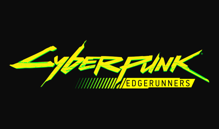
Another dystopian anime, Cyberpunk: Edgerunners, is set in Cyberpunk 2077. If you know the game, this is like the tv series for it.
The story revolves around a city in the future that’s obsessed with tech and body modification-obsessed city. David Martinez, the main character, loses everything and decides to become an edgerunner—a cyberpunk or mercenary outlaw. And we follow that journey in this 10-episode anime animated by Studio Trigger with the supervision of CD Projekt.
The logo has a similar color palette to Summer Time Render with a slight cyan shadow and the word Cyberpunk in a yellow serif font. It almost looks mechanical, while Edgerunners is in black sans serif font with a paint-like streak in the background fading into what looks like a battery bar.
All the logo elements pay homage to the story itself, which is cool and expresses the anime’s theme.
Fall Season 2022
Lastly, we have the anime released from October to December. You’ll see some comebacks from anime of old below.
Chainsaw Man
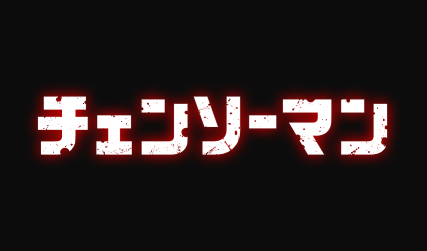
Here we have another anticipated anime by numerous anime and manga fans; Chainsaw Man has a complex story despite the simple synopsis. Denji, the main character, wants a simple and peaceful life with the girl he likes.
But Denji is forced to work under the Yakuza to kill devils, so he does so with the aid of his own pet devil Pochita. In a turn of events, Denji dies, but Pochita merges with his body and revives him.
In Denji’s revival, we see him able to transform parts of his body into a chainsaw, hence the name. Now we watch his journey after being recruited by Public Safety Bureau to help them slay devils, and he reaches his dream.
The logo has various variations, but the most prominent color is yellow. And the logo is in sans serif font—the word Chainsaw inside a chainsaw and Man booking like the handle.
Bleach: Thousand-Year Blood War Arc
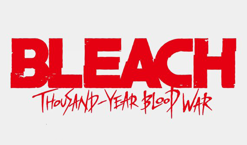
One of the long-awaited comebacks, Bleach, returns with our resident Soul Reaper, Ichigo Kurosaki. This arc starts his final battle from becoming a substitute Soul Reaper to becoming a full-fledged one. This arc is the start of his last battle.
The secrets of Soul Society, where the Soul Reapers live, will be revealed in this epic season. Of course, the iconic logo is in a serif font, with Bleach underlined and flames emerging from the middle line and the kanji below it.
But for this arc itself, there’s another logo in red sans serif font. Bleach is in bold, thick letters, while under it is Thousand-Year Blood War Arc in a font that could look like it’s been sliced on the paper or painted with a thin brush.
Mob Psycho 100
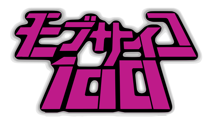
If we have Bleach making a comeback, so is Mob Psycho 100. It’s about an Esper named Kageyama Shigeo, a.k.a; Mob, as he navigates through life. He has difficulty expressing himself, and when his emotions hit 100%, something terrible will happen.
Join him as he navigates through life, exorcising evil spirits, meeting false espers and bad organizations, and trying to live an everyday life despite being a strong esper. The logo has a retro style sans serif font with the effect of leaning back, which shows the theme of the anime, colorful and fun, yet with a foreboding feeling.
Blue Lock
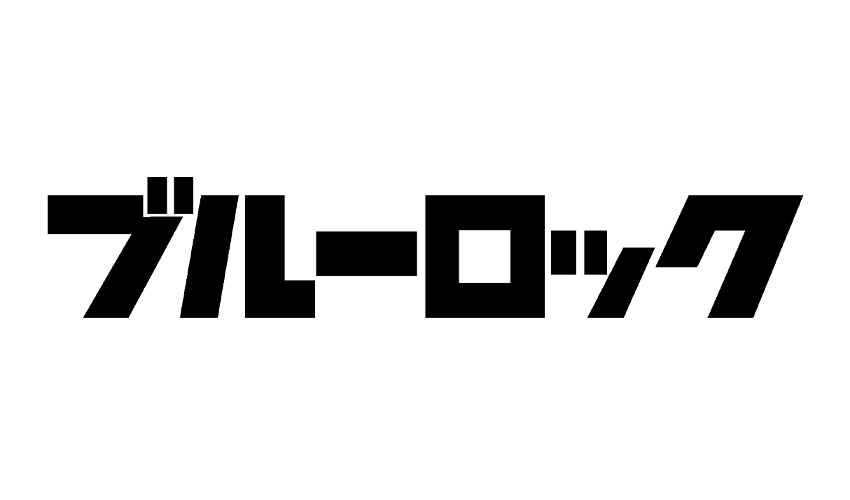
Another sports anime on the list is Blue Lock. Blue Lock, in this anime, is a project by the hired coach, Jinpachi Ego, of the Japanese Football Association to make their dream of winning the world cup a dream come true.
Jinpachi creates this elaborate plan of pitting players against each other for a chance to be part of the national team as the striker. However, if one loses, they are banned from playing forever.
Yoichi Isagi is the leading player we follow as he tries to right the wrong of his high school team and reach his goal through the project—to become the best striker in the world and lead Japan to glory in the World Cup.
The logo is a simple sans serif in a white hue. The font style looks a bit faded, like if you wore out something, and the O in lick is a pentagon in a soccer ball-like design since Blue Lock Project is like a prison despite its end goal.
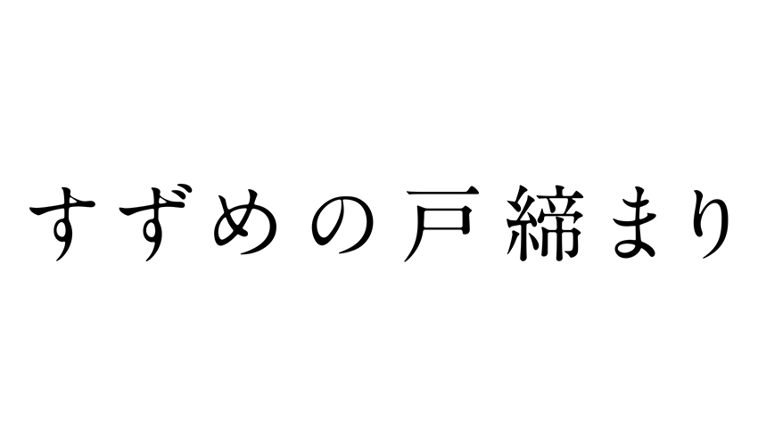
Suzume no Tojimari / Suzume’s Door-Locking
The only movie on the list we have is Suzume’s Door-Locking. Suzume’s Door-Locking is from Makoto Shinkai, creator of Your Name, Weathering with You, and Garden of Words.
We follow Suzume, a 17-year-old girl living in Kyushu who meets a traveling man looking for a door. Suzume follows him to a mountain where a mysterious door is the only thing standing amidst the ruins.
Upon opening the door, she continually opens it one after the other in different parts of Japan, and disasters occur each. The anime centers on her journey of discovering the secrets of the door.
The logo is in plain white kanji, but the striking aspect of the logo is the background itself—Suzume looking back at the “camera” in front of a door with shallow water surrounding her.
Create Your Creative Logo Today
There you have it; our top picks for anime logos per season with a bit of synopsis and logo analysis for each. We hope these inspired you to create a creative logo design and possibly go and try to watch anime.
Key takeaways from the designs above:
- Font style matters.
- Choose a color palette that shows who you are.
- Add icons or images that make your design pop.
- Wordmarks are a great way to announce who you are as a business, especially a small business.
- Have fun with your design process.
Also, if you need other design templates like Instagram posts, YouTube banners, business cards, menus, and more, we have it all, so visit our website.
Get ready to impress people with your design. Try it right here.