60 Real Estate Logos That Help Sell the Dream
Differentiate yourself from shady real estate brands that aspiring property owners steer away from.
Through branding, you can become a credible company and a valuable voice in the real estate industry. The branding strategy that will earn your customer’s trust is best paired with good graphic design.
To begin, you first have to secure an effective real estate logo that will be your ticket to a remarkable first impression.
In the USA alone, there are 2 million active real estate licenses as found in a study by The Association of Real Estate License Law Officials (ARELLO). You can rise above the saturated market with compelling visuals.
You want to look for a logo that will look good on digital platforms as well. There’s value in becoming a brand that gets extra advantage through digital marketing. To do this, your branding kit needs an effective graphic design to grab the attention of your leads in the online world.
Take a look at and be inspired by these well-designed property logos. They are your listing agents for branding success.
Keys
After signing a contract, processing payments, and accomplishing formality, your clients are ready to receive the key to their property. This piece of metal, however, is not just a result of a transaction. It is also a symbol of luck, health, adventure, and even love.
Keys are an exciting symbol that makes the audience curious about what waits for them behind a lock.
Resedinta 8 logo by Irina-Alina Constantin
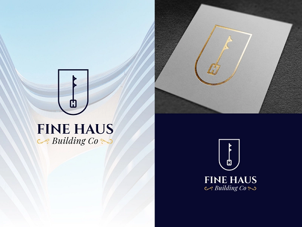

Real estate logos with keys make a great pairing. You can use different types of keys to communicate your specialty. The common double-sided key works for modern brands. On the other hand, antique key styles are a good choice for luxury real estate companies.
Minimalist
The stripped-down lifestyle that put a focus on essentials. Its a growing lifestyle trend that real estate companies are paying attention to. Fear not. there will be no problem incorporating this style into logos because simplicity is a principle of logo design.
Paper Realty Logo by Jacob Cass

Real Estate Cloud by Type08 (Alen Pavlovic)
Better Housing Foundation by designcrowd ka hero 2
Blue Lighthouse by SimplePixelSL
Blueline Realty Group by 3Guys
Blueline Realty Group by gudeveleven
Chat Home Real Estate by realdreams
City Metropolis by podvoodoo13
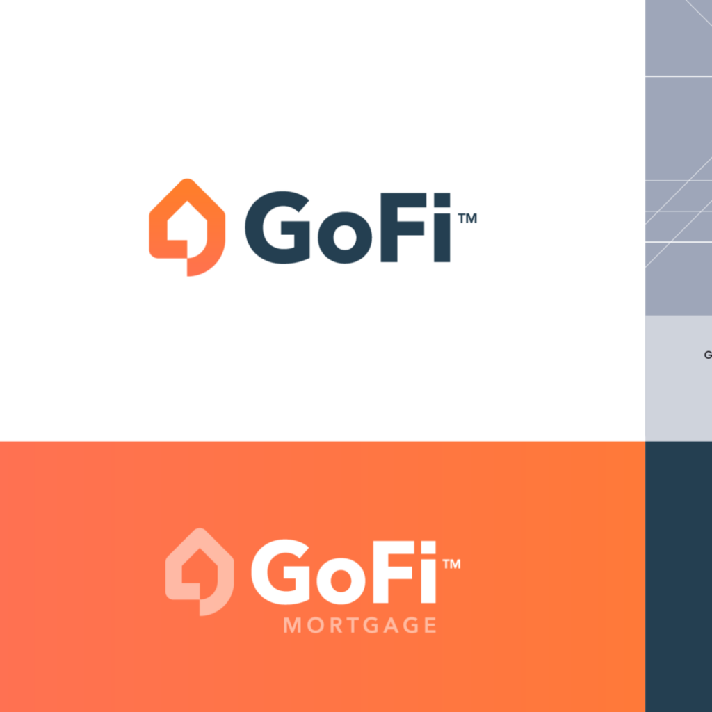
GoFi Mortgage by Jeroen van Eerden (.nl)
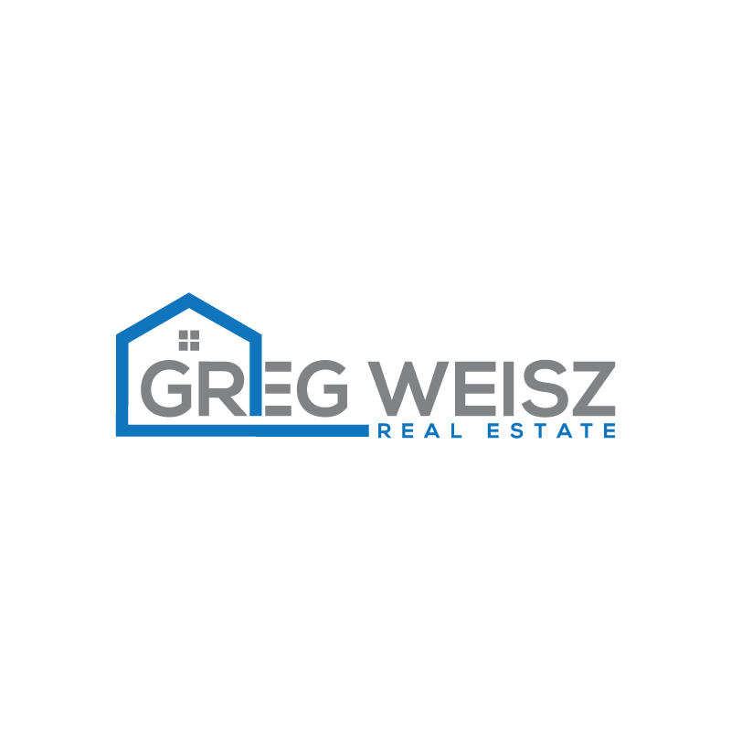
Greg Weisz Real Estate by MD.Tarek Hossain
You use no-nonsense drawings of common real estate symbols like roofing, location pins, buildings, and more. Make sure that you use illustrations that aren’t heavy on details. This will help you communicate minimalism and create an adaptive realtor insignia.
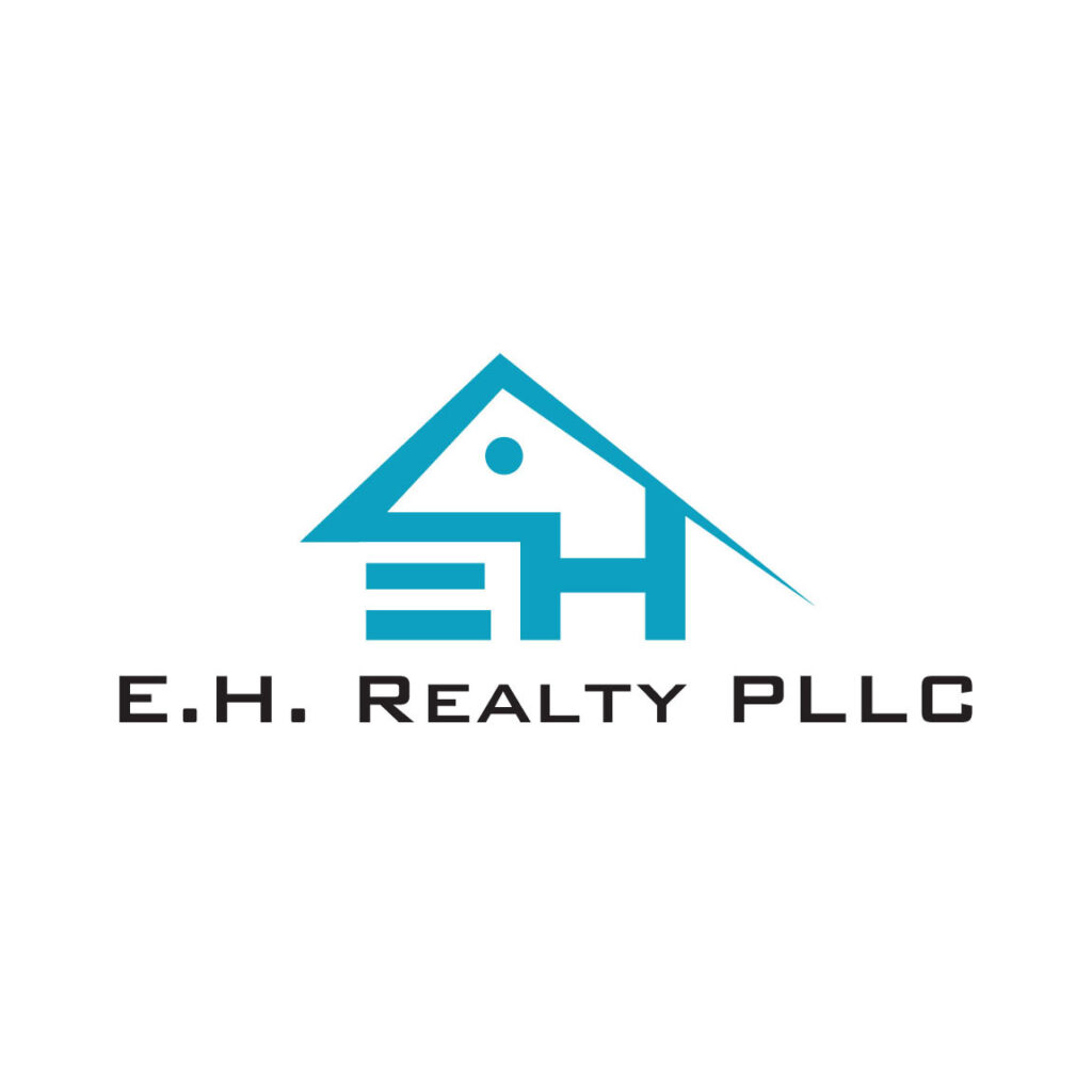
E.H. Realty PLLC by nebullagraphixx

ETRE by Type08 (Alen Pavlovic)
Modern Real Estate Logo by MD Bodiuzzaman
Yupe Real Estate Services Logo by Aditya Chhatrala
Real Estate Building Search by town
Pro tip: Be mindful of what your niche and the illustration you will put in your logo.
For example, if you specialize in rural real estate, drawings of cityscapes may not be the best thing to add to your design. Your symbol has to be related to your specialty in order for it to connect with your target audience.
Round
Shapes hold a lot of meaning. People attach human qualities to figures. For round shapes like the oval and circle, people think of the shape as something they can take shelter in. This explains why other brands use this shape in their design.
Associating your real estate company with positive traits can help you become a brand that your clients can come to for help.

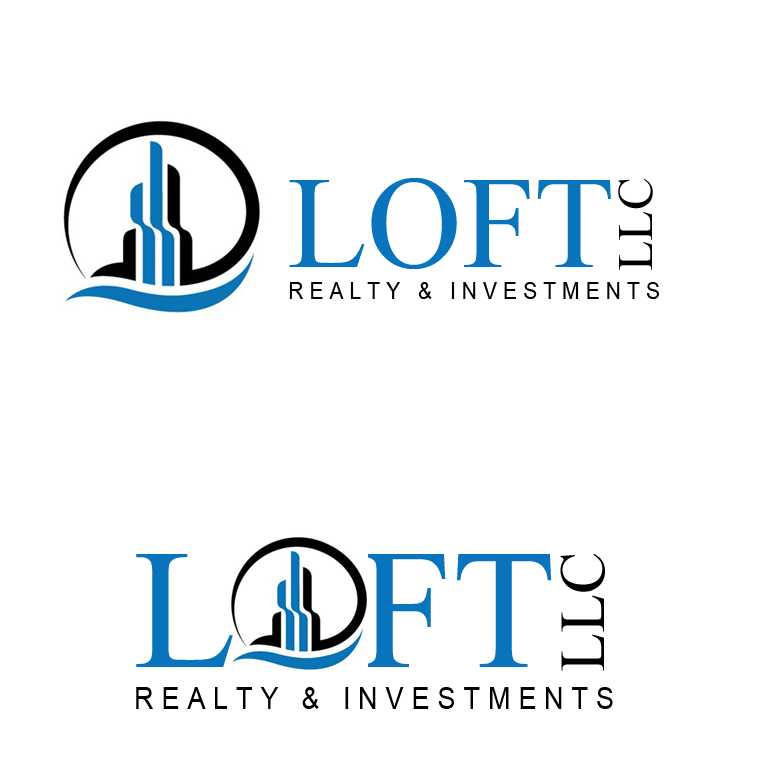
Loft LLC by designcrowd ka hero 2

Additionally, the shape frames the brand name and illustrations which is great if you plan on adding more decorative elements to the design. You can use this to emphasize the visual hierarchy as well.
By having a clear visual order, you can lead the eyes of your audience to important information.
Abstract
Abstract logos are a good option for brands that want something scalable. Its meanings can adapt to a lot of different meanings and applications. You don’t have to tie your brand down to just one specialty like a brokerage.
Real Estate Developer Logo by Frankie Soo
Towernote by Type08 (Alen Pavlovic)
TruHome Realty Logo by Derek Truninger
At Home Realty Group LX by Logo no 1
Avenue Real Estate by Graphiczone
Better Housing Foundation by designcrowd ka hero
Bronson Realty by LL d.e.s.i.g.n
Real Estate City Logo by Sentavio

Business Blue Buildings by FishDesigns61025
CCRG by Type08 (Alen Pavlovic)
City Delivery Box by SimplePixelSL

Hand House Home by maraz201459489
This is also a good time for you to incorporate design trends into your brand symbol. It makes your brand appear modern and in with the times. There are a lot of trends you can use, but for starters, you might want to consider gradient colors.
Modern Architecture Real Estate by FishDesigns61025

Gradient colors add personality and depth to abstract design. It uses two or more colors to create an eye-catching look of colors transitioning into each other. This makes for impressive and striking design, but it also translates well to online platforms as well.
Using colors in a strategic way will allow you to create a deeper meaning for your design. You are likely to see the colors blue, red, yellow, orange, and black in real estate logos. However, there’s a better way for you to choose the right color for your property branding kit.
Compass Premier by Deziner Zone
Green & Orange Building Windows by YandiDesigns
Applying color psychology to your design lets you communicate your brand story and identity in a comprehensive way. Different colors allude to particular traits such as:
- Red – Love
- Orange – Youth
- Yellow – Energy
- Green – Security
- Blue – Reliability
- Black – Luxury
You can read more about how you can tap into the spectrum to strengthen your identity. Click here to learn the psychology behind colors.
Home Builder X by LogoBrainstorm
Homing Realty Logo Concept by Ardiann Fauzi

The open house is here
BrandCrowd’s logo maker will equip you with everything you need to flip your branding kit into better shape. There is absolutely no need for prior design experience in order to make the most out of this design tool.
It provides users with a customizable gallery of property logos. Each brand symbol is designed to give brands a professional look. The logos transform marketing assets such as business cards, keychains, websites, ads, billboards, and more.

The only thing that these ready-made logos need to be perfect is your real estate brand name.
Communicate your top-notch services through symbols to discover countless opportunities. This will help build brand credibility and awareness. Through design, you can unlock a better future for your real estate today.