Top 100 Exciting Tech Startup Logos in 2020
We never run out of inspiration. The industry welcomes a barrage of bold brands spearheading different forms of advancements in the market.
It’s a popular belief that in a span of one second, three startup ideas are brought to life. These companies will not come into fruition easily without a competent branding plan. Each perspective of these startups holds promising innovations for both their sector and design inspiration.
Besides, building a strong visual identity is an essential part of launching a startup and any business strategy. For those dreaming to become a startup entrepreneur and struggling with the lack of design inspiration, you will never run out of fresh material.
Today, we are going to take a look at tech startups logos in 2020 from all over the world you need to see.
Trends you’ll spot
It would also provide unique insight to look at the logo design trends of 2020 in conjunction with the relevant startups of the year. Expect these design themes to appear in the logos of the startups in this list.
- Geometry- This is a trend that uses shapes and symmetry to create a balance. Shapes such as circle, diamond, square, and rectangle are one of the most popular choices for logo concepts today.
- Fun fonts- Everyone is raging about chaotic typography. Text-based logos are becoming more exciting with whimsical font combinations and spacing that ooze personality.
- Flat design- Many brands have made the switch to two-dimensional graphic elements. Companies like Microsoft and BMW are two of the most notable names that have transformed their logo into something minimalist and readable.
- Gradient- Gradients are color transitions that change the mood of a design. It adds a modern yet subtle accent to the output. Logos of Instagram and Mozilla Firefox make use of this design trend flawlessly.
The four trends above have and continue to shape the design movement of today as more brands prioritize accessibility and creativity in their graphic materials.
Emerging startup logos
The startups we are about to see span from different sectors. These international brands are one of the many companies that people are keeping a close eye on for different reasons. Whether it be for their unique solutions, funding milestones, and promising stories, people are acknowledging how they are making a mark in their respective industry.
Without further ado, let’s look at some great logo designs from noteworthy brands in no particular order.
StethoMe

This AI healthcare company adopted a round logo that is arranged to look like a smiling stethoscope. It gives the lung and heart screening tech company a friendly and approachable appearance.
PLACEengage
The AR-enabled app allows property development stakeholders to hold virtual town halls and live updates regarding various local community projects. PLACEengage is a European application developed in 2018. It has a simple, flat logo that champions the minimalist art movement.
Kindred

As a robotics company, Kindred went with a simple pattern creating the illusion of movement. The company’s round logo is partnered by a sans serif font that adds a modern touch and depth, too.
Buddybuild

Based in Vancouver, this app tool development company aids teams in bringing their iOS app to life through various integration and deployment processes. The startup instills trendy elements in their logos with various shades of blue and a chunky font.
Element AI

This AI company stems from North America. It works with consulting, machine learning, and more. Element AI has a logo inspired by the periodic table of elements characterized by the typography and square shape.
Shape Therapeutics

The health technology industry is becoming more important than ever. Shape Therapeutics offers a gene therapy platform that enables a more efficient method of cure development for genetic diseases and more. Their S logo has a strong pattern that creates a contrast with the slender fonts used for the brand name.
Better.com

For the real estate industry, Better.com provides a platform that streamlines mortgage processes. They have a modern logo with lowercase letters and modernist shapes that take the form of an open door. It is a symbolic, flat logo.
GreenDeck

The AI company aids retail brands to make informed piercing and purchasing decisions. Their logo matches its machine learning solutions with geometric forms and patterns. Blue is also a popular choice for startups and big brands in the technology sector.
Primo

The Thailand-based startup provides customer engagement solutions to marketers from all over the world. The brand takes on another modern looking logo with geometric figures and evenly spaced sans serif text.
AdEasy

AdEasy is an adtech startup stemming from Malaysia. The brand provides various digital solutions and brands itself accordingly. The megaphone in its logo embodies the potential reach brands will get from their service. It is an easy (no pun intended) takeaway. Instant visual communication cues like this are effective.
ADBRO

Using primary colors, the gradient is the star of this marketing startup’s logo. The triangle shape also gives the symbol a dominant appearance while never veering away from simplicity.
Zilingo

Talk about simplicity. The asymmetric pattern in this marketplace platform’s logo makes for a creative symbol. This contrasts with the brand’s direct letter-based design using a bold serif font.
Coupang

This is a Korea-based eCommerce platform that personalizes shopping experiences. Although Coupang’s wordmark is not paired with additional graphics, it stands well on its own. The design is significantly improved by the font contrast and color.
Tink

Bold colors do the trick for brands that want to stand out from the crowd. The coral tones of this Sweden-based finance startup breaks away from the cool tones often seen in the industry.
Alan

You have probably noticed how the healthcare industry loves using the color green. It has a long history of utilizing this color and this healthcare insurance startup isn’t going to ignore that. Alan chose a fresh shade of green for their brand symbol.
UFODRIVE

Car rental logos now have an advanced competitor with UFODRIVE’s space concept. Their concept communicates the innovative solutions they offer to people who want to rent zero-emission rides. UFODRIVE’s space-themed logo works great for its electric car rental service.
Zego

Insurtech startups are seeing a lot of innovation. Zego is a UK based brand that is not afraid to play around with edgy fonts. The font they used for their brand name provides character and intrigue.
Virtuo

This super classy logo is made up of symmetric typography and overlapping figures that add depth to the otherwise plain brand symbol of this car rental application.
Funnel

Marketing data is power. This Stockholm-based marketing software startup has a logo that symbolizes how leads are refined as they are lead further along the funnel. The brand knows how to keep its insignia short and simple.
Wayve

Engaged in the deep learning AI and robotics industry, Wayve is a UK startup. It has a round brand logo that will make you think if it is a literal wave, but you’ll soon realize that it is an image of a winding road.
Passbase

Here we have another flat design logo from an identity verification platform. Passbase shows off its modern solutions with a modern metro color and its lower case typography. This brand is one of the many brands that opt for 2D elements to uphold readability in many devices.
Tide

Another subscriber to the modern typography, Tide adds flair to its logo with a subtle gradient. This is a banking platform that empowers small businesses to gain access to accounting systems.
AnsweriQ

This is one of the first logos featuring an animal on the list. AnsweriQ keeps its logo fun with a multicolored bird. This is an AI customer service tech startup based in Seattle that specialized in algorithms.
Legal OS

Neoplasticism inspiration for logos? Why not. Legal OS is a contract automation tool provider based in Berlin. Its logo is instilled with an unprecedented art style, making it unique even without the brand name in its design.
Spendesk

Playing around with graphic elements gets you good results. Just look at the silhouette of this symbol combination. It may not be interesting at the first look, but it will change once you see the silhouette of the letter S in being formed. This is a France-based management platform founded in 2015.
Front

Based in California, Front is a communication channel for teams to stay on top of their workflow and collaboration. Its brand name is beside a figure that is overlapping onto itself much like an envelope. This makes sense because the app aids teams in being more well-rounded through a shared inbox.
Cohesity

Right off the bat, Cohesity’s logo makes an impression with its bold all caps typography. Despite using thin fonts, it is still able to lead your eyes with the hypnotizing strokes used to form the letter S. Teams use this data platform to unite their storage for easy backup and security.
Snyk

Developers need security, too. Especially in the time where data is power. Like the fierce guard dog depicted in the security company’s logo, Snyk fortifies its logo by putting it over a crest-shaped background.
Snowflake

This data management platform offers a lot of unique features. Snowflake’s logo embodies this with a patterned ice crystal design. Like most tech brands, it has a cool-toned logo that is often associated with innovation and professionalism according to color psychology.
Want to learn more about how colors shape how we perceive brands? Read about it here.
TripActions

Using AI-driven technology, this business travel platform personalizes the travel experiences of professionals. The typography adds personality to the design in subtle ways. The points of the lower case I are in colors red and blue, embodying their mission of bringing “the circles and squares together.”
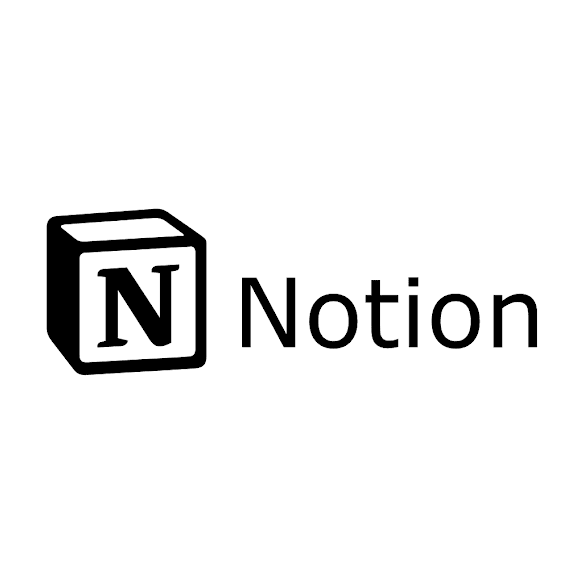
Notion

Home security is going through a strong shift to digital. Notion is a startup that provides smart solutions to homes in America. They have a humble yet contemporary text-based approach to their logo that matches their product design well.
Tidelift

Making use of a symbol in an initial logo packs a punch when it comes to visual communication. Its bold T character is accented with upward orange elements that are pointing upward. Tidelist provides tools and applications for developers.
PayFit

For SMEs, PayFit has helped handle and keep track of their staff’s salary and leaves. The solutions provider went for an initial as its logo’s focal point, but it also paid attention to the importance of a wordmark. This logo does not look overwhelming because the fonts create contrast in terms of size and style.
Spacemaker AI

As an AI solution for making the most space out of a construction plan, the start-up adapted a minimalist logo design. The missing strokes of the letter S character create a strong balance that leads the eyes and helps complete the character.
Capacity

3D Logos are rarely seen today. Capacity added a modern spin to the logo concept by incorporating the minimalist design. This startup integrates apps and documents into an organized platform with AI.
Gremlin

The startup pays homage to its folklore creature namesake with its logo. Some may say it’s creepy, others may say it’s cute. This startup’s logo surely creates an impression in a sea of flat and contemporary concepts.
Observe.AI

This California brand provides voice AI solutions that aid contact agents to hit higher numbers. You can liken the pattern of its round logo to soundwaves. The brand chose a highly adaptive color scheme for the logo with black and white which will make it easier to match the logo with other colors and platforms.
Movandi

5G has been the talk of the town for quite some time now. Movandi is a wireless systems startup that provides solutions to 5G users. The brand’s name logo looks in touch with the trends today, but it also adds a detail to its concept. Take a look at the letter M inscribed on the circle graphic element.
Petal

Looks like a Venn diagram, right? Petal is a credit card FinTech startup based in New York. It aims to provide accessible and easy services which is portrayed well by their very modern round logo.
GoJek
GoJek is a Southeast Asian logistics startup that began in Indonesia. It has a clean and adaptive logo. The circle graphic element looks like a pin in a map which is a good nod to the service they are offering.
Codility

The UK SaaS startup helps tech brands find more people to take into their team. Codility also offers remote online code testing services. This multifaceted software platform dons a logo that references coding. The yellow accent adorns it with an eye catching element.
LumApps

Workplaces are being led into a more integrated corporate experience with this social and collaborative software. This 3D inspired symbol alludes to the connectivity their service provides. It looks as if the figures are coming together which fits their social collaborative intranet solution.
Asana

One of the best things about gradients is how easy it is to detect. This is because the gradual change in color can simulate a light source. This work management platform startup adorned the three circles n its logo with eye-catching warm colors.
Scribeless

The startup provides handwritten letters to brands that need personalized stationery assets. Scribeless went for a classic fountain pen nib as its logo’s main focus. This pentagon-shaped silhouette gives the service platform a bold and dominant look.
Rover

Gone are the days when cars were the only thing you could book from an app. Rover is a network for pet owners to find various services for their pets. The lettermark is in a fun serif font which gives the design a laid back look.
Samsara

Bird logos are a popular choice for companies in different sectors. This industrial IoT provider doubles down on the wisdom with the owl illustration and the dark blue color. The brand uses classic elements that people associated with professional traits.
Tessian

The data security startup has an abstract multicolored logo. It is recommended that brands use only two to three colors at a time when designing their brand logo. This will help make it more adaptable to various channels.
If you want to see more versatile abstract symbols, click here.
Qtum

Blockchain brands are often in the color blue for good reason. It is one of tech’s favorite colors and this is backed by color psychology. The connecting dots are common symbols in data networks.
Kyber Network

The startup provides payment APIs in the cryptocurrency sector. It has such a lively and happy air all thanks to the brand’s teal color choice. By simply changing up the color, you can make technical subjects look quirky.
Tiki

The Vietnam-based retail startup has a bright blue and amiable logo. This brand’s logo also underwent a creative change to be more appropriate for the pandemic we are facing. Tiki has a strong all caps logo.
Halftime break for inspired minds
Whew.
That’s been a total of 50 logos and we have 50 more coming your way.
Looking at these logos sure have gotten your mind crawling with design ideas. Facilitating a logo design contest is an effective way for you to receive a bounty of amazing design bids. From the selection, you can select the best logo and call it your own.
On BrandCrowd, you will also uncover an abundance of tech logos ready to be the face of your brand. But you will also get the chance to personalize the ready-made design using our logo maker to make it even more perfect. It’s a good day to start working on your branding.
Now, let’s look at more amazing startups.
Celonis

Gitlab

Traveloka

Carousell

HOOQ

Confluent

Tokopedia

Zylo

Streem

AirGarage

Airtable
Bloomscape
Calm
Checkr
Cockroach Labs
Codecov
Divvy Homes
Envoy
Fathom
HealthSherpa
Instabase
LeadIQ
Legalist
Loom
Moveworks
Current
Dynamic Yield
Letgo
Smule
MoEngage
WP Engine
PebblePost
Springbot
Notion
Pilot
Wanchain
Pundi X
Spatial
Swiftly
Brightloom
Sensibill
Klue
TopHat.Io
Tulip Retail
Aspect Biosystems
C88 Financial Technologies
MariaDB