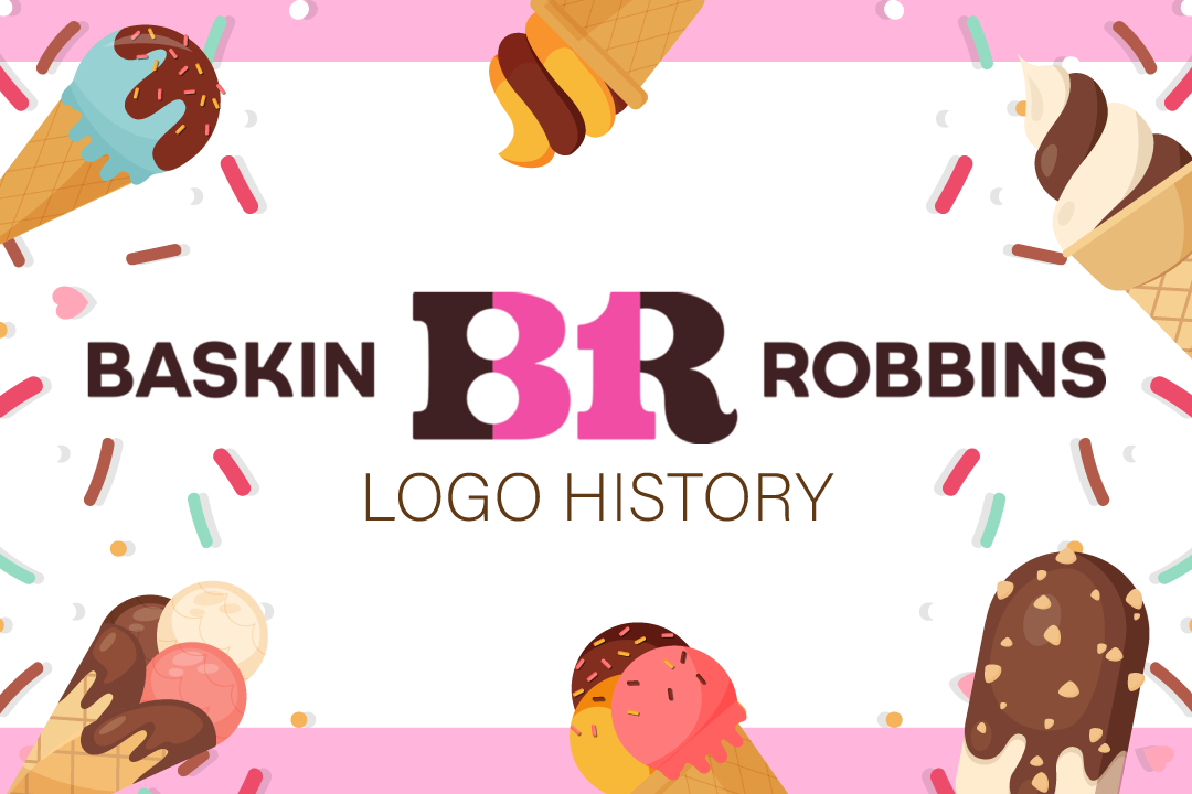
Baskin Robbins Logo History
Ice cream, with its irresistible sweetness and endless flavors, has a remarkable ability to evoke joy and nostalgia in people’s hearts worldwide.
Ice cream parlors have undoubtedly become beloved staples in communities, serving up frozen scoops of happiness to eager customers. The Baskin-Robbins logo design is a timeless favorite among the iconic names that have left an indelible mark on frozen delights.
Join us as we take a delightful trip on the logo evolution of the Baskin Robbins ice cream logo.
Let’s go!
Brief history of Baskin Robbins
When it comes to ice cream logos, there’s one design that has delighted taste buds and captured hearts for generations – Baskin-Robbins. Regardless of the season, this beloved brand has remained a consistent go-to for ice cream enthusiasts, thanks to its delectable flavors and rich history.
Baskin-Robbins has built a reputation as a world-renowned ice cream seller. But in its early days, this iconic brand was not immediately recognizable by its famous logo. It’s a journey of transformation and innovation that has helped them stand out in a crowded industry.
Today, Baskin-Robbins is inseparable from delightful ice cream experiences and a memorable logo. Their continuous efforts to refine their image over the years have brought them to the forefront of the ice cream industry.
While many may need to become more familiar with the brand’s logo journey, it is a testament to their dedication to staying fresh, vibrant, and exciting in the ever-changing world of frozen desserts.
So, if you’re among those who’ve savored Baskin-Robbins’ delectable ice creams without knowing the story behind this sweet logo, you’re in for a treat.
Grab and spoon, and let’s dive in!
Baskin Robbins Logo Evolution
Baskin-Robbins’ logo evolution is a captivating journey of visual identity transformation, reflecting the brand’s commitment to staying fresh and flavorful throughout its rich history. Check out the sweet secrets behind the brand’s logo evolution.
1953-1980
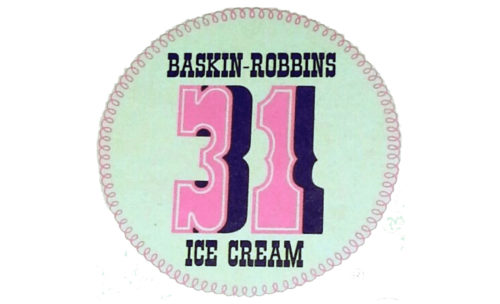
Inspired by the advice of the local advertising firm Carson-Roberts, this design featured a light minty green background with stitched borders. Dominating the logo was the pink number “31,” symbolizing a flavor for each day. At the same time, “Baskin-Robins” was elegantly printed above and “Ice Cream” below, both in a welcoming and dark blue font.
This green logo design exuded a warm and friendly charm, embodying the brand’s commitment to serving a delightful array of flavors.
1980-1990
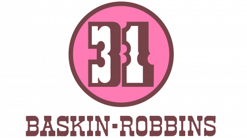
Baskin-Robbins adopted a logo that truly embodied the essence of joy and playfulness. With its prominent pink color, the logo exuded happiness and a sweet, inviting charm. At its core, the design featured the number “31,” rendered in white with a brown shadow and outline, set against a round pink background.
Below, the company name was elegantly presented in a font with high-contrast strokes, reinforcing the brand’s identity. The consistent use of this typography, the iconic number “31,” and the circular logo all contributed to the logo’s strong recognition and association with the brand.
1991-2006
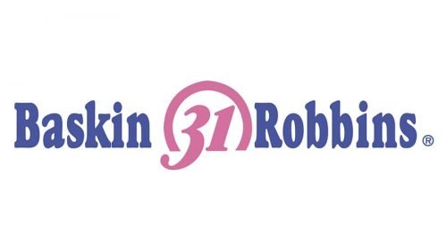
In 1991, Baskin-Robbins retained the iconic “31” as the centerpiece of their branding. This time, they seamlessly integrated it with the wordmark by positioning “Baskin” to the left and “Robbins” to the right of the number. The color palette was simplified to just two colors, pink and blue, offering a clean and harmonious design that maintained the brand’s distinct identity.
This logo successfully merged tradition with modernity, emphasizing the brand’s commitment to providing delightful ice cream experiences.
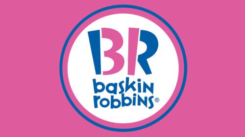
2006-2020
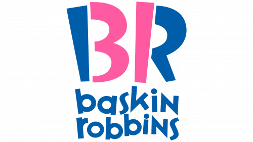
In 2006, Baskin-Robbins embarked on a comprehensive brand refresh, unveiling a new logo that encapsulated their commitment to innovation. While the “31 flavors” concept, once groundbreaking in the 1950s, had lost its power to astonish in modern times, the company’s legacy of introducing over 1,000 flavors since 1945 remained impressive. Remarkably, Baskin-Robbins retained the iconic number “31” as a cornerstone of its brand identity.
In this logo, the designers ingeniously placed the figures “3” and “1” at the heart of the emblem, subtly incorporated into the pink portions of the letters “B” and “R.” This clever integration allowed “31” to remain a meaningful part of the design. However, it might only be noticed if one knows where to look. The wordmark, now in lowercase letters, resided beneath the emblem, representing a fresh and contemporary direction for the brand’s visual identity.
The 2006 logo beautifully bridged tradition with a modern, minimalist aesthetic, reflecting Baskin-Robbins’ enduring commitment to delivering delightful ice cream experiences.
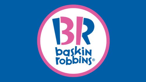
2020-2022

The 2020-2022 iteration of the Baskin-Robbins logo maintained a close resemblance to its predecessor, with only subtle adjustments. Notably, the color palette was made slightly more saturated and darker, enhancing the vibrancy and visual impact of the iconic design while preserving the brand’s recognizable and beloved identity.
2022-Present
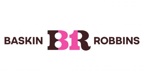
The current logo pays a heartfelt tribute to the brand’s original emblem from 1947. It preserves the classic chocolate and pink palette but enriches it with more profound and vibrant hues. While embracing modern styling, the redesign maintains a striking resemblance to the brand’s historical badge.
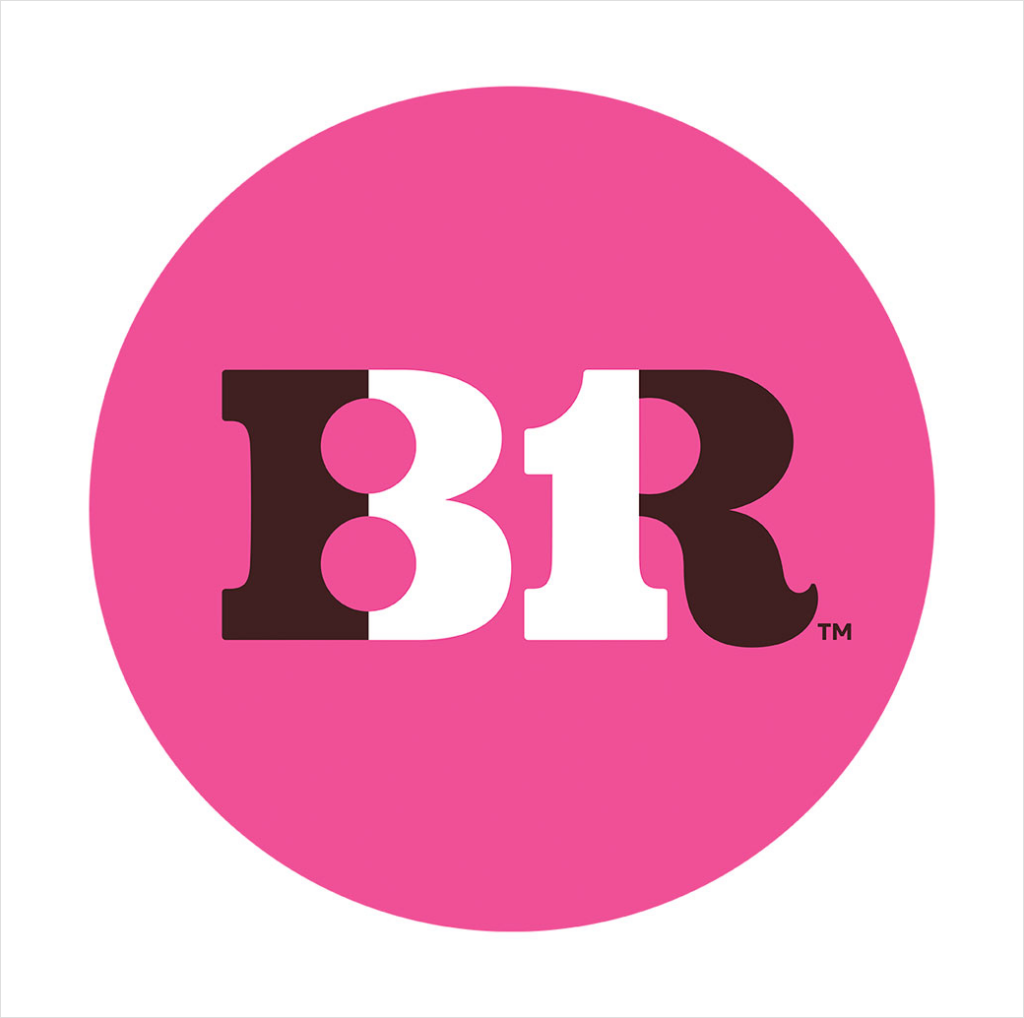
The centerpiece of the revamped logo is a bold and sophisticated “BR” monogram icon in brown, cleverly incorporating the “31” concept in pink. Flanking the seal, the full logotype appears in a modern, simple, and uppercase sans-serif typeface.
Baskin” on the left and Robbins on the right, creating a fresh yet timeless representation of the beloved ice cream brand.
Baskin Robbins Design Elements
Baskin-Robbins’ design elements have evolved, blending tradition and innovation to create a visual identity as rich and delightful as their ice cream flavors.
Check out the design elements that made the iconic Baskin Robbins logo:
Font
Baskin-Robbins’ font in their new logo closely resembles the commercial font known as Variex Regular. With its distinctive zig-zag letters, this typeface exudes a sense of playfulness and joy, aligning perfectly with the brand’s commitment to delivering a delightful ice cream experience.
Colors
Color plays a pivotal role in Baskin-Robbins’ brand identity, with pink being an enduring and essential component since the inception of their logo history in 1953.
The incorporation of blue in 1991 marked a significant evolution, and the current logo showcases a refined palette featuring slightly different shades of these iconic colors. The harmonious blend of pink and blue reflects the brand’s history and innovation, evoking a sense of joy and nostalgia while maintaining a modern and inviting appeal.
If you want to use the right colors for your brand just like Baskin Robbins did, check out our color psychology blog to learn more!
Shape
The choice of a circular shape in Baskin-Robbins’ logo is a strategic embodiment of the psychology of shapes in branding. The circle, as a timeless and universally appealing form, represents unity, harmony, and inclusivity, mirroring the brand’s mission to provide a diverse range of flavors for everyone.
This shape is not only visually pleasing but also symbolizes the notion of completeness and endless possibilities, a perfect match for a brand known for its ever-expanding flavor selection.
Design Your Ice Cream Logo Today!
In summary, the Baskin-Robbins logo history is a journey through time, reflecting the brand’s commitment to preserving its core identity while embracing evolution. From its charming beginnings in 1953 to the modern and nostalgic design of today, each logo iteration has left an indelible mark on the world of frozen treats.
If you want to create a memorable logo that shows off your brand, BrandCrowd is here to help! From AI logo generators to your advertising needs, such as Flyers, Posters, Pinterest Board Covers, and many more, we’ve got you covered!

