Disney Logo History and the Magic Behind the Changes
What’s the first thing that comes to mind when you think of your childhood? For a lot of us, it’s Disney. The songs we sang out loud, the funny characters that made us laugh, and the stories that made us believe in magic? All those moments are part of growing up. Sitting in front of the TV, waiting for your favorite movie to start, felt like stepping into another world.
And before the story began, there was always that castle. The Disney logo. Bright, cheerful, and full of promise. It was a sign that something wonderful was about to happen.
Over time, it has changed its look, but that same feeling remains. The Disney logo has become a symbol of imagination, joy, and the magic that never really fades, no matter how old we get.
So hop on the magic carpet, and let’s take a closer look at how the Disney logo design came to life and became one of the most iconic symbols in entertainment history.
The Walt Disney Company: A Quick Overview
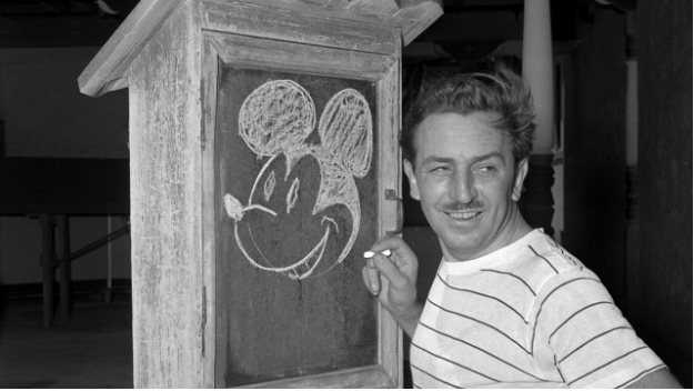
Every bit of Disney magic started with one big dream and a man named Walt. Back in 1923, a young Walt Disney packed his bags and headed to Hollywood with more ideas than money.
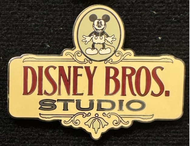
Together with his brother Roy, he opened a tiny studio called the Disney Brothers Studio. It wasn’t fancy, but it was the start of something huge.
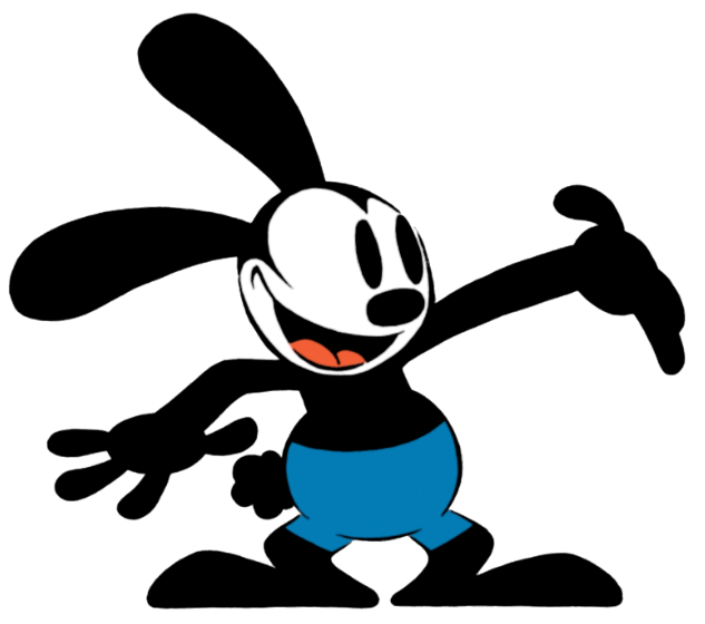
Walt’s first cartoon star was Oswald the Lucky Rabbit, but after losing the rights to him, Walt didn’t quit. Instead, he came up with a new character, a cheerful little mouse who wore red shorts and big yellow shoes. Yep, Mickey Mouse. That’s when everything changed.
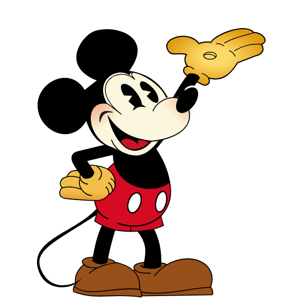
Mickey became a hit, and suddenly, everyone knew the name “Disney.”
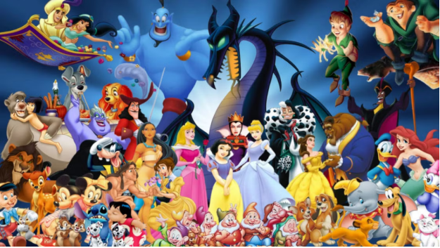
From there, the magic just kept growing. In 1937, Disney released “Snow White and the Seven Dwarfs,” the first full-length animated feature film. It was a massive success and opened the door to more timeless stories, such as Cinderella, The Lion King, and Frozen.
Soon, Disney wasn’t just making movies; it also produced TV shows, theme parks, toys, and much more.
The Walt Disney Logo History
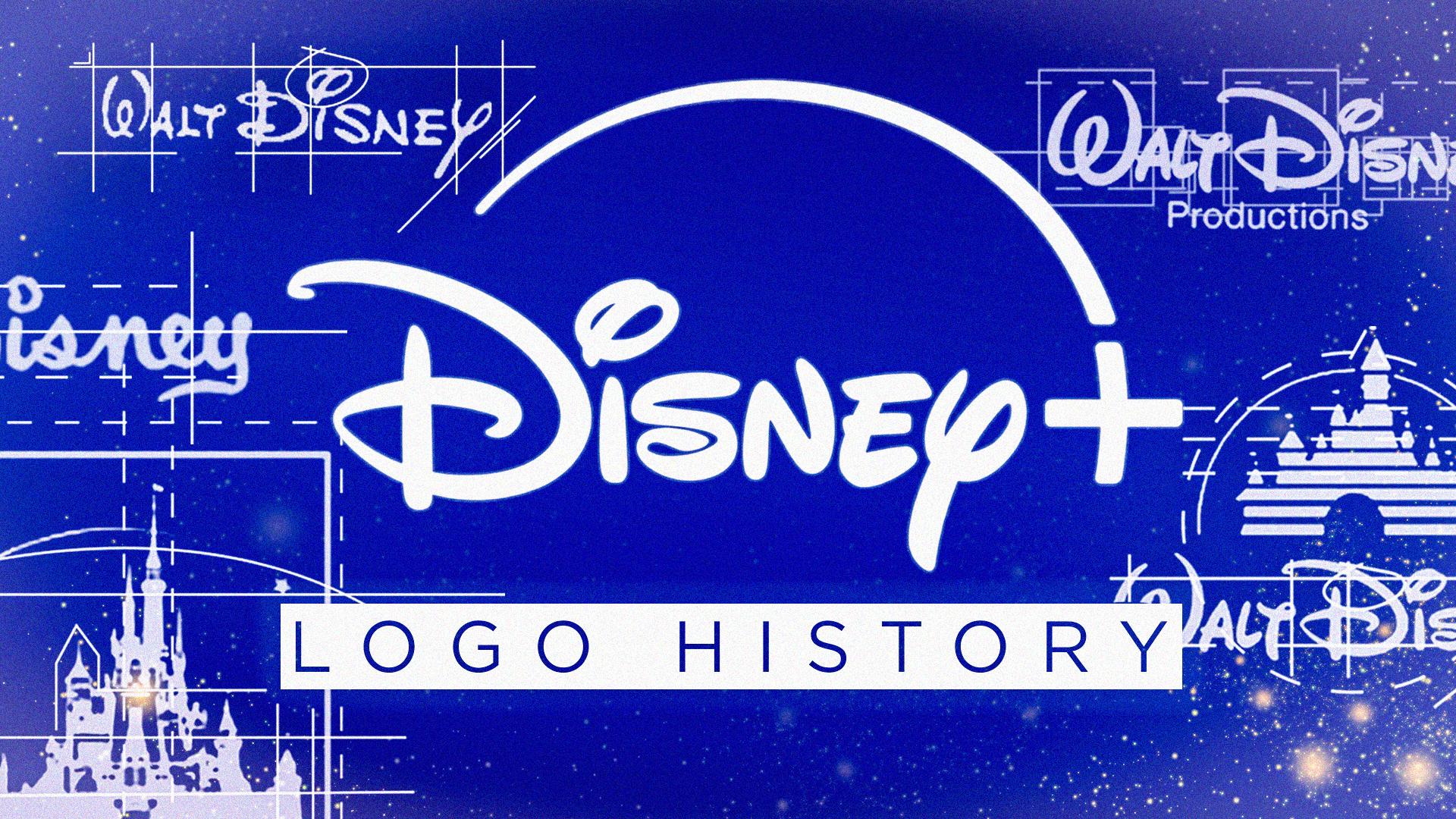
And just like the stories, the Disney logo evolved, too. What started as a simple signature eventually evolved into the magical sparkle castle we all recognize today. From a small dream in a tiny studio to a global symbol of imagination, Disney’s story proves that a little bit of creativity and a lot of heart can truly make magic happen.
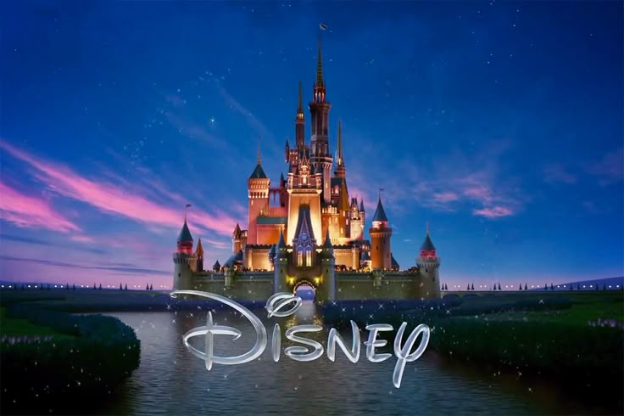
The first version of the logo was simple, featuring Walt Disney’s signature.
Over time, it grew into something much grander: the castle we all know today, often surrounded by sparkles, fireworks, and that familiar swoosh of light.
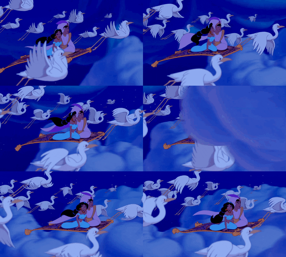
Whether you see it before a movie, on a toy, or at the entrance of a theme park, the Disney logo instantly tells you one thing: you’re about to experience something magical.
Here’s how Disney has changed its logo over the years:
1929-1937
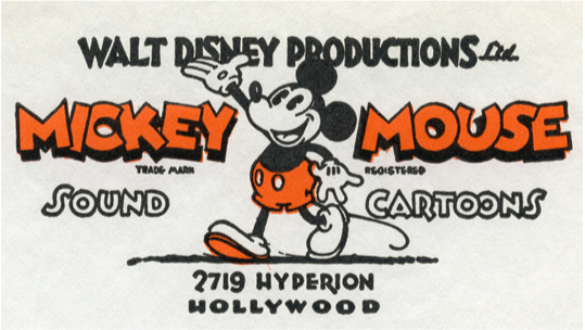
Back in the early days, Disney was still finding its footing, and so was its logo. Between 1929 and 1937, the logo looked very different from the polished castle we see today. It featured Disney’s very first star, Mickey Mouse, front and center.
Mickey wasn’t just a character; he was the heart of it all. His cheerful face represented everything Disney stood for: fun, imagination, and that friendly spark that made people smile.
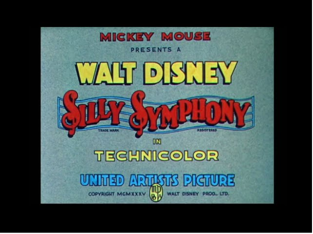
Most of the time, the logo appeared as simple, hand-drawn title cards that said “Walt Disney Productions.”
The style changed slightly depending on the cartoon, whether it was a Mickey Mouse short or a Silly Symphony episode.
During this time, Disney wasn’t focused on having one official logo. The magic was really in the cartoons themselves.
The characters, especially Mickey, were doing all the work of building the brand. And honestly, they did it perfectly! Mickey stole the show every single time.
1937-1948
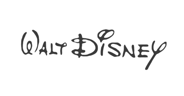
By the late 1930s, Disney had grown from a small studio into a household name, and it was time for a logo that matched its growing magic.
Between 1937 and 1948, the company introduced a new look that would become a major step toward the Disney logo we all recognize today.
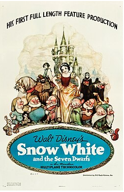
This version featured Walt Disney’s own signature, written in a flowing, cursive style. It first appeared in Snow White and the Seven Dwarves (1937), Disney’s first full-length animated film.
The handwritten script felt personal and creative: a perfect reflection of the studio’s charm. It was elegant but still playful, easy to read yet full of character.
One fun detail: the “T” logo in “Walt” looked a bit like a “Y”, which confused some people at first. But even with its quirks, the logo worked beautifully. It gave Disney its first true visual identity, and it appeared not only in movies but also in posters, merchandise, and other promotional materials.
1948-1972
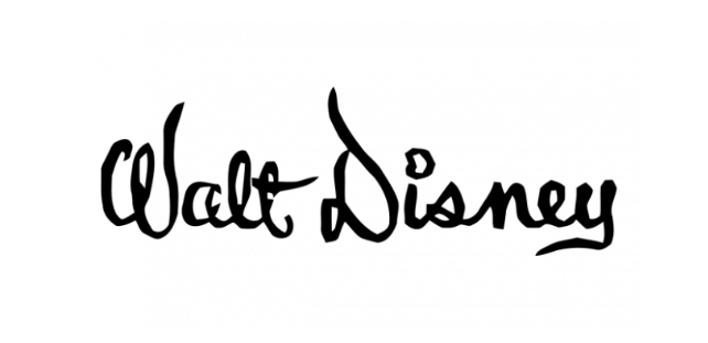
As Disney continued to grow, its logo underwent a minor makeover. Between 1948 and 1972, the famous script logo was refined and polished to match the studio’s maturing image. It still had that familiar handwritten style, but this time it wasn’t an exact copy of Walt’s own signature.
The letters were stretched taller, with longer, flowing lines that gave the logo a more elegant and stylish look, though it could be a bit tricky to read at first glance.
Although there was still no castle yet, this era made the “Walt Disney” wordmark an icon in its own right. It stood for creativity, storytelling, and the growing magic that would soon take the world even further into Walt’s dream.
1972-1983
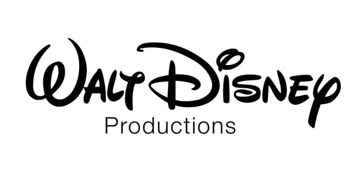
By the 1970s, Disney decided it was time to give its logo a little refresh: something that felt classic but clearer.
So, they brought back Walt Disney’s handwritten style, the one everyone loved, and made it easier to read. Beneath it, they added the word “Productions” in a clean, simple font to give the design a nice, modern touch.
This version struck the perfect balance: fun, friendly, and polished. It kept that playful Disney charm while making sure people could actually read it at a glance.
This update also introduced the typeface that we still see everywhere today, from movie openings to theme park signs.
1983-2006
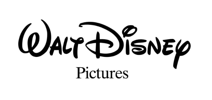
The 1980s brought a whole new kind of magic to Disney’s logo. The classic “Walt Disney” script stayed the same, because really, why mess with perfection?
However, the word “Productions” was replaced with “Pictures,” a subtle change that made the logo feel more movie-focused and modern.
1985
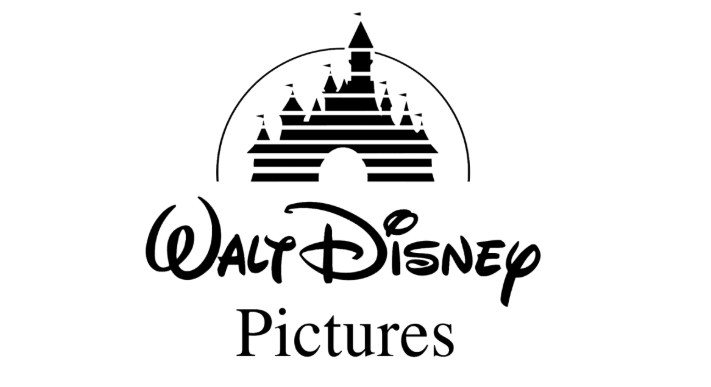
Then came the big upgrade in 1985: the debut of the castle.
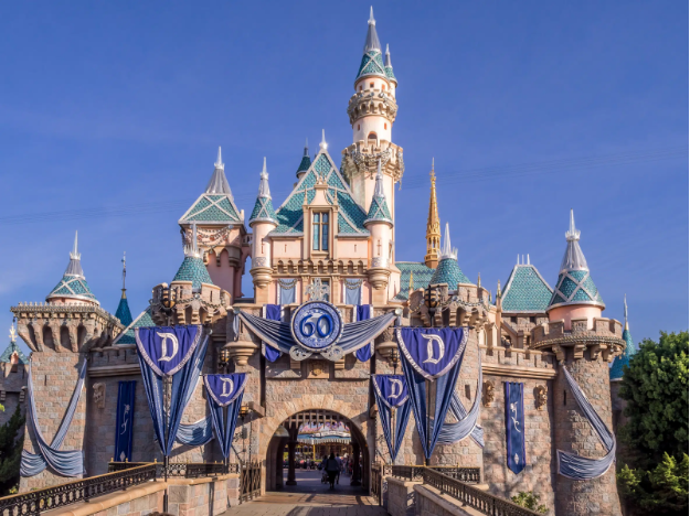
Inspired by Cinderella’s Castle (and the dreamy Neuschwanstein Castle in Germany), this new version first appeared in The Black Cauldron.
It showed a white castle with a glowing arc of light swooping over it, like a shooting star. Simple, magical, and instantly unforgettable.
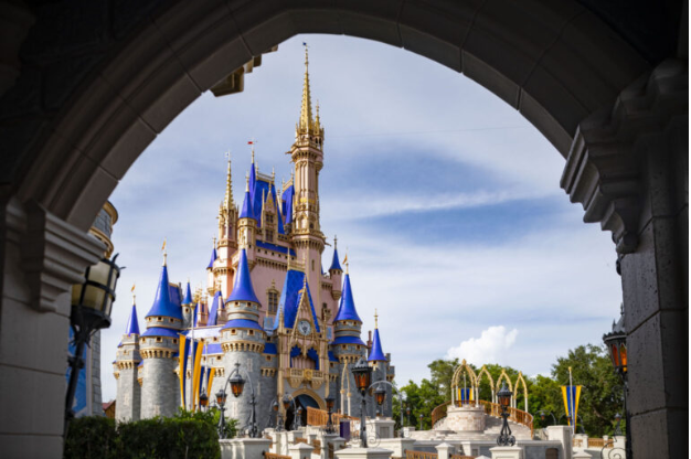
For the first time, the Disney logo moved. The animated castle opening made every movie feel like the start of an adventure. The music swelled, the spark flew across the sky, and just like that, you were in Disney’s world.

From that moment on, the castle and the “Walt Disney Pictures” script became the face of Disney magic, lighting up screens (and hearts) all around the world.
2006-2011
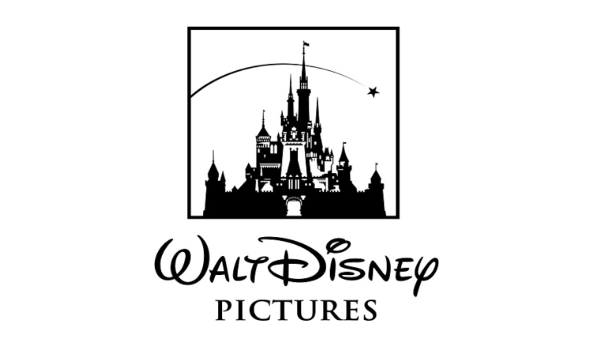
By 2006, Disney had given its iconic castle a complete makeover. What used to be a simple white outline turned into a beautiful, detailed 3D castle: complete with sparkling towers, glowing windows, and a star that twinkled at the end of the famous arc.
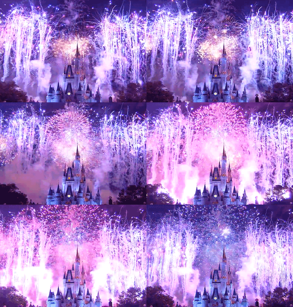
It looked magical in every way, especially when brought to life in full color and animation.
2011-Today
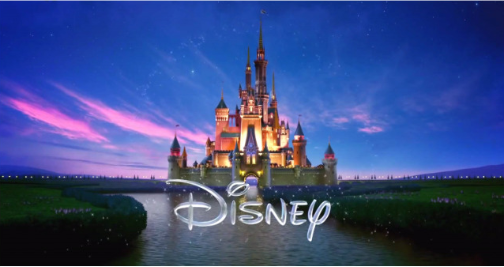
In this version of the logo, Disney opted for a bold and straightforward design. The words “Walt” and “Pictures” were dropped, leaving just the name “Disney.” Short, confident, and instantly recognizable.
The castle, of course, remained more detailed and magical than ever, glowing with lights and surrounded by a dreamy sky.
Over time, its appearance has evolved slightly, incorporating hints of Cinderella’s castle, Peter Pan’s world, and even touches from the real castles at Walt Disney World and Disneyland Paris.
2023-2024: 100 Years of Disney Magic
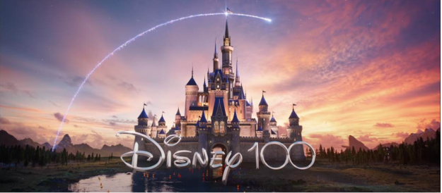
A whole century of dreams, magic, and fairy tales; now that’s worth celebrating! In 2023, Disney hit a major milestone: its 100th anniversary.
And of course, the celebration wouldn’t be complete without a special, seasonal logo to mark the occasion.
Under the “Disney100” banner, the studio gave its famous castle a dazzling new look. This time, it shimmered in elegant platinum tones: a perfect nod to a hundred years of timeless stories.
From a simple sketch to a sparkling castle, Disney’s logo has grown right alongside its stories. Each version adds a little more magic, just like every new Disney movie does!
Key Design Elements of the Disney Logo
These are the key design elements that would instantly take you back to your favorite Disney moments!
Logo Colors
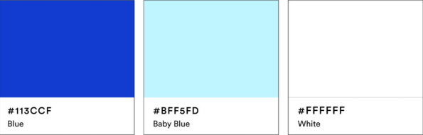
The Disney logo sparkles in blue, baby blue, and white: a color trio that feels just as magical as the worlds Disney creates.
- Blue represents imagination and endless possibilities, like the night sky before the fireworks begin.
- Baby blue adds softness and warmth, capturing that dreamy, fairytale feeling we all know and love.
- White stands for purity, trust, and that touch of Disney magic that never fades.
Together, these colors create a bright, timeless look that feels both playful and enchanting.
And for special occasions, Disney often gives its logo a little makeover with golds, silvers, or festive tones, while keeping that unmistakable Disney charm shining through.
Logo Symbols
The castle is the heart of the Disney logo, a symbol of dreams, fantasy, and happily ever after. Inspired by real and imagined fairy-tale castles (like Cinderella’s and Sleeping Beauty’s), it’s instantly recognizable.
Other elements often join the fun too:
- Disney fictional characters sometimes make cameo appearances, reminding fans of the magic behind the movies.
- Fireworks light up the sky in animated versions, signaling celebration and excitement.
- Stars twinkle above the castle, tying everything together with that extra sprinkle of Disney magic.
Logo Font
The Disney logo’s font is pure personality: fun, playful, and unmistakably “Disney.” It’s inspired by Walt Disney’s own signature, giving it a personal and whimsical touch.
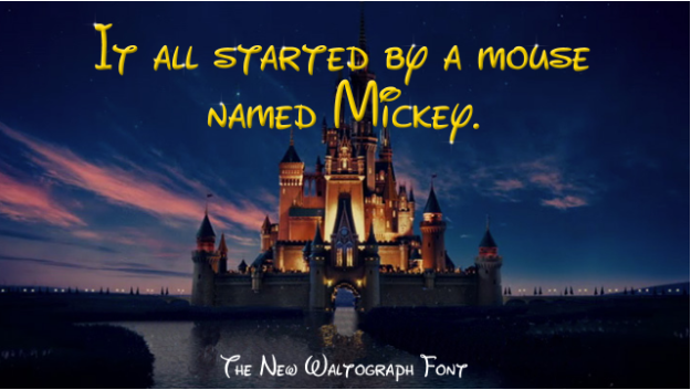
This custom wordmark is hand-drawn to capture the studio’s imaginative spirit.
Fans often recreate the style using the “Waltograph” font, a fan-made version inspired by the iconic look (though it’s not officially part of Disney’s brand).
Every curve and swirl in the lettering tells a story: one of creativity, joy, and timeless imagination.
What We Can Learn from the Disney Logo
There’s a reason the Disney logo feels so special, and there’s a lot we can take away from it, too!
- Keep it simple but memorable. Disney’s logo is a simple wordmark and a castle, yet it’s instantly recognizable.
- Tell a story. Every version of the logo feels like it belongs in a fairytale. Your logo should reflect the story or feeling behind your brand.
- Use colors with meaning. Disney’s shades of blue and white spark emotions like trust, joy, and imagination.
- Stay consistent, but evolve. Disney’s logo has changed over the years, yet it has always retained its magical heart. Minor updates can keep your brand fresh without losing its identity.
- Add your own magic. Whether it’s a symbol, a font, or a touch of animation, ensure your logo has something that is uniquely yours.
Design Your Disney-Inspired Logo Today
The Disney logo shows that a bit of creativity and heart can turn something simple into pure magic. Your logo can do the same and be the start of your brand’s own fairytale!
Ready to make some magic? With BrandCrowd, you can create your own Disney-inspired logo in just a few clicks. Pick a template, play with colors and fonts, and watch your dream design come to life!
Read more about your favorite brand’s logo history here:
- Who Changed Their Look? A Mid-2025 Roundup of Brand Logo Updates
- Logo History: Popular American Hot Dog Brands
- The Pedigree Logo History Unleashed
Frequently Asked Questions About the Disney Logo
1. What does the Disney logo represent?
The Disney logo represents magic, imagination, and storytelling. The castle and playful font remind us of childhood dreams and the wonder of Disney movies.
2. Why did Disney choose blue and white for its logo?
Blue and white symbolize trust, creativity, and purity: values that match Disney’s family-friendly and magical brand. These colors also look clean, timeless, and full of charm.
3. Has the Disney logo changed over time?
Yes! The Disney logo has evolved from a simple handwritten wordmark to the detailed castle design we know today. Each version reflects Disney’s growth and creativity through the years.
4. What font does Disney use?
The Disney logo uses a custom wordmark inspired by Walt Disney’s signature. The fan-made “Waltograph” font looks similar, but it’s not the official Disney font.
5. How can I design a logo like Disney’s?
You can easily create a Disney-inspired logo with BrandCrowd! Choose a design, customize your colors and font, and bring your own brand magic to life in just minutes.
Shayne Jain is a content writer with 7 years of experience specializing in creating engaging and impactful content. Her passion for writing began at age 8, when she started crafting short stories and songs. You can find her kicking balls on the football field or immersed in a good video game when she’s not writing.
Header Image by Selwyn Legaspi