How to Turn Your Logo Into a Business Document System
A logo stored in a Downloads folder is not enough to keep your business documents consistent. If every proposal, invoice, and deck starts from a blank page, the files will look unrelated even when the mark itself is sound. Whether you develop your logo design with an online logo maker or hire a designer, those assets still need to be applied consistently across your documents.
Owning logo files is only the starting point. A business document system turns those assets into reusable templates you can open, complete, and share without redesigning the layout each time.
This article walks through how to organize your logo kit, choose the right file for each use, build a branded Word template, set up a PowerPoint logo slide master, and keep PDFs aligned with the same identity. The aim is a workflow you can maintain without a full-time designer.
What Is a Business Document System?
A business document system is the small set of approved assets and templates that help everyday files look like they belong to the same company. It connects your logo, fonts, colors, and layouts so new documents begin on-brand.
Most small teams need only a few core pieces:
- Approved logo files for screen, documents, and print.
- A short color palette with HEX or RGB values.
- Heading and body fonts that staff can install.
- Reusable Word and PowerPoint templates.
- Clear naming and storage rules.
Templates do not make weak content look strong on their own. They do remove repeated decisions about logo size, margins, and type hierarchy. Once those choices are set, you can focus on the message instead of repairing formatting.
Think of the logo kit as source material. The document system is how that material is applied consistently across letters, presentations, and client-ready PDFs.
Organize Your Logo Kit Before Creating Templates
Organize the files before you open Word or PowerPoint. Disorganized folders are a common reason the wrong logo version reaches a client document.
Create one central brand-assets folder and keep original masters protected. Work from copies when you export or resize files.
This structure works well for most freelancers and small teams:
- Brand Assets
- Logos
- Fonts
- Colors and Brand Guidelines
- Word Templates
- PowerPoint Templates
- PDF Documents
- Exports and Final Files
Separate primary logos, alternate logos, icons, and wordmarks. Keep light and dark versions in clear filenames, such as logo-primary-color-transparent.png and logo-primary-white-transparent.png.
Add a short notes file with approved colors, fonts, and minimum logo size. That reference helps anyone else create documents without guessing.
Do not overwrite master files. If you flatten a logo for one slide background, save that export under a new name so the original remains intact.
Choose the Right Logo File for Documents, Presentations, and Print
A logo can look sharp in one place and soft in another. Both file format and display size affect the result.
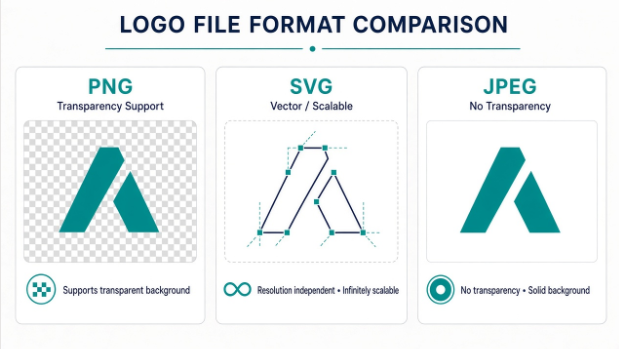
Raster images such as PNG and JPEG are built from pixels. Vector artwork such as SVG, and many PDF or EPS files, is built from paths and can scale more cleanly when the software supports it.
For most Word documents and presentations, a transparent PNG is a practical choice. SVG is useful when your application opens and renders it reliably. JPEG is widely supported, but it does not support transparency and often leaves a white background around a logo.
| File format | Best use | Advantages | Watch-outs |
| PNG | Word documents, presentations, digital documents | Can support transparent backgrounds | Raster image; quality depends on pixel dimensions |
| SVG | Scalable digital and office workflows where supported | Vector-based and resolution-independent | Compatibility and editing behavior vary by software and version |
| PDF or EPS | Print production and workflows that accept vector artwork | May preserve vector information | Not every application handles these files the same way |
| JPEG | Photographs and certain flattened images | Widely supported | Does not support transparency; can show a background around a logo |
Effective resolution also changes with size. A 1,200-pixel-wide logo placed at four inches delivers about 300 pixels per inch. At eight inches, the same file delivers about 150 pixels per inch.
Treat that calculation as a useful check, not a universal print standard. Printers, paper, and production methods still determine final quality.
Use this short selection checklist:
- For logos over colored backgrounds in Word or slides, prefer a transparent PNG with enough pixels for the largest planned size.
- For flexible scaling, test SVG when your software supports it.
- For print vendors, keep PDF or EPS masters available.
- Avoid JPEG when you need a clean transparent edge.
- Do not enlarge a small image and expect missing detail to return.
Keep original vector or print-ready files even if you use PNG for daily work. Those masters matter when you later need large-format or production artwork.
Create a Branded Word Template
A branded Word template is a reusable starting point for letters, proposals, and reports. It is more than a one-off document with a logo pasted at the top.
Begin with page size and margins. Keep margins consistent so text does not crowd the logo. Set a simple font hierarchy with one heading style, one subheading style, and one body style from your approved fonts.
Use brand colors sparingly. A header rule or accent for headings is usually enough. Too many colored elements can make the page feel busy and compete with the logo.
Place the logo without distorting its proportions. Resize from a corner handle, or lock the aspect ratio in your editor. Put the logo in the header when it should repeat across pages, and leave enough clear space so body text does not collide with it.
Save the finished layout as a Word template where supported, often as a .dotx file. Microsoft Word can save a customized document as a template so new files start from that design. Menu labels vary by version and operating system, so confirm the Save as Template or Save As options in your copy of Word.
Test the branded Word template with real content. Paste a long paragraph, a short note, a bullet list, and enough text to create a second page. If the logo, header, or page breaks fail under real copy, fix the template before sharing it.
How to Add a Logo to Letterhead
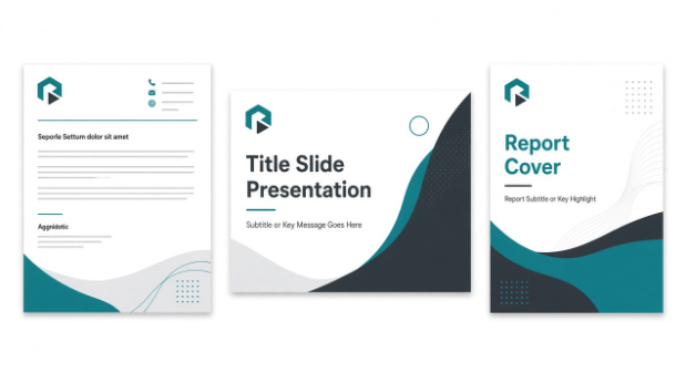
A letterhead places your logo and contact details in a stable layout so every letter starts from the same base. The design does not need to be elaborate. It does need predictable placement.
- Choose a transparent PNG sized for the header, or another approved file that keeps proportions clean.
- Open a document with your standard page size and margins.
- Insert the logo into the header, or another reserved area if your layout requires it.
- Resize the logo proportionally until it is readable without dominating the page.
- Align it with the left, center, or right margin and keep clear space around it.
- Add contact information in a smaller type size so it supports the logo instead of competing with it.
- Type sample letters of different lengths and check page two behavior.
- Export a PDF and review logo sharpness, spacing, and margins on screen.
Common letterhead problems include oversized logos, headers that take too much writing space, low-resolution artwork, uneven margins, and contact details that compete with the mark. Not every business needs the same layout. A consultant letter and a clinic letter can share the same rules while using different information density.
Build a Branded PowerPoint Slide Master
Adding a logo to every slide by hand often creates inconsistency. One presentation deck can end up with several sizes and alignments. A PowerPoint logo slide master reduces that drift by placing shared elements on the master and layouts first.
Open Slide Master view in PowerPoint. Microsoft documentation describes selecting View, then Slide Master, and working from the top master slide and the layouts beneath it.
Place the logo only where it belongs. Title slides, dense chart slides, and closing slides often need different treatment.
Define theme fonts and colors so titles and body text stay consistent. Create or adjust layouts for title slides, section dividers, standard content, images, and closing slides. Keep the logo clear of text placeholders, and check contrast on both light and dark backgrounds.
When the system looks stable, save a reusable PowerPoint template such as .potx where supported. Microsoft guidance is to use Save As, choose PowerPoint Template, and create new decks from that file later.
Test with real slides, including a title slide, a text-heavy slide, a chart slide, and a closing slide. If elements collide, correct the master rather than each individual slide.
Consistency means intentional placement. It does not mean putting a logo in every corner.
Extend Your Brand System to PDFs and Other Business Documents
Once Word and PowerPoint templates are in place, extend the same identity to proposals, invoices, reports, forms, and digital brochures. Reuse the same logo version rules, type hierarchy, spacing habits, and accent colors. Employers can extend that consistency to payroll documents by using an online pay stub generator to prepare pay statements with company branding and itemized earnings and deductions.
Export to PDF when you need a stable file for review, email, or print. PDF export does not automatically repair weak layouts. It preserves what you already built, including problems.
Before you send a final PDF, check for:
- Awkward page breaks and orphaned headings.
- Font substitution that changes spacing.
- Clipped logos or cut-off text.
- Soft or pixelated logo edges.
- Weak contrast between text and background.
- Broken hyperlinks.
- Unnecessarily large file sizes.
- Readability on both screen and print.
Keep master templates editable. Share PDFs as final outputs, not as the only copy of your design system.
Use WPS Office in Your Document Workflow
Many small teams move between Word documents, presentations, and PDFs in the same workday. An office suite that opens those formats in one place can reduce tool switching while you build and test templates.
If presentations are the next priority, a Powerpoint download path helps you open and refine .ppt or .pptx template files while you validate Slide Master layouts.
When a proposal or letterhead is ready for delivery, a pdf editor is useful for last-pass checks such as page order, annotations, or light text corrections before sending.
WPS Office is one option that combines document, presentation, and PDF tools in a single suite. Feature availability can vary by plan, platform, and version, so confirm the tools you need in your installed copy.
Keep the workflow practical. Edit templates, export PDFs, and review final files without rebuilding the brand for each format.
Common Logo and Document Branding Mistakes
Low-resolution logos are one of the fastest ways to make a document look unfinished. Start from a high-resolution or vector master, then export the size you need.
The wrong file format creates unnecessary cleanup. JPEG logos with white boxes and soft PNG enlargements are common examples.
Stretching or compressing a logo weakens the mark. Always scale it proportionally.
Inconsistent colors often appear when people sample from screenshots. Use the approved palette values instead.
Mixing unrelated fonts makes documents feel unfinished. Limit yourself to the approved heading and body pair.
Placing the logo differently in every document recreates the problem templates are meant to solve. Decide default positions and reuse them.
Rebuilding each document from scratch wastes time and invites drift. Open the approved template every time.
Skipping real-content tests hides header collisions and overflow until a client sees them. Test with both long and short copy before sharing.
Letting old logo versions circulate creates brand confusion. Archive retired files in a clearly named folder.
Exporting PDFs without review can lock in soft logos, awkward breaks, and broken links. Complete a final pass every time.
Low-contrast logo placement, such as a light mark on a pale slide, reduces recognition and readability. Check contrast before publishing.
Build a Repeatable Brand Document Workflow
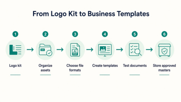
Turn the guidance into a routine you can reuse:
- Gather and verify the approved brand assets.
- Organize the files in one brand-assets folder.
- Choose the appropriate logo version for each use.
- Create a branded Word template.
- Build a PowerPoint template using Slide Master.
- Create reusable PDF-ready layouts where needed.
- Test templates with real content.
- Store approved master templates centrally.
- Give final files clear names and dates.
- Review the system each quarter, or after any logo update.
The goal is not identical documents. A letter, a pitch deck, and an invoice should serve different purposes while remaining clearly connected to the same brand.
Keep this checklist nearby:
- The brand folder exists and originals are protected.
- Transparent document logos and print masters are labeled.
- Word .dotx and PowerPoint .potx masters are stored centrally.
- Real-content tests are complete.
- Final PDFs are reviewed before sending.
- Old logo versions are archived.
Teams that later need custom interactive presentation systems beyond standard office templates may look at specialized builds such as LabD Tech’s Darkoi interactive presentation platform. Most small businesses can get strong results first by finishing reliable Word, PowerPoint, and PDF masters.
Conclusion
A logo kit becomes more useful when its assets are organized and built into repeatable templates. That is how a mark in a folder becomes a business document system.
Start with clean folders, the right logo files from your logo maker, one branded Word template, and one PowerPoint slide master. Then export carefully, review your PDFs, and keep the approved masters in one shared place.
If your current logo files are scattered or incomplete, gather the approved versions into a single brand kit and rebuild your templates from those masters. Consistent documents are easier to maintain when every file starts from the same trusted source.