40 Finance Logos You Can Bank On
Finance logos are often one of the most challenging logos to do.
This is because finance is a sensitive and important subject to most. Whether it’s a bank, fintech app, loaning company, or investment firm, they’ll need to ensure that they are secure, credible, and that we can trust them with our hard-earned money.
And your logo, the first thing that customers see from your business, needs to convey all these values at one glance.
Sounds difficult? It doesn’t have to be. We explore the basics of what makes a great finance logo below to help you with your logo design process. We also listed down famous finance logos and various logo ideas to jog your creative juices.
You can also check out our logo design tool after reading to apply your learnings and create a beautiful finance logo.
Now let’s get to the article.
What Great Finance Logos Have in Common
A great finance logo communicates security, credibility, professionalism, authority, and stability. This is why you typically see icons that can symbolize these messages: a leaf for growth, heavy squares or rectangles for stability, or shields for security.

Finance Graph Portfolio by Design.com

Finance Shield Arrow by BrandCrowd

Finance Stock Market Chat by Design.com
Another example is animals. Lions, tigers, eagles, horses, foxes – they are popular since they can express strength, power, and wisdom.

Regal Lion Finance by Design.com

Pegasus Horse Crest by BrandCrowd

Tiger Head Shield by Design.com

Running Fox Wildlife by BrandCrowd
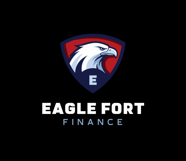
Patriotic Eagle Shield by Design.com
Of course, iconography isn’t just limited to philosophical or conceptual meanings. Businesses can go literal with it and use an icon that directly summarizes their offerings: piggy bank for savings, charts for the stock market, or a spreadsheet for a money tracker app.
Straightforward designs like these are also helpful for new businesses since people can instantly understand what your business is all about in just one glance.
Typography can also solidify your logo. You won’t see any fancy, whimsical, or doodle-style fonts here since finance institutions avoid them due to the childish connotation. Instead, they go for clean sans-serif fonts or more elegant serif fonts, since those are more corporate and “safe”.

Finance logos also tend to be minimalist. Go for a classy wordmark logo with a singular icon or an abstract shape that encapsulates your brand values. Overly bright colors, cutesy illustrations, or playful mascots won’t really fit the industry so avoid those.
So to sum up, a well-designed finance logo tend to have the following elements:
- Meaningful iconography that conveys security and credibility
- Symbolic elements related to your brand
- Descriptive icons that can communicate your products and services
- Clean, corporate typography
- Muted and restrained color palette
- Minimalist and uncluttered designs
Best Color Palette for Financial Logos
Color palette is another important factor in creating a great finance logo or bank logo.
This is because color can dictate how your customers can feel about your brand. This is explored in color psychology, where it is said that each color can evoke different emotions when one sees it.
Colors can also have different associations with them. You know how anything green looks eco-friendly, while light pinks are automatically tagged as feminine? The same concept applies to your finance logos.
So how do you choose the best logo color combinations? Here are some of our suggestions:
Blue Logos
Blue logos dominate finance branding because it’s associated with reliability, security, and calmness. Blue is also the most popular color in the world (according to surveys) and is favored across genders, ages, and races. It makes it a “safe” color to use since most people will usually like it.

Financial Investment Firm by Design.com
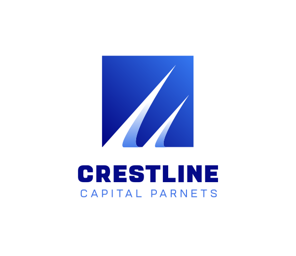
Blue Professional Swoosh by BrandCrowd

Blue Wallet Fintech by Design.com
Black Logos
Black is another great option for those looking to have a formal, traditional, or corporate feel in their logo. At the same time, black can also feel more high-end and premium, which is why it’s a favorite amongst investment firms, private banking, or financial consultants.
Black Logistics Innovation by BrandCrowd

Vault Lock Banking by Design.com
Greek Architecture Pillar Column by BrandCrowd
Green Logos
The color green is often used to symbolize growth, prosperity, and wealth. Brands like Fidelity, Robinhood, and Wise use green to reinforce financial success and upward momentum.
The shade of green also matters. Muted greens like the Citizen’s Bank logo looks fresh yet still restrained and formal, while the lighter and more vibrant green of Kiva makes them look friendlier and more approachable.

Natural Organic Leaf by Design.com

Dollar Money Currency by BrandCrowd
Technology Fintech Software by Design.com
Red Logos
Red logos are often used to project power, strength, and authority. It’s typically used by businesses who want to be seen as the leader or trendsetter in their sphere.
You can also use red as an accent color rather than the main color, if you just want to add visual interest without going overboard.
Red Energy Insurance by BrandCrowd

Arrow Finance Graph by Design.com
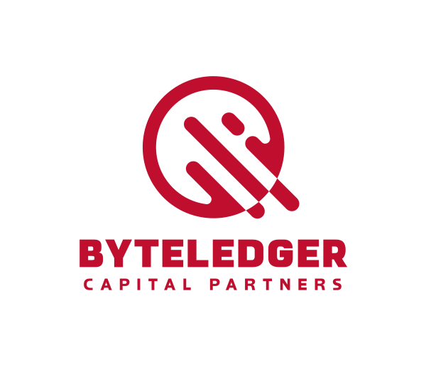
Finance Tech Company by BrandCrowd
Yellow Logos
Yellow, as well as neighboring colors like orange and gold, can also be used for your finance logos. Yellow portrays optimism, energy, and growth, which are great values for any finance institution. At the same time, yellow stands out amongst a sea of blue or blacks.

Accounting Stocks Trade by Design.com

Digital Fintech Currency by BrandCrowd
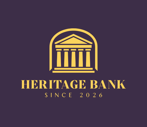
Finance Bank Column by Design.com
Finance Logos of Top Financial Brands and Banks
Let’s now take a look at some of the most recognizable finance logos and bank logos today and what makes them work so well. Who knows, maybe we’ll see your logo added to this list in the future!
Mastercard

Mastercard’s overlapping circles suggest connection and unity, while the red and orange color conveys growth and movement. The simple yet bold abstract logo concept makes it one of the most iconic finance brand marks in the world.
Visa

Visa’s wordmark logo uses a clean, simple, yet strong typography that makes them look professional and authoritative. The slight slant to the V also subtly conveys motion and progress. The bold blue color also adds visual interest without overcomplicating the design.
CitiBank

Citi’s logo is simple but memorable thanks to its red arc resembling an umbrella. The umbrella is meant to signal protection and security. Meanwhile, the clean wordmark makes it feel modern, professional, and reliable.
American Express
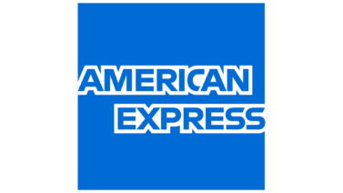
American Express uses a blocky wordmark and a sharp square box to create a logo that feels structured and stable. The design also has a badge-like look that signals authority and legacy. It’s a logo that feels established and high-trust.
PayPal

PayPal may have rebranded now to an all-black logo but this logo remains to be one of the most recognizable logos of all time. The layered P icon symbolizes connectivity while the slight italics communicate speed, which fits the online payment business. Meanwhile, the roundness of the design makes it feel friendlier compared to traditional banks.
HSBC
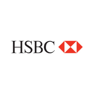
HSBC’s iconic geometric bow emblem is supposed to symbolize stability and power, with the two arrows moving outwards to represent growth and movement. Meanwhile, the red color is used to further establish their brand values of power and action.
Morgan Stanley

Morgan Stanley’s logo is a clean and traditional wordmark that feels formal and conservative. The brand avoids icons or colors entirely, which reinforces their “no-nonsense” identity. It also conveys their trust in their reputation–that they are well-known and established enough that they do not need to add frills to their logo to catch attention.
Deloitte

Deloitte’s bold font and black color portrays strength while the slight roundness of the sans-serif font maintains their approachable and modern vibe. The bright lime green dot also adds more uniqueness to the design while also signifying ideas such as wealth, success, and growth.
Wells Fargo
Wells Fargo uses a classic stamp style logo to reinforce their legacy and reputation. Their bold red color was seen as shocking at the time they used it (as it was seen as too lively for a bank), but it just goes to further show their values of being innovative and progressive.
Barclays

Barclays uses an eagle to suggest protection, vigilance, and leadership. It makes the logo feel powerful while also helping the brand stand out amongst the more minimalist logo of competitors.
Bank of America
Bank of America’s flag-inspired icon and color scheme reinforces their patriotism without being too on the nose. The angled stripes also add motion and visual interest while still keeping the orderly and restrained feel of the logo.
Chase

Chase’s geometric emblem stands for loyalty and unity, to represent their goal of putting their customers at the forefront of their brand. The shape feels stable and structured, and feels like a stamp of credibility even without text. It’s a great example of corporate finance minimalism.
Goldman Sachs

Goldman Sachs relies on a straightforward wordmark that feels serious and institutional. The typography and perfectly even spacing is designed to feel elite, professional, and corporate.
Santander
Santander’s flame logo symbolizes triumph. It shows that their brand is the leader in the industry. At the same time, the bold red color makes them look even more powerful and eyecatching.
Remitly

Remitly’s logo shows a stylized handshake, which corresponds to their brand’s service: a safe remittance even across borders. It’s simple and straightforward, yet done so creatively.
Create Your Finance Logo Today
Inspired by the examples above?
Try experimenting with our logo maker tool now. You can find logos that can suit every financial business such as fintech apps, brokerage apps, global banks, or money trackers. Our logo maker tool also gives you that creative control, as you can fully customize fonts, colors, and icons to match your brand’s personality.
We also have marketing tools such as Facebook cover maker, video maker, and website builder to fully build your brand identity. Be sure to check those out as well!
Faviola Publico is an SEO Content Writer specializing in branding and digital marketing strategies. Outside of work, she enjoys reading slice-of-life novels and watching any mystery thriller-themed series.