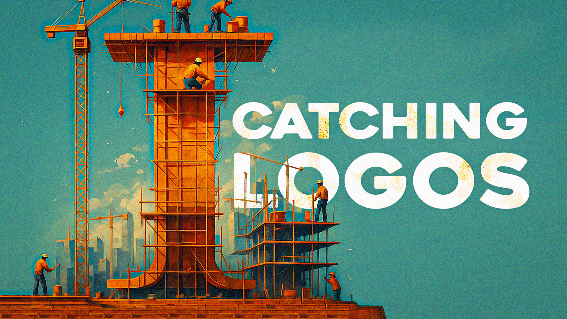
‘I’ Catching Logos That Stand Out
Can you think of a brand that starts with the letter “I”? Chances are, you just pictured a logo in your mind. Maybe it was Instagram’s colorful icon or Intel’s sleek wordmark. The letter “I” logo appears in some well-known brand names worldwide.
There’s something about a strong, simple letter that makes a logo easier to remember. When paired with smart design and logo maker tools, it can help a brand stand out.
Let’s look at famous logos that begin with “I” and why they work so well.
Famous Logos Starting With ‘I’
Some logos are hard to forget. Whether it’s the color, shape, or font, something about them just sticks. The following brands all start with “I” and have widely recognized logos. Each one shows how powerful a simple letter can be when used right.
Here are some famous logos:
Intel
Intel is a leader in computer technology. Its name and logo are known around the globe. The current Intel logo is simple, with bold letters and a clean look. It dropped its old swirl and focused on a more modern design.
The logo reflects trust, power, and speed. That fits the company’s mission to power everything from laptops to data centers. It may look plain at first, but it shows confidence through simplicity.
IKEA
IKEA is known for low-cost furniture and DIY home setups. Its bold blue and yellow logo reflects its Swedish roots. The oval shape with capital letters gives it a strong, friendly look that’s easy to read from a distance.
The IKEA logo stays clear even in busy store signs or printed instructions. It’s playful but dependable—like a brand you can trust to help you build something.
iPhone (Apple)
The iPhone is more than a product. It became a global icon. While it uses Apple’s famous logo, the name “iPhone” set a new trend. The trending lowercase “i” started with the iMac and carried over to iPod, iPad, and iPhone.
This small letter helped Apple feel more personal and modern. It shaped the way tech was branded for years. Even now, other companies still try to copy the “i” style.
IMAX

IMAX brings large-screen, high-quality movie experiences to theaters. Its logo is very direct. Just four capital letters in a thick font. It’s usually shown in blue or white, depending on the background.
The simple design matches the brand. IMAX is all about big visuals and bold sound. The logo doesn’t need to be fancy. It just needs to stand tall and feel solid.
iHeartMedia
iHeartMedia combines radio, streaming, and podcasts. Its logo blends a lowercase “i” with a red heart symbol. Together, they form a warm and clear image.
The heart makes the brand feel emotional and human. It tells people that this brand is about music, voice, and connection. It stands out in a sea of media logos that can often feel cold.
Indiegogo
Indiegogo is a crowdfunding platform that helps people raise money for projects. Its logo uses a bright pink color and a clean font. The bold design makes it look fresh and easy to approach.
The lowercase name and vivid color give it a startup feel. It invites people to share ideas and build new things. It looks friendly and open, which works well for a platform built on community support.
Infosys

Infosys is a global tech consulting company. Its logo is straightforward: a blue wordmark with clean lines and a soft curve in the font.
The design makes the company feel professional and modern. It doesn’t try too hard. It speaks to large businesses that want steady, long-term partnerships.
Indeed

Indeed is one of the top job search engines. Its logo is clean and uses lowercase letters. Above the “i,” there’s a swoosh that adds motion and style.
This design feels welcoming. It matches the brand’s goal to help people find jobs easily. It’s one of the most recognizable logos in the recruitment industry.
iRobot

iRobot makes home cleaning robots like the Roomba. The logo is modern and straightforward. It usually appears in green and black with a rounded typeface.
It feels futuristic but friendly. That works well for products meant to live in your home. The design helps people feel at ease with intelligent machines.
Instagram is one of the most used social apps in the world. Over the years, its logo design has changed from a vintage camera to a modern, colorful icon. The current version uses a simple camera outline inside a gradient background. It’s bright, clean, and easy to spot on any phone screen.
While it’s not an ‘I’ logo per se, it bears mentioning as it matches the app’s focus on photos and creativity. It feels fun and social, just like the platform itself. Even without text, people know what it stands for.
Other Worthy Mentions
Not every logo with an “I” is as well-known as Instagram or Intel, but plenty of strong examples are worth noting. These brands use the letter “I” boldly and clearly, helping them stand out in their fields.
Ibanez

Ibanez is a popular Japanese guitar brand. Its logo features a flowing script with the lowercase “i” smoothly blended into the rest of the name. The design feels musical, stylish, and true to its rock-and-roll roots. It has a custom, hand-drawn look that guitar lovers recognize right away.
Iveco
Iveco is a heavy-duty vehicle manufacturer from Italy. Its logo uses strong, uppercase letters with a solid font. It looks sturdy, just like the trucks and buses it makes. The bold “I” at the start helps the name feel serious and industrial.
ING

ING is a Dutch financial services group. The logo shows the uppercase letters “ING” next to a proud orange lion. The “I” stands tall and straight, helping balance the strength of the other letters. The logo feels trustworthy, and the lion logo adds a royal and protective touch.
IATA
The International Air Transport Association, known as IATA, uses its four-letter acronym in bold uppercase font. The “I” stands firm at the front, followed by strong, simple characters. The logo often appears with a wing logo or aviation symbols, making it easily tied to the airline industry.
IEEE

IEEE is a global group for engineers and tech professionals. The name stands for the Institute of Electrical and Electronics Engineers. The logo uses bold, capital letters with a clean font. The “I” at the start anchors the acronym and gives it structure. It feels professional, global, and tied to progress in science and technology.
Why the Letter ‘I’ Stands Out in Branding
The letter “I” is short and direct. It’s clean, easy to read, and often feels personal. In branding, that matters. Companies want their names to connect quickly, especially when people scroll faster or scan logos on a screen.
Many brands use “I” because of its flexibility. Depending on the design, it can feel modern, innovative, or even friendly. Whether it’s lowercase or capitalized, it works across many industries. Here’s why the letter “I” stands out:
- It feels personal. The word “I” can make a brand feel more human and connected to users.
- It fits short, catchy names. One-letter starts are strong and easier to brand.
- It looks clean in logos. Designers can build around a single vertical line for bold, simple designs.
- It became trendy. Apple’s use of “i” in products helped other brands follow the style.
Design Principles Behind Effective “I” Logos
So what makes these “I” logos work? It’s not just the letter itself. It’s how designers shape the letter into something that matches the brand. These logos balance clarity, meaning, and personality.
Here are five design tips that often show up in successful “I” logos:
- Keep it simple. A clean design is easier to remember and spot from far away.
- Use strong fonts. Fonts say a lot about tone; bold fonts feel confident, soft ones feel friendly.
- Stick to 1–2 colors. Too many colors can be distracting. Simple palettes stand out.
- Make it scalable. The logo should look small (like an app icon) or large (on a billboard).
- Add a symbol when needed. A small icon, like a heart or a dot, can give more meaning.
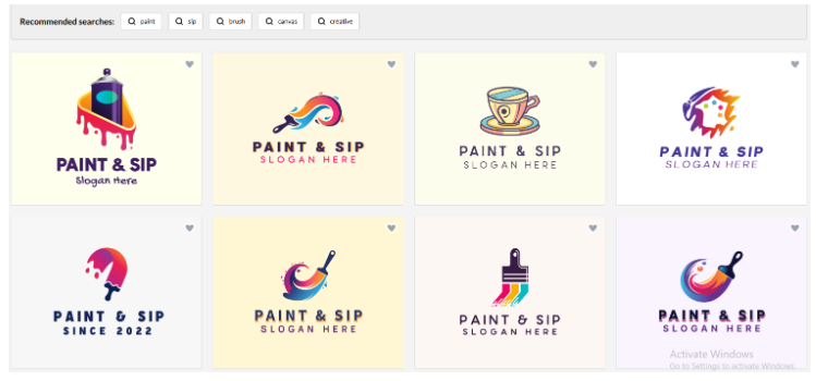
If you’re looking for inspiration or designing your brand, BrandCrowd is a good place to start. It’s an online logo maker and marketplace. You can type in your brand name and get logo ideas right away.
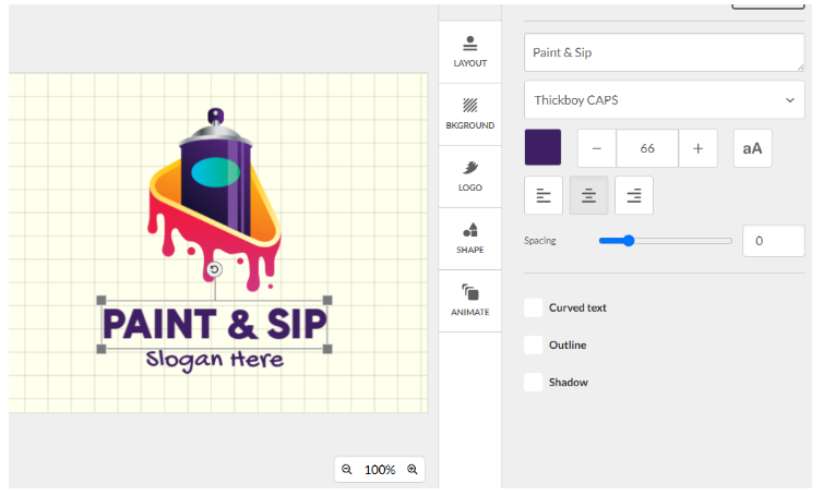
BrandCrowd lets you filter logos by letter, color, style, and industry. Whether you want something playful or serious, there’s a design that can help spark your creativity.
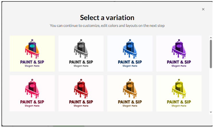
Here are other “I” logo inspirations from BrandCrowd:
- Creative Studio Letter I Logos
- Decorative Boutique Letter I Logos
- Tech Company Letter I Logos
Creative Studio Letter I Logos
Creative logos are great for businesses like design studios, media teams, or art brands. The letter “I” is often turned into something fun or artistic. You might see bold shapes, paint strokes, or playful colors. They’re made to stand out and show off the brand’s creative side.
Get started with creative studio letter I logos here:
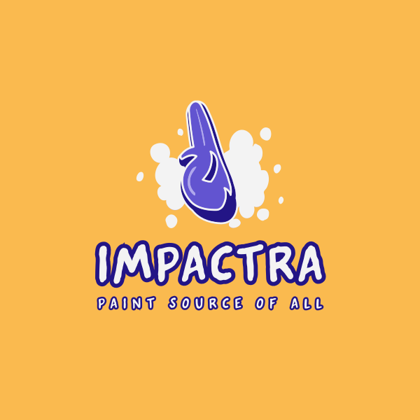
Blockbuster Graffiti Letter I by Design.com
Information Letter I by BrandCrowd
Stripes Studio Letter I by Design.com
Creative Studio Letter I by BrandCrowd

Decorative Boutique Letter I by Design.com
Barber Grooming Letter I by BrandCrowd
Modern Script Letter I by Design.com

Gradient Designer Letter I by BrandCrowd
Water Drop Letter I by Design.com
Tech Company Letter I by BrandCrowd
Decorative Boutique Letter I Logos
Boutique logos with the letter “I” usually look pretty and stylish. They work well for shops, beauty brands, or handmade goods. You’ll often see soft colors, fancy fonts, or little design touches like leaves or sparkles. These logos feel personal, elegant, and a little bit fancy.
Check out the following logos:

Minimal Logo For Studio For Visionary Architecture

Logo For Islamic Clothing Brand


ICEBOUND – Jewelry Store Specializing In Diamonds

Logo And Business Cards For International Health And Life Science Company

Modernisation Logo Entreprise Secteur Finance

Create A Logo For A Micro Venture Capital Firm

New Technical University In Panama Needs An Awesome Logo

Infusion Therapeutics CBD Products
Tech Company Letter I Logos
Tech logos that use “I” are often modern and straightforward. They use clean lines, sharp fonts, and sometimes cool symbols. These logos feel bright and fresh, perfect for tech startups, apps, or software companies. They show that the brand is forward-thinking and ready for the future.
Choose from one of the options below:

Company Startup Letter I by BrandCrowd
Monoline Serif Letter I by Design.com
Creative Studio Letter I by BrandCrowd

HR Management Letter I by Design.com
Electronics Circuit Letter I by BrandCrowd
Generic Tech Letter I by Design.com
Athletic Sports Letter I by BrandCrowd

Gold Boutique Letter I by Design.com

Cyber Glitch Letter I by BrandCrowd

Construction Builder Letter I by Design.com
Design Your Letter I Logo Today
Many have built strong identities from tech companies to lifestyle brands with this one simple letter. It shows that good design doesn’t need to be complex. Sometimes, a single line can say a lot.
So next time you spot a brand that begins with “I,” take a closer look. There’s probably a wise design choice behind it.
If you’re building a brand of your own, check out BrandCrowd. You can explore thousands of letter “I” logo ideas and customize one that fits your style. It’s quick, easy, and a great way to bring your brand to life.
Read More on Designs Here:
- How Visual Branding Directly Impacts Your Sales
- How to Create Beautiful Menus That Reflect Your Brand
- Brand Personality: What It Is and How to Find Yours
Shayne Jain is a content writer with 7 years of experience specializing in creating engaging and impactful content. Her passion for writing began at age 8, when she started crafting short stories and songs. When she’s not writing, you can find her kicking balls on the football field or immersed in a good video game.
Header Artwork by Selwyn Legaspi