The Role of Texture in Logo Design
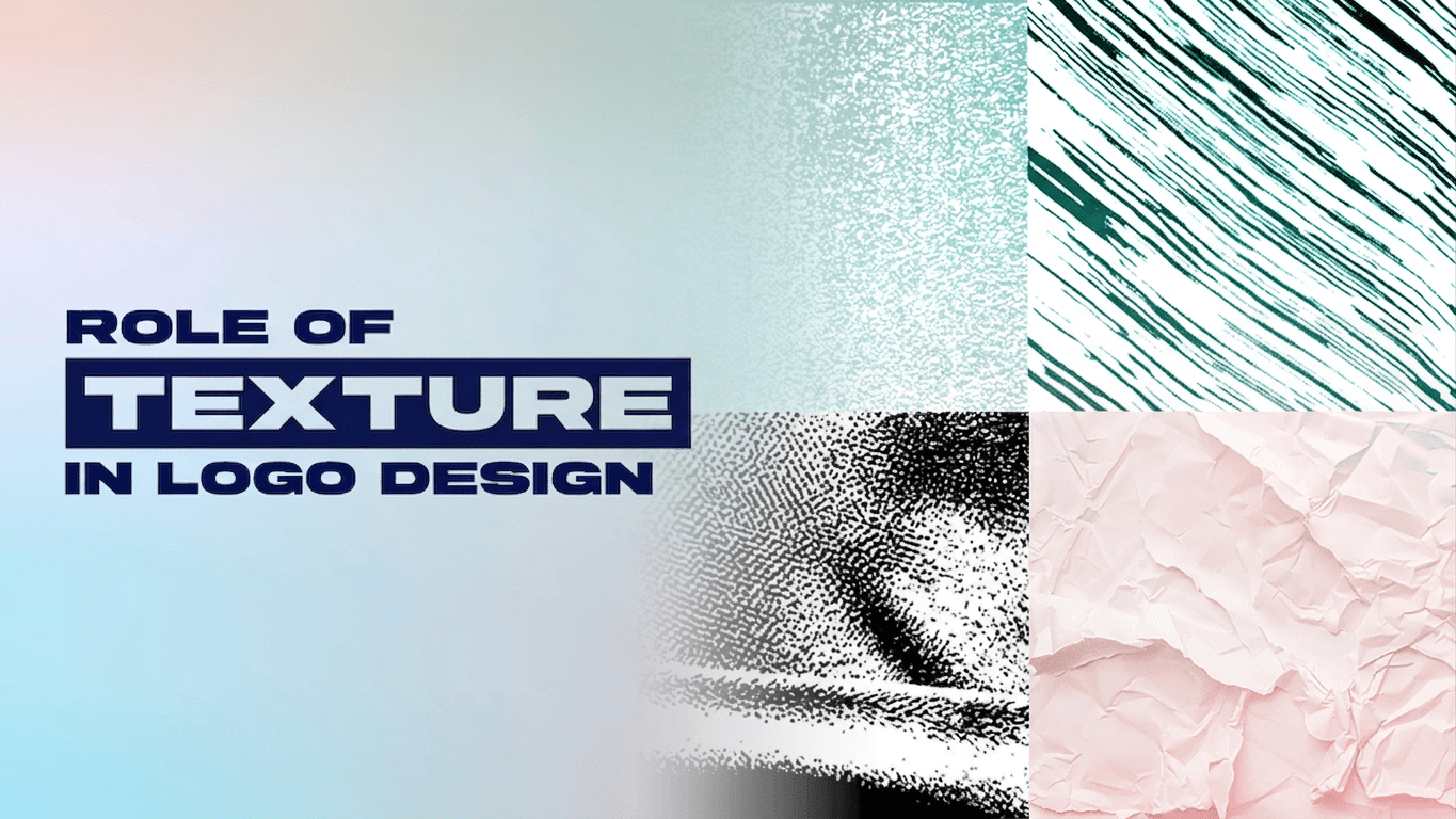
Logo design usually centers on colors, fonts, and icons. We rarely discuss texture, even though it’s one of the most effective ways to convey the brand’s personality to your audience.
Understanding how texture works helps you make more intentional design decisions. When used well, it can add depth, warmth, and a sense of craftsmanship and luxury. It should also not affect readability, scalability, and versatility.
Learn how to use texture in logo design, the dos and don’ts, and how designers keep it in check below.
What Texture Actually Means in a Logo
In design context, texture is the surface quality a visual element appears to have, even when you’re looking at a logo on a flat screen or printed page. It can be rough, smooth, grainy, metallic, or soft. Regardless, it works with other logo design elements to shape how the brand is perceived.
Texture usually appears in two forms — visual and physical:
Visual texture
Visual texture creates an illusion of depth without adding physical surface. Designers achieve this by using digital effects to make the graphics appear more expressive while keeping their logos’ overall structure. These effects include noise overlays, wood grains, metallic finishes, or watercolor washes. You can find them on websites, presentations, videos, and social media platforms.
Instagram’s 2016 app icon redesign is a well-known example of visual texture at work. The original logo mimicked a physical Polaroid camera before it was replaced with a simplified camera glyph set against a multi-color gradient. It features depth and warmth created only through digital color blending.
Instagram (2011-2016)

Instagram (2016-2022)

Physical texture
Physical texture is the application of logos on a real surface using different materials or finishing techniques. Common practices include embossing, foil stamping, engraving, embroidery, and textured paper stocks.
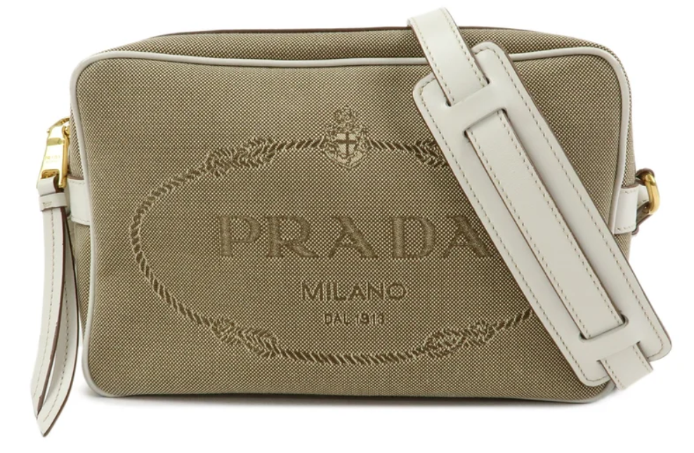
So, logos may appear as a simple black vector online but can be embossed or printed with metallic foil on various branded assets. You can find them on business cards, letterheads, packaging, and apparel. This is common among luxury brands like Prada, which is known for embossing its logo on its leather products.
Prada
Why Texture Matters in Logo Design
Texture is important in logo design as it can influence how people feel about a brand. It sets the brand apart from its competitors, makes the logos memorable, evokes emotions, and shows authenticity.
Texture creates emotional connections
Just like with colors and typography, people can also associate certain textures with specific emotions. For example, subtle wood grains feel warm and communicate craftsmanship. On the other hand, a brushed metal finish speaks of precision and innovation. One example is Jameson Irish Whiskey. Its logo uses aged, slightly worn visual detailing that shows heritage and craftsmanship.
Jameson Irish Whiskey
Texture makes logos more memorable
Compared to a flat artwork, texture helps logos leave a stronger impression. It adds visual detail, giving people another reason to remember the brand. Harley-Davidson’s emblem logo is a useful example here. Its detailed, textured badge treatment is part of what makes it instantly recognizable.
Harley-Davidson
Texture helps differentiate a brand
Most modern brands use flat, minimalist logos for their scalability, but this makes logos look similar to one another. Subtle texture can create distinction and add character while maintaining the simplicity of your minimalistic design. One good example is Jack Daniel’s black-and-white label design, which makes the brand stand out on the shelves.
Jack Daniel’s
Texture reinforces authenticity
Textured logos can help support a brand’s storytelling. Rather than serving as mere decorations, the textures signal to people that their products are made with the utmost care. For example, Trader Joe’s hand-drawn, paper-style logo reinforces authenticity that a slicker, flatter grocery brand wouldn’t create.
Trader Joe’s
How Texture Influences Brand Perception
Different textures don’t create the same effect. For example, rough, organic textures evoke craftsmanship and authenticity, while smooth or polished textures give off luxury, innovation, or professionalism.
While most of your audience are not design experts, they can naturally pick up on this even though they couldn’t explain it. Thus, it’s important to use the texture that suits your brand. Don’t go for what looks interesting or aesthetically pleasing. Choose textures that will reinforce your brand’s personality.
Here are some examples of how textures shape perception:
| Texture | Brand Perception | Common Industries | Examples |
|---|---|---|---|
| Wood | Natural, handcrafted, dependable | Furniture, outdoor, artisan goods | Off the Grain |
| Paper | Authentic, creative, approachable | Crafts, stationery, handmade products | Trader Joe’s |
| Grain | Rustic, vintage, organic | Coffee, bakeries, breweries | Jameson Irish Whiskey |
| Marble | Elegant, premium, sophisticated | Beauty, luxury retail, hospitality | Prada |
| Fabric | Comfortable, warm, lifestyle-focused | Fashion, home décor, apparel | Ralph Lauren |
| Metal | Modern, durable, innovative | Automotive, manufacturing, technology | Harley-Davidson |
When To Use Texture in a Logo
While texture adds character to logos, it works best if it supports a brand’s story and personality. It should enhance the design without compromising the logo’s clarity or versatility, so it stays recognizable across different applications regardless of size. The truth is not every brand can benefit from textured logos.
Textured vs. flat logos
Neither approach is objectively better. It still depends on how the logos will be used. Put side by side, here’s how textured and flat logos fare against different factors.
When textured logos are beneficial
Brands benefit from texture if they want to evoke authenticity, highlight their craftsmanship, or show a tangible experience. Some examples include artisan businesses, restaurants, coffee shops, breweries, and outdoor brands like Patagonia. Its logo features tactile, fabric-inspired textures to illustrate a rugged, tangible feel.
Patagonia
When flat logos are a better choice
Some industries don’t require texture on their logos to convey clarity and precision. This is the case for SaaS companies, fintech brands, and healthcare organizations. Some good examples are Slack and Stripe.
Both rely on clean, flat wordmarks and icons that stay legible across dashboards, apps, and small UI elements. Healthcare organizations like Mayo Clinic follow the same logic.
Slack

Stripe

Mayo Clinic

Textured vs flat logo
| Factor | Textured Logo | Flat Logo |
| Scalability | Riskier at small sizes | Reliable at any size |
| Personality signaled | Craft, heritage, tactile | Modern, minimal, tech-forward |
| App icons & favicons | Limited, needs simplification | Strong |
| Print & packaging impact | Strong | Moderate |
| Production complexity | Higher | Lower |
| Best-fit brands | Artisan, outdoor, heritage | Tech, SaaS, startups |
However, this rule isn’t absolute. Some still use texture in their supporting brand graphics while keeping their flat logos as their primary.
Print and digital considerations
Another thing to consider is how texture behaves when printed or used digitally. Here are some factors you need to watch out for.
For print:
- Convert to CMYK before finalizing: RGB usually shifts in tone or loses vibrancy, so it’s important to convert them to CMYK. This is important if you have soft gradients or subtle shading in your textured logos, as they are usually designed in RGB.
- Check the resolution on raster-based textures: Textures like paper or wood grain may appear pixelated or blurry when printed if the resolution is not high enough. Ensure that the file’s resolution is above 300 DPI to preserve its quality.
- Account for how ink sits on different paper stocks: Not all paper stocks absorb ink the same, so always test how ink sits on different paper before ordering a full print run.
- Ensure that the logo is saved as a vector file: Print vendors need scalable vector artwork; a texture built from a raster image (like a scanned paper grain) can look pixelated once enlarged for signage or packaging.
For digital:
- Keep texture subtle: Low-opacity gradients and soft shading tend to survive compression on social platforms and render consistently across screen resolutions. However, dense grain or fine detail can appear as visual noise, especially on lower-resolution or older displays.
- Test the logo on both light and dark backgrounds: Textures can appear differently on the background. Nielsen Norman Group’s research on dark mode is a useful reference for how contrast and legibility shift between light and dark environments.
Textured Logos in Small Sizes
Textured logos still work well at small sizes as long as the logo design texture is subtle or removable. A rich texture can make logos hard to recognize when reduced to the size of a favicon or app icon. Thus, most brands take the texture away to preserve readability.
To ensure the logo keeps its quality, designers have to test textured logos across common applications. These include favicons, mobile app icons, QR codes, embroidery, and social profile images for Facebook and Instagram.
This is why having responsive logo systems is essential. You don’t have to rely on a single version of your logo. Create multiple logo variations you can use in different contexts. You can have a full textured logo for your packaging and other marketing materials. On the other hand, your simplified flat version of your logo can be used on compact applications.
Limitations of Texture in Logo Design
While texture elevates the brand’s personality, you need to be wary of several tradeoffs before you build a brand identity around it.
- Limits scalability and legibility: Textures work well on huge applications, whether in print or digital form, but suffer on smaller assets.
- Affects the logo file’s complexity: Heavy textures on logos make the file harder to edit, resize, and print.
- Doesn’t always appear the same after physical application: Applying textures on real surfaces strips out gradients and fine shading.
- Ages design faster: Unlike simple, flat logo designs that age slowly, textured logos tend to look old fast.
- Takes longer to test: Textured logos require several rounds of logo testing as texture behaves differently across sizes, backgrounds, and production methods.
Practical Tips for Creating Effective Textured Logos
Text should support a logo, not compete with it. All logos — even the textured ones — rely on other logo design elements, like clean typography, familiar shapes, and balanced composition, to be effective across different applications.
Here are some best practices professional designers follow to create the best textured logos:
- Design the logo’s flat version: Make sure the logo looks good in a single color before introducing any textures.
- Apply texture: Treat texture as optional rather than the design’s foundation.
- Test on multiple sizes: Check how the textured logo looks across different applications — big and small.
- Remove texture when necessary: Identify which applications work with textured logos and which don’t.
- Build with vectors: Save the primary logo as a vector to keep it sharp at any size. You can add texture as a separate layer for specific uses.
Conclusion
Texture is a tool you can use to reinforce your brand’s story, but it shouldn’t take the place of other logo design elements. Before you consider adding texture, ensure your logo design has a color palette that aligns with your brand, readable fonts, clear shapes, and a balanced combination.
Texture enters when you want to add emotion, depth, and character to your design. When used perfectly, it can effectively make your brand feel more human and memorable. Otherwise, it will just undermine your logo rather than enhancing it.
Ready to design your logo? Explore thousands of customizable designs and bring your brand to life with the BrandCrowd Logo Maker today.
Read more on branding here:
- Logo vs. Icon: What’s the Difference and Why It Matters
- What is a Dynamic Logo?
- How To Choose the Best Logo Design Based on Data
Dianne Claveria is an SEO content writer specializing in digital marketing, branding, and technology trends. Passionate about helping businesses grow online, she enjoys exploring the latest tools and innovations in the digital space while creating content that’s both engaging and search-optimized.