Iconography in Food Logos: Beyond the Fork and Spoon
What makes you choose one restaurant over another before even seeing the menu? Often, it starts with the logo. According to research, 75% of consumers recognize a brand by its logo first, even before the company name. From fast food chains to organic juice startups, food logos tell a story.
If you’re starting a new food business or updating your current brand, a reliable logo maker can help you design a symbol that stands out. But to do it right, you need to understand how iconography works and how to use it with purpose in your logo design.
Let’s get started.
What Is Iconography?
Iconography is the use of pictures or symbols to convey ideas. These symbols can quickly tell people something without using words. For example, a tree might represent nature or growth, while a flame could represent spice or heat.
In logos, iconography makes it easier for people to remember your brand. A simple image can tell a lot about your business and how it feels.
For food brands, the correct symbol can show freshness, tradition, fun, or health. That small image can make a big difference in how people see your business.
The Role of Iconography in Food Logos
Icons help people understand your brand right away. They can suggest taste, culture, or even feelings like comfort or joy in the food world.
Here’s how icons help in food logos:
- Instant recognition: A unique symbol helps customers recognize your brand quickly, even from a distance or in a crowded marketplace.
- Telling a story: Icons can reflect your brand’s heritage, values, or mission. For instance, a family crest may indicate tradition, while a sprout represents organic growth.
- Creating emotion: Symbols can evoke nostalgia, trust, joy, or appetite. Think of how a warm loaf of bread or a cheerful sun can create a comforting vibe.
- Setting you apart: Using unexpected or creative symbols allows you to stand out from competitors relying on overused icons.
Commonly Used Symbols in Food Logos
Many food businesses turn to familiar symbols to represent their brand. While some of these are classic choices, using them creatively can still make a logo feel fresh and modern.
Fork and spoon
The fork and spoon are the most recognized icons in food logos. They represent eating, dining, and food in general. While they’re widely used, adding a twist like shaping them into a heart or blending them into another image can give your logo a unique edge.
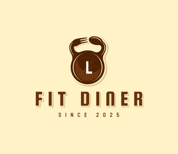
Spoon Fork Kettlebell by BrandCrowd
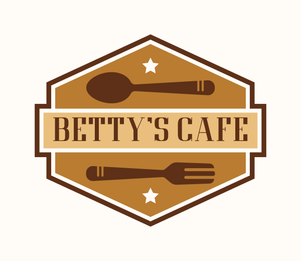
Diner Spoon Fork by Design.com
Chef’s hat
Also known as a toque, the chef’s hat symbolizes professionalism and culinary expertise. It’s often used in logos for restaurants, catering services, or cooking schools. A chef’s hat’s clean, classic look adds a sense of quality and trust.
Culinary Chef Hat by Design.com
Kitchen Chef Hat by BrandCrowd
Wheat and leaves
Wheat, leaves, and other natural elements are popular in food logos for organic, vegan, or health-focused brands. These symbols communicate freshness, sustainability, and a connection to the earth. Their simple shapes also allow for minimalist and clean logo designs.
Crown Wheat Bread by BrandCrowd
Bunny Vegetable Leaves by Design.com
Fruits and vegetables
Bright, colorful icons of fruits or vegetables are often used in juice bars, smoothie shops, or farm-to-table restaurants. A strawberry or carrot, for example, can quickly tell customers what kind of food you specialize in.
Natural Fresh Fruit by Design.com
Harvest Natural Vegetable by BrandCrowd
Cultural and regional symbols
Many food businesses use cultural elements to reflect their heritage or cooking style. For example, chopsticks in an Asian restaurant logo, a taco outline for a Mexican food truck, or an olive branch for Mediterranean cuisine. These icons help create an immediate connection with the type of food offered.
Chopstick Bowl Signal by BrandCrowd
Taco Mexican Food by Design.com
Innovative Iconography: Thinking Outside the Plate
Many food logos today go beyond the usual fork, spoon, or food images. Instead, they use creative and unique symbols to help their brand stand out, such as:
Abstract and geometric shapes
Some logos use simple shapes like circles, lines, or other geometric forms instead of showing food directly. These shapes create a clean, modern look that feels smart and stylish. This approach gives the brand a fresh and sophisticated image.
Snack Burger Food by Design.com
Abstract Archway Window by BrandCrowd
Bull Burger Restaurant by BrandCrowd
Homemade Croissant Bread Bakery by Design.com
Use of non-literal symbols to create a modern and sophisticated brand image
Instead of showing food items, many logos use symbols that represent the brand’s values or personality. These non-literal images make the brand seem more modern and thoughtful, appealing to customers looking for something different.
Beef Restaurant Burger Bite Cow by BrandCrowd
Baker Pastry Bread by Design.com
Cake Dessert Bakeshop by BrandCrowd
Pastry Bakery Restaurant by Design.com
Chocolate Cake Dessert by BrandCrowd
Hidden messages and negative space
Some logos hide small, clever images or messages within their design that are not obvious at first glance. This technique adds depth and makes the logo more memorable when people discover the hidden details.
Fruit Food Utensils by Design.com
Space Rocket Coffee Cup by BrandCrowd
Beige Squirrel Silhouette by Design.com
Baby Rabbit Silhouette by BrandCrowd
Silhouette Male Thunderbolt by Design.com
Typography as iconography
In many food logos, the style of the text is designed to be more than just words. The lettering can also act as a symbol that reflects the brand’s personality. Using unique fonts or hand-drawn styles helps the logo feel personal and special, combining meaning with clear communication.
Snack Burger Meal by BrandCrowd
Cute Playful Nursery by Design.com
Fruit Juice Business by BrandCrowd
Elegant Luxury Sign by Design.com
Mexico Mexican Fiesta by BrandCrowd
Famous Food Iconography Logos
Some well-known food brands have built their identity around clever and powerful icons. Here are ten examples of effective use of iconography in food logos:
Starbucks

Starbucks uses a green icon with a siren, a sea creature from old stories. The siren has long hair, a calm face, and a crown, which gives the logo a relaxing and welcoming look.
The symbol connects to the brand’s Seattle roots and coffee’s connection to sea trading. The calm green color makes people feel peaceful, just like sitting down with a cup of coffee.
Domino’s Pizza
Domino’s Pizza has a logo that looks like a red and blue domino tile. Three dots represent the brand’s first three stores, and the tile shape connects directly to the name.
This playful and straightforward icon is easy to remember. The use of bright colors and clean shapes makes it modern and fun, which matches the fast, casual pizza vibe.
Subway

Subway’s logo uses arrows on the first and last letters of the word. These arrows point in different directions and look like subway entrance signs.
This small but bright icon shows movement and fast service. It also makes people think of going somewhere fresh, which fits Subway’s focus on fresh ingredients.
Pringles
Pringles uses the image of a smiling cartoon face with a big mustache and bowtie on the chip can. This character is fun and easy to spot.
The friendly face adds playfulness to the brand and makes it stand out on store shelves. It also gives the logo personality, which helps people connect with the product.
Taco Bell

Taco Bell’s logo is a bold, bright image of a ringing bell. The shape is smooth and modern, with purple and pink shades that feel young and fun.
The bell connects to the brand name and also grabs attention. It gives the logo a playful feel that matches their creative and casual menu.
Jollibee

Jollibee’s logo features a happy bee wearing a chef’s hat and bowtie. The bee smiles widely, making the brand feel cheerful and friendly.
This icon is perfect for a fast food brand focusing on families and fun meals. The bee also ties into the name and helps people remember it easily.
The Fat Duck

The Fat Duck logo features a clean, minimalist design that reflects the restaurant’s sophisticated and innovative culinary style.
It typically consists of the restaurant’s name, “The Fat Duck,” presented in a simple, elegant serif or sans-serif typeface. The typography is often black or dark-colored, giving it a timeless and refined look.
The logo incorporates a subtle graphic element, such as a stylized duck feather silhouette or an abstract shape, which hints at the restaurant’s playful yet refined identity. It balances simplicity with a touch of whimsy, mirroring The Fat Duck’s reputation for combining precision with creativity in its dining experience.
Baskin Robbins

The Baskin-Robbins logo is vibrant and playful, perfectly capturing the ice cream brand’s fun and joyful spirit.
The most distinctive feature of the logo is the use of the initials “BR” in bold, rounded typography. The pink sections of the letters cleverly form the number 31, representing the brand’s original promise of offering 31 different flavors, one for each day of the month.
The color palette features bright pink and blue, creating a lively and inviting look that appeals to families and ice cream lovers of all ages.
Wendy’s

The Wendy’s logo features a friendly and approachable design centered around the iconic image of Wendy, the red-haired girl with pigtails, inspired by the founder’s daughter. Wendy’s face is illustrated with soft lines and a warm smile, showing a sense of family, warmth, and trust.
The logo often includes the brand name “Wendy’s” in a casual, hand-lettered-style script, reinforcing the approachable and down-to-earth personality of the brand. The color palette prominently uses red, which conveys energy and appetite, along with white and blue accents that add freshness and clarity.
Overall, the Wendy’s logo combines a nostalgic, homemade feel with a modern touch, reflecting the brand’s focus on quality, friendliness, and comfort food.
Tips on How To Design an Effective Food Logo Iconography
Creating a strong food logo takes more than just picking a symbol. It requires thoughtful design and alignment with your brand’s message. Here are some helpful tips:
- Know your brand identity: Define your identity before choosing an icon. Is it fun and casual or upscale and traditional? The right icon should reflect that.
- Keep it simple: A simple logo design is more straightforward to recognize and remember. Avoid too many details or overly complicated visuals. Think of how easily your icon could be drawn by hand.
- Be unique: Avoid clichés unless you can give them a fresh spin. Using familiar icons like a fork or a chef’s hat can work, but make sure you add your twist to stand out.
- Consider versatility: Your logo will appear in many sizes and on different platforms. Make sure the icon looks good in black and white, small sizes, and digital or print materials.
- Use color and typography wisely: While iconography concerns the symbol, it works best when paired with the right colors and fonts. Make sure your overall logo design feels balanced and cohesive.
Design Your Food Logo Today
Iconography plays a powerful role in food logos. It helps tell your brand’s story, creates an emotional connection, and makes your business instantly recognizable. While forks and spoons are common choices, a world of symbols awaits exploration.
Ready to bring your food logo to life? Visit BrandCrowd to explore thousands of customizable templates and find the perfect design.
Read more about food branding here:
- How To Create Beautiful Menus That Reflect Your Brand
- Logo History: Popular American Hot Dog Brands
- Jell-O Logo History
Shayne Jain is a content writer with 7 years of experience specializing in creating engaging and impactful content. Her passion for writing began at age 8, when she started crafting short stories and songs. When she’s not writing, you can find her kicking balls on the football field or immersed in a good video game.
Header Artwork by Khim John Blazo