Logo vs. Icon: What’s the Difference and Why It Matters
In branding and design, two terms often get mixed up: logo vs. icon.
At first glance, they can look almost interchangeable, especially in digital spaces where both appear as small visuals on screens. But they are not the same thing, and using them incorrectly can quietly weaken how people experience your brand.
The interesting part is this: one is built for identity, the other is built for interaction. Understanding the role of logo design is especially important because a logo represents the core identity and personality of your brand, while icons are primarily functional visual tools. And if you swap them or blur the line between them, you can end up with design choices that confuse users or make your brand feel inconsistent.
Once you understand the difference between a logo and an icon, you start to see branding and product design in a completely different way. It affects everything from how people recognize your business to how easily they navigate what you’ve built.
In this blog, let’s break it down properly so you can use both with confidence in your business.
What Is a Logo?
A logo is the foundation of how your brand is recognized. It is the visual mark people connect with your business at first glance, and often the one thing they remember long after they’ve interacted with you.
Your logo is your business identity made visual. It is what appears on your website, business cards, packaging, social media, ads, flyers, and everything in between. When done right, it doesn’t just look good; it builds trust and familiarity over time.
But what makes logos interesting is that they are not one-size-fits-all. Different businesses use different logo styles depending on how they want to be remembered and how flexible they need their branding to be.
Common forms of logos
Logos come in several formats, each serving a different purpose in branding. Understanding these helps you choose the right direction for your business identity.
Here are the different logo variations you can try:
1. Wordmark logos
These are text-based logos where the brand name is the main design element. They work best when the name itself is unique or memorable, like Google or Coca-Cola.
Related: Read more about Google’s logo history here.
Example:
Professional Metallic Brand by BrandCrowd

Chrome Metal Typography by BrandCrowd

Metallic Consulting Typography by BrandCrowd
2. Abstract logos
These use shapes, forms, and visual concepts that don’t directly represent an object. Instead, they create meaning through design. Abstract logos are often used by modern brands that want a unique, flexible identity that stands out without being literal.
Example:
Professional Fitness Company by BrandCrowd
Law Column Pillar by BrandCrowd

Gold Real Estate Home by BrandCrowd
3. Mascot logos
Mascot logos feature illustrated characters that represent a brand. These are often friendly, expressive, and memorable. They work well for brands that want to feel more personal, playful, or approachable.
Example:

Janitor Broom Cleaning Housekeeping by BrandCrowd
Outline Viking Helmet by BrandCrowd

Wild Jamaican Lion by BrandCrowd
4. Emblem logos
Emblem logos combine text and symbols inside a single shape or badge. They often feel traditional and established, making them popular with schools, organizations, and legacy-style brands.
Example:

Christian Church Cross Chapel by BrandCrowd

Beekeeper Honey Bee by BrandCrowd

Coastal Lighthouse Harbor by BrandCrowd
5. Vintage logos
Vintage logos are inspired by older design styles, often using retro typography and classic layouts. They are commonly used by brands that want to communicate heritage, craftsmanship, or nostalgia.
Example:
Outdoor Bass Fishing by BrandCrowd
Gym Boxing Gloves by BrandCrowd
Landscaper Shovel Gardening by BrandCrowd
Related: For more inspiration, check out our blog on 50 vintage logos that never go out of style
Each format still serves the same core purpose: recognition. The difference is how that recognition is built and how flexible the logo is across different platforms.
Where logos are used
A logo is not something you design and only use once. It follows you everywhere. Think of it as your visual signature that shows up every time someone interacts with your business, whether online or offline.
You will usually see logos appear in places where people are either discovering your brand or already engaging with it.
On your website, it’s often the first thing people notice in the header. On social media, it becomes your profile identity. On products, it becomes part of what people physically hold in their hands. Each placement quietly reinforces who you are.
You will typically see logos used in:
- Websites and landing pages
- Social media profiles
- Product packaging and labels
- Advertising campaigns
- Business cards and printed materials
- Storefronts and signage
See how famous brands do it:
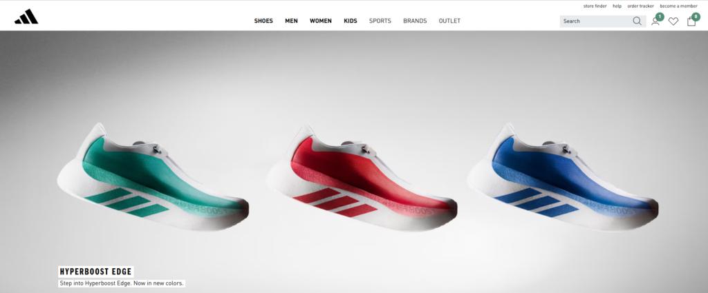
The famous three-stripe Adidas logo on their website
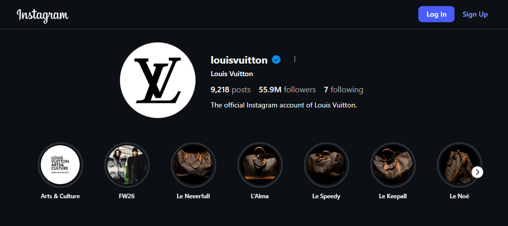
Louis Vuitton logo on their Instagram profile
The famous Coca-Cola product packaging

Heinz ketchup’s witty billboard advertisement

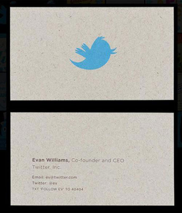
Evan Williams, Co-founder & CEO of Twitter
Starbucks’ signature logo on its stores

Related: Check out this blog if you want to learn more about famous logos and the lessons behind their design
What Is an Icon?
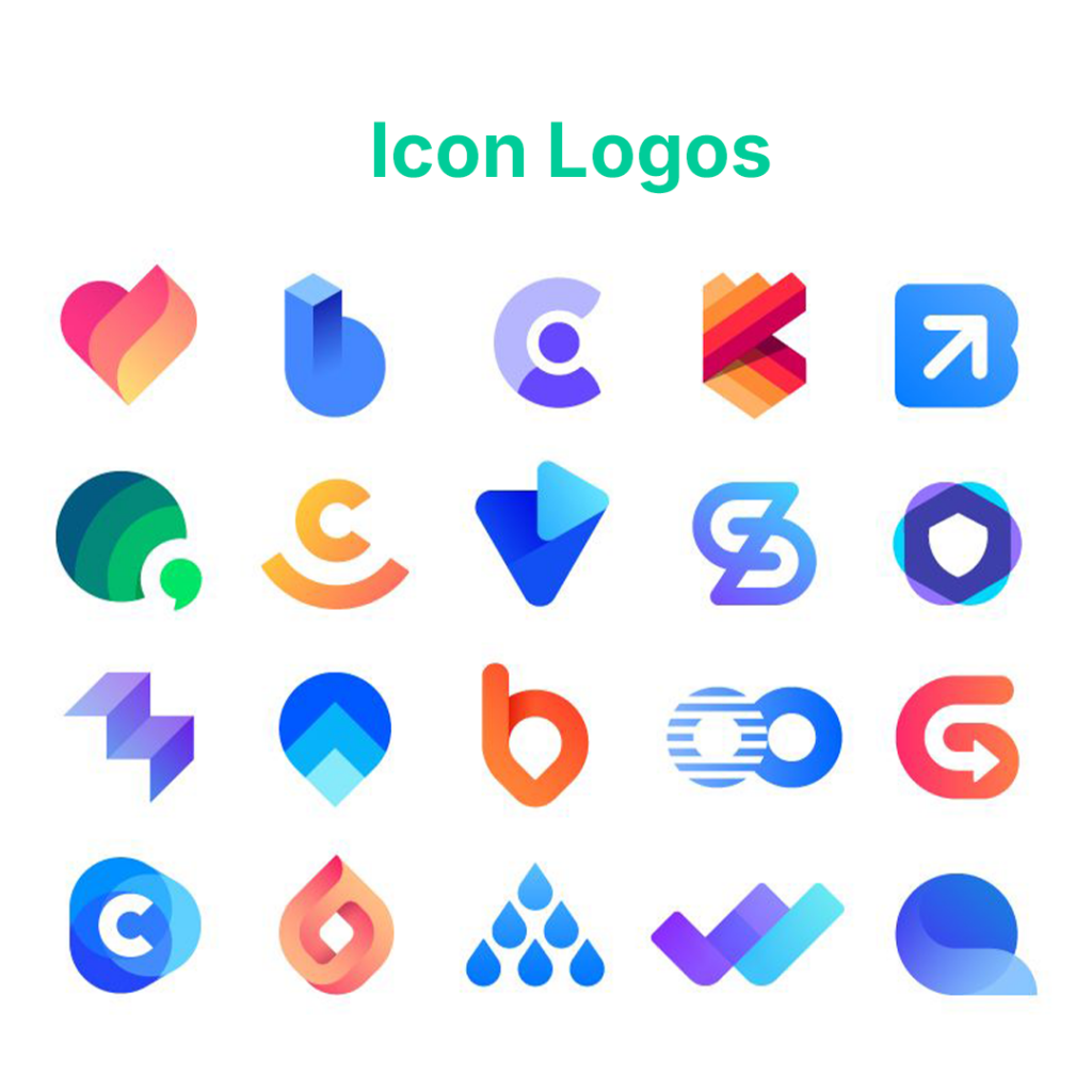
An icon is a small visual symbol that communicates something quickly. Instead of using words, it uses simple shapes or graphics to represent actions, features, or ideas.
You see icons almost everywhere, especially in digital spaces. They guide you, help you navigate, and make interactions faster without needing long explanations. When you tap a search icon, open a menu, or click a shopping cart, you already understand what it does before reading anything. That is the power of icons.
Unlike logos, icons are not focused on identity. They are focused on function. Their main job is to make things easier to use.
Common types of icons
Icons come in different forms depending on where they are used. Each type serves a specific purpose.
- UI Icons: Used in websites and apps to represent actions such as search, settings, home, or notifications. They are essential for navigation and usability.
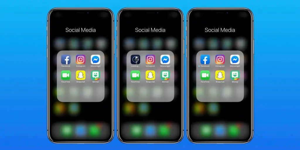
- App Icons: These represent an entire application on a device. They need to be simple, recognizable, and visually distinct because they compete for attention on a small screen. Platforms like AppSigma help developers analyze App Store performance and user review insights, making it just as important for the app icon to communicate a strong, memorable brand from the very first glance.

- Website Icons: Used on web pages to highlight features, sections, or services. They help break up content and make information easier to scan.

- Favicons: These are the small icons that appear in browser tabs next to a website’s name. Even though they are tiny, they help users quickly recognize and return to a site.
Related: Learn all about the tiny icon that could in our complete guide to Favicons blog.
What makes a good icon?
A good icon is not just about looking nice. It needs to work instantly and without confusion.
Strong icons are:
- Simple and uncluttered
- Easy to recognize at a glance
- Clear even at very small sizes
- Consistent in style with the rest of the design
If a user has to stop and think about what an icon means, it is not doing its job properly.
What Is the Difference Between a Logo and an Icon?
A logo represents a brand’s identity, while an icon represents a function, action, or concept. Logos are used for recognition and branding, while icons are used for usability and navigation.
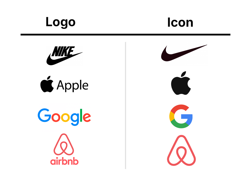
At a basic level, the difference comes down to purpose. A logo is designed to help people recognize and remember a business. It carries meaning, personality, and identity. When someone sees a logo, they should immediately connect it to a brand they know.
An icon, on the other hand, is designed to help people do something. It is not about identity. It is about clarity. Icons guide users through a website, app, or system by showing them what actions they can take without needing to read instructions.
Check out this comparison table:
| Aspect | Logo | Icon |
| Purpose | Brand identity | Function or meaning |
| Role | Recognition | Usability |
| Design | Detailed or stylized | Simple and minimal |
| Size | Scalable for all uses | Optimized for small sizes |
| Usage | Marketing and branding | UI and interaction |
Can a Logo Be Used as an Icon?
Yes, a logo can serve as an icon, especially if it features a simple, recognizable symbol. Most brands use a simplified version of their logo, often called a logo mark, for small spaces like app icons, profile images like a Facebook profile picture, and favicons.
In practice, many well-known brands don’t use their full logo in small formats. Instead, they extract the most recognizable part. Think of the Nike swoosh or Apple’s Apple symbol. These elements are strong enough to stand alone without text, making them ideal for use as icons.
You’ll commonly see logos adapted into icons for:
- App icons
- Website favicons
- Social media profile images
These are all places where space is limited, and clarity matters more than detail.
However, not all logos translate well into icons. If a logo relies heavily on text, fine details, or complex layouts, it can become hard to read when scaled down. What looks great in a website header may become unclear or cluttered at smaller sizes.
Key considerations for using logos as icons
If you’re planning to use your logo as an icon, here are a few things to keep in mind:
- Keep it simple: The design should be clean and easy to recognize at a glance.
- Remove unnecessary details: Avoid small text or complex elements in icon versions.
- Focus on a single element: Use a symbol or shape that clearly represents your brand.
- Test at small sizes: Always check how it looks as a favicon or app icon before finalizing.
- Maintain brand consistency: Even when simplified, it should still feel connected to your main logo.
When Should You Use a Logo Instead of an Icon?
You should use a logo when your goal is to clearly represent your brand and make it recognizable. Logos are best used when identity matters more than function.
A logo is not just a visual. It tells people who you are. So anytime you want your business to be seen, remembered, or trusted, your logo should be the one leading. Using a logo maker can help businesses quickly create professional branding elements that reinforce recognition and consistency.
Related: Check out our list of the best logo makers in 2026
Icons may help users navigate, but they don’t build brand recognition as effectively as a logo does.
When to use a logo
There are specific situations where a logo is the better choice because your brand needs to be front and center.
- Introducing your brand: When people see your business for the first time, your logo helps create that initial impression. It gives your brand a face and makes it easier to remember.
- Running ads or campaigns: In marketing, recognition matters. Your logo should always be visible so people can connect the message back to your brand.
- Designing packaging or merchandise: Products need clear branding. Whether it’s a label, box, or printed item, your logo helps customers identify and trust what they’re buying.
- Creating a website header: Your website is one of your main brand touchpoints. Placing your logo in the header helps users instantly know they’re in the right place.
Why Does the Difference Between Logos and Icons Matter for a Business?
At first, the difference between a logo and an icon might feel like a design detail that doesn’t matter much. But in reality, it affects how people recognize your brand, how they interact with your product, and how professional your business appears overall.
When used correctly, both elements work together. When used incorrectly, they create confusion and weaken your brand identity.
And if you’re wondering why knowing the difference between these two matters for your business. Here’s why:
1. Stronger brand recognition
A logo is what people remember about your business. It’s the visual anchor that connects your name, products, and reputation in one place.
If you use icons where a logo should be, you lose that connection. People may interact with your content, but they won’t clearly remember who it came from. A consistent logo helps your brand stay recognizable across every platform.
2. Better user experience
Icons are designed to help users move through a product or website easily. They guide actions such as clicking, searching, and navigating menus.
When icons are used correctly, they make things feel simple and intuitive. But if they are confused about logos, users may struggle to understand what branding is and what functionality is, which creates unnecessary friction.
3. Clear communication of purpose
Logos and icons communicate different things. A logo says, “This is the brand.” An icon says, “This is what you can do.”
When this distinction is clear, users don’t have to guess. They immediately understand the difference between identity and interaction. This improves clarity across your entire design system.
4. More professional brand appearance
Brands that clearly separate logos and icons tend to look more polished and intentional. It shows that the design was planned, not randomly put together, especially when extended into assets like a digital business card.
On the other hand, mixing the two or using them incorrectly can make a brand feel inconsistent or unfinished, even if the product itself is good.
5. Consistency across platforms
Your brand exists in many places, like websites, apps, social media, and marketing materials. Each of these platforms uses logos and icons differently.
When you understand the difference, you can keep everything consistent. Your logo stays focused on identity, while your icons stay focused on usability. This creates a smoother experience no matter where users find you.
6. Stronger digital product design
For apps and websites, like affiliate marketplace platforms, the difference becomes even more important. Logos help users recognize the product, while icons help them use it efficiently.
If both are used correctly, your product feels easier to navigate and more enjoyable to use, especially when paired with tools like QR Codes that help users quickly access information. If not, users may feel confused or overwhelmed, even if the design looks good visually.
Conclusion
The difference between a logo and an icon is simple but important. A logo represents your brand identity, while an icon supports user interaction and navigation.
Both play different roles, but together they create a complete visual system for your business.
When used correctly, logos build recognition and icons improve usability. Understanding how to balance both will help you create a stronger, more professional brand presence across all platforms.
Shayne Jain is a content writer with 7 years of experience specializing in creating engaging and impactful content. Her passion for writing began at age 8, when she started crafting short stories and songs. You can find her kicking balls on the football field or immersed in a good video game when she’s not writing.