
Mercedes Benz Logo History
When naming luxury car logos, there’s no doubt that people would instantly think of Mercedes Benz. With its three-pointed star logo, the allure of refined luxury, innovative features, and captivating performance, this famous car brand leaves every car enthusiast’s heart racing. Driving a Mercedes Benz is not merely a means of transportation but an unforgettable experience.
Before you use our logo maker and start your design inspired by this luxury brand, let’s first dive deeper into the factor that played a massive role in the brand’s success – the Mercedes-Benz logo.
Join us as we ride through time and explore the captivating journey of the Mercedes-Benz logo and how it became a true emblem of automotive luxury and innovation.
Brief Overview of the Mercedes-Benz Logo
Whether you’re a car enthusiast or not, you probably have heard of Mercedes-Benz. You might know that this name is famous for its luxurious and sophisticated cars that have been captivating drivers worldwide for over a century.
But do you know the story behind their iconic logo?
Mercedes-Benz is a renowned German automobile manufacturer with a rich history dating back to the early 1900s. The company’s name comes from combining two words: “Mercedes,” the name of a powerful and elegant automobile, and “Benz,” from Karl Benz, one of the pioneers of the modern car.
At its core, the three-pointed star represents a desire for universal motorization, which makes Mercedes-Benz vehicles a symbol of innovation and excellence in the automobile industry.
Like the Lamborghini logo, the car logo has undergone subtle modifications, which evolve in design but remain true to its roots. Despite the changes it has undergone, the fundamental idea behind its logo remained constant: the pursuit of excellence and a commitment to engineering top-notch vehicles.
Mercedes-Benz Logo Over The Years
As you gaze upon a Mercedes-Benz logo, you can’t help but feel the allure of its history and the promise of exceptional driving experiences. This vehicle logo is a testament to the brand’s dedication to craftsmanship, elegance, and technical innovation.
In this section, we will take a trip down memory lane and discover the incredible evolution of the famous Mercedes-Benz logo.
Let’s get started!
1902-1909
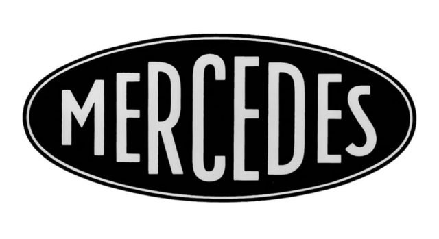
The original Mercedes logo was very different from the logo you know today. It has a unique oval icon placed horizontally and contains a bold, simple font with the word “Mercedes,” with each letter getting more prominent towards the center and smaller towards the right. The badge had two lines outlining it and was either black and white for paperwork or dark blue with silver for the actual emblem.
The badge logo looks classy and stylish, perfect for representing a luxury car brand like Mercedes.
However, it was changed later on.
1909-1916
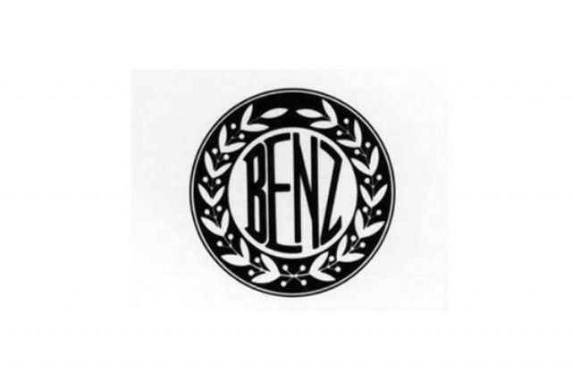
In 1909, the Benz logo was a beautiful and stylish circular logo. The stamp had a thick double outline, and a fancy wreath design was inside. The word “Benz” was written in a particular, unique font in black, placed on a white background within the inner circle. This logo looked elegant and ornate, reflecting the brand’s strength and vitality.
1916-1926

The brand introduced an elegant logo in 1916 – a blue and white logo star shining brightly against a deep burgundy-red background. It was enclosed in a thick circular frame, and inside the circle, the brand’s name and some beautiful leaf decorations were drawn in white.
This logo version had a sophisticated color palette, with the blue and white star symbolizing style and excellence, while the rich burgundy-red background represented power and strength.
1926-1933
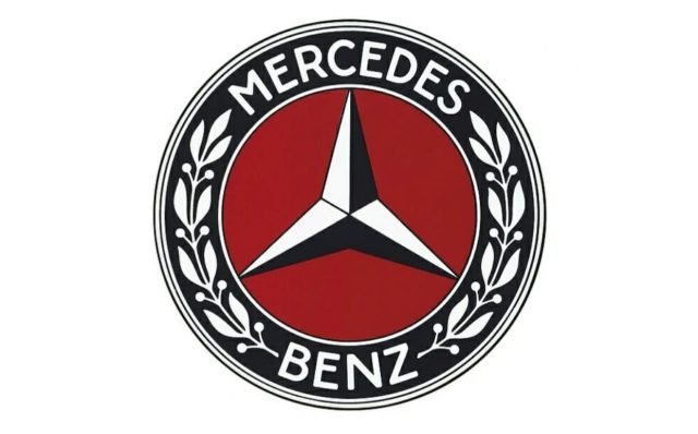
In 1926, the brand got a new logo with some minor tweaks from the previous one. This version had a white and blue star logo on a deep red background, surrounded by a thick circular frame. Inside the circle, there was a white wordmark and some leaf decorations. The emblem looked very classy and sophisticated, with its colors representing style, elegance, and strength.
The white wordmark and leaves added a touch of refinement to the design, symbolizing power and elegance.
1933-1989
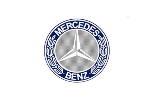
The logo again went through some changes in 1933. A light ray color replaced the deep red background, giving the logo a new look. The blue-and-white star now uses white and gray shades, while the thick blue frame around the logo remains the same.
The leaf icons were redrawn and made slightly more prominent, giving the logo an updated appearance while maintaining its elegance and sophistication.
But later on, the logo was changed into a black silhouette which now looks like a steering wheel:

1989-2009

This three-dimensional logo rocked a modern and dynamic look. The color palette of the badge changed to a gradient gray, and the star symbol was now crafted in a glossy, metallic texture, which makes it shine and stand out.
With this update, the logo continued to represent the brand’s commitment to innovation and excellence, showcasing a perfect blend of modernity and classic elegance.
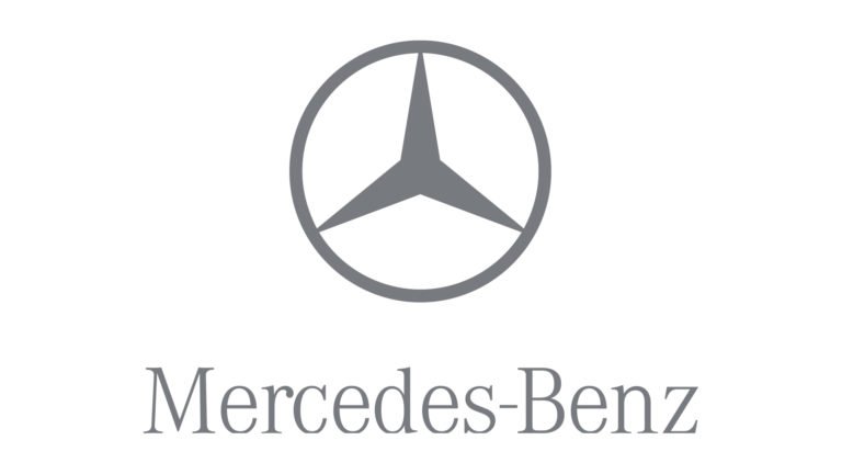
2009-2011

2009 logo took on a new look by adopting a flat design. The three-dimensional elements were removed, giving it a more minimalistic and contemporary appearance. The emblem and the wordmark were redrawn in plain gray color without any additional details or embellishments.
The typeface of the lettering remained unchanged, preserving the brand’s recognizable style. However, without the shadow effect, the lines of the lettering appeared thinner and cleaner.
The simplicity and elegance of this version continue to symbolize the brand’s legacy of excellence and timelessness.
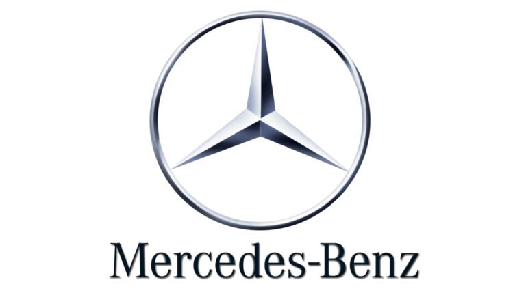
2011-Today

The current logo retained some elements from the 1989 version but had noticeable changes. The emblem resembled the 1989 design, which featured a circular frame, but the frame became thicker, which resulted in a more impactful and bolder appearance.
The wordmark with thinner lines and elegant font complements the emblem perfectly, showcasing a harmonious balance between strength and grace.
The final logo version that the company used captures the essence of timeless elegance, reflecting the brand’s ongoing pursuit of excellence and its enduring impact in the automotive world.
Mercedes-Benz Design Elements
In this section, let’s dive into the captivating world of the Mercedes-Benz logo design and uncover the significance of:
Symbol

The three-star emblem has represented the brand throughout the years, but did you know that the star was initially seen as a protective image for Gottlieb Daimler’s home? Gottlieb Wilhelm Daimler was a German engineer who was a pioneer of internal-combustion engines of the Mercedes-Benz.
The number three, represented by the three rays of the star, held particular importance as a sacred and perfect number. Daimler saw his company’s products as conquering the three essential elements – water, air, and land. This vision aligned with the diverse engines they produced, catering to maritime and river transport, aviation, and land-based vehicles.
Later, Mercedes-Benz adopted the emblem to represent the brand’s ingenuity, conquering the elements and its journey towards automotive innovation and luxury.
Emblem
The emblem has predominantly taken on a circular shape throughout the history of Mercedes-Benz, except for its early years. Initially, the symbol featuring the word “MERCEDES” was designed in an elongated oval shape, stretching horizontally.
However, the company encountered a challenge when it discovered that its closest competitor, the Italian brand Maserati, also used an oval logo, but theirs was elongated vertically.
Mercedes-Benz changed its emblem to distinguish itself and avoid confusion, opting for a circular design significantly. This circular badge became a defining symbol of the brand, setting them apart and solidifying their identity in the automotive world.
Font

The Mercedes logo used the print element only in the first third of the twentieth century. Subsequently, it was decided to abandon it. The reason for such a decision was that the brand had already become well-known.
The font has never performed the primary function in the logo, and let’s face it: you can quickly identify the Mercedes-Benz logo without needing typography. But on some versions, the brand used an exclusive typeface called “Mercedes-Benz Corpo.”
Color
During the initial three decades of Mercedes’ existence, the logo underwent several transformations, and its color scheme changed too. In the early years, the three-rayed star took on various colors like gold, white, red, and blue, with a golden laurel wreath as a crown.
If you’re confused about how to use the proper color schemes, check out our color psychology guide to understand more about using colors properly in design.
Design Your Automobile Logo Today!
The Mercedes-Benz logo history is a captivating journey of evolution and symbolism. From its humble beginnings in the early 1900s to the modern-day representation, the logo has undergone significant transformations, each reflecting the brand’s values and aspirations.
Are you ready to design your luxury vehicle? Your brand and logo might quickly reach the most famous logos list! Feel free to experiment with our logo maker and design from scratch. If you’re ready to put your plan out there, don’t hesitate to use our other templates for your advertising needs – from Flyers, Posters, Facebook Stories, and many more!
Revamp your brand identity and leave a lasting impression with your automobile logo!
