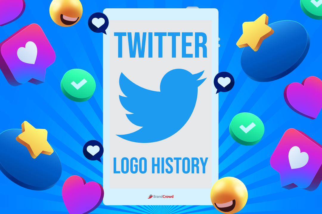
Twitter Logo History
What’s your go-to social media platform if you want to learn the latest world happenings or simply share your life events and thoughts?
Twitter has become one of the top social media platforms with its massive user base of over 230 million monthly users! Over the years, many social media users could instantly recognize the blue bird icon on browsers and mobile devices.
But just like other social media logos, it wasn’t a smooth ride for Twitter either. It took decades for this famous social media platform to finalize its logo.
Hang on to your seats and join us as we look at the evolution of the iconic Twitter logo design!
Brief Overview of the Twitter Logo
Over 16 years old, Twitter has come a long way since it first launched online. A few weeks ago, this social media platform was the hot topic of the news, forums, and other social media pages since the famous entrepreneur Elon Musk bought it and took control of the company.
Aside from its entertaining content, Twitter is widely known for its iconic bird logo, which pops up everywhere – from the company’s website, billboards, and t-shirts, to other promotional materials on almost every website.
We all know the blue bird logo of Twitter, but only some know about the company’s history and how it finalized its logo.
Back in 2006, the founders and developers of Twitter were inspired by Flickr, a photo-sharing platform. So they created Twitter while following the unspoken rule about five-character length for American SMS short codes.
Fun fact: Did you know that Twitter was initially named “Twttr?” There’s one solid piece of evidence to prove it: Co-founder Jack Dorsey’s first-ever tweet was “just setting up my twttr.”
Pretty interesting, right? But wait, there’s more!
As the website grew in popularity, the developers worked hard to maintain its unique brand identity and had the idea to make animal logos to represent the website.
Among all the animal choices, the developers chose the bird logo, which has the ‘twit’ sound and named it Larry the Bird in honor of the NBA Legend Larry Bird.
Wow, can you imagine another animal logo idea that could have represented Twitter? We cannot!
Twitter Logo Evolution
Now that you know where it all started, let’s take a trip down memory lane and go through the Twitter logo evolution throughout the years!
If you use the internet every day, it’s unlikely to go without seeing the tech giant’s logo, but it wasn’t always that way. Like other famous brands, Twitter struggled to develop its brand image and identity.
Before gaining immediate recognition, Twitter underwent four significant changes before it reached the logo we know today. Check out the four designs below:
2005-2006
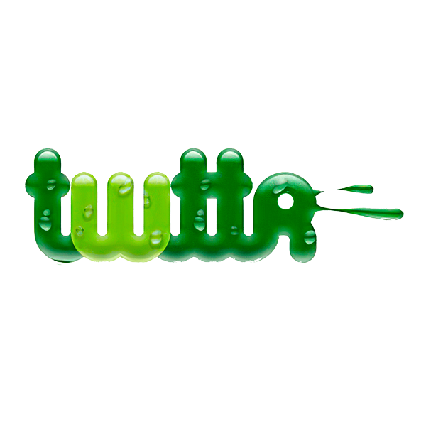
If you look at the first logo of Twitter, you’ll agree that there’s no resemblance or connection between the first and the current logo – not even the slightest detail!
But did you know that this logo version was never used on a public product? The logo above was only used to represent the program while it was still being designed and developed. Nevertheless, let’s check out this historical logo.
In terms of color, the logo is in a slimy dark and light green color palette, covered with drops of dew. Compared to the soothing sky blue logo we love today, the first logo was a snotty green that looked like it had sneezed from the computer!
Thankfully, the name and branding were updated for the 2006 launch. If you’re looking to design your logo, understand the color theory to decide which colors to use.
2006-2010

The first official Twitter logo was a relief from the prelaunch version.
Fun Fact: Graphic designer Linda Gavin created the logo just a day before the official launch!
It was a simple wordmark logo in sans-serif font that included the vowel and featured a unique rounded type space, with small cap letters and no spacing between them. The color palette was also completely changed – from green to light blue.
Blue is a standard color within the social media industry, and according to color psychology, it represents trust, integrity, and calmness.
The simplicity of the logo means the company’s simplicity. The founders loved it, and this logo represented the company for four years before the introduction of the bird symbol.
Not bad for a day’s work, right?
2010-2012

The next major update of the Twitter logo retained the previous logo but added the famous bird logo! It was a cartoon-like mascot with eyes, eyebrows, and paws, but it was later redesigned for a more minimalist look.
Did you know that the bird in this version was bought on the stock website for just $15?
As a combination mark logo, this version contained the wordmark in a Pico Alphabet font type and a blue bird mascot, which people instantly loved.
The famous bird logo is an obvious choice among the animal logos because of the company’s connection with it – thanks to the company’s name and posts called “tweets.”
2012-Present
In 2012, Twitter management saw the need to refresh the brand’s image to even greater simplicity. By this time, the top social media platform had become very famous worldwide, so much so that the logo did not seem to need the company’s name behind as people could instantly recognize its famous bird logo.
So, the final version dropped the word, and the mascot logo became the company’s official logo. The removal of the brand’s name is something similar to what the Starbucks logo went through in 2011.
During the launch of this logo, Twitter stated that there wouldn’t be any changes to this logo for a long time.
Retake a look at the logo and pay attention to its details. While the bird may look similar to the previous logo, three fundamental changes exist. Can you spot them all?
First, the color was slightly changed to a darker shade, which is now close to the actual blue color, to make it stand out better on the white background of a webpage!
Then, if you notice the fluff on the top of the head and the top feather of the previous logo, they were removed to simplify the look of this new and minimalist logo.
Lastly, the bird’s name was changed from ‘Larry’ to ‘Twitter Bird.’ The bird icon symbolizes the joy of unlimited communication and freedom – just like the website’s primary purpose.
Twitter Logo Design Elements
Shape and symbol: Did you know that the current Twitter bird illustration was created with 15 circles layered on each other? The designer, Martin Grasser, used this approach to give an impeccable shape to each part of the bird: the wings, beaks, head, and tummy.
On that note, if you want to learn more about the suitable shapes to use for your logo, you better brush up on some shape psychology to ensure you deliver your brand message!
Color: The original logo is light blue, and we can understand why! Blue logos have been popular among famous brands, especially social networking, and business companies.
In the 2012 version, the bird consists of darker blue shades to add some contrast against the common white background. If you look at the shade, it would still be classified as light blue, but compared to the previous version’s hues, it’s a bit closer to true blue.
Font: The final version of the Twitter logo ended the text logo version. The previous two logo versions used a custom-rounded bubble font.
Design Your Social Media Logo Today!
Ta-da! We hope you enjoyed our trip through the logo versions of Twitter. If you liked this blog, comment down below on which social media platform you want to read next.
Looking to start your career and follow the footsteps of Twitter? Start with a stunning logo today. Visit our website to discover thousands of logo designs you can customize according to your brand’s colors and styles!
If you need other designs, we also have various templates for your social media needs, such as Facebook covers, Instagram Posts, Twitter headers, and more!
Start your design today, and who knows? Your company might just be the next favorite social media platform!
