70 Famous Architecture Logos
There are over 600,000 businesses in the architecture industry. According to the IBISWorld report, the industry shows no signs of stopping this growth soon.
It is a competitive landscape for companies involved. So how does one succeed?
Successful firms are where they are today because of their expertise, creativity, and branding. Today, we are going to talk about the latter. We will examine their logos or the facade of their companies.
There are a lot of lessons to be learned from these design legends. Getting logo ideas and inspiration from brands that have made their mark in the industry is an age-old strategy. From here, you can check out what works so you can apply it to your logo as well:
Famous Logos of Top Architecture Firms
These companies are famous for a reason. They have worked to find themselves at the top of the Giants 300’s 2019 list of leading architecture companies. Giants 300 uses validated data from each respective firm. The US companies in the survey totaled up to 485. Factors such as revenues for general contracting, design-build, CM at risk, and IPD, and other transactions related to the contractor.
These flourishing companies certainly know how to brand their business for success. After all, a proper branding approach impacts growth positively.
Gensler
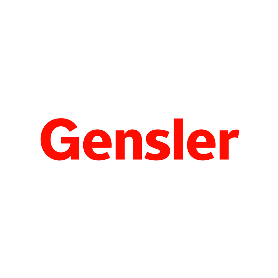
In 2017, the brand has generated the highest revenue in all of the architecture firms in the US. The company operates in 16 areas of practice in different sectors. That’s how big the firm is.
The California-based brand communicates its adaptability and elegance through a sans serif wordmark. It is red and in a shade which gives the design a passionate look. This fits the brand well because the firm was started by a married couple named Art and Drue Gensler with the help of their associate, James Follett.
Perkins and Will
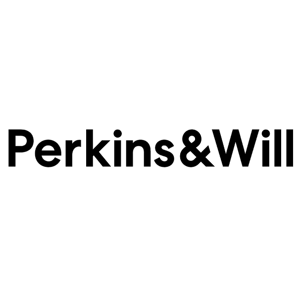
Founded in 1935 by Lawrence Perkins and Philip Will, the logo has a black and white typography logo. The logo design used to have a “+” or a plus sign to represent the word “and”, but the current brand symbol now uses an ampersand.
HKS
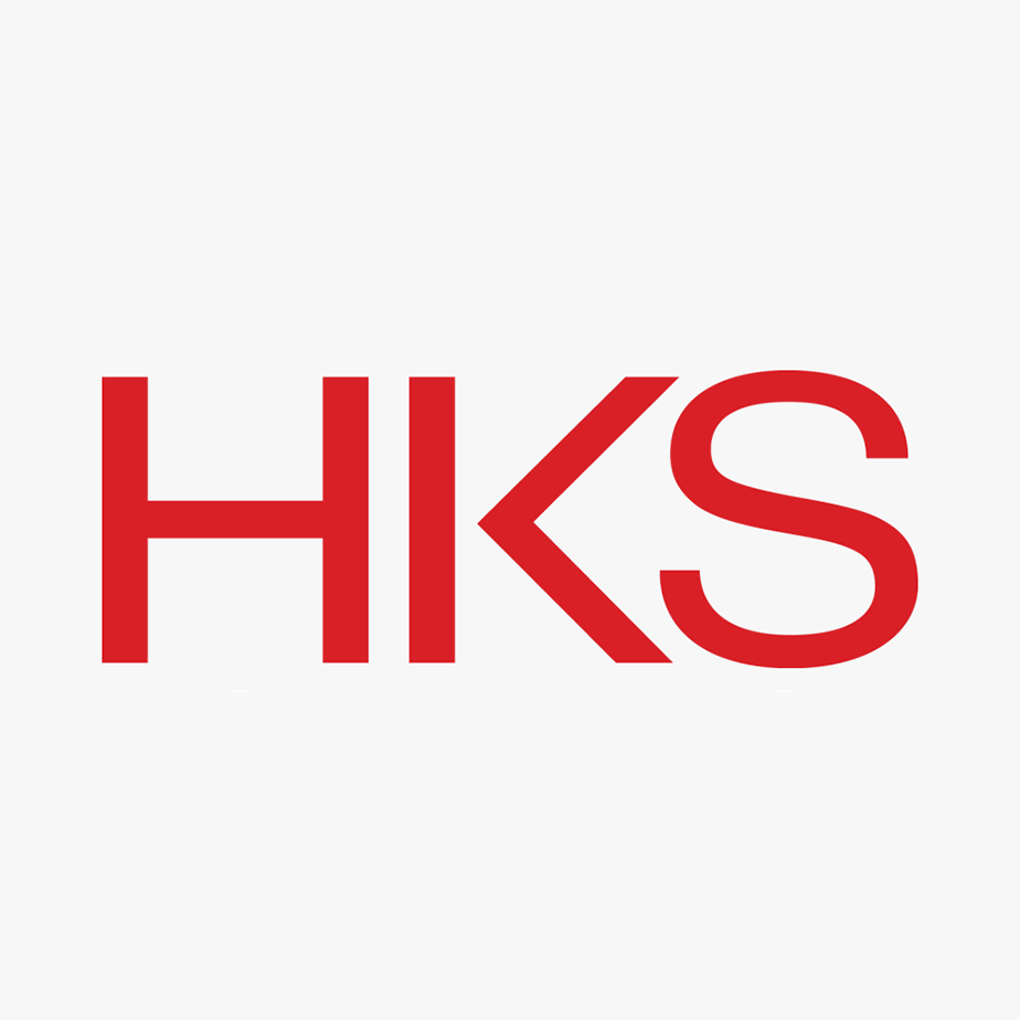
Here we have another firm with a red typography design. HKS adds a unique spin to its typography by severing the branches of the letter K. This disconnection in the glyph creates an intriguing appeal.
Perkins Eastman
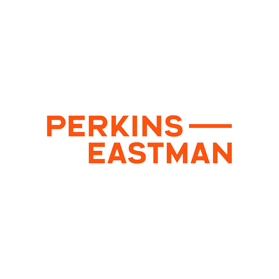
Typography logos can be made different just by adding simple graphic elements. This can come in the form of a simple line like the one seen in Perkins Eastman’s design.
The brand also changes its colors for special occasions. For example, Perkins Eastman changes the logo to a rainbow color scheme during June or the LGBTQ+ pride month. Most companies do this to show solidarity with the community. This is one way for brands to take a relevant approach to branding and marketing.
IBI Group
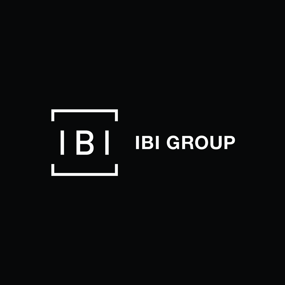
The square shape is deeper than most people make it out to be. It communicates professionalism, stability, and security which is apt for an architecture company symbol. These traits help brands build a reliable voice especially when a brand is in a field that is involved in safety and infrastructure.
The IBI Group logo leverages this shape psychology fact to create an eye-catching symbol.
NELSON Worldwide
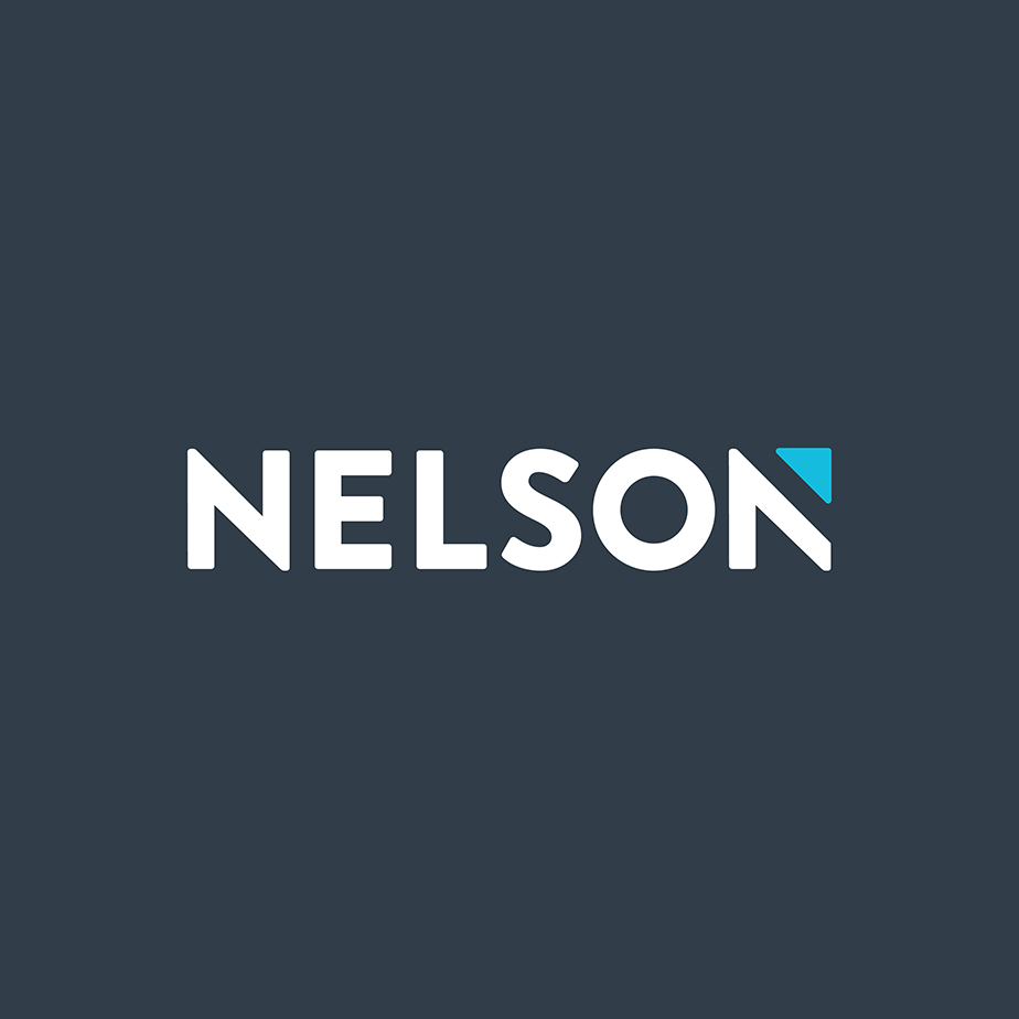
Geometric figures create a strong accent to logo designs without adding unnecessary complexity.
NELSON Worldwide’s brand symbol is a wordmark. But if you look closely, you’ll notice that the typography has a playful and modern design element. The letter N at the end of the wordmark features a vivid shade of blue that makes it unique.
Corgan
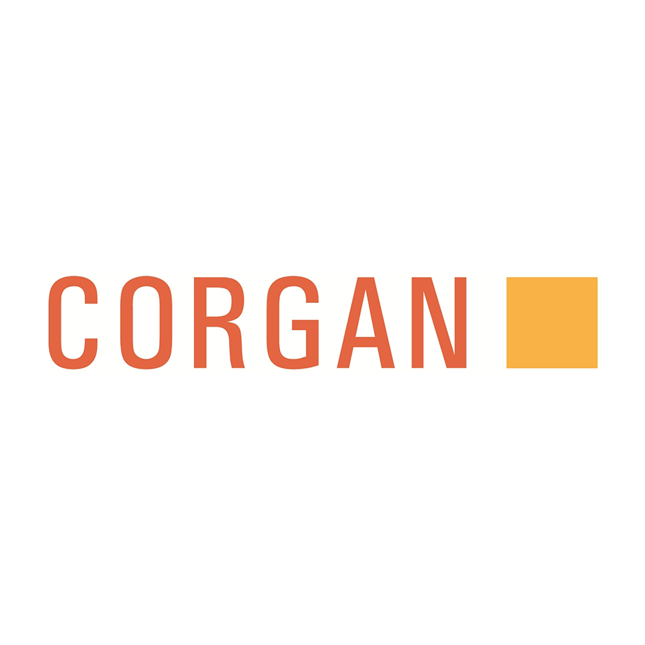
All of the text-based logos we’ve seen so far are in a sans serif font. This one is no different. Corgan’s brand mark is always presented with an orange square. This figure is either used to house the text or sit beside it.
The architecture brand’s symbol embodies creativity and energy.
ZGF Architects
Zimmer Gunsul Frasca Architects LLP is one of the great firms that use an initial logo. These types of logos are often used by businesses with long names. It is a concise way to present your brand and make you easier to recall.
NBBJ
This firm knows how to create an eye-catching logo. NBBJ does this by using a heavy font that gradually transitions to a skinnier font. This typography logo has good contrast between its graphic elements. It stands well on its own even without illustrations or icons.
Kohn Pedersen Fox
As one of the largest firms in New York City, Kohn Pedersen Fox has an authoritative wordmark. Thanks to its use of serif fonts that are known for communicating traditional and formal brand traits.
Interior Architects
The brand’s minimalist logo is straightforward and free of clutter. It fits the brand’s goal of creating smart and innovative solutions for its clients. The symbol uses spacing and text to create a logo packed with sophistication.
It fits the niche of the brand perfectly. The logo adapts itself to architecture, interior design, design strategists, and other related purposes.
HMC Architects
HMC Architects is a firm that specializes in healthcare, education, and civic architecture. It has a text logo that allows versatility to the design. The font that is used in the logo creates an impact while retaining the sharpness of the wordmark.
Elkus Manfredi Architects
This full-service firm was founded in 1988. The namesake and minds behind the company are Howard F. Elkus and David P. Manfredi. The brand gives justice to its name by using a well-balanced typography logo.
The design features a combination of sans serif and serif fonts to complement each other.
KTGY Architecture + Planning
The award-winning design firm has a shape logo. The tall square figures frame each letter and complement the silhouette.
The logo silhouette also looks like a high-rise infrastructure that you’d see in cityscapes. This is one of the logo design trends in other industries like construction brand logos as well.
Cooper Carry
We have another square logo from Cooper Carry. This firm’s slogan is “Connecting people to place.” This logo design embodies that perfectly. The asymmetrical design makes the symbol look as if it is coming together as a coherent whole. While the mismatch text creates an avant-garde vibe.
Scroll to see more famous architecture logos
Studios Architecture
WATG
LS3P
Architects Orange
Solomon Cordwell Buenz
Hord Coplan Macht
PGAL
Cuningham Group Architecture
Moseley Architects
tvsdesign
Robert A.M. Stern Architects
Moody Nolan
MG2
Payette
Ennead Architects
Arquitectonica
Beyer Blinder Belle
Quinn Evans Architects
CBT
HLW International
The Beck Group
VLK Architects
LMN Architects
TreanorHL
DGA
Ayers Saint Gross
Diamond Schmitt Architects
NAC Architecture
Shepley Bulfinch
Fentress Architects
Kirksey
Mithun
DAVIS
BWBR
BHDP Architecture
Wilson Associates
MBH Architects
JCJ Architecture
RATIO
Steinberg Hart
Adrian Smith + Gordon Gill Architecture
Niles Bolton Associates
FXCollaboratives
Ted Moudis Associates
JLG Architects
Boulder Associates
Davis Brody Bond
Array Architects
GBBN
CO Architects
WDG Architecture
OZ Architecture
HuntonBrady Architects
Grimm + Parker Architects
Rule Joy Trammell + Rubio
Conclusion
The brand logos above have been effectively used in their operations and campaigns to create a better image of their firm. They have achieved this by taking a strategic approach to their design.
Your journey through a city of famous architect logos has enlightened you with what a good architecture logo should look like. There’s a variety of architecture design themes that can be seen on this roundup. Brands use font, shapes, gradients, and other elements to create an impressive logo.
One of the common logos in this list is the text or wordmark symbol. This can be explained by the versatility and scalability of word logos. These logos are stylish all while being direct—two traits that many firms strive to be.
Architecture firms select a style that will best fit their niches such as restoration, contractor, interior design, urban planning, and other specialties.
Do you plan on starting up your own architecture company or rebranding your current one? Render your brand’s identity and core competencies into a defining graphic mark.
BrandCrowd’s logo maker will help you achieve a balance between form and function. Select a design from the gallery to develop a better brand symbol today.
