
Testing Your Website Color Scheme: Tools and Techniques for Optimizing UX
Color is one of the most powerful tools in web design.
Aside from making your website look more visually appealing, color can also influence customer emotion, affect how they perceive your brand, guide them to a specific part of your website, or encourage them to purchase.
But how do you know if you’re using the right color scheme for your website? The answer is through color testing.
You’re in the right place if you don’t know what color testing is! We’ll walk you through everything you need to know—what it is, its importance, plus the right tools and techniques to use. We’ll also give some tips on making a beautiful website, which you can easily achieve with our website builder and logo maker tools.
Let’s get started!
What is color testing?
Color testing evaluates how different colors or color schemes can affect a website’s aesthetics, usability, and user behavior.
It can help you determine if your chosen color scheme:
- Can help users navigate your site better (Usability)
- Is readable for people with visual impairments (Accessibility)
- Can drive more conversion (A/B Testing)
- Is visually appealing to your users (Color Perception)
- Can convey the right emotion or brand image (Color Psychology)
While each of these goals requires different techniques, the end result is the same—to create a website that is both beautiful and functional for all users.
Tools and Techniques for Testing Website Color Schemes
Color testing or doing a website color analysis can be done by:
Usability testing
Usability testing focuses on whether your colors improve your website’s user experience (UX) or successfully guide your user to the intended action.
For example, people won’t click gray buttons because they look “disabled” to them. Blue-colored texts are associated with links, so people are more likely to click them. “Buy” buttons are typically red, so people’s minds are trained to think of red buttons as “purchase.”
Color also helps draw your user’s eyes to an important part of your website. For instance, a bright-colored button is more attention-grabbing than a soft pastel one. Red text will stand out in a sea of black text.

Website heatmap tools like Crazy Egg or Hotjar can help you see if your users are clicking on your intended areas. Beta testing can also do a more thorough assessment to see if your colors impact user behavior. You can do this by asking a few users to run tests or hiring people from usability testing hubs.
Accessibility testing
This testing ensures that your website colors are inclusive and accessible to everyone, including those with disabilities and visual impairments.
One aspect is color contrast. Black text on a white background is readable. However, the low contrast makes gray text on a white background difficult to read.
Too much can also be bad. A bright blue background and neon red text may contrast highly but are too harsh on the eyes.

A healthy contrast between your colors (while considering color harmony) can make your website more accessible and readable.
Ensure your color scheme follows Web Content Accessibility Guidelines (WCAG) 2. For instance, they require body text colors to have a minimum contrast of 4.5:1 and large text colors to have a contrast of 3:1.
WCAG 2 also requires sites to provide a text or visual cue instead of just relying on colors for information. An example is adding an asterisk or “Required” text label on your form fields instead of using red-colored text to convey importance. This way, even colorblind users can fill out the form properly.
Certain color combinations should also be avoided as much as possible, as they aren’t ideal for colorblind users. These are colors like red-green, green-blue, green-brown, or blue-purple.

Source: Australian College of Optometry
Tools like WebAim Contrast Checker, Google Lighthouse, Stark plug-in, or colorblind simulators can help measure your site’s accessibility.
A/B Testing
A/B testing’s main goal is to find the best colors to boost your website’s performance and conversion.
This is done by testing two or more versions of a specific web page or element with different colors. You’ll then measure which version performs better by analyzing metrics like clicks, conversions, bounce rate, and page time.
For example, you can test a red “Add to Cart” button compared to a blue one and see which one gets more sales. You can also check if a pale pink and white color scheme on your homepage increases retention compared to a lavender and white.

A/B testing gives you a more data-backed approach to your web design. No more guessing; you’ll let your user’s data speak for itself!
You can use tools like VWO, Optimizely, Unbounce, or ContentSquare. You can also monitor your site performance through Google Analytics.
Color perception testing
Your whole team might think that your web design is amazing. But how about your users? Do they feel the same?
That’s exactly what color perception aims to know.
Color perception testing is used to determine how users perceive your website’s colors and reach a data-backed consensus. After all, color preference is completely subjective. People can prefer a different design depending on their age, gender, background, culture, and even the device they are viewing the website on.
Color perception testing should ideally answer:
- What color the users like
- Why they prefer the color
- What impressions or associations they get from the color
- If other web design elements affect their perception., e.g., they may like red but only against a white background
- If they only like a color scheme when compared to others versus when used in an actual mockup
Here is a sample test from Storyblocks:
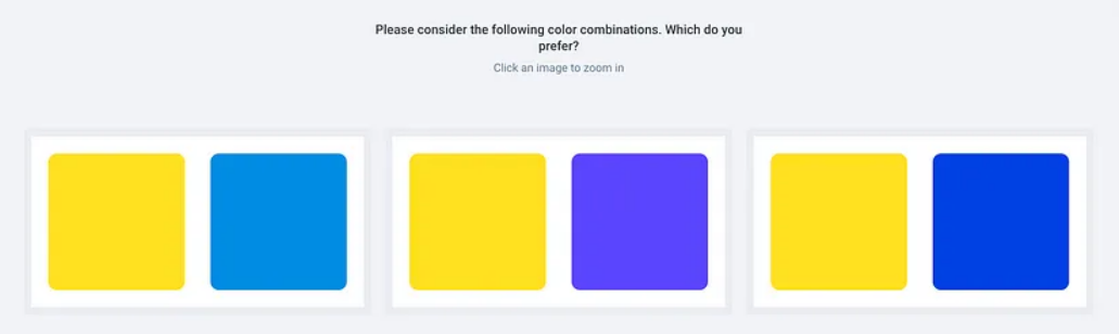
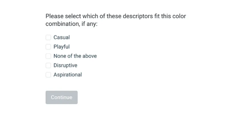
User testing like the one above or running surveys can help you get feedback for your website color scheme. For more comprehensive insights, you can also leverage automated usability testing to gather data on how users interact with different color combinations across various pages and workflows, and analyze patterns in user color preferences more efficiently—especially if you’re running multiple tests across various demographics or device types.
Color psychology testing
Last is by considering color psychology.
Color psychology is the belief that each color can have a specific influence on a person’s emotions and perception.
For example, blue is seen as professional and trustworthy, so banks tend to use it. Orange is seen as fun and energetic, which is why brands with a younger target audience prefer it.
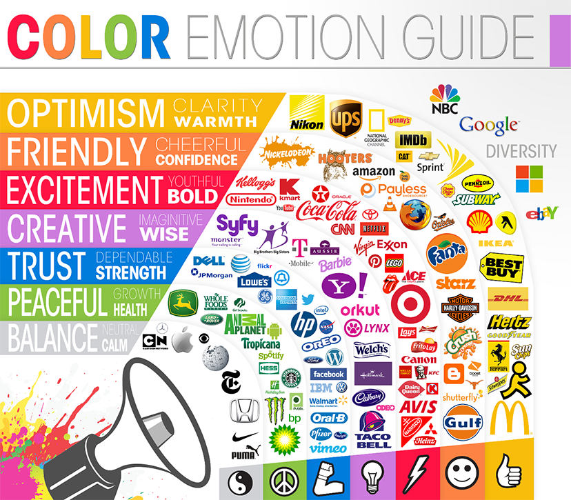
Your website color scheme is affected by color psychology as well. This is why testing whether the color scheme aligns with your brand’s identity and the specific emotion or image you want to evoke is important.
A law firm matches with a simple black-and-white color scheme or maybe even dark blue and white. But bright yellow and orange? Definitely not, as they will be perceived as childish and immature.
Color psychology testing can be done through surveys, research groups, and focus testing.
Tips for Effective Color Schemes and Optimized Web Design
Now, you know how to do color scheme or color palette testing. But there are still some best practices that you can follow to ensure your colors (and website!) are the best they can be. This is especially true when you’re building on an AI hosting platform or any modern web hosting solution, where design and performance are integral.
When analyzing competitor color schemes for inspiration, tools like a Scraper API can help you efficiently gather data from multiple websites to identify successful color trends in your industry.
These tips are:
Understand color harmony
A harmonious color scheme leads to a balanced and cohesive design. When you utilize color harmony, each color works well together instead of conflicting or dulling each other.
This can be achieved by looking at your color wheel.
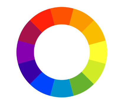
- Complementary colors: Colors opposite on the wheel, e.g., blue and orange. They create more energetic and vibrant looks due to their high contrast.
- Analogous colors: Colors next to each other, e.g., blue and green. They create more subdued and subtle designs.
- Triadic colors: Colors evenly spaced on the wheel, e.g., blue, red, and yellow. They create a balanced palette.
- Monochromatic color: A palette from one color, only in different saturation and brightness, e.g., light blue, blue, cyan, dark blue, navy.
These color combinations can help you find a harmonious color scheme that reflects your brand identity while ensuring that your web design remains easy on the eyes.
Follow the 60-30-10 rule
The 60-30-10 rule is typically used in interior design, but the core idea can also be applied to web design.
The idea is that:
- 60% should be your main or dominant color. This is the background color of a web page.
- 30% should be for your secondary color, complementing your main color. This is the color used for your headers, sidebars, or icons.
- 10% should be your accent color. You’ll use this pop of color to draw attention to important elements like CTAs or buttons.
This rule will help you avoid color overload and overwhelming your users with too much visual clutter.
Leverage tools for your web design
Aside from the ones we’ve mentioned above, you can also consider the following tools:
- Coolors and Paletton – to generate color palettes
- Adobe Color – to experiment with color harmonies
- BrandColors – to find the official color codes used by brands
- ColorZilla – to extract any color from an existing website
- Gradient Hunt – to find the latest design inspiration and trendy color palettes
- BrandCrowd – to create websites, logos, and other visual assets
- BrowserStack – to test your website on multiple devices and browsers
Once your design is complete, consider incorporating usability testing tools to evaluate how real users interact with your interface and identify areas for improvement. Accessibility testing tools can detect color contrast issues, missing alt text, ARIA errors, broken links, and HTML issues, helping websites support WCAG, ADA, EAA, Section 508, 190+ languages, and privacy standards. These tools should help create a stunning and functional web design.
Test whenever you make a change
Testing shouldn’t be limited to the design phase or an A/B test. Every change—whether you change color schemes, add a new image, change font, or a competitor redid their website—should warrant testing.
Why? Any change in your web design or new trends in the design industry can affect how your users view your site. Regular testing ensures that your web design remains relevant and competitive.
Conclusion
Color plays an important role in how users view your web design.
By following our tips on testing your website color schemes, you too can find the optimal color combinations that lead to great UX and beautiful web design.
Want to apply what you learned in this article? Head on to our beginner-friendly website builder tool or tap into our creative community of web designers back in DesignCrowd. Both should be able to help you create the website of your dreams!
Feel free to check out our other tools such as domain name generator, video maker, and animation maker as well.
Till next time!