The 8 Types of Logo – Which One Is For You
Choosing a suitable logo for your business can be daunting. There are infinite combinations of colors, shapes, fonts, and layouts to mix and match. We’ve put together this handy guide on different types of logos available to help you design an outstanding logo.
There are many ways to define logo design, but we’ve chosen to break down logo design into eight distinct categories. Each category has its unique characteristics – this means each logotype can be suited to specific industries, products, or services.
Read on to find out which type of logo could work for your business:
- Monogram Logos
- Wordmark Logos
- Combination Logos
- Emblem Logos
- Mascots Logos
- Pictorial Logos
- Abstract Logos
- Dynamic Logos
—————————————————————————————————–
Monogram Logos
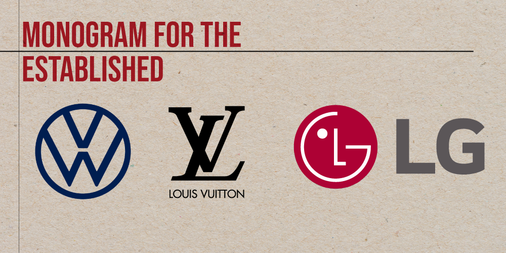
Also known as lettermark logos or initial logos, monograms come to life by using the initials of a brand name together. This design is especially true for brands with long names for their businesses. Thus, the first letters of your business name (initials) become your logo.
Usually, the initials overlap to create a single symbol with a unique silhouette. But you can try adding lines and shapes to create the distinct concept you want. Make sure to take the location of the logo into account as well to make it more effective. Your typography is also essential for this, especially since your market would only see your initials.
This type of design is advantageous for brands with a long name and want to achieve a visually straightforward design for their graphic mark. Designers recommend this for businesses that have established themselves in their industry with a solid following.
Brands can create a show-stopping design by using shapes to frame the decorative elements. It’s a dynamic logo that works well on putting a kind of copyright on any merch and social media post you make.
Monogram logos are a beautiful way to represent your company and become a timeless way to embody your business. That’s why plenty of famous brands use monogram or lettermark logos.
- BBC, with their whopping $ 1.8 million Gill Sans logo
- Louis Vuitton, with their overlapping L and V
- LG with their simplistic initials enclosed in a red circle
- Volkswagen, with their unforgettable VW
- Hewlett Packard, with their negative space initials infused in a blue circle
If you want a simplistic but modern look, go for this design.
—————————————————————————————————–
Wordmark Logos
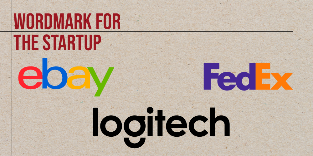
Wordmark logos are the counterpart of lettermark design. They feature the entirety of a company name and mainly rely on typography for a balanced design.
Thus, you need to ensure that your font is readable and looks clean for your market. The feel of your brand is also dependent on this aspect. There are two main font types you can choose from; Serif or Sans Serif.
Fonts falling under Serif are those with details on the tails. Curves like cursive handwriting characterize them. Fonts like Times New Roman, Georgia, and Courier New are examples of this style. The Serif font type is often associated with more traditional and professional service industries such as finance, law and government.
For Sans Serif, the fonts under this type look much more modern. It lacks the tail that defines a serif but embodies Sans. Arial, Helvetica, and Calibri are examples of this simple yet effective style.
Although no illustrations are typically involved, a wordmark logo can still let you transform your brand into a household name. You can make this logo pop with a beautiful color combination to add to the typography.
Also, add a warm or cool color to the background. Warm colors give you that cozy feel, while cool colors ease the eyes of your audience.
The logo is excellent for new businesses trying to establish a name for themselves and cultivate a following. The design lessens visual distractions and allows your audience to familiarize themselves with the unabbreviated version of your business name.
Various brands choose this as their logo style as well. They are a great way to represent the values, products, and services their respective brands provide.
- Logitech, with their Sans Serif logo that has a camera on it
- FedEx with their iconic orange and purple logo
- Coca-Cola, with its cursive logo
- Yahoo! with their minimalist purple logo
- eBay with their colourful yet simplistic logo
Do you notice the pattern? Some brands use color psychology to help evoke specific values like purple for delivery services that mean ambition or mystery. Or red to stimulate hunger.
—————————————————————————————————–
Combination Logos
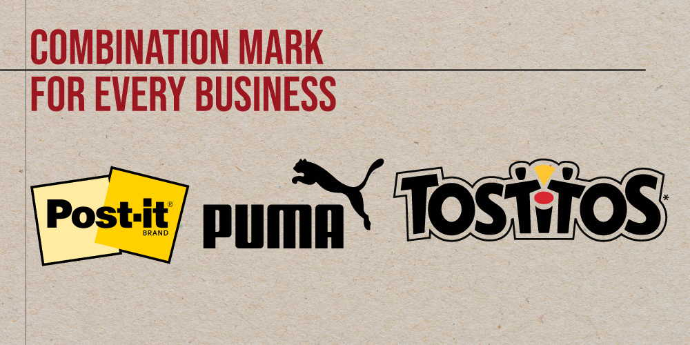
Introducing illustrations to your design will allow you to strike a balance between eye-catching ornaments and readable typography. As the name suggests, it’s a combination of two logos.
Common pairings include:
- Lettermark and Emblem
- Mascot and Lettermark
- Abstract and Lettermark
- Pictorial Mark and Emblem
- Dynamic and Lettermark
Drawings and sketches help symbolize what your business can bring to the table. The design makes it easier for you to cross any language barriers and reach a wider audience.
Utilizing different styles like line art, cubism, pop art, flat design, or others is another way to spice your design. It can also aid in developing a look and feel that is specific to your business.
One thing you should be wary of is visual clutter. Illustrations that have a lot of detail may give off a negative impact on your design – oversaturating it.
It’s best to keep the design simple and free of intricate detail that may make it hard to remember and apply on different platforms.
Thus, any business can use this. Whether you are a startup or established brand, this visual will indeed work for you.
Well-known brands use this for themselves since it helps grab attention and raise brand awareness.
- Post-it with their sticky note graphic and Sans Serif logo
- Puma, with their eye-catching, jumping puma over their brand name
- Tostitos with their lettermark with a nacho on top of the I overlapping an emblem-like background
- Burger King with their brand name in the middle of two burger buns
- NASA and their space-cluttered logo
—————————————————————————————————–
Emblem Logos
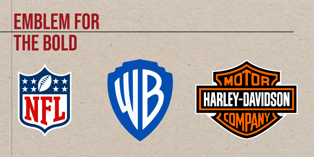
An emblem logo takes inspiration from the heraldic visual design. It takes the form of a shield or crest shape and incorporates illustrations such as animals like lions and eagles representing the brand.
Emblems are usually for schools or children’s brands. But they have a couple of other advantages. When you use this design, you communicate which industry you serve.
The graphic represents the values you uphold as a business, much like the houses of medieval England. Like lions represent a household’s courage, a rose symbolizes love or passion. As long as your visuals duly represent your values, the emblem is the right one for you.
The regal nature of this design pairs well with sophisticated brands in various industries. It also has a frame that helps add visual prominence to any brand identity.
Add some florals, torches, squiggly lines, and maybe even animals to improve the logo. Remember to incorporate them in a spherical or shield shape to be considered an emblem.
Famous brands use this type too to let you know that they stand for such values as a business.
- NFL with star-spangled logo commit themselves to provide the highest standard of sport’s entertainment
- Harley-Davidson, with its winged logo, dedicates itself to providing stable and robust motorbikes for its patrons.
- Starbucks, with its iconic siren logo, Starbucks commits itself to honor its maritime history of coffee.
- BMW, with an airplane propeller as its logo and has Germany’s color in its four quadrants.
- United Parcel Service (UPS) with their brand name encased in a shield to who their reliability as a service provider
Each of the logos created here has values that they promise to embody and are consistent with them. That’s why their businesses are thriving.
—————————————————————————————————–
Mascots Logos
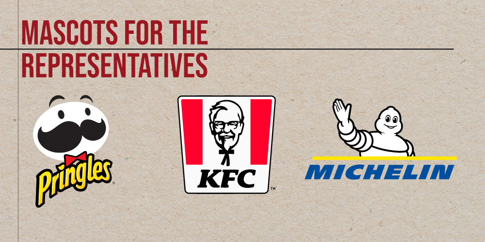
The defining aspect of a mascot logo is the use of characters. Your logo becomes the brand ambassador for your business.
The illustrations used are often caricatures or anthropomorphized animals, objects, or people to represent them. This style is commonly used by sporting teams, gaming clans and food brands.
Having a great brand representative will help you reinforce your brand as a hallmark in the industry even more. It helps your market relate to your business more because your mascot says everything about your values and what you sell.
Audiences around the globe can use this as another way to reference your company. Plus, it’s a versatile design concept suitable for schools, military brands, manufacturing, and more.
Mascot logos are a great way to establish a long-lasting brand because of iconic characters that resonate with generations to come.
- KFC with Colonel Sanders who represents their high-quality Kentucky Fried Chicken
- Pringles with Julius Pringle, who represents their seasoned crisps
- Michelin with Bibendum who represents their tire manufacturing since 1898
- Fruit Loops with Toucan Sam who represent the fun when eating their cereal
- Wendys with Melinda Lou “Wendy” Morse to embody the food chain
Notice that most of the brands that use a mascot are food chains. It’s to relate to customers on a personal level and look how much easier it is to market them.
—————————————————————————————————–
Pictorial Logos
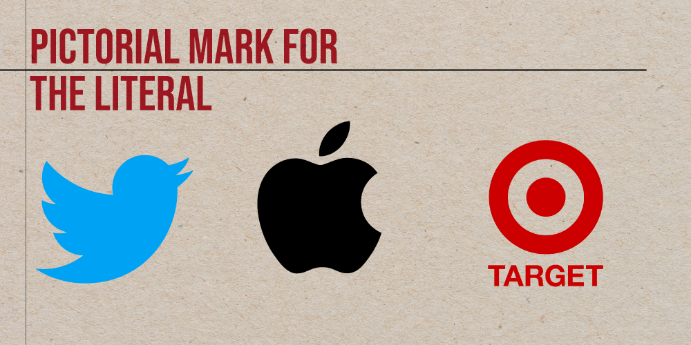
The pictorial logo is literal. This design showcases what you sell and is often a simple representation compared to abstract logos. Most often pictorial logos utilise stylized animals, minimal shapes or common symbols like targets, crosses and lightning bolts.
You can use any image as your mark. As long as it’s associated with the service or product you provide, your logo did its job. Much like abstract visuals, it catches the eye of your market immediately and explains what you offer right away.
This style is versatile since as long as the perception is related to your product and service, you’re good to go. It’s the association that matters. Thus, it’s a popular choice amongst brands worldwide.
- Twitter with their bird that promotes a 250 character limit for a post on the social media platform
- Target has a red bullseye for a logo. It encourages you to find what you need in the retail store.
- Apple has their literal apple for a logo representing their quality OS and gadgets.
- Microsoft has a window-pane-like logo that has the colors of their software products.
- Dominos, with its literal domino shaped logo that provides quality bread crusted pizza
All logos said above are literal representations of their names, or the association gives them life and makes them effective.
—————————————————————————————————–
Abstract Logos
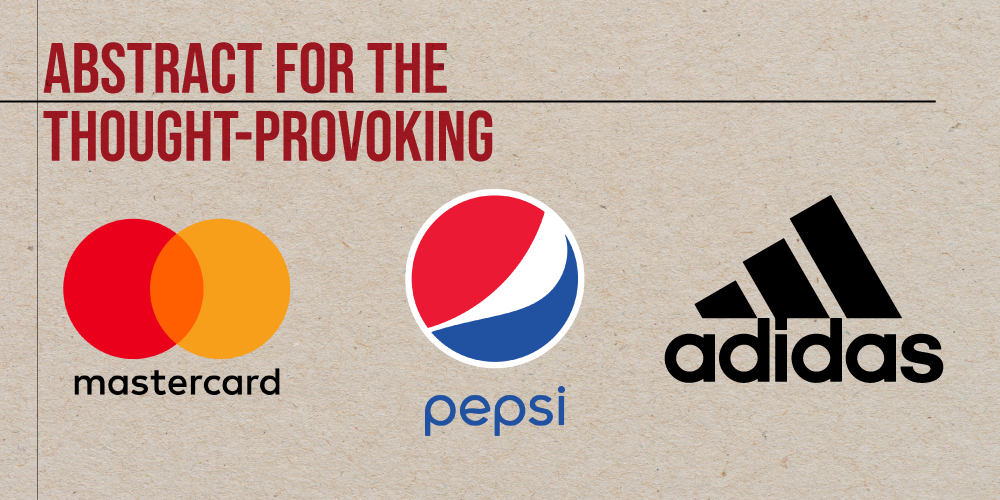
You don’t always have to have a literal design. Instead, you can use an abstract design as the focal point of your logo. This style focuses on using design elements to create an emotional effect, and it differs from illustration because it doesn’t attempt to replicate it.
The design relies on the combination of movement, textures, and colors to represent it. It’s thought-provoking which makes anyone who sees it stop and stare. Once they do that, they’ve engaged with your brand and see what you have to offer.
This method can help you build a more original identity and develop a creative and stylish visual. It’s an incredibly versatile type, not only does it look great, but abstract logos are always original.
Brands use this design especially when they want to stand out from the competition.
- Spotify utilizes negative space to show three frequency waves representing movement and sound.
- Pepsi also utilizes negative space in their logo, showing a smile that promotes happiness with every sip.
- Adidas has a trefoil created through negative space representing their dedication to providing variety, where you can find their products, and perseverance to reach their goal.
- Olympics has five hoops that represent the five continents of the world. They come together for the love of Olympism
- Under Armour uses an inverted U overlapping with an upright U to form the U and A that you see today. It represents athleticism, speed, and strength.
If you think about it, negative space allows your audience’s eyes to fill in the gaps, thus making an effective abstract design to evoke certain emotions.
—————————————————————————————————–
Dynamic Logos
Flexible and ever-changing, that’s the theme of dynamic logo. This design gives your audience something to look forward to seeing. In a sense, your base design stays (whether a monogram or a pictorial mark), but you add features to it to make it relevant today.
Take a look at Google and its context-themed logo. Every time an important event happens on a particular day, you would see its brand name change, like for Halloween or the birth of Albert Einstein.
Dynamic logo design also helps your brand appear more updated with relevant events and gather more visibility. Plus, you can also use the visual as another avenue to showcase your capacity to be creative and stand on social issues.
Brands can achieve this by creating a solid base design and tweaking it using decorative elements when necessary. Typically, you would start with a wordmark, but you can use any type.
And then add elements to change it however you want. Maybe for Earth Hour, you would have it look like the night sky or something like that. However, it can be pretty demanding to constantly develop different versions of your brand mark to match various events.
No rush or pressure. Just take your time. The best logos come from well-thought-out ideas and precise execution. But be sure that it adheres to a particular context that everyone understands.
- The City of Melbourne logo has an M filled with abstract shapes inside the M, depending on the event.
- Google has its seasonal changes in logo depending on the occasion for that day.
- MTV rebrands its logo depending on the decade.
- Nickelodeon has its iconic orange wordmark. Nickelodeon can be put on any shape, depending on the occasion.
- Shazam’s logo creates movement around its S initial that shows sound waves.
Each of these logos shows the characteristics of dynamism: versatile, context-based, movement.
—————————————————————————————————–
Bring Your Logo Design Home
Give your visions of brand identity to life with this list of logos types. Knowing which one works for different industries is the first step into getting ahead of the competition.
Be seen as credible and professional with the logo, the face you show your market today.
If you want to read more on design, you can check out our other resources on brand identity, typography, and color manipulation.
Happy designing, and may your logo be splendid!