How Uniqlo’s Logo Became a Global Fashion Symbol
Ah, the joy of shopping for clothes – an experience we all cherish! Uniqlo is a name that instantly pops into mind regarding iconic brands and clothing logos offering high-quality apparel.
But have you ever found yourself wondering about the story behind Uniqlo’s distinctive logo? The one that has become synonymous with comfort, style, and innovation? Well, wonder no more! In this article, we’ll embark on a fascinating journey into the vibrant world of Uniqlo’s logo history.
Plus, using our AI logo generator, you can have your version of the Uniqlo logo or create an apparel logo for your clothing business.
Get ready to uncover the threads of creativity woven into Uniqlo’s logo!
Brief History of Uniqlo
Uniqlo, short for “Unique Clothing Warehouse,” is a Japanese casual wear designer, manufacturer, and retailer that has evolved into a global fashion brand.
The history of this clothing brand logo dates back to March 1949, when it was founded as a small textile company in Yamaguchi, Japan, by entrepreneur Tadashi Yanai. Initially named “Ogori Shoji,” the company focused on producing men’s casual clothing.
One of Uniqlo’s key strategies has been its collaboration with designers and celebrities, creating limited-edition collections that generate significant buzz and contribute to its global appeal. This clothing logo is also known for its commitment to innovation in fabric technology, introducing popular products such as the Heattech line, which provides warmth without bulk.
Uniqlo’s Logo History
The fashion logo is also known for its commitment to innovation in fabric technology, introducing popular products such as the Heattech line, which provides warmth without bulk.
In this section, we’ll dive into the world of Uniqlo’s logo and its variations over the years:
1984-1991

The initial design showcased the original brand name, Unique Clothing Warehouse, in a deep, reddish-brown hue that resembled the subsequent version’s red.
The backdrop was either white or a very light gray. The wordmark utilized a neat sans-serif font inspired by a square logo with rounded edges. The wordmark was presented either in a single line or segmented into three lines.
1991-1998
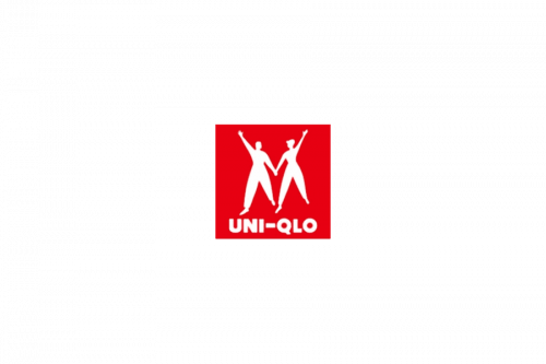
By 1991, the logo had transformed, adopting a brighter shade of red. The design and structure also evolved, with the entire emblem now centered on a red square base, with the figures and inscription rendered in white.
This version introduced a shortened brand name, albeit inadvertently misspelled. Additionally, a noticeably bolder typeface was employed in this iteration.
1998-2006
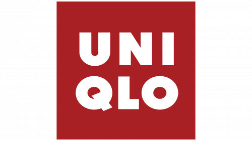
The revised version, spanning from 1998 to 2009, featured a color closer to the original, albeit more saturated. The shape deviated from a perfect rectangle, and the iconic figures that had been part of the brand for over a decade were omitted.
The emblem now solely consisted of the brand name, presented without the hyphen and divided into two lines. The font underwent another update in this period. The logo redesign was credited to Richard Seireeni and Sy Chen from The Brand Architect Group.
2006-Today
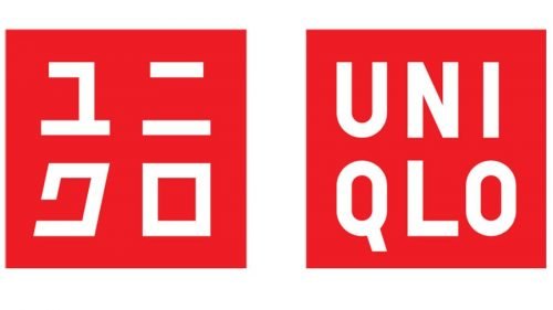
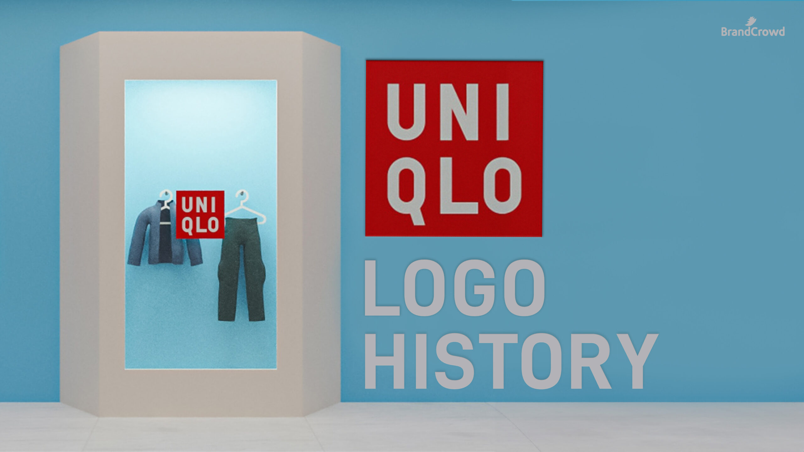
Kashiwa Sato, the lead designer at Uniqlo, crafted the logo introduced in 2006, which is still used today.
Notably, it deviated from the conventional approach by incorporating Japanese and English elements, a rarity in brand emblems. This iteration revived the vibrant red square background, maintaining the white color for the inscription. Each language version featured its distinct square backdrop while adhering to the same logo style.
Similar to its predecessor, the current English version of the logo divided the word “Uniqlo” into two parts, stacking them vertically. Meanwhile, the Japanese version featured four hieroglyphs. Sato intended for both versions to be displayed together, creating a distinctive dual-language logo with an international flair.
Uniqlo’s Logo Design Elements
Check out the different design elements of the Uniqlo logo:
Font
The original Uniqlo logo used the Futura Std Extra Bold font. The current logo has a custom font based on the FF DIN bold typeface. The letters are all uppercase, evenly spaced, and centered, giving it a clean and modern look.
Read more about the importance of font selection here.
Color
The choice of red and white in Uniqlo’s current logo serves multiple purposes. Firstly, it establishes a strong connection with Japan, echoing the colors of the Japanese flag. Additionally, this color combination aligns with the branding strategies of several successful companies, signaling Uniqlo’s ambitions on a global scale.
Check out red and white logos for more ideas.
Furthermore, scientific studies indicate that nearly 50% of people prefer red due to its positive emotional impact. This deliberate color choice in the logo aims to resonate positively with a significant portion of the audience.