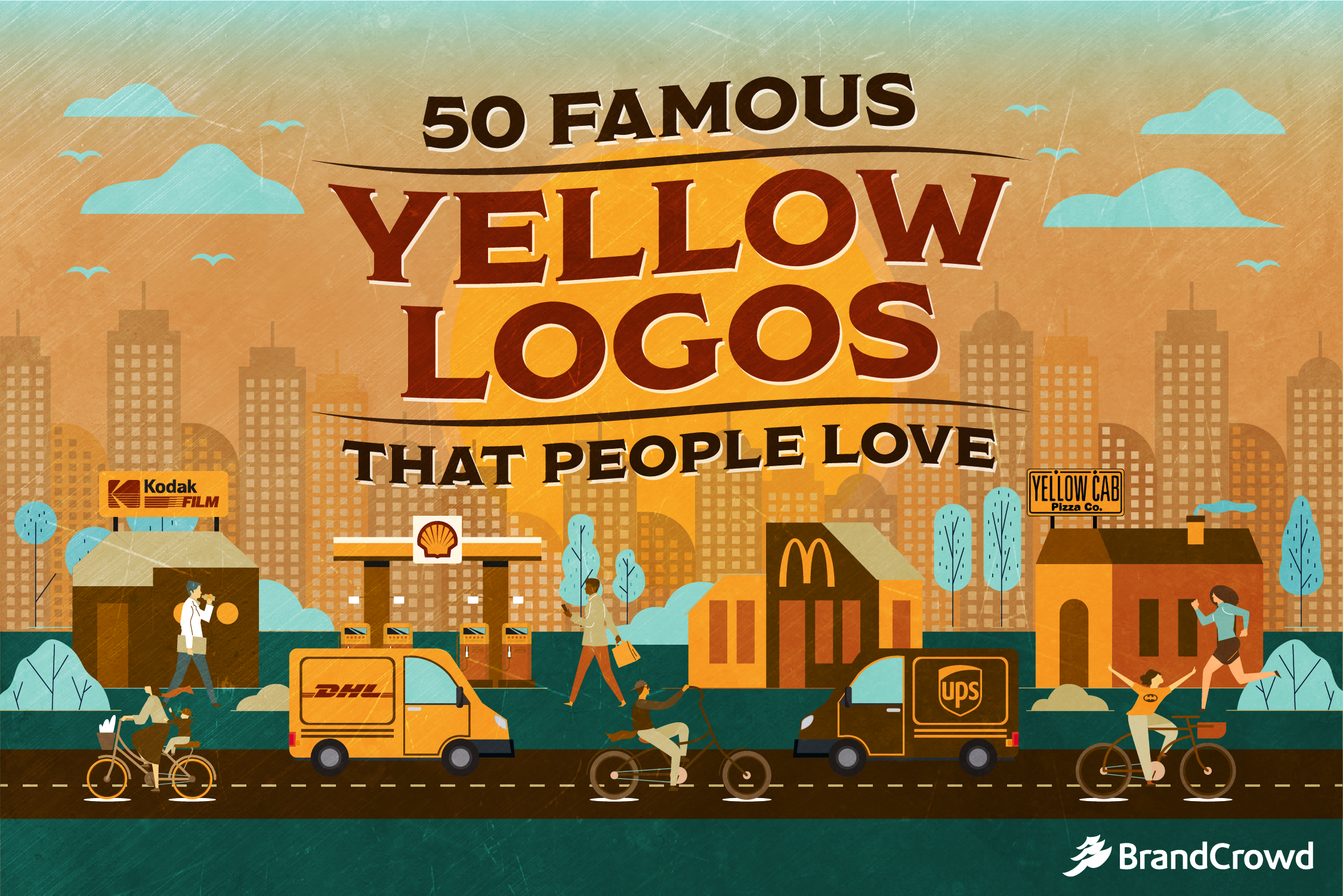
50 Famous Yellow Logos That People Love
The color yellow says hello. It is often said that it is too cheery to be used seriously, but these famous yellow logos from top companies prove them wrong.
Logos of this color tend to capture the attention of passers-by excellently. Ever wondered why street signs are yellow? This practical application of this color is a good reason for you to get a yellow logo for your attention-worthy brand. But, we’re not gonna stop there.
The youngins now love yellow, too.
In fact, they have a specific shade dubbed as the Gen Z color.
It used to be a light shade of rose quartz and serenity blue, but now the growing trend among this generation is the color yellow. Brands are beginning to consider going with the color yellow as Generation Z’s purchasing power steadily grows.
Color psychology has also found that the color yellow benefits food companies. It is said that when used with red, the color combination can really get the appetite going. This is caused by happy thoughts associated with the warm color and the activity of eating.
Yellow is a popular choice for food companies, but it works for other sectors as well.
Today, we’re going to talk about these recognizable logos spanning from a whole variety of industries. It used to always be about red and blue logos, but not anymore.
Denny’s
This yellow hexagon logo first debuted in the ‘80s. From the chain’s beginning, they stuck to using a wordmark logo that featured serif fonts.
When their logo was redesigned, it took in an era-appropriate color. Since the 80s was a time of all things vibrant, this worked well for the fast-food restaurant. Denny’s is one of the many food companies that use color psychology to their advantage.
Lay’s

Best known for their delightful potato chips, Lay’s has been a staple since 1932.
The yellow round logo of Lay’s was introduced in the late ‘90s. From 1932 until 1997, it used to be in red and white. Adding yellow to the logo really improved the depth of this logo. This pairs well with the 3D take of their logo today.
IKEA

The IKEA logo you see today was totally different from its initial design.
The logo of this Swedish brand carries its origin country’s colors. But it took several tests before they eventually settled with this. Colors such as brown, black, and red were tested for a significant number of years, but only the blue and yellow really stood out. Since being redesigned in the groovy time of the 80s, IKEA has carried the same logo ever since.
Kodak

Offering a wide range of products from film to medical diagnostic equipment, this company has been through a lot of ups and downs. But they’re best known for their camera products and their dazzling yellow logo.
As they have adapted their operation to the digital age, they have sought a modern approach to everything. Including their logo. However, they cleverly retained a yellow-colored element in their logo to pay homage to their past.
Stanley

This tool manufacturer rolls out products like toolboxes, cutting instruments, hammers, and other construction materials. Stanley decided to have a brand logo that carries an eye-catching color that also has a relevant meaning to its audience.
Yellow also pertains to caution. Aside from the road, people often use it in environments that need repairing and building such as construction sites. This is to serve as a reminder of the possible hazards.
Snapchat

This multimedia messaging app is all about capturing fun moments as fast as you can. People love Snapchat. It’s the seventh most used app in the US according to Statista.
It uses ephemeral messaging which explains the ghost illustration seen in the center. For the color, Snapchat has a predominantly yellow color that gives the design positive energy. The sunny background helps it stand out from other apps, too. Since most apps are typically in cooler shades such as Facebook and Twitter.
DHL

Most of DHL’s competitors have red or dark-colored logos. Although DHL’s wordmark is red, the yellow does a lot to give the brand a lift. The chunky font used in the design is called Gran Turismo Italic. It comes with line details that give it an illusion of motion.
This logo creates an impact and a strong distinction from competing brands.
National Geographic

The magazine and television network features subjects that include science, geography, world history, and other related matters.
Audiences know this square logo that borders every National Geographic magazine cover since it graced the cover in 1888. When the company partnered with Disney in 2001 to create a dedicated network, the vivid shape was put on television.
McDonald’s

Ahh yes, the golden arches. This iconic fast food restaurant is one of the biggest worldwide. The McDonald’s logo history can be summed up in a quick sentence. They made one arch into two. This M shaped mark stands as a reference to the chain’s old architecture.
Batman

Detective Comics’ best comics include Batman. This billionaire superhero is considered the hero of the night. The logo is seen in the dark skies of Gotham nights and a huge collection of comic merchandise loved by fans.
Superman

Known as the man of steel, this superhero has an equally strong symbol. Superman is one of the most well-known heroes in comic history. The logo has stayed with the comic series since its first publication on April 18, 1938.
Best Buy

Also referred to as the yellow label, Best Buy remains one of the leaders of retail. It’s readable and catches your attention in a snap. Even back then when Best Buy was known went by the name Sound of Music, the brand has had a yellow logo ever since. The color has become one of the inextricable parts of their story.
Subway

The sandwich and salad chain keeps it fresh with bright natural colors. Their logo also carries the convenience and ease of coming to their store. The arrows stand for the store’s entrance and exit. You come in for a sandwich and leave in just minutes.
Sprint

This telecommunications company has a pin-drop logo that looks like a flapping wing. The brand wanted a design that symbolized its ever-growing reach as a leader in technology. Sprint’s yellow logo surely is optimistic and aspirational.
CAT

This Fortune 100 company is one of the brands standing at the forefront of machinery and other construction essentials. Caterpillar Inc. shortens its name in its logo. This creates a catchy and neat logo that is easily remembered. Its simplicity is perked up by the energetic yellow shade.
Ferrari

The upright horse in Ferrari’s crest is famously known as the prancing horse. This horse is always depicted using the color black because it is a tribute to the deceased World War I hero named Count Francesco Baracca. The beloved soldier developed a liking to painting this symbol on his battle plane.
Enzo Ferrari added his own personal touch by setting the horse in a yellow background. Yellow is said to be the color of Modena, his birthplace.
Shell

When this gas company began in 1900, its logo was monochrome. The brand kept it that way until 1948 when they decided to redesign their logo using red and yellow. Ever since then, the Pecten Maximus, otherwise known as The Great Scallop, has been painted this way.
Warner Brothers

Yeah, you know this logo. It’s only greeted you during the intro of nearly every movie you’ve watched. Typically, Warner Brothers usually puts this logo against a backdrop of blue cloudy skies. This pairs well with the yellow and blue elements of the crest.
Post-it

The sticky office staple comes in many colors, but none of them outmatch the iconic yellow shade. Officially, the color is known as Canary Yellow.
There is no special or hidden meaning to the color other than it was the only paper color available during the day it was invented. But still, people loved the product and the brand knew better than to change it.
Chupa Chups

The lollipop of everybody’s childhood has a deep connection with art.
It was designed by none other than Salvador Dali. The artist is one of the most iconic figures of the surrealist art movement. This flower-shaped logo has gone through minimal changes over the years.
BIC

Designed by French artist Raymond Savignac, the ballpoint pen company has treasured this logo ever since. The wordmark and the little boy standing beside it have been inseparable as well. BIC’s logo takes on a beautiful dandelion shade.
Toblerone

This mountain-shaped chocolate has a straightforward logo. The Toblerone logo depicts a mountain that was inspired by the Swiss alps. But have you ever noticed the bear that is sneakily placed in the details of the mountain? That’s a hidden symbol for you.
If you want to see how mountains can be used in logo design click here.
Rockstar Energy Drink

This energy drink has an electrifying and grungy logo. It has an edgy yet eye-catching design that works well for its carbonated energy drink product. The wordmark is in a font that resembles a stenciled way of writing.
Los Angeles Lakers

Purple and yellow is a classic pairing. This pairing is considered complementary colors because they are on the opposite side of each other in the color wheel. The iconic NBA team utilizes this color trick in their logo.
Pirelli

This tire company illustrates the letter P in a way that stretches out to create a long silhouette. The elastic P spans out up to the end of the wordmark, which communicates durability. The logo’s typography is often seen in yellow, red, and a combination of both.
Hertz

The American company used to have a predominantly black logo. It was only until 2009 that this car rental company rebranded to a flat design. They offer rental services for cars, trucks, vans, and more. The color yellow seems fit for a brand that gets people to hit the road.
Burger King

The yellow burger buns in the Burger King logo was first seen in 1957. As the years passed, the brand adapted its logo to modern times. The color blue was also added to create better contrast in the logo.
Pringles

Stop asking, “Why put a mustachioed man on a potato chip packaging?” Start asking, “Why not?” Pringles has Julius Pringles as its poster man. Despite the different renditions of this good sir, the yellow wordmark never changes.
Rockstar Games

Rockstar Games is best known for its flashy and colorful games such as Red Dead Redemption and Grand Theft Auto. Simplicity is the word that best describes the gaming company logo. Their logo keeps it simple with an initial logo and a white star shape at the end of its stroke.
Bumble

Buzzingly yellow is what you can describe this mobile application’s logo.
The app used to be a dedicated app for dating, but the brand now offers features that businesses and friends can use. You can really say that the app is really busy like a black and yellow bee.
Reese’s

Did you know that this particular shade of orange as a background is trademarked by The Hershey Co.? This fact is quite a shocker for many.
When you think of this peanut butter cup, you automatically think orange and yellow. The pairing of its background and the flashy colored wordmark works so well.
Chevrolet

Car logos are designed in cool tones, but Chevrolet is one of the brands that beg to differ. The bowtie logo carries a custom made font created by Tom Speedwell. Chevrolet’s logo was said to be inspired by a Parisian wallpaper.
In-N-Out

Arrows convey rush and promptness that fast-food chains seem to love. Another thing about it is that it works so well for catching the attention of passers-by as well. In-N-Out’s logo looks as if it’s saying “Look at me!” The strong contrast of their brand colors helps communicate this as well.
Hard Rock Cafe

It’s all about the rock and roll lifestyle for this brand. This restaurant chain has expanded to hotels and casinos in over 74 different countries. This yellow logo has been displayed in the entrances of the store since 197.
Juicy Fruit

Wrigley’s chewing gum wasn’t always yellow. It used to be green and red, but that was way back then. Today, Juicy Fruit maintains the fun appearance of their product with appetizing colors.
Schweppes

The Swiss carbonated drink company has a ribbon logo that appears as if it is swooping in a slant direction. This logo is always seen in a sharp shade of yellow that is distinctly Schweppes.
Meguiars

This car care product manufacturer has a polished logo. The logo is a clever nod to their most popular products, the car wax. Its finish has a sheen that goes well with the brand’s bold color choice.
It uses the color combination of red and yellow which creates an attractive look.
Goodyear

Hermes is the star of this tire company logo. In Greek mythology, Hermes is a deity considered as the herald of the gods. He is often symbolized with a winged foot that takes him to places quickly. You can see this symbol nestled between the brand’s wordmark.
Temple Run

The running video game was popularized in 2011. A totem-like object stands as its logo. The goldish shade of yellow refers to the treasure often associated with ruins where the game is set. It looks intriguing and challenging at the same time.
League of Legends

Developed by Riot Games in 2009, League of Legends is a multiplayer online battle arena. It has a distinct art style from the other games in its genre. The game’s wordmark is in a serif font that creates an old-timey feel to the design.
Yellow Cab

The pizza chain pays an obvious homage to taxis. Western taxi cabs are yellow because the color makes it easier for riders to spot a ride to hail on busy roads. Yellow Cab’s logo cleverly chose a logo that resembles a car plate.
UPS

This logo used to have a metallic finish. However, the brand redesigned and followed the flat design movement. It lost depth, but it gained an improvement in legibility. UPS’ old gold shade is now a bright shade of sunlight.
Cheetos

Cheesy snacks are often packaged in warm colors that resemble the flavor. The wordmark is a custom-made serif font. It is owned by Frito-Lay that also owns Lays, another yellow logo company we’ve mentioned above.
Sonic The Hedgehog

This is a famous platformer video game led by Sonic as the main character. He’s fast and he’s blue. Since he’s the star and namesake of the game, the logo is colored in complementing colors like yellow and red.
Maggi

This seasoning manufacturer has been in business since the 1800s. Maggi’s logo is in a unique pointed shape that can be likened to a speech bubble.
Hardee’s

We weren’t kidding when we said that restaurants love using color psychology. Just look at this Hardee’s, not to be mistaken with its sister company Carl’s Jr. It’s a fast food chain known best for their charbroiled burgers.
Cheerios

The creators of everyone’s favorite honey nut cereal always kept something yellow and red in their packaging. It still has a lot of the ‘70s spirit in its design which you can see in its serif font.
Lipton
Lipton’s logo has always referred to the radiant sun or the sunlight. Their current logo looks a lot like the sun with their brand ribbon over it. This British brand has kept the lens flare in its design concept for two redesigns now.
Pokemon

Gotta catch em all, right?. By “all” we mean loved yellow logos. For this article, we certainly won’t forget about the 90s classic video game and anime series that changed the lives of many.
Going through the logo history of Pokemon, you won’t see any major changes in its design. Despite the different ventures, versions, and other undertakings the brand has dabbled in, they have kept this nostalgic yellow and blue logo untouched.
Did we have you at yellow?
Having the logo of your dreams can be done faster with readymade designs. BrandCrowd has a wide gallery of yellow logos that fit a long list of industries. Each insignia is curated and designed by professional designers from all over the world.
Your brand can be one of the famous companies mentioned above. An effective logo will serve as your brand’s instant visual communication tool as you grow your audience.