50 Construction Logos To Build You A Better Brand
Planning and building construction projects day in and day out is hard work. So why complicate your branding process?
A good construction logo allows you to forge connections with your target audience instantaneously.
In fact, it’s possible to communicate your specialties and competence in construction within the first 10 seconds of looking at your logo.
Once you’ve got a sturdy foundation for your brand identity, you can start contributing to this industry’s astounding growth. Which, by the way, is no joke. The construction market is expected to grow at $8 trillion dollars in the next ten years.
Sounds exciting right?
We’re letting you in on a secret to get there quicker. Our years of logo expertise has gifted us with the key to creating amazing logos that work amazing for any brand. Construction is no stranger to us.
So whether you’re a construction start-up, renovation contractor, real estate developer, heavy engineering, sponsor builder, or any construction firm under the sun, we’ve got the right logo for you.
Just head right into these categories to find the logo that will serve as your beam:
These concrete logos are zoned for success. Each one casts a positive light on the value your business brings to your clients. You can create lasting impressions and brand recognition with the right mix of powerful visuals and striking colors to represent your company
Minimalist
One thing we love about minimal logos is its malleability. Although they are simple, you can use them for a whole lot of things without losing impact. Minimal logos are easily transformed into different colors, sizes, place them on different platforms, and they’d still look good.
This is a celebrated concept in art, life, and buildings. The great architects in history have long championed the design movement. People enjoyed the challenge of creating more with less. The highly adaptive output didn’t hurt either.
Minimalist Pharoah by Rohendah
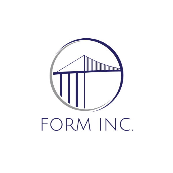
Ambassador Bridge by LogoBrainstorm
The simplistic approach in design makes your output memorable. Using easy-to-recall symbols free of clutter, they will have an easier time recognizing your brand.
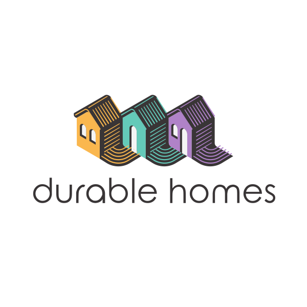
Minimalist Builder Town Buildings by LogoBrainstorm
Minimalist House Roof by neostudio
Red Number 5 Stroke by podvoodoo13
Modern Minimalist Pillar by SimplePixelSL
Plus, it’s a design concept that holds deep meaning. It alludes to using resources as little as you can to create great outcomes.
This belief is something your brand can benefit from. Your audience may develop a judgment around your brand that is on par with the traits of minimalism such as clear and resourceful. For operations as lucrative and high-stake as construction, that’s not a bad look at all.
Chimney Tower Logo by SimplePixelSL
Hammer Building Construction Logo by arishu
House Construction Builder Crane Logo by podvoodoo13
Fast Growing Business by LogoBrainstorm
Minimalist Blue Stairs by LogoBrainstorm
Home Welfare by LogoBrainstorm
Minimalism loves color. In fact, minimalist logos actually benefit a lot from it. With very little elements to instill your brand in, color is one way you can achieve that. Never sacrifice color.
Another tip when creating a minimalist design is to think very carefully about your typography. Do your fonts speak for your brand message? Are the elements spaced well? Does the spacing take away from the impact of white space?
Once you’ve evaluated and balanced your design, you should end up with a good-looking logo that will serve your brand for years to come.
Typography
Want increased logo readability? It’s as simple as getting a typography logo.
But before you get a logo that just screams your brand, let’s talk about the two types of typography logos often seen in the market. There are letterforms and wordmarks.
Letterforms
Otherwise known as initial logos, letterforms use brand initials as the focal point of a logo. They are usually made up of either one or two letters to add weight to the design. This is great for brands with wordy names.
Architectural Letter H by JimjemR
Blue Green House B Logo by town
Green Developer H Logo by AMCstudio
Letterforms are amazing logos for brands that have been in business for quite some time. It’s a good way to simplify your brand when rebranding.
Wordmarks
This is a straightforward take on logo design. Lettermarks use only type and color elements to create a symbol. The right wordmark logo will give your audience ease when recalling your brand name.
Modern Company Text by BrandCrowd
Wordmarks work especially well for small brands that haven’t gotten much experience and recognition from the market.
Some may worry that these logos are overly simple and may fail to showcase your brand identity. But there’s a ton of ways to push a typography logo further.
Trying out color tricks like gradients lets you create eye-catching contrasts. It’s also one way for you to break free from the monotony of flat design by creating an illusion of depth. Gradients make use of color transitions that can begin vertically, horizontally or diagonally.
Illustrations
Graphic design elements such as drawings add personality to your branding. They showcase your company’s capacity to be creative and instill beauty in every project.
You can use graphic renders of infrastructure or even machinery to let audiences know that you are a construction company. Drawings are also effective for highlighting whatever niche your brand serves.
Black Blue Hill House by eightyLOGOS
Construction Earthmover by SimplePixelSL
Green Forest House Logo by radkedesign
Trowel and Bricks Logo by smegenai3000
City Delivery Box Logo by SimplePixelSL
Green Real Estate Logo by town
Geometric Building Square by town
Making use of your brand colors is best applied when designing logos heavy on illustration. Doing so aids your brand in carrying out a consistent identity. This will give you a more established visual look that will boost brand awareness.
High Rise Buildings by LogoBrainstorm
Blue Real Estate Logo by AMCstudio
Builder Big House Logo by town
The most used color when it comes to construction logos has got to be blue. A cursory look at the Google image search results can confirm this. It makes sense considering that the color blue symbolizes intelligence and trustworthiness.
Hack any illustration logo by making sure your design is versatile. Don’t rely heavily on colors to give your logo a striking appearance. Effective illustrations must retain their visual impact even when printed in monochrome. It’s important to prioritize how your logos will look in different applications.
Abstract
Did you know brains subconsciously like abstract art? Representational art attracts humans because our brains are naturally drawn to visual intrigue.
Your construction company can benefit from abstract logos because they’re unique and carry deep symbolic meaning. These logos may not be upfront, but they provide astonishing figures to represent your brand.
Abstract Structure Letter B Logo by SimplePixelSL
Blue Buildings Logo by LogoBrainstorm
Gradient Hammer Letter B by SimplePixelSL
Abstract logos solicit emotional responses from your audience. It is not upfront like illustrations, but they help the audience remember your brand for its identity and beauty. Think of it as another way of setting your brand apart from the predictability of your competitors.
But don’t worry. As vague as these logos can be, they still resemble real objects, but in a tastefully artistic way.
Red Line Geometry Building by town
Gardening Shield Logo by SimplePixelSL
House Paint Brush Logo by FishDesigns61025
Gardening Shovel Logo by SimplePixelSL
Real Estate Abstract Building Construction by town
When creating an abstract design concept, keep color schemes in mind. Make sure that you use colors that create a good contrast. Since this design concept has the nature to be vague, utilizing exciting colors can benefit your logo’s overall look.
Cutting the ribbon
Hold your horses. Before we move forward to cutting the ribbon to your project’s launch day, we have to first break the ground.
You need to have a good logo before you even go about marketing and starting your operations. Especially now when 75% percent of construction companies now use social media marketing campaigns to reach more clients. It’s best to give your brand the best possible face to give audiences a remarkable impression of your brand.
With our logo maker tool and a vast library of construction logos, it won’t take you long to get to that ribbon-cutting day.