Fanta Logo History: Decades of Playful, Fruity Design
Are you a business owner looking for a soft drink logo inspiration? Prepare to journey through the logo history of one of the most famous drinks worldwide – Fanta!
As we navigate through the decades, you’ll witness how the Fanta logo evolved, mirroring the changing design trends and consumer preferences. From the whimsical designs of the 1950s to the bold, colorful aesthetics of the 200s, each era tells a unique story about how the logo encapsulated the essence of this beloved beverage.
Also, feel free to use our AI logo generator and generate yours in just a few minutes.
Join us as we go through Fanta’s logo history. Let’s get started!
Brief Overview of Fanta
Fanta, the vibrant and fizzy soft drink known for its fruity flavors, has a unique origin story that dates back to the challenging days of World War II. The history of Fanta is a testament to innovation, adaptability, and the power of imagination in the face of adversity.
Fanta in Coca-Cola’s History
Fanta holds a unique position in Coca-Cola’s history. It was the second drink ever produced by the company, following the original Coca-Cola. This new creation was a product of necessity and a testament to the brand’s adaptability and willingness to explore new tastes.
Over the years, Fanta has grown to become a global sensation. While Fanta Orange remains the most popular flavor, it has expanded its reach to over 180 countries. More than 70 different Fanta flavors are available worldwide, showcasing the brand’s ability to innovate and continuously cater to diverse tastes.
Fanta in the World War II
During the war, Max Keith, the German-born head of Coca-Cola’s local operation, played a pivotal role in keeping the business alive. He improvised by mixing whey and apple fiber with whatever seasonal fruits were available to create a soda reminiscent of ginger ale. This new concoction was marketed as Fanta, a name inspired by the German word “fantasie.”
Max Keith’s resourcefulness sustained the local operation and allowed him to accumulate profits despite having yet to contact Coca-Cola’s headquarters in the United States. After the war ended, Max returned the profits to the company’s headquarters in Atlanta, and Coca-Cola resumed its operations in Germany.
Today, Fanta remains a symbol of creativity, adaptability, and the power of imagination, proving that even in the most challenging times, innovation can create something refreshing and delightful.
Fanta Logo History
In the colorful world of Fanta, every detail tells a story. Join us on a visual journey through time as we delve into the fascinating history of the Fanta logo.
From its humble beginnings to its vibrant and iconic present, the evolution of the Fanta logo mirrors the brand’s transformation and the enduring spirit of innovation that has made it a beloved global beverage.
Check out the history of Fanta’s logo:
- 1940-1962
- 1962-1970
- 1970-1980
- 1980-1995
- 1995-1997
- 1997-2004
- 2004-2008
- 2008-2010
- 2010-2016
- 2016-2021
- 2021-2023
- 2023
1940-1962

The first Fanta logo, introduced in 1940, exudes a timeless charm. This iconic design featured a striking black lowercase logotype. The letter “F” had a fancy, long tail that curved gracefully, giving the whole procedure a unique charm. This vintage logo encapsulated a sense of elegance and a special character that became synonymous with Fanta’s early identity.
1962-1970

In 1962, Fanta underwent a fresh redesign. The logo featured a light blue and white scheme, with a white uppercase sans-serif text on a blue rectangular badge. The upper part of this badge curved downward, forming a friendly, smile-like shape.
1970-1980

Fanta underwent a logo makeover in the 1970s. The inscription was updated with a smoother, thicker sans-serif typeface, giving it a sleek and confident appearance. Three orange circles arched over the “N” in the wordmark, symbolizing the drink’s primary flavor: oranges. This design change added a bold and fruity touch to Fanta’s logo during this era.
1980-1995

In the 1980s, Fanta underwent a vibrant transformation. The logo shifted from black to intense blue, and the orange hue became a striking red. A neat, smooth leaf was introduced, enhancing the orange imagery.
Additionally, the all-capital lettering gave way to a title case inscription, lending a more contemporary look. The iconic red and green emblem was repositioned to the left, marking a significant visual shift during this period.
1995-1997

This time, the three oranges were replaced with an abstract orange leaf logo, symbolizing a contemporary and creative spirit. This change added a unique touch to the brand and highlighted its adaptability and growth.
1997-2004

From 1997 to 2004, Fanta’s logo featured the familiar logotype, albeit in a slightly altered shade of blue. This logotype was creatively placed diagonally against a vibrant orange or yellow background, depending on the flavor variant. A stylized green leaf, enclosed within a blue outline, emerged from the letter “N,” infusing a dynamic and lively element into the design.
2004-2008

In 2004, Fanta’s logo underwent simplification. The blue wordmark returned, set against a white background. However, it was placed diagonally, with a green leaf above the inscription, for a modern touch.
2008-2010

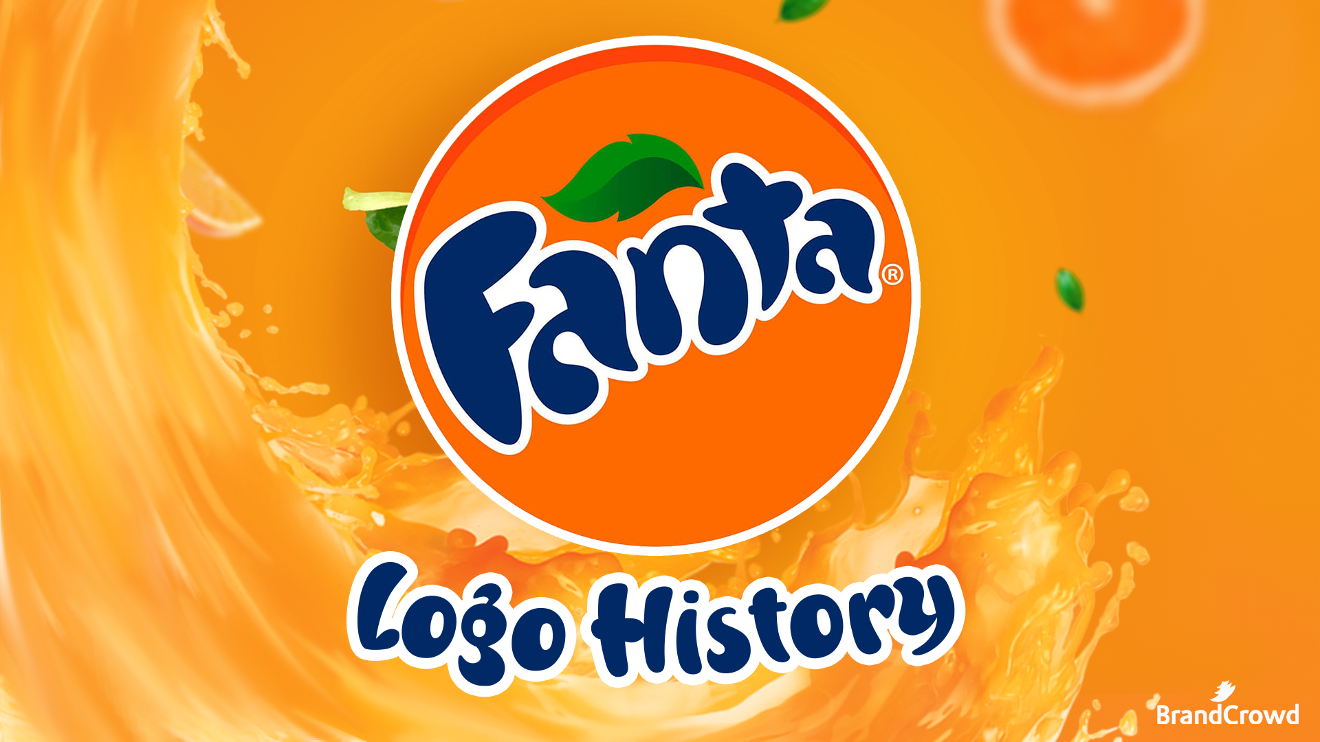
Between 2008 and 2010, Fanta unveiled a new logo. This version featured a dark-blue inscription outlined in white, boldly positioned on a solid orange roundel. A gradient green leaf adorned the space above the “an” in the wordmark. The lettering was set diagonally and showcased a bolder and smoother character design compared to the previous version, giving it a modern and dynamic feel.
2010-2016

From 2010 to 2016, Fanta made a notable change to its logo. The inscription was enlarged, while the orange circle logo surrounding it became smaller. This update gave the logo a stylish and bright appearance, making it recognizable and memorable globally.
2016-2021

The rounded shapes of the wordmark were replaced with square ones, resulting in a bold and confident sans-serif inscription. The iconic green leaf logo was also redesigned and enlarged, now emerging from the letter “N” and pointing upwards to the left. The entire logotype was placed within a solid orange circle, evoking associations with the sun, summer, and, of course, oranges.
2021-2023

In 2021, the major change was removing the heavy blue shadow that had characterized the logo since 2016. While all other elements remained consistent, the white lettering in a geometric sans-serif typeface, surrounded by a thick blue outline, presented a notably different appearance without the shadow effect.
Fanta’s 2023 Logo

In the latest 2023 logo redesign, Fanta has adopted a minimalistic approach. The orange roundel and the green leaf have been removed, leaving only the white uppercase logotype. This logotype is outlined in thick blue and features a massive shadow that resembles the design seen in the 2016 badge.
However, the shadow extends downward in this iteration, forming a distinctive triangle shape. This minimalistic badge exudes intensity and brightness, reflecting the company’s new direction and progressive spirit.
Fanta Logo Design Elements
The Fanta logo has evolved, reflecting the brand’s ability to adapt and innovate. In this section, we will talk about its design elements and how each piece played a crucial role in the success of Fanta’s logo.
Font

The primary Fanta logo is characterized by its bold uppercase lettering, which exudes a vibrant and playful feel. The font used in this logo is a designer sans-serif typeface known for its clean lines and contemporary appeal.
Color

Fanta’s visual identity has significantly shifted its color palette with the 2023 redesign. The brand has streamlined its colors to blue and white, bidding farewell to the vibrant orange and green shades previously associated with the logo.
The new, simplified color palette provides a clean and modern look and aligns with Fanta’s evolving brand identity, which remains rooted in delivering exciting and enjoyable beverage experiences. Tools like Flipsnack’s presentation maker can help showcase such branding transformations in a visually engaging and professional way.
Shape

The logo has transitioned from rounded shapes to square and geometric forms, demonstrating Fanta’s versatility and contemporary appeal. To learn more about using geometry in logo design, check out our blog about the Psychology of Shapes.