Logo Design Trends For 2022
The year is about to end, and new design trends will unfold. And branding and rebranding your business becomes reliant on trends. This knowledge could be excellent and risky at the same time.
Excellent because you give your business a fresh look. Risky because you might look like your competitors. But if you’re willing to take the risk, don’t get left behind.
Let’s learn logo design trends for 2022. We’ll discuss each of the trending elements so you can ride the trend train.
Every year, rather every decade, you see a twist to famous brand logos like BMW. or even GoDaddy. Their logo aesthetic adapted to the trends.
For example, in 2011, what was trending were 2D designs that had gradients paired with a grainy texture. But for the decade to come, let’s learn each of its trends and how you can utilize them in your next logo design session.
We have three major elements to talk about:
- Clutter is Real
- Hue Manipulation
- Say Typography
And in each of these major topics, we’ll be discussing what’s fashionable for your business. You can mix and match them however you want to express yourself online.
Clutter is Real
This first point focuses on how organized your design is. We tackle the placement and arrangement of elements that affect the view of your market with one glance at your logo.
A study by Harvard Business Review, their findings suggest that companies and even business should have one visual aspect and one textual aspect that represents what you sell.
This implication means that you need to make people see what your business offers through your logo. Thus, here are trending logotypes you can apply to your logo:
- Hazy Effect
- Movement to Grab
- Hit Em’ With Nostalgia
- Negative Space to Imagine
- We All Need Layers
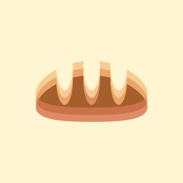
1. Hazy Effect
When creating brand graphics, designers want to go bold and show movement. Thus, the blurring effect comes into play.
You might think this is a mistake but fret not. It’s the truth. A blur to the logo usually means a bad omen on the design, but for 2022, it’s to create focus.
Notice how the blur emphasizes certain aspects of the logo. Whether it be the upper right corner of a pictorial mark or the outskirt letters of a wordmark, your logo looks more sophisticated and organized.
Lastly, it makes your logo versatile because it’s easier to transition into an animated one.
Frosted Glass Icon Pack by Zihui Yang
2. Movement to Grab
This second pointer pertains to the portrayal of how much motion is in the logo. Meaning, your visual has animation.
Famous examples would be Spotify and Amazon. The movement also guides the viewer’s eyes, making it fun and refreshing to see.
You can either go wild and or minimalistic for this type. As long as it’s animated and moves, you’re good to go. It’s a great way to attract attention and build a connection to your target market.
mllnnl Logo Animation by Tsuriel ☰
Round glass logo animation by BrandMills Studios
3. Hit Em’ With Nostalgia
Remember what the 90s and earlier designs made you feel? Fun, approachable, even lively. Well, it’s making a coming back. Think about MTV, and that’s precisely the design that’s returning to the big leagues.
Depending on what you want your brand to feel like, you can tell your market that you are every bit of fun and approachable with the typography you use and the color scheme.
Go bold and choose warm colors to aid you in hitting that nostalgic mark. If you think about it, years before 2022, everyone wanted slick and minimal.
They wanted to exude professionalism and credibility. Now, you want your market to see your brand as personable and on their level.
Have you ever watched cartoons in the 1930s or earlier? Those creepy but fun-looking cartoons from Disney?
Those are also making a comeback to make your market feel closer to you. Rubber hose characters are like mascots representing your brand to feel more personal.
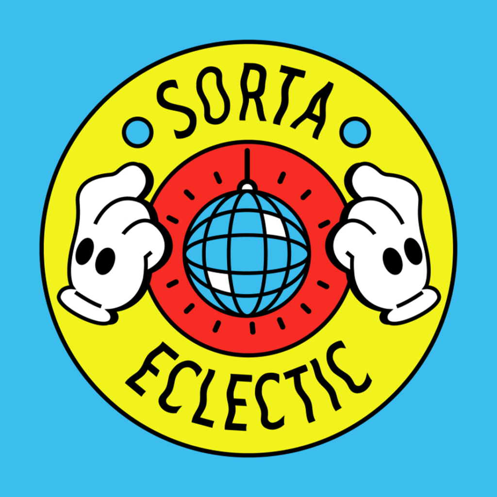
sorta eclectic concept two by OVCHARKA INDUSTRIES
4. Negative Space to Imagine
Negative space, also known as white space, is a great way to design your logo. It’s literally like an optical illusion to keep your market and spectators on their toes.
Like the earlier designs, white space allows you to direct where your audience would look. But this year, that’s not the only reason it’s trending.
Now, the negative space will be with other elements depending on what your business wants. This factor makes your design versatile.
You can fill the void with something seasonal and have it on top of a photo background or a solid color–a dynamic logo. Aside from that, ultimately, you can incorporate motion by changing the fill or layout of the logo for a much more practical design.
Skyscraper Office Space by shen02
5. Add Some Layers
We all know that everyone has layers, but your logos need it too. It’s a mixture of some of the other logo element trends we’d be discussing today.
Geometry defined modern design. Thus, designers opted to experiment with geometry and fun colors, not only that but also perspective.
The overlay shapes give your logo boldness and uniqueness, making your brand stand out.
You can have this style appear 2D or 3D, depending on how you design it. Manipulating your layers can give your brand the effect of professionalism or fun and approachable.
3D Cube Tech Logo Design by Connor Fowler (.com)
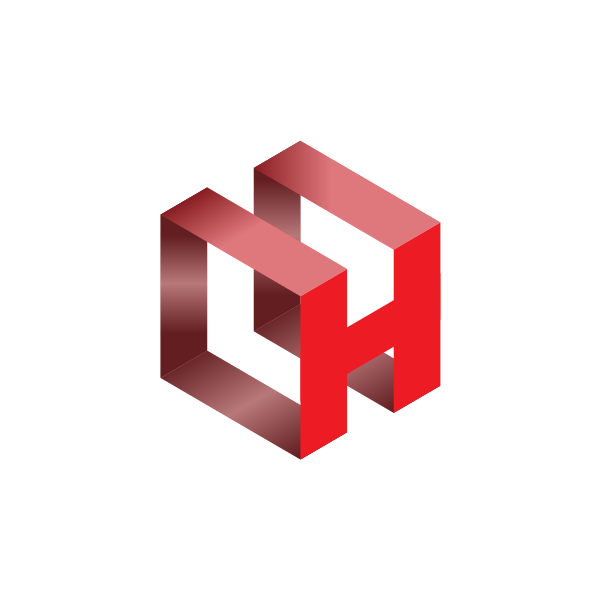
3D Red Letter H by iServiceOfficial
Hue Manipulation
Now we move on to colors. Next year, you’ll be seeing bold and vibrant strokes. It’s like a 90s flashback with a retro kind of vibe.
Did you know that having a distinct brand color gives you an 80% chance to get more recognized? That’s right. It’s that high, so you need to pick the best color combination for your business.
Here are the most used colors for logos according to statistics:
- Blue (35%)
- Red (30%)
- Grayscale (23%)
- Yellow (20%)
- Green (7%)
- Purple (1%)
With that in mind, make sure you choose the right one. You could use color theory as a guide or follow the trends below:
- Littered with Gradients
- Psychadelic Goodness
- Grunge Takes Center Fold
1. Littered with Gradients
Our first bullet has had its debut in earlier years, but it’s coming back stronger with 3D design next year. The manipulation of color isn’t new in design, but having several shades of one color make up the shape of your mascot or visioned design is a great way to go.
The contrasting colors create a treat for the eyes that catches the gazes of your audience. Aside from that, they are a great way to show your creativity. Don’t be scared to experiment with the color wheel.
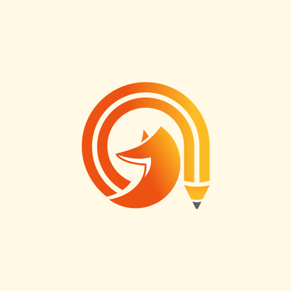
2. Psychedelic Goodness
If gradients are shades of one color, psychedelic colors mix, and match hues. It’s a literal blast from the past since, as stated earlier, businesses have gone bored of minimalistic, neutral colors.
Now, they combine sleek font with the diverse color wheel. Depending on what businesses want their brand to look like, they utilize the wheel as they please.
It gives businesses a look of fun and professionalism that people indeed enjoy seeing.
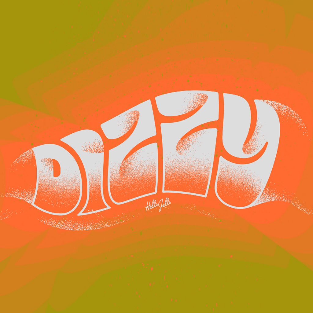
Dizzy – Typetober Lettering Illustration by Hellsjells
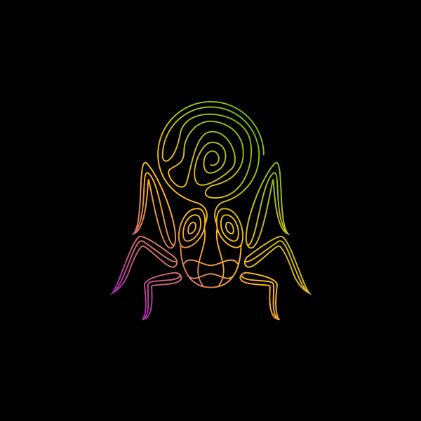
Psychedelic Mystic Spider by ArtFreedom
Say Typography
The last of the three main themes, typography, is a vital ingredient to your design. Whether a wordmark or a combination mark, your font needs to be unique to stand out.
Thus, get to know these last three trending logo elements for 2022:
- Grunge Takes Center Fold
- Words Take Form
- Stencil For You
1. Grunge Takes Center Fold
Dark tones combined with the bold and striking font were the epitome of grunge style. It’s making a comeback now and is undoubtedly giving that edgy but fun vibe to brands.
The typefaces of this style have a distinct texture of being rough. Typically, this is associated with rock bands or gothic, but today, the typeface has colorful backgrounds.
Though some still have dark tones for their background and rough font textures.
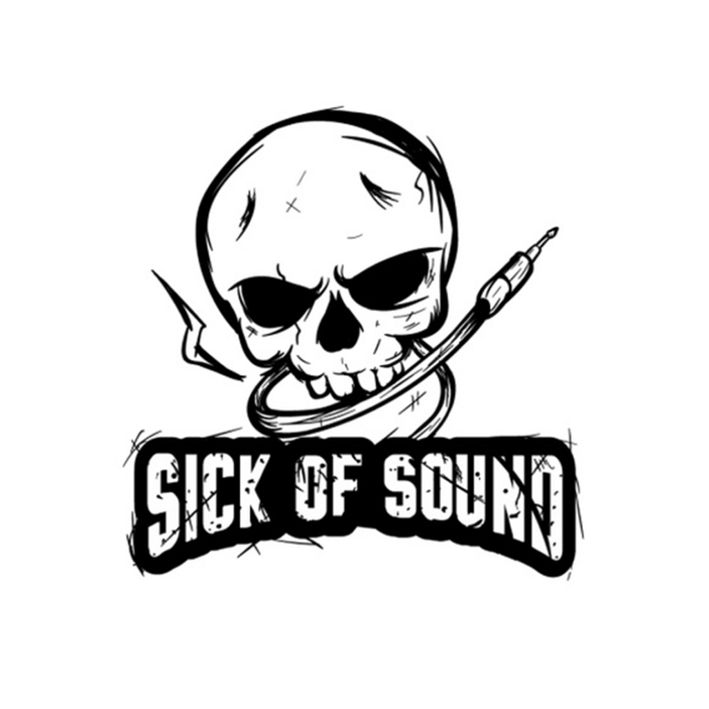
sick of sound… by Muhammad Rifa’I
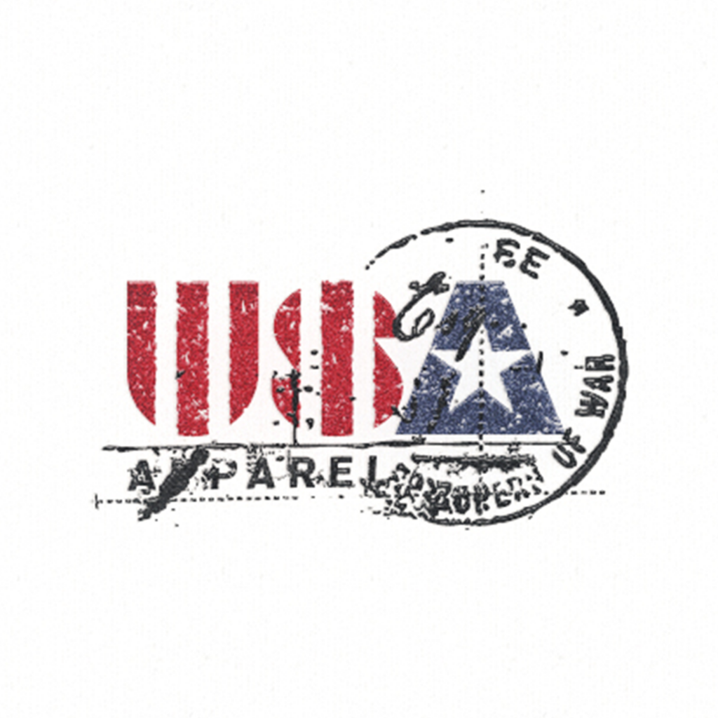
Us Apparel … by Arno Kathollnig
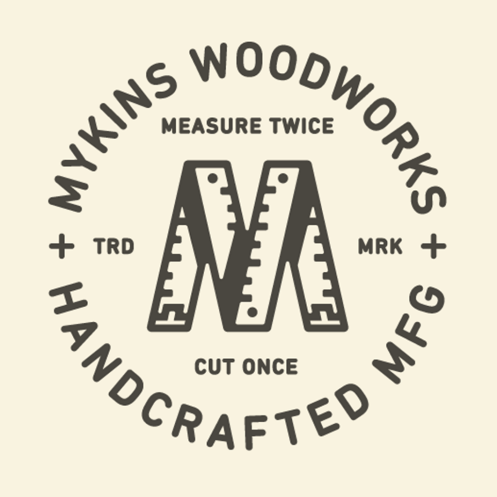
2. Words Take Form
Wordmarks are a no-brainer. They’ll always be relevant in the design scene for logo creation. But now, they are taking shape.
They now look like emblems, wrapped around each other or incorporated into the overall image of the design. This style gives your brand a vintage but trendy feel.
Most emblems created with wordmarks look like designs from old England, and others look puzzling to look at, but they’re fun to look at either way.
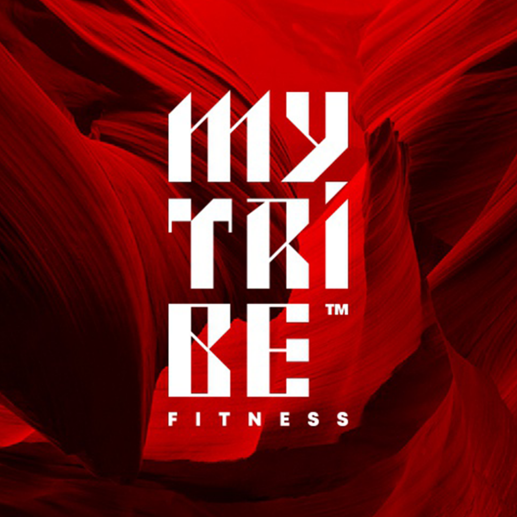
Mytribe Fitness™ by Cajvanean Alexandr
3. Stencil For You
Like many different typography styles, the stencil is a prominent one. The Stencil’s time to shine is now, and as you can see in some wordmarks, the missing spaces have an impact.
Don’t overdo it, though, since it could cause a different effect. Instead of sophistication, your brand could look lost.
Thus, use this trend in moderation, but go ahead; if you want to give yourself a feel of mystery, go ahead. This style also serves as an optical illusion but for wordmarks.
Branding Looks Fun in 2022!
You are now well equipped to tread through the competitive world of 2022 with these logo design trends.
Remember that your goal when creating a logo is to gain brand loyalty which is 10x more important than a single purchase (Venngage, 2019).
Make your logo thrive through association. Give them an image to look at and search for meaning.
Let us help you there. We offer two methods to aid you in your branding endeavor: hire a designer or create your logo.
Whichever you choose, we know you’ll thrive. Learn Logo Design Trends for 2022 today.
Go forth and prosper, small business!
